Category: Commercial Printing

Commercial Printing guides from Avanti Printing in Irvine, California.

  • Carbonless NCR Forms Irvine: 2-Part, 3-Part, Numbering

    Carbonless NCR Forms Irvine: 2-Part, 3-Part, Numbering

    Carbonless NCR forms Irvine businesses reorder are 2-part or 3-part sets, crash-numbered through every ply, padded or bound as books, with a starting number you own. Spec the ply count, color sequence, glue edge, and whether a last copy has to read after a tech writes on a tailgate. Quotes still confirm size, material, quantity, finish, and date.

    Carbonless NCR form book with color copy sheets

    I estimate these jobs at Avanti Printing, 15321 Barranca Pkwy, Irvine, CA 92618. The books leave this plant and ride in HVAC vans, dental drawers, warehouse clipboards, and glove boxes from the Spectrum to Santa Ana. Call (949) 788-6100 if you already have a starting number and a ply count. A pretty unit price on 2,500 loose sets is not a program if ply three is a ghost after a ballpoint on a truck hood, or if book 14 starts at the same invoice number as book 3.

    If you came here from a “standard NCR form” dropdown, ignore the photo of a four-color 8.5×11 with a gold foil logo and a barcode that looks like a boarding pass. That photo is a product shot, not your ticket. Carbonless NCR forms Irvine trades and medical offices actually reorder from this plant are almost always a numbered 2-part or 3-part, black plus maybe one ink, wraparound book or snap-apart set, with a stub, a perforation, and a sequence you can hand an accountant. Numbering, crash, and the last-copy image are the three places those jobs reprint. Write the sequence on the purchase order. Then pick the ply.

    Who this is for in Irvine, Orange County, and statewide California

    This page is for the person who signs a forms estimate and also owns a gap in a number series: an HVAC owner dispatching from Tustin, a plumber covering Newport to Santa Ana, an electrical contractor in the Irvine Business Complex, a roofing crew that still writes change orders on a roof, a medical or dental front desk in the Spectrum, a physical-therapy clinic near UCI, an auto shop along the 405, a warehouse on Barranca that needs delivery tickets, or a statewide operator that wants one origin and one sequence. It is not a fold-style lecture. Panel brochures are a different ticket. It is not a saturation-mail spec. A postcard that reminds a patient of Tuesday is not a triplicate encounter form. It is not a catalog press comparison. If the piece is a bound sell book with a spine, that is not an NCR book.

    You should read this if any of the following is true. You ordered 5,000 4-part sets because the unit cost looked serious, then discovered ply four was unreadable on a job site. You numbered the face of the top sheet in toner and wondered why the canary copy had a blank where the invoice number should be. You started book 20 at 000001 because the portal defaulted. You printed unit prices on 2,000 invoices and then changed the trip charge. You bound 50-set books with no chipboard and watched them curl in a July van. You asked a receptionist to collate white, yellow, and pink on a conference table. You need the same work-order story in a truck book, a counter pad, and a PDF, and you have not split those piles.

    If the piece is a single un-numbered sheet for a bag or a counter, you do not need carbonless. We print one-sheet flyers when the leave-behind should stay a single panel. If the story has to sell the company while the numbered form does the job, we print capability brochures that ride in a truck, not in a numbering machine. If the reminder is an appointment card that never takes a carbon image, we print appointment postcards that remind, not a triplicate encounter form. Name each product. Quantity each product. The NCR set is the audit trail. The audit trail is not the brochure.

    The plant is in Irvine. The teams we pad and number for are California teams: Orange County first, then Los Angeles, the Inland Empire, San Diego, and the rest of the state when one origin and one sequence is the point. Heat, clipboards, truck hoods, and medical-office drawers are part of the ply spec, not color commentary. A 3-part book that never leaves a climate-controlled billing office is not the same object as a 3-part book that rides in a Transit on the 5 in September.

    Pick 2-part, 3-part, or 4-part before you pick a color

    Start every carbonless conversation with the distribution list, not with a logo swatch. The ply count, the color sequence, the crash, and the book thickness all follow who keeps a copy. Doing it in reverse — picking a “standard 3-part” because every office has seen yellow and pink — is how you buy a handsome set that nobody files.

    Use this as the planning surface before anyone opens a forms template.

    Construction Who usually keeps a copy Typical Irvine use Last-copy risk What it does to the book
    2-part (CB + CF) Writer keeps one, customer or job file keeps one Receipts, simple invoices, delivery tickets, payment acknowledgements, two-stop work orders Low if the writer uses a ballpoint on a hard backer Thinner books. 50 sets per book is a common industry pattern, not a law.
    3-part (CB + CFB + CF) Customer, office, and field or billing Trade work orders, medical encounter/superbill-style tickets, PO plus receiving, job plus accounting plus customer Medium. Ply three needs a real press and a real writing surface. Thicker. 25 or 50 sets depending on how much a tech will carry.
    4-part (CB + CFB + CFB + CF) Four desks: customer, job, accounting, warehouse or referring office Purchase orders with receiving, multi-location shops, jobs that still paper-trail four ways High. Ply four is the copy people photograph as “faint.” Heavy. Crash has to actually crash. Dummy it.
    5-part and up A committee Rare on a tailgate. Sometimes a factory traveler. Often too faint for field writing. Test or stop at four. A brick. Ask whether a PDF is the fifth copy.

    Two footnotes belong under that table. First, “typical” is a pattern I see on Orange County desks, not a forecast for your license. A dental payment receipt is not a roofing change order. I will not invent a close rate. I will insist you name who keeps each ply. Second, the ply count and the print quantity are not the same integer. Books that still look like your brand can sit while you reprint a version with a new disclaimer. That split only works if you kept the price list and the license number off the wraparound, or accepted that those books die when the number changes.

    Ply count is a distribution list, not a personality for the form. If accounting, the truck, and the customer each need a copy, that is 3-part. Adding a fourth “just in case” is how ply four becomes a rumor in a glove box.

    Do the arithmetic on one page. Example pattern — and it is a pattern, not your quote: six field techs, a 3-part work order, 50 sets per book, two books per tech on the truck, a drawer of backups at the shop, a year of tickets. You might need 40 books, not 5,000 loose sets in a carton nobody will number in the field. “Let’s print 2,000 of everything so it matches” is how 1,400 sets wait in a closet while the dispatch phone number on the wraparound is already wrong.

    Color is a filing system. The classic American sequence is white, canary, pink, goldenrod. White is the original, the CB top sheet the writer hits. Canary is often the customer or the job. Pink is often accounting. Goldenrod is the leftover that sits in a warehouse. That mapping is a habit, not a statute. If your office files by color, write the map on the ticket and on the stub: “white — customer, canary — shop, pink — billing.” If you print all-white 3-part because the brand deck forbids yellow, you will spend the next year asking which copy is which. I will print all-white when you have a reason. I will push back when the reason is a logo guideline that never met a filing cabinet.

    Get pricing for this project

    Matching business forms and stationery

    Loose sets, snap-apart, and numbered books

    A carbonless form is not one product. It is at least three, and they do not substitute.

    Loose snap-apart sets are edge-glued collations with a stub and a perforation. You write, you snap, you hand copies. They live in a box on a counter, in a tray at receiving, in a billing office that writes twenty tickets a day at a desk with a hard surface. They do not live well in a van unless you put them on a clipboard with a chipboard. There is no wraparound to stiffen the stack. There is no book cover to take a logo and a phone number you might want to change later. Numbering still belongs here if the set is an invoice or a work order. Numbering does not magically turn a loose set into a book.

    Bound books are the trade default in Orange County for a reason. A wraparound cover, a chipboard back, a glued or stitched spine edge, numbered sets, often 25 or 50 per book. The cover takes the abuse. The chipboard is the writing plate. The book is a unit you can issue to a named tech and collect when they leave. Sequential invoices that have to survive a year of glove boxes are books. A carton of loose sets issued “as needed” is how numbers scatter and how one tech writes on a stack with no backer.

    Counter pads are a cousin: glued at the top, chipboard back, not always perforated into a snap stub, sometimes a wrap. Useful at a medical window or a parts counter where the writer never leaves the desk. Less useful in a crawl space. Say where the hand is.

    Hold the format to the hand, not to a catalog photo.

    • 2-part or 3-part numbered book, 50 sets, wraparound, chipboard: the default field invoice and work order I see from Irvine trades. Issue by name. Collect by name.
    • 3-part numbered book, 25 sets: when the ply is thicker, when the tech will not carry a brick, or when you want smaller books so a lost book is a smaller hole in the sequence.
    • Snap-apart loose sets, boxed: receiving, billing, a parts window, a warehouse desk. Numbered if they are documents. Unnumbered if they are truly scratch.
    • Counter pad with chipboard: medical or dental window, cash receipt, “sign here” at a desk. Still spec the ply.
    • Binder-punched sets: when the office copy has to live in a 3-ring. Punch the CF, not the writing surface, unless you like tearing the original. Say which ply holes, and whether the holes are on the stub that gets thrown away — that last one is a classic way to punch a filing copy you cannot file.
    • Continuous or tractor forms: a different era and a different machine. If you still have a dot-matrix that needs pinfeed, say so. Do not send an 8.5×11 PDF and assume we will put holes in the side “like the old ones.”

    Book construction is a spec, not a bindery mood. Typical industry pattern for a handwritten invoice book:

    1. Wraparound cover, often 80 lb to 100 lb cover or a true cover-weight, printed one or two colors. Logo, company, license number if you want it there, a line that says what the book is. Keep unit prices off it.
    2. Chipboard backer, thick enough that a ballpoint images ply three on a knee. Without it, the last copy is a rumor.
    3. Sets glued or padded at the stub, perforation so the set leaves the book clean.
    4. Numbering through the set, same number on every ply, usually the top right or a numbered box you drew.
    5. Optional wraparound that tucks, so the book closes in a bag. Optional manila tag or cloth tape on the spine for books that will be thrown on a truck floor.

    Sets per book is not a branding exercise. Fifty is common because it is a day’s-to-a-week’s work for a busy tech, depending on the trade. Twenty-five is common when 3-part or 4-part already makes a fat object, or when you would rather lose a smaller sequence if a book walks. One hundred is how you build a weapon that will not fit in a cargo-pants pocket and will curl once the wraparound gives up. Count how many tickets a person writes before they come back to the shop. Then pick 25 or 50. Do not pick 100 because the unit cost of the cover amortizes. The cover is cheap. The lost book is not.

    Issue books. Do not leave a carton in a break room. A numbered sequence is a control. If three techs pull from one carton, you will have three books in three vans with interleaved numbers, and the office will spend Thursday reconstructing a week. Write a log: book number, starting ticket, ending ticket, who took it, date. That log is not print. It is why print is worth doing.

    Numbering, crash numbering, and the starting number you own

    Numbering is the reason many of these jobs exist. A pretty 3-part without a number is a notepad that happens to make copies. A number that appears only on the top ply is a fight with a customer who has a blank canary and a charge on a card.

    What crash numbering actually is

    Crash numbering is impact. A numbering machine, or a crash unit on a press, strikes the set hard enough that the number is pressed through the carbonless coatings and develops on every ply. The number is the same on white, canary, and pink. That is the point. Toner or inkjet that sits on the face of the CB sheet does not break the capsules on the back. The copy is then a form with a silent invoice number. I will not call that numbering. I will call it a reprint.

    Crash is not the same as printing a number in the PDF 2,000 times as static art. Static art can number each ply if we image every ply — which is a different production path, a different collation, and a way to get out of sequence when one ply mis-collates. Crash hits the assembled set. The set is already in order. The number is a physical event. For handwritten books, crash is the grown-up default.

    Color of the number is usually red or black. Red is easier to see against a black-print form and looks like “a number” to people who have been looking at invoice books since the 1990s. Black is quieter and can disappear into a dense table. Say which. Position is a box you drew, with enough quiet space that a 6-digit stamp does not land on a rule or a logo. A number that crashes through a heavy flood of ink on every ply can fill in. Knock a window around the number. That knock-out is a production object, the same way a glue-flap knock-out is a production object on a folder.

    Prefix and suffix are allowed. INV, WO, PO, RX-style office codes, a location letter for a second shop. Keep them short. A 12-character prefix plus 8 digits is how you force a tiny stamp into a box that was drawn for 6 digits. Typical industry pattern is a 6-digit number, sometimes 7, sometimes with a 2- or 3-character prefix. Modulus check digits exist on tickets that will be keyed. If you need a check digit, say so before we number, not after book 40.

    Starting number, ending number, and the overlap you cannot un-print

    You own the sequence. We will not invent it. Send the first number of this order, and whether it continues a previous Avanti run, a previous vendor, or a software series. Send the last number of the last book you still have in a truck. Photograph the last used ticket if you have to. Guessing 000001 is how you duplicate a year of invoices.

    Software is the usual collision. QuickBooks, ServiceTitan, Jobber, Dentrix, a custom shop system — they number invoices too. Paper books and software can share a series, or they can use two series with a prefix, or the paper can be a work-order number that later becomes an invoice in software. Pick one of those three. Do not print books numbered 1001–3000 and also let the office software issue 1001–3000 as a different document. I cannot audit your file. I can refuse to start at 000001 because a portal defaulted.

    On the ticket we will show:

    • Starting number, including prefix
    • Ending number (start plus quantity minus one, plus any spoilage band you approve)
    • Number of digits, including leading zeros if you want them. 000147 and 147 file differently. Say which.
    • Crash through all plies, yes or no. If no, you are explaining why.
    • Position, ink color of the number
    • Whether missing numbers from press spoilage are pulled, replaced, or logged. A 1,000-set run will eat some sets in numbering and bindery. Typical industry spoilage is a small band, not a mystery. We can pull damaged numbers and reprint those few, or we can log gaps. Auditors prefer a log to a silent skip. Say which your books need.

    Spoilage is why “print exactly 2,000, numbers 1000–2999, no gaps” is a production conversation, not a checkbox. We can number long, pull wrecks, and deliver a clean contiguous band. We can deliver 2,000 and log three missing numbers. We cannot promise a mechanical process with zero waste and also refuse a log. Choose the grown-up version.

    Do not restart at 1 every calendar year unless you also change the prefix. 2026-0001 is a series. 0001 every January is a collision with last January’s unpaid ticket. If the books are a multi-year object, let the number climb. Eight digits will last longer than the wraparound.

    Crash numbering wants a hard strike. 4-part needs more strike than 2-part. Digital short-run books still need a numbering pass that actually impacts, or a path that images every ply. If you want 250 books, full color on the wrap, black on the form, crash red numbers, that is a real job. It is not a “print it like a flyer” job. We print versioned flyers when the sheet should not take a crash number. Do not ask a flyer quote to number through three plies.

    Request a numbered NCR book quote

    Sequential invoices that an auditor can follow

    Sequential invoices are a control, not a graphic. The number climbs. Each ticket is unique. Voids are kept, not shredded in a truck. Books are used in order. That is the whole religion. Print is how you make the religion physical when the work still happens on a roof, in a bay, or at a window where a tablet is a rumor.

    California businesses still have to keep records. I am not your CPA and I will not cite a penalty. I will tell you that a gap with no void, a duplicate number on two customers, and a book that went home with a tech in 2024 are the three stories that make a bookkeeper quiet. Numbered NCR invoices exist to make those stories rarer. They do not exist to look retro in a brand deck.

    Rules I want on the wraparound or on a shop sheet, not as folklore:

    • Use the next book in the drawer. Do not open book 40 while book 12 is still half full in a van.
    • Void in ink across all plies. Keep the voided set. Do not snap the customer copy into the trash and keep a clean office copy with the same number.
    • One series per document type, or a prefix per type. Work orders are not invoices unless you decided they are and configured the software that way.
    • When a tech leaves, collect the book. Issue a new book to the replacement. Do not let two names share a sequence in two cities.
    • If you also invoice in software, map the paper number into the record, or map the software number onto the paper with a stamp. Two numbers with no map is how you refund the wrong job.

    What does not belong on a sequential invoice that you will print by the thousand: a unit-price table that changes, a surcharge that changes with fuel, a license that expires, a tech name, a QR that points at last year’s booking tool, an offer that dies on a Friday. Put stable identity on the wrap and the form: legal name, address, phone, what the document is. Put the rate on a current rate-sheet flyer that can die in ninety days, or write it by hand in a blank. A 3-part book with last year’s trip charge printed in the footer is a 3-part argument.

    Medical and dental offices use the same control with different words. Encounter tickets, superbills, payment receipts, routing slips: numbered so a day sheet can be tied to a drawer. The number is not a claim number from a payer. Do not print ICD grids that will change, or a payer list that will change, on 5,000 sets. Put the stable intake on the form. Put the grid on a short-run sheet you can kill. If the “form” is actually a marketing piece about a new service line, it is a brochure or a flyer, not an NCR book.

    Statewide operators: one sequence from Irvine is a gift if you log it. It is a mess if Anaheim and San Jose each restart at 0001. Prefix by location (A, SJ) or assign blocks (Irvine 100000–199999, San Jose 200000–299999). Put the block on the PO. We will number what you assign. We will not notice that San Jose already printed 100000 at a different vendor unless you say so.

    Carbonless plies, image color, and why the last copy goes faint

    NCR here means no carbon required, the paper system, not a cash register. The mill brand you will still see on cartons is NCR PAPER, a mark long associated with the mill now operating as Appvion. The chemistry is micro-encapsulation, not magic. Read the mill’s own product story if you like machinery: Appvion, maker of NCR PAPER brand carbonless. The working picture is enough for a purchase order.

    Three sheet types build a set:

    • CB — coated back. Top sheet. You write on the front. The back holds microscopic capsules of colorless dye.
    • CFB — coated front and back. Middle sheet. Front is a receiver. Back is more capsules. This is the sheet 3-part and 4-part cannot skip.
    • CF — coated front. Bottom sheet. Receiver only. Nothing to transfer further.

    A 2-part set is CB + CF. A 3-part set is CB + CFB + CF. A 4-part set is CB + CFB + CFB + CF. Reverse that stack and the image does not walk down. Reverse sequence exists as a mill collation for certain printers so that after a copier or laser dumps pages, the stack ends up in writing order. Handwritten books in this plant are almost always straight sequence: write on white, copies below. If you send us precollated mill stock and a note that says “standard 3-part,” say whether it is straight or reverse. Collating pink on top is how a receptionist writes on the copy and leaves the original blank.

    Image color is black or blue, depending on the mill grade. Black-image is the default I spec for invoices and work orders that will be scanned or photographed. Blue-image can look “more carbonless” and then scan as a weak gray. If the office copy will be scanned into a job file, buy black-image and dummy a scan. I will not promise that a phone camera in a dim bay will read ply three. I will insist ply three is dark enough that a copier has a chance.

    Why ply four whispers:

    • Each step is a pressure event. Energy spreads. The last receiver gets less.
    • Soft writing surfaces steal the strike. A pad on a sofa arm, a form on carpet, a stack of 50 sets with no chipboard: the capsules on ply one break, ply four does not.
    • Gel pens, felt tips, and soft pencils are poor strikers. Ballpoint, firm, on a chipboard or clipboard, is the honest tool. Put that sentence on the wrap if your techs insist on a Sharpie.
    • Heavy coverage on the CB front — a flood of ink, a large photo, a dense screen — can interfere with a clean write and with crash. Keep the writing area open. A form is a writing object first.
    • Age, heat, and humidity cook capsules and receivers. A carton that sat in a van through an Orange County September will not image like a carton that sat in a conditioned stockroom.

    Paper is hygroscopic. Laboratories condition it before they trust a test. ASTM D685 is the standard practice for that conditioning — temperature and relative humidity in a controlled band so results mean something. You are not running a lab. You are still holding coated paper that takes up and gives up moisture, and a dye system that cares about pressure. Read the idea: ASTM D685, conditioning paper and paper products. A typical industry pressroom conversation sits around roughly 70°F and 50 percent relative humidity, plus or minus a band. That is a pattern, not a warranty. What matters in the field is the opposite climate: a closed van in July, a damp coastal closet in Newport, an inland garage in Tustin, a drawer against a sun-facing window in a Spectrum suite. Crash numbers and last-copy images that were honest in the plant can look tired after that trip if the stack was already at the limit.

    Do not coat carbonless like a brochure. Aqueous, UV, and film on the writing face are how you build a skating rink a ballpoint cannot talk to. The mill already coated the sheet for image transfer. We print, perforate, number, and pad. If you want a gloss sell sheet, that is a different SKU. If you want the wraparound to take a flood photo, we can print the wrap on ordinary cover stock and keep the sets uncoated carbonless. Do not ask for spot UV on the signature line.

    Basis weights are mill grades, not “80 lb text” in the sense your designer means. Carbonless CB/CFB/CF runs on purpose-built lightweight sheets. They feel thinner than a copy-paper original on purpose. If you want the original to feel like a letterhead, you are asking for a CB that may not match the mill set, or you are asking for a different product. I can talk about a heavier CF tag bottom on some constructions. I cannot make ply three feel like 100 lb cover and still transfer. Dummy the write, not the brand’s paper romance.

    Size, stub, perforation, and files that survive a numbering machine

    Name the finished size of the set, the stub, and the detached ticket. Those are three measurements. Designers send an 8.5×11 PDF with no stub and then argue that the glue “ate” the logo.

    Sizes that actually get written on

    8.5×11 is the default work order and invoice in American shops because clipboards, file folders, and copiers are that size. Detached, after a 1/2-inch or 3/4-inch stub at the top or the left, the ticket is shorter or narrower than letter. If you need a true 8.5×11 detached sheet, the set has to start larger, or you accept a stub on a foldered sheet. Say which. A “letter size form” that files in a letter folder after snap-apart is a spec. A letter PDF with a logo 1/8 inch from the top edge is a stub conflict.

    Other sizes that are honest:

    • 8.5×7 or 8.5×5.5: shorter invoices, receipts, window tickets. Easier in a pocket. Less room for a parts table.
    • 5.5×8.5: pocket work orders, some medical routing slips.
    • 4.25×5.5 or similar receipt: payment at a window. Not a job costing form.
    • Legal 8.5×14: long parts lists. Awkward on a clipboard, honest when the table is long. Do not shrink a legal table onto letter and then yell at the 6-point type on a roof.
    • Custom: real, needs a reason, and a die or a trim path we can repeat.

    Stub on the top versus stub on the left is a filing and a writing choice. Top stub, snap down, is the common invoice. Left stub, like a legal pad, can sit in a binder. Glue on the edge the writer will not fight. Perforation must be on the set, not only drawn as a dotted line in Illustrator. A drawn dotted line does not snap. We cut a perf. Show it on the dieline as a perf, with a measurement from the edge.

    Hole punches, if any: 2-hole or 3-hole, which ply, which edge, in the stub or in the ticket. Punching through a crash number is how you file a donut. Punching only the original and not the office copy is how billing loses the trail. Say it in words.

    What to put in the file

    Send a print-ready PDF at the actual set size including stub, or a PDF of the detached ticket plus a stub diagram. Fonts outlined or embedded. 0.125 inch bleed only if we are flooding an edge that will survive the perf; most forms want a margin, not a bleed off a snap. Live matter off the perf, off the crash box, off the glue. Rule weights that will hold on a lightweight CB. 0.25 point hairlines disappear. 0.5 point is a grown-up form rule.

    Writing lines need space for adult handwriting, not for a 9-point mock signature. A parts table with 14 rows at 10-point type will be filled with two rows of scrawl and a “see attached.” Give fewer lines and more height, or attach a second sheet as a true 2-part addendum with its own number or a “page 2 of 2” that references the parent number. I would rather you have a clean 3-part and a flyer-weight extra sheet than a 4-part novel nobody finishes.

    Screens and photos: keep them off the writing band. A screened logo in the writing area is where a ballpoint skips. A photo of a van on the CB is a brochure impulse. Put the van on the wraparound. Keep the form a form.

    CMYK or black plus one spot. Most trade books in this plant are black, or black plus a PMS on the wrap and maybe a second color on the form. Full-color forms exist. They cost more, they can muddy a writing area, and they still need crash. If the brand wants a color hero, put it on the wrap and on a leave-behind brochure that does not have to image through four coatings. The numbered set can stay black and readable.

    Variable names, per-tech headers, and per-location addresses belong in the numbering conversation and the version conversation. Three locations is three wraps, or a blank for a stamp, or a short-run split. Do not hide three addresses as layers in one PDF named final_form.pdf. Someone will flatten the Tustin wrap onto the San Jose book.

    Proofs for NCR are not a JPEG of a white rectangle. I want:

    1. A layout proof of the form at size, stub and perf marked, crash box marked.
    2. A wrap proof if there is a wrap.
    3. A numbering proof: start, end, prefix, digit count, a sample strike position.
    4. A dummy on the real carbonless, the real ply count, written on with a ballpoint on the real chipboard, all plies pulled apart. If ply three is weak, we change something before 2,000 exist.

    A PDF cannot crash. Sign the dummy.

    Trades on the 405 and medical offices in the Spectrum

    Two buyer groups drive most of the numbered carbonless we still produce for Orange County: field trades, and clinical or clinic-adjacent offices that have not put every signature on a tablet. The chemistry is the same. The content and the risk are not.

    Trades: work orders, change orders, invoices, delivery

    HVAC, plumbing, electrical, roofing, landscape, garage-door, restoration, pest, auto, welding, and the rest of the licensed field still write in places a tablet hates: attics, roofs, dark bays, customer driveways with no signal. A 3-part book on a chipboard is a tool. The original can go to the office. The canary can stay on the job or go to the customer. The pink can sit in the van until Friday. Map it. Then train it. A map that lives only in the owner’s head is how ply two ends up in the trash.

    What belongs on a trade ticket: job address, customer name, date, a description that a second tech can understand, materials, hours or a contract reference, signatures, the license line you are required to show, a number that crash-hit every ply. What does not: a full price book, a seasonal coupon, a headshot of a tech who will leave, a map of Orange County that will be wrong the day a freeway opens.

    Change orders are their own series or a clearly marked document type on the same series. Mixing “this is extra work” into a line on an invoice without a number the customer initialed is how you collect slowly. A 2-part change-order book in the same bag as the 3-part invoice book is a kit, not a confusion. Quantity them separately. Do not print “invoice / change order / receipt” as three checkboxes on one 4-part and expect the number series to mean one thing.

    Delivery and receiving tickets: 2-part or 3-part, signed, numbered, stub at the top. Warehouse on Barranca, fabricators in Tustin, food distributors who still paper-trail a dock. The last ply has to read after a stubby pen on a carton. Dummy that write on a box, not on a conference table.

    License numbers and CSLB lines: if you print them, they must be true on the day you use the book. A book with an old license, an old address on Barranca when you moved to Alton, or an old phone, is a book you will hide. Put the slow facts on the wrap only if they are actually slow. Otherwise a stamp, a label, or a short-run wrap reprint beats 200 lying covers.

    Medical, dental, and clinic windows

    Irvine’s clinical corridor — Spectrum, Jamboree, the UCI-adjacent offices, the medical-device neighborhood that still has a front desk — still uses paper for some windows: payment receipts, routing slips, encounter tickets, release-to-release handoffs that a copier will see the same afternoon. Numbered 2-part and 3-part belong there when the day sheet has to match a drawer.

    Put as little protected health information in preprinted type as you can. The form is a blank with labels: name, DOB, date of service, amount, signature. The writer fills the rest. Do not preprint a diagnosis menu that will be wrong in a year. Do not preprint a payer list. Do not put a sample patient name in the artwork we will print 2,000 times. I will not invent a HIPAA lecture. I will refuse to typeset a column of example SSNs on a proof because it “looked real.”

    California security prescription pads are a different product. Controlled-substance prescription forms have to meet Health and Safety Code requirements and have to come from printers on the state’s security-printer list. That is not a carbonless work-order book with a caduceus. Do not send a Word file of an Rx blank and ask us to crash-number it as “NCR scripts.” If you need security prescription printing, that is a licensed path with its own features and its own delivery rules. If you need a numbered encounter form or a payment receipt, stay on this ticket. Mixing those two objects on one PO is how everyone has a bad afternoon.

    Appointment reminders are not encounter forms. A card that says Tuesday at 2 is a postcard or a small flyer. The numbered form is what happened at 2. Keep them separate so a copy change on the reminder does not reprint the sequence. We print those reminders as appointment postcards from the same Irvine plant when that is the honest object. We do not crash-number a postcard.

    Front-desk reality: a chipboard pad, a ballpoint on a lanyard, a drawer that is not a van. 2-part is often enough for a payment receipt. 3-part if billing, the chart, and the patient each want paper. Books of 50 at a window are fine. Books of 50 in a van are a different thickness conversation. Do not copy the trade spec onto a clinic because the unit cost looked similar.

    Orange County conditions that fade a form or skip a number

    Local color is only useful when it changes a ply or a log. These do. The plant address is 15321 Barranca Pkwy, Irvine, CA 92618. Phone (949) 788-6100. From here, cartons go to shops, clinics, and sometimes a second warehouse. The following are true often enough to belong on the ticket.

    • Heat. A week in a van on Barranca Parkway in September will age capsules and curl books faster than a month on a shelf. Smaller issues of books beat a heroic trunk stash. Chipboard still matters when the wraparound goes limp.
    • Coastal versus inland humidity. Newport and Laguna offices do not store like a Tustin industrial park. Rotate stock. Do not be surprised when one shop’s last-copy image looks tired first.
    • Pressure. Carbonless images under pressure. A pallet of copy paper on a carton of forms, a stack of tile samples on a receiving desk, a toolbox on a book in a van: you will get ghost images and premature transfer. Store forms flat, not under freight.
    • Office parks. Spectrum, the Irvine Business Complex, University Research Park, South Coast Metro: a receptionist takes a book, not a carton. Kit by desk. Do not drop 40 books on a medical suite mailroom and call it a program.
    • HOA and job-site paper. The form is not a yard sign. It does not need an HOA variance. It does need a clipboard. Techs who write on stucco will blame the mill.
    • UCI and campus-adjacent clinics. Turnover of staff and of students. Issue books against names. Collect them. Dated disclaimers belong on a sheet you can kill, not on 5,000 numbered sets.
    • Anaheim Convention Center and show work. A numbered invoice book is not a booth handout. Do not freight your only sequence to a show floor as a giveaway. If you need a show leave-behind, that is a flyer or a brochure. The book stays in the shop.
    • Bilingual Orange County. Spanish and English on a work order is a real request in service, home, and clinic-adjacent work. Two languages on one 3-part is one version. Two separate books is two sequences. Pick. A token Spanish block in 6-point under an English novel is a gesture.
    • Statewide teams. One sequence with location prefixes, or assigned blocks. One pallet in Irvine and a starved shop in San Jose is not a California program. Split shipments on the PO. We can carton by office. We cannot invent a San Jose closet or notice that they already numbered 0001 locally.

    If a form mails, it is probably a letter in an envelope, not a postcard, and not a crash-numbered self-mailer. Customers do not sign 3-part in a mailbox. Mail the reminder or the statement as its own piece. Keep the NCR for the handshake. The same plant handles commercial printing work across California that never sees a numbering machine. Tell us which pile is which.

    Mistakes that reprint a sequence you cannot un-print

    These are the repeats. They come from good agencies and from files built in a spreadsheet.

    1. Numbering the top ply only. The customer copy had no invoice number. The argument lasted longer than the reprint.
    2. Starting at 000001 because the form defaulted, while last year’s books still sat in three vans.
    3. Printing a unit-price table on 2,000 invoices, then changing the trip charge.
    4. Ordering 4-part because it looked complete, then discovering ply four was unreadable on a truck hood.
    5. No chipboard. Techs wrote on a stack. Ply three was a whisper. The mill was blamed. The backer was the error.
    6. Collating reverse sequence as if it were straight. The receptionist wrote on pink for a month.
    7. A drawn dotted line instead of a perforation. The snap tore through the signature.
    8. Logo and crash number in the same box. The number filled in. The logo punched a hole in the name.
    9. Gel pens as the house pen. Beautiful on ply one. Ghost on ply three.
    10. Three locations, one PDF, one starting number, no prefixes. San Jose and Irvine issued the same invoices.
    11. Tech names on the wrap. Two departures later you have covers you will not issue.
    12. Punching holes in the stub you throw away, then wondering why the file copy will not go in a binder.
    13. Storing cartons under freight. Ghost images across 500 sets before anyone wrote a ticket.
    14. Mixing a security prescription request onto a carbonless work-order PO.
    15. Asking the front desk to collate white, canary, and pink from mill reams with fanapart “if we have time.”
    16. A 100-set 4-part book that would not fit in a bag and would not get used.
    17. Software and paper sharing a number series with no map and no prefix.
    18. Flood coating the writing face like a brochure. The ballpoint skated. No image, no crash.

    Reprints are worse than a dummy on the first pass. Once 800 books have last year’s surcharge and a number band you already issued, you do not have inventory. You have a shredding appointment and a gap. Send the last used number. Send the ply map. Send a dummy write. That is slower than clicking a quantity in a portal. It is faster than numbering the wrong object twice.

    What to send for a quote

    Write one email or use the form with the facts a plant estimates from. Adjectives do not change capsule chemistry.

    • Finished size of the set, stub size and edge (top or left), detached size after snap.
    • Ply count: 2, 3, or 4, and who keeps each color.
    • Color sequence: white/canary, white/canary/pink, and so on, or all white. Black-image or blue-image.
    • Construction: numbered book (sets per book, wraparound, chipboard), snap-apart loose, or counter pad.
    • Quantity of sets, and how they bundle (40 books of 50, not “2,000 forms” as a feeling).
    • Numbering: starting number, prefix, digit count, crash through all plies, ink color, position. Last number already issued in the field.
    • Ink on the form and on the wrap: black, black plus PMS, or more, and whether the wrap is a different stock.
    • Perfs, punches, drill, round corners, or none.
    • In-hands date, and whether that date is a wish or a contract. File freeze date if it is different.
    • Files: PDF with stub and crash box, or a note that design is still open. A sample of the existing book if this is a match or a continuation.
    • Ship split: one Irvine dock, cartons by shop or clinic, named books or bulk.
    • Whether we should leave a spoilage log or number long and pull wrecks for a clean band.

    We confirm size, material, quantity, finish, and date on every quote. Numbering, if any, is a line. Bindery, if any, is a line. Avanti Printing is at 15321 Barranca Pkwy, Irvine, CA 92618. (949) 788-6100. The quote link on this page is the same form we use for commercial work that starts on Barranca Parkway and ships the state.

    FAQ: carbonless NCR forms Irvine

    Do I need 2-part or 3-part?

    Count the desks that keep a copy. Writer and customer is 2-part. Writer, customer, and office or billing is 3-part. A fourth copy is a 4-part conversation and a last-image test. Do not buy 3-part so the book “looks official” if ply three will be thrown away. Originating the job in Irvine does not change how many people file paper.

    What is crash numbering, and can I just print the numbers in the PDF?

    Crash numbering is an impact strike through the assembled set so every ply shows the same number. A number living only in the top-sheet PDF is a top-sheet number. Copies will not have it unless we image every ply and collate perfectly, which is a different job. For handwritten invoice and work-order books, crash is the default I will spec. If you want digital imaging on every ply instead, say so, and accept a collation and sequence conversation. Do not assume toner on ply one is a crash.

    How do I pick a starting number?

    Photograph the last used ticket in the field, not the last carton in a closet. Continue that series, or start a prefixed series that cannot collide with software. Do not restart at 000001 in January unless last year’s 000001 is gone from the world. Send us the start. We will calculate the end from the quantity and the spoilage plan. We will not guess.

    How many sets should be in a book?

    25 or 50 is the usual fork. 50 for 2-part and many 3-part field books. 25 when the book is already thick or when a lost book should be a small hole. 100 is almost always too many for a van. Count tickets per week per person, then issue two books, not one brick. I will not quote a set-per-book from a photograph of a competitor’s cover.

    Will the last copy be readable on a job site?

    On 2-part, usually yes with a ballpoint and a hard backer. On 3-part, yes if you dummy it on a chipboard and forbid gel pens. On 4-part, maybe, and only if we test. On 5-part, I want a reason. Heat, a soft surface, and a light hand are how ply three dies even when the mill is honest. The dummy is cheaper than a conference call with a customer who cannot read their copy.

    Can you match our old books from another printer?

    Usually, if you send a physical sample: size, stub, ply colors, number position, wrap, chipboard, and the last number. A JPEG of a closed book is not a sample. We will still confirm size, material, quantity, finish, and date. We will not promise a mill-for-mill capsule match from a photo, and we will not continue a sequence we cannot see.

    Are these the same as California security prescription pads?

    No. Numbered carbonless encounter forms, receipts, and work orders are ordinary business forms. California security prescription forms for controlled substances are a regulated product with required features and a state-approved printer list. Do not order them as “NCR Rx books” on this ticket. If your clinic needs both, they are two jobs, two files, two delivery stories.

    How do I get an NCR quote from Avanti?

    Send size, stub, ply count, sequence, construction, quantity, numbering start, wrap, and date. Use the quote form or call (949) 788-6100. We will confirm size, material, quantity, finish, and date in writing, and we will show the number band on the ticket. A 250-set digital 2-part pad and a 10,000-set 3-part crash-numbered book program are not the same estimate.

    Number the book you can still issue next quarter

    Carbonless NCR forms Irvine programs are a sequence problem. 2-part and 3-part are distribution lists. Books exist so a van has a writing plate and a log. Crash numbering is how every ply tells the same story. Sequential invoices are a control you either honor or you do not. Heat, pressure, and gel pens are how a correct press run becomes a faint copy. A dummy write on the real chipboard is cheaper than a reprint of a number band you already handed to a customer.

    Khalid, Avanti Printing, Irvine. Bring the last used ticket and a ply map. Bring leftover books if you have them. We will tell you whether the job is a 2-part pad you can issue next week, or a 3-part crash-numbered book program you will still want when the trip charge changes. Then we will number the version a tech can snap without apologizing.

    Send ply count and starting number for a quote

  • Envelope Printing California: #10, Window, Letterhead

    Envelope Printing California: #10, Window, Letterhead

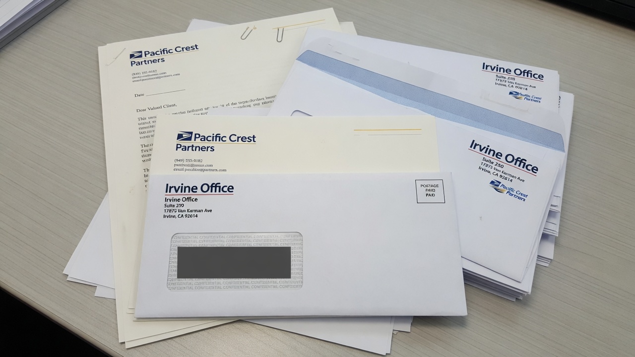
    Envelope printing in California starts with three SKUs: a #10 for a folded 8.5×11 letter, a #10 window that shows the insert address, and a 9×12 that mails as a flat. Match letterhead mill and shade. Ink and toner are different machines. USPS still measures the window, the height, and the thickness.

    Printed number 10 envelopes with matching letterhead

    I estimate these jobs at Avanti Printing, 15321 Barranca Pkwy, Irvine, CA 92618. We print stationery that leaves this plant and lands on desks in Spectrum towers, the Irvine Business Complex, University Research Park, Newport and Tustin medical corridors, and the rest of California when one origin is the point. Call (949) 788-6100 if you already have a mill name and a window die. Quotes still confirm size, material, quantity, finish, and date. Postage is a separate USPS charge. A pretty #10 on a website is not a mailpiece until a clerk can measure it and an insert can sit still in the window.

    People order “envelopes” the way they order pens. They mean a closed-face #10, a window #10, a 9×12 catalog, a #9 reply, and a letterhead sheet that has to look like it was born in the same mill. Those are five objects. They do not share a die, a postage bucket, or a laser-safe story. This page is the estimator’s version of that split. It is not a postcard size chart. It is not a saturation-route lecture. It is not a catalog press argument. If the piece is named mail, the envelope is a container the Postal Service will grade. If the piece is a counsel letter that never sees a sorter, the envelope is still a container your client will hold next to the letterhead. Either way you start with the insert, not with a catalog photo of a square flap.

    Who this is for in Irvine professional offices and statewide California

    This guide is for the person who signs a stationery estimate: an office manager in a Spectrum high-rise, a law-firm administrator at Park Place, a CPA group along Jamboree, a wealth desk in Newport, a medical-practice manager in Tustin, an architecture studio in the Irvine Business Complex, a commercial broker covering from Santa Ana to Costa Mesa, or a statewide professional brand that wants one origin on Barranca Parkway. You mail letters, invoices, engagement letters, reports, and contracts. You also hand a matching sheet across a conference table. You want those two objects to look like one firm.

    It is not a walk-in box of leftover white wove. It is not a souvenir announcement envelope. It is not a Laguna Woods ZIP product page. The plant is in Irvine, 92618. The mail is California mail that happens to start here. If the only instruction you have is “standard envelopes, match the letterhead,” you do not have a spec. You have a hope.

    You should read this if any of the following is true. The window shows half a ZIP after the letter shifts. The #10 is a cooler white than the letterhead. Someone flooded a dark panel on a converted envelope and the return address disappeared into the ink. You ran window envelopes through a laser and the film wrinkled. You stuffed a 9×12 like a briefcase and then argued with a flat rate. You ordered 2,500 closed-face #10s and 250 letterhead sheets, then wondered why the sheets died first. You need a #9 that actually fits inside the #10. You print letters in-house on preprinted letterhead and the envelope has to survive that same device.

    If the story is a mailed card with no wrapper, you do not need this suite. Start with postcard printing and mail prep from Irvine and keep the postage in the card bucket. If the contents are a multi-panel leave-behind that sometimes rides in a 9×12 and sometimes sits on a table, we print brochures that insert as documents, not as a second identity system. If the pile is a counter handout that never sees a flap, versioned flyers for locations that never see a tray are a different object. Do not mix a handout flood and a laser-safe envelope on one purchase order and then blame the dock when the wrong pile is in the window.

    B2B readers in Spectrum towers should stay here too. A named letter with a suite and a permit imprint is still an envelope job. A box of #10s for the receptionist to stamp is still an envelope job. The difference is which office takes the mail and whether the address lives on the envelope or on the insert. The plant conversation in front of that choice is the same: size, stock, window, match to letterhead, ink or toner, date.

    Pick the envelope from the insert, not from a stock photo

    Start every envelope conversation with what goes inside, how it is addressed, and how it is sealed. The SKU follows. Doing it in reverse — picking a “standard #10” because every office has seen one — is how you buy a handsome face that will not take the letter, will not show the ZIP, or will not rate as a letter.

    Use this as the planning surface before anyone opens an envelope template.

    SKU Finished size (inches) USPS shape if addressed as usual What it is for What kills it
    #10 closed-face 4.125 x 9.5 Letter Counsel letters, proposals, anything that should not show the inside Addressing the envelope and the letter to different people; dark floods; square flaps that look social
    #10 window 4.125 x 9.5, plus a die-cut window Letter, if the window and insert pass Invoices, statements, engagement letters with the address on the letter Insert shift; 1/8-inch clearance gone; window in the barcode clear zone; laser-unsafe film
    #9 reply 3.875 x 8.875 Letter, and it must fit inside the #10 Courtesy or business reply that rides with the letter A #10 printed as a “reply”; missing FIM or barcode on a BRE; too thick a nest
    6×9 booklet 6 x 9 Letter if under 6.125 high, under 1/4 inch thick A thicker folded insert that still wants letter postage Creeping over 6.125 high; clasps; a book that makes a lump
    9×12 catalog 9 x 12 Flat. Height is past 6.125. Length is past 11.5 if you address the 12-inch edge. Unfolded 8.5×11, contracts, thin reports, a short stack of sheets Pretending it is a jumbo letter; clasps; overfill past 3/4 inch; uneven thickness
    10×13 catalog 10 x 13 Flat A thicker kit, a bound report, something a 9×12 will not close A 9×12 ordered “for savings” that will not close; parcel territory if it exceeds flat max

    Two footnotes belong under that table. First, “typical” is a pattern I see on Irvine professional desks, not a forecast for your practice area. A litigation letter is not a monthly statement. I will not invent an open rate. I will insist you name the insert. Second, letterhead quantity and envelope quantity are not the same integer. Sheets die in the printer. Envelopes die in the mail. Order them as a suite with two counts.

    A #10 is a letter because it is 4.125 inches high and 9.5 inches long. A 9×12 is a flat because it is taller and longer than the letter box. Originating the cartons in Irvine does not change those national measurements. Read the Postal Service summary: USPS Quick Service Guide 201, physical standards for commercial letters. If a stationery catalog disagrees with that guide, the guide wins.

    Aspect ratio still applies. Length divided by height for a #10 addressed parallel to the 9.5-inch edge is about 2.30, inside the 1.3 to 2.5 automation band. A square envelope is 1.00. Squares look “architectural” on a mood board and mail as nonmachinable letters. I would rather you print a rectangular #10 with a square mark on the letterhead.

    Get pricing for this project

    Matching stationery suite for an Irvine office

    The #10 closed-face: everyday mail for California offices

    A #10 is 4-1/8 by 9-1/2 inches. It exists because American letter paper is 8.5 by 11 and folds into thirds that sit in that pocket with a little air on every side. That air is not waste. It is how the letter goes in, how inserting equipment does not crush a corner, and how the flap still seals after a 24 lb sheet and a #9 have taken their space.

    Hold 8.5×11 as the insert. Fold it so the finished packet is about 8.5 by 3.67 inches. The #10 is taller and longer than that packet on purpose. If you design a “#10 insert” that is 9.5 by 4.125, it is not an insert. It is a competing envelope. If you specify a letterhead with a 1/2-inch bleed misunderstanding and the sheet trims to 8.6 by 11.2, it will dog-ear in the fold and peek in a window. Bleed belongs on the print file. The sheet trims to 8.5 by 11.

    Face, flap, and seam are three print surfaces

    The face is what the carrier sees. For Irvine professional offices that usually means a return address in the upper left, a small mark or wordmark, and a quiet field. Postage lives in the upper right: stamp, meter, or permit imprint. Do not put a logo where the indicia goes. Do not put a QR code in the lower-right barcode clear zone. Do not write a marketing teaser across the face of a counsel envelope and then ask why it looks like a mailer. The face can carry a thin rule. It should not carry a campaign.

    The flap is a second surface. Some firms print a web address or a privacy line on the flap. That is fine if the type clears the gum and the score. Type that sits on the remoistenable strip is how you mail a sentence to the inside of the flap. Square flaps look ceremonial. Commercial (diagonal) flaps look like business. Wallet flaps give you more glue. Pointed flaps look like a wedding. Say which flap you are buying. A PDF cropped to 9.5 by 4.125 with no flap drawn is not an envelope file.

    Seams are a converting choice. Diagonal seams and side seams behave differently under a window and under a laser. A side seam that creeps into the window opening is a converting error you will photograph. Grain and seam placement also change how a #10 feeds in a desktop unit. If your office will laser the envelopes, say so at quote, not after the first jam.

    Stock: 24 lb wove is the workhorse, not a personality

    Typical industry ranges — and they are ranges, not a promise that every mill’s 24 lb feels the same:

    • 24 lb white wove: the default commercial #10. Stiff enough to run. Thin enough to stay a letter after a folded sheet. Takes litho ink and many toner engines if the gum and window are honest.
    • 28 lb white wove: a more substantial hand. Common when the letterhead is 70 lb text or a 28 lb writing sheet and you do not want the envelope to feel like a cheaper cousin.
    • 24 lb or 28 lb writing, including 25 percent cotton and 100 percent cotton: the law-and-accounting voice. Fibers show. Watermarks may live on the letterhead and not on the envelope unless you buy that pair on purpose.
    • Laid finishes: traditional, tactile, and a laser argument. Heavy laid can be a feed and fuse problem. If the office printer is the second press, dummy the actual device.
    • Colored wove: possible. Dark fields fight OCR and fight a permit imprint. A pale gray or ivory can match a cream letterhead. A navy flood is a marketing envelope pretending to be stationery.

    Security tint is an inside print. Medical, legal, and financial offices in Orange County use it so the letter does not read through the wove in a Spectrum lobby. Tint is not a window. Tint is a pattern. Say whether you want it. A full-coverage inside flood is a different converting conversation and can add curl.

    Weight of the filled #10 still has to live at or under 3.5 ounces if you want machinable or automation letter prices. A 24 lb envelope plus one 24 lb letter is nowhere near that. A 24 lb envelope plus a 24 lb letter plus a 28 lb #9 plus a clipped check plus a folded brochure is how you find the ceiling with a scale, not with a PDF. Weigh a dummy. A PDF cannot read a scale.

    Closed-face addressing is a second pass

    If the address is not in a window, it has to go on the envelope. That is inkjet, toner, a label, or a hand. Commercial drops want an Intelligent Mail barcode and a standardized delivery address. Irvine suites, Spectrum high-rises, and UCI-adjacent units still need the secondary line. A beautiful #10 with “200 Spectrum Center Dr” and no suite is a beautiful return.

    Inkjet on a dark flood or a heavy varnish is the same collision you get on a coated mailer. Keep the address panel light. If the brand wants a color face, knock out a pale rectangle large enough for name, address, barcode, and quiet space. Labels exist for the job you already flooded. Labels look like labels.

    Window envelopes: the eighth-inch that reprints a drop

    A window is not a design flourish. It is a hole with rules. The address lives on the insert. The envelope is a frame. If the frame is wrong, or the insert moves, or the film is cloudy, the piece is not a clever #10. It is a reject, a nonmachinable letter, or a return.

    What USPS actually requires in the opening

    For letter-size and flat-size mail in window envelopes, every character in the delivery address — including any Intelligent Mail barcode, marking, or endorsement — must stay completely visible through the window through the full range of movement of the insert. A clear space of at least 1/8 inch is required between the address block (including any optional endorsement line and barcode) and the top, bottom, left, and right edges of the window. That clearance must still be there when the insert is shoved to each limit inside the envelope. The address, as seen through the film, has to sit on white paper or a very light color. Window cover, if used, has to be non-tinted clear or transparent material, glued on all edges. Glassine is allowed. The bottom edge of the address window must be at least 1/2 inch from the bottom of the envelope; 5/8 inch is preferred. On a letter, the window must be parallel with the longest edge.

    That is the Postal Service’s own language, compressed. Read it from the source, not from a template that assumed a “standard window”: USPS Publication 25, window envelope standards. If a slide deck disagrees with that page, the page wins.

    The practical meaning for an Irvine invoice run is blunt. The folded letter has play inside a #10. That play is often a quarter inch or more, depending on fold tightness and insert count. You do not design the address to “look centered in the window” on a still PDF. You design a panel large enough that after a full slide in every direction, the ZIP, the barcode, and the 1/8-inch quiet space are still in the hole. A dummy with the real fold, the real envelope, and a shove test is the proof. A JPEG of a window is not a proof.

    Common commercial #10 windows, and why “standard” is still a die

    A common commercial #10 window is about 4-1/2 inches wide by 1-1/8 inches high, set roughly 7/8 inch from the left and 1/2 inch from the bottom. Other dies exist: a slightly different left offset, a double window for a return address plus a delivery address, a statement window that is taller. “Standard window” on a purchase order is how you get a hole that does not match the letter template your accounting system has used for six years.

    Send the window die you actually have in the field, or send the insert template with the address block drawn at final size, measured from the left and bottom of the folded panel. We will match the hole to the panel, or we will tell you the panel has to move. We will not guess from the word standard.

    Double windows are a statement product. The upper window shows a return address printed on the insert. The lower window shows the delivery address. Both windows still need the 1/8-inch rule. Both still need light paper behind them. If the letterhead has a color bar that runs through the upper window, you did not design a double-window program. You designed a brand collision.

    The insert is the mailpiece as much as the envelope is

    Window jobs fail on the letter more often than on the converting. Typical failures I see on professional files:

    • Address block too close to the fold. After the fold relaxes, a line tucks under the paper and the city disappears.
    • Address block too high. The window looks at letterhead art, a logo, or a confidentiality banner.
    • Gray type, 8-point script, or reverse type on a navy band. Contrast dies. The sorter is not your brand guide.
    • Barcode drawn as decoration, or omitted because “the window is tight.” Tight windows do not get automation prices.
    • A second language interleaved between street and city. Keep one standardized delivery address the equipment can parse. Put the other language in the letter body.
    • A confidentiality footer that sits in the window when the insert drops. Move the footer. Do not shrink the address.

    Fold panel matters. A letter folded so the address sits on the bottom third is the usual #10 window story. Fold it the other way and the window looks at a blank or at a signature block. Office staff who fold by hand will not match a machine fold unless you give them a sample. If 400 invoices will be folded at a Spectrum desk, give the desk a dummy and a fold mark. If we insert here, the fold is our problem and still has to match the die.

    Thickness through the window still has to stay honest. A window #10 with a letter, a #9, and a folded extra can stay a letter if the stack is under 1/4 inch and even. A window #10 with a binder clip, a key, or a USB is not a letter. It is a lump. Lumps are how you buy a surcharge or a refusal.

    Film, laser, and heat

    Window film has to be clear enough for print contrast. It also has to survive the path you actually use. A toner desktop unit fuses with heat. Some films wrinkle, haze, or let go. Latex self-seal adhesive can fire in that heat and glue itself to the fuser. Remoistenable gum can pick up moisture in a coastal closet and then stick in a stack. Peel-and-seal tape is often the grown-up path for office lasers. “Laser-safe” is a converting spec, not a slogan on a carton. Dummy the actual printer in the actual office, or dummy the production inkjet we will use here. Do not assume the film that survived a litho jet press will survive a receptionist’s laser on the 15th floor.

    Orange County heat makes a marginal film worse in a parked car and in a July mailroom. Heat is the amplifier. The root cause is still the wrong film or the wrong gum for the device.

    9×12 catalog envelopes are flats, and that is not an insult

    A 9×12 exists because some 8.5×11 documents should not be folded: contracts, signature packets, thin reports, a short stack of sheets that have to arrive flat. The envelope is about 9 by 12 so a letter sheet sits inside with a margin, the same logic as a 9×12 folder, except this object has a flap and a postage class.

    USPS letter maximums are 11-1/2 inches long, 6-1/8 inches high, and 1/4 inch thick. A 9-inch-high envelope is already past 6-1/8. If you address parallel to the 12-inch edge, length is 12 inches, which is also past 11-1/2. You are in flats. Flats have their own physical standards: more than letter size in at least one dimension, and no more than 12 inches high, 15 inches long, and 3/4 inch thick for the common commercial flat box. A 9×12 sits inside that box if you do not overfill it and if you keep it rectangular and uniformly thick.

    Postage for a flat is not letter postage. I will not invent a per-piece number here because the Postal Service moves prices. As a planning picture, retail First-Class large envelopes cost materially more than a 1-ounce letter stamp. Confirm the live figures on the Postal Service site before you lock a client deck. Originating the cartons at 15321 Barranca Pkwy does not turn a 9×12 into a #10.

    Catalog opening versus booklet opening

    Catalog style opens on the short side. You slide 8.5×11 in along the long dimension, like a file. Booklet style opens on the long side, like a book. Catalog is the default I see for contracts and correspondence that must stay flat. Booklet can feed some inserting equipment more happily. Say which construction you are buying. A PDF labeled “9×12” with no flap edge marked is not a converting file.

    10×13 is the next catalog size when the fill is thicker or the 9×12 will not close without a fight. Do not force a bound report into a 9×12 and then photograph the bulge. Measure the dummy. If the stack is heading toward 3/4 inch, you are at the flat ceiling. Past that you are in parcels, and parcels are a different conversation.

    What belongs in a 9×12, and what belongs in a #10

    Fold the letter if the letter can fold without losing the job of the piece. An engagement letter, an invoice, a one-page opinion — those are #10 work. A recorded document, a signature packet with tabs, a set of 8.5×11 sheets that will be punched, a thin report you do not want creased — those are 9×12 work. A packed presentation folder is often a 10×13 or a hand-delivery. Mailing a stuffed, irregular kit as if it were a letter is how the budget finds out at the dock.

    If the 9×12 is carrying a brochure plus a letter plus a sheet, name each insert. We print those brochures as document inserts that have to meet the same in-home as the envelope, and we still need the envelope on the same ticket because inserting waits for the slower object. If one of the sheets is really a flyer that will also sit on a counter, split the finish: the mailed pile has to stay insert-safe; the counter pile can flood. See flyers when the sheet never goes in a flap.

    Clasps, string-and-button, and metal fasteners are how a 9×12 leaves automation. They are old catalog habits. Peel-and-seal or gum is the adult closure for a flat you still want processed as a flat. Uniform thickness matters. A USB in the corner is a bump. Bumps are how flats lose the prices you claimed.

    Matching letterhead: mill, shade, and the sheet the laser will see

    Matching is the whole point of a stationery suite and the place most reprints hide. The envelope and the letterhead are rarely the same converting path. Letterhead is a flat 8.5×11 sheet. Envelopes are folded, glued, windowed, gummed objects. They can share a mill family, a shade, a fiber, and an ink formula. They will not share a press sheet unless you are doing something unusual. Plan the match. Do not hope the word “white” will do it.

    Build the suite as a kit with two clocks

    Letterhead dies in the office printer. Envelopes die in the mail and in the drawer. A typical industry pattern — a pattern, not your quote — is more envelopes than letterhead if you mail more than you print, or more letterhead than envelopes if the office lasers ten drafts for every letter that actually leaves. Count use. Do not print 1,000 of everything so the spreadsheet looks neat.

    A grown-up Irvine professional suite is usually some mix of:

    • Letterhead, 8.5×11, often 24 lb writing or 70 lb text, sometimes cotton.
    • Second sheets: same stock, no logo, or a quiet footer only. People forget second sheets and then laser a blank from the copy room that is a different white.
    • #10 closed-face, matching shade and ink.
    • #10 window, same converting family, window die matched to the letter template.
    • #9 reply if you ask for money or a signature back. It has to fit. Measure.
    • 9×12 catalog if you send unfolded documents.
    • A business card is a different product on a different board. Do not specify the envelope from the card coating.

    Put the slow facts on the envelope and the letterhead: firm name, address, phone, a stable URL, the mark. Put the fast facts on the letter body you laser: matter number, invoice line, offer, person. When a partner leaves, you change the card and the signature block, not 2,000 envelopes. When you move suites inside a Spectrum tower, you reprint the return address. That is a stationery event. Budget it as one.

    Shade, fiber, and watermark

    Bright white, natural white, and cream are three colors even when everyone says “white.” A 96-bright wove envelope next to a warmer cotton letterhead is a visible seam on a conference table. Pick a mill family or accept the seam. Send a sample of the current letterhead if this is a match, not a hex from the website.

    Cotton is a fiber content, not a vibe. 25 percent cotton is the common professional sheet. 100 percent cotton is a heavier statement and a heavier price. Cotton letterhead next to a wood-pulp #10 looks like two vendors met in the lobby. If the letterhead is cotton, the envelope should be the matching envelope from that mill, or you should decide in writing that the envelope is wove and the sheet is cotton. Silent mismatch is how managing partners notice.

    Watermarks live in the sheet. They often do not live in the envelope. If the watermark is part of the identity, say so. We will tell you whether the matching envelope carries it. A fake watermark printed in varnish is not a watermark. It is a decoration, and it can fight a laser.

    Laid versus wove is a tactile choice with a device consequence. Laid shows a linear texture. Some office lasers mark it; some jam; some look fine. Wove is the safer production path for a firm that lasers every letter. If you want laid, dummy the actual printer with the actual envelope, including the window version.

    Preprinted letterhead versus imaging the whole letter

    Two honest paths:

    1. Preprint the identity on letterhead and envelopes. The office (or our lettershop) lasers or inkjets the body and the delivery address. This is still the default for Irvine professional offices that want a tactile sheet and a stable mark.
    2. Image the whole letter — mark, body, address — in one digital pass, then insert into a stock or printed envelope. Useful when versions churn, when names are variable, when you do not want leftover letterhead with last year’s suite number.

    Those paths have different match problems. Path one needs the preprint ink to sit in the same color family as any digital body, and it needs the envelope to match the preprint. Path two needs the envelope to match a digital sheet that may be a different mill than last year’s carton. Neither path is “more professional.” The professional move is to pick one and proof them together on a table, in daylight, next to the card if the card will sit in the same folder.

    Laser on preprinted letterhead still has rules. Keep the top of the sheet honest if the device needs a grip. Keep heavy coverage away from the fuser’s worst habits. Do not preprint a full-bleed dark edge and then ask a desktop unit to feed 500 sheets without marking. If the office printer is a cheap inkjet, uncoated writing stock is your friend and a heavy cotton may be a fight. Ask what device will actually print the body. “We have a printer” is not a spec.

    Grain on letterhead should feed the device and fold across the letter without a white crack through a navy rule. Against-grain folds on a heavy cotton with a hard ink line hairline. That hairline will sit in a #10 looking like a defect. Score is rarely used on 24 lb. Grain and ink coverage are the levers.

    Ink versus toner on converted envelopes

    This is not a catalog-press lecture. It is the envelope version of a simple question: what machine puts color on a folded, glued, sometimes windowed object, and what machine puts color on the letterhead that has to sit next to it?

    Use this as the decision frame before anyone talks about a unit price.

    Path What it actually is When it is honest Match to letterhead How it dies
    Litho ink on converted envelopes Offset on an already-made envelope, often a jet-style envelope press Hundreds to many thousands of a static face, 1 to 4 colors, type and a mark Can match a litho letterhead in the same ink; still proof the pair Heavy floods, tight bleeds, small type on a seam, wet ink on gum
    Litho on flats, then convert Print the envelope as a flat sheet, then die-cut, fold, glue, window Heavy coverage, edge-to-edge color, a face that a converted press cannot hold Best chance at a full-bleed match to a flood letterhead Lead time; a converting error after you already like the print
    Toner digital on envelopes A toner or liquid-toner engine printing the made envelope or a flat blank Short runs, versions, variable return addresses, tests, a match to digital letterhead Strong when letterhead is the same engine and the same mill family Fuser heat versus gum and window film; latex firing; coverage limits on some engines
    Flexo A simple in-line converting print, often 1 or 2 spot colors High volume, simple faces, little art Spot color can be close; process photos are the wrong ask Tiny type, photographs, a “just like the letterhead photo” request
    Thermography Raised ink, the old professional look A tactile mark on a closed-face #10 or letterhead Matches only if both objects are thermographed, which most offices no longer want on the sheet they laser Raised surfaces in a laser; a shiny bump that looks dated next to a digital letter

    Two footnotes. First, those quantity notes are typical industry planning ranges, not a break-even coupon. A 250-run of a window #10 with a PMS match can still be litho if the letterhead is litho and the match is the point. A 5,000-run can still be toner if you have six suite versions. Second, “digital” on an envelope is not the same machine as “digital” on a 14 pt card. Do not import a card coating conversation onto a 24 lb wove flap.

    What ink wants

    Litho ink on a converted #10 is still how a lot of static professional stationery is built. It likes type, a spot color, a small mark, and a return address. It does not like a full-bleed photograph wrapped around a seam. Coverage near the gum and the window patch is a dirty-hands problem. Ink needs dry time before you box 2,000 in an Irvine July. Stacking wet envelopes is how you offset a logo onto the back of the next face.

    Spot color is the match tool. If the identity is PMS and the letterhead is litho PMS, print the envelopes in the same ink in the same window of days when you can. CMYK builds of a spot color on a digital letterhead next to a true PMS envelope will show. Sometimes that is acceptable. Sometimes a managing partner will hold them in daylight on Barranca Parkway and send them back. Proof the pair. Do not argue from a coated-book formula on an uncoated wove.

    Process color on envelopes is real. It is also how you discover converting limits. A photo that looks fine on a flat proof can sit on a window patch or a seam. Draw the die. Keep live matter off the window, off the gum, off the side seams, and off the score of the flap.

    What toner wants

    Toner is honest when the run is short, the versions are many, or the letterhead is already a toner sheet. A firm that just moved from suite 200 to suite 340 in a Spectrum tower does not always need 5,000 litho #10s. A digital 500 with a correct return address is the adult reprint. A medical group with three letterheads for three tax IDs is a version problem, not a romance-with-offset problem.

    Toner still has to live with converting chemistry. Heat plus remoistenable gum plus window film plus latex is a test, not a default. Ask for laser-compatible construction if the office will run the envelopes, or if our production toner will. If the dummy wrinkles the window, we change film or we change path. We do not ship 1,000 and hope the 15th-floor device is gentler than ours.

    Variable data on envelopes is a toner (or inkjet) job: names on closed-face #10s, office versions, a permit imprint that changes, a return address that maps to a location. Lock the file. A spreadsheet you “just cleaned” after we printed 800 faces is a reprint. If the address belongs on the letter, use a window and spare the envelope the variable pass.

    I will not pretend ink is always cheaper at quantity or that toner is always faster. House 24 lb, a one-color mark, and a clean file can be fast on either path. A cotton mill sheet we do not stock is slow on both. The quote still has to confirm size, material, quantity, finish, and date. Path is one of those facts, not a brand loyalty.

    Request a letterhead and envelope suite quote

    Files, bleeds, gum, and a dummy with the real insert

    Send a print-ready PDF built on the actual envelope dieline, not on a 9.5 by 4.125 rectangle that ignores the flap. Fonts outlined or embedded. Images at production resolution. Live matter off trim, off the window, off the gum, off side seams, and off the flap score. Return address in the upper left. Postage area clear in the upper right. If there is a window, draw it as a named die line, and place a dummy address at final size on a separate insert PDF.

    Color: CMYK or a named spot. Do not build the mark in RGB. Do not put a 5 percent yellow cast in the address panel of a window insert to “match the brand warmth.” That cast is how contrast dies through film. If the envelope must match existing letterhead, send a printed sample, not a screenshot.

    Bleed on converted envelopes is limited. A converted #10 is not a full-bleed poster. If you need color to the edge, you are often on a print-then-convert path, and you still need to talk about the flap, the seams, and the interior. A nervous “add a little extra” that grows a #10 to 4.25 by 9.6 is how a letter starts looking like a custom that no inserting machine loves. We would rather you have a hard die and an honest live area.

    Letterhead files are 8.5×11 trim, 0.125 inch bleed if you actually have bleed, live matter off trim, and a clear zone where the office device will print the body. Mark the fold panel if the sheet will show through a window. Put the address block on that panel at final size, with 1/8-inch pad beyond the worst-case shift. If variable fields exist, mark them. If they do not exist yet, still show the empty panel.

    Proofs for a stationery suite are a set:

    1. Contract-quality proof of the letterhead and of each envelope SKU, including flap and back if they print.
    2. A physical dummy of each envelope on the actual stock, with the actual window film and gum.
    3. The real insert, folded the real way, shoved to each limit in the window.
    4. A side-by-side of letterhead, #10, window #10, and 9×12 in daylight, not under a Spectrum LED that hides a shade miss.
    5. A pass through the actual laser or inkjet that will print the body or the closed-face address, when the office or the lettershop will do that pass.

    Each revision that moves a window, a return address, or a stock is a day. “One more small change” after you already approved the dummy is how you buy a second dummy. I would rather you take Tuesday to confirm the suite number than take Thursday to reprint 2,000 faces with last year’s floor.

    If the same program also needs a leave-behind that is not mailed, say so. Handouts can flood. Window inserts cannot always. Mixing those two specs on one purchase order is how the wrong pile gets folded into the hole.

    Orange County offices, heat, suites, and the laser on the 15th floor

    Local color is only useful when it changes a spec. These do. Mail we produce for this site originates at Avanti Printing, 15321 Barranca Pkwy, Irvine, CA 92618. Phone (949) 788-6100.

    • Suites and receiving rooms. Spectrum, the Irvine Business Complex, University Research Park, South Coast Metro, Park Place. Secondary lines on the insert are the job. A window that shows a beautiful unique URL and hides “Ste 400” is a beautiful return. Named pieces without suites are not late. They are lost in a mailroom.
    • Cluster boxes and Informed Delivery. Design the #10 face for a hallway and a phone JPEG. That does not change litho. It does change how busy you can make the face before it looks like junk in a thumbnail.
    • Office lasers. Most Irvine professional letters are still finished on a device in the suite. Laser-safe gum, film, and stock are field specs. A beautiful latex flap that fires in a fuser is a service call you did not want.
    • Heat. Summer envelopes in a car on Barranca Parkway, or in a mailroom that faces west, will curl, block, and pre-seal latex. Store cartons sealed, off concrete, away from a sun-facing window. Peel-and-seal often survives that better than latex. Dummy it.
    • Coastal versus inland humidity. Newport and a Tustin industrial park do not store wove the same way. Gum picks up moisture. Cotton moves. Rotate stock. Do not be surprised when one office’s drawer looks tired first.
    • Bilingual California. Useful on many files. Still keep one standardized delivery address in the window. Do not interleave lines the OCR will read as a broken city-state-ZIP.
    • Medical and legal corridors. Tustin, Irvine, Newport. Security tint, window statements, HIPAA-ish habits on the face. Put claims and account detail on the insert, not on the envelope teaser. A #10 that advertises a balance due in 14-point type is a privacy conversation, not a branding win.
    • UCI-adjacent and student-heavy ZIPs. Occupants move. If the envelope is a window statement, the list still needs a current Move Update story. Print cannot invent a deliverable suite.
    • Anaheim Convention Center weeks. If the 9×12 is a handout kit for a show, that is freight, not a letter mailing. Do not mix show freight into the permit trays.
    • HOA and municipal rules. Those affect signs and door hangers. They do not veto a USPS box. Do not confuse those projects on the same stationery PO.

    Permit geography matters when the #10 is a commercial mailing. The imprint has to match a permit that can live at the entry office. Using our permit, your permit, or a broker permit are three paperwork paths. Pick one when you quote, not at the dock. A pretty envelope with the wrong indicia is how Friday dies. If you are only stocking the drawer and stamping at a retail counter, say that. Retail stamps do not need a permit imprint. They still need a legal size.

    The same plant handles commercial printing work across California that never sees a #10. Tell us which pile is which. A board-level capabilities piece and a window invoice envelope can share a mark and still have two stocks, two postage buckets, and two freeze dates.

    Mistakes that reprint stationery or re-rate the mail

    These are repeats. They come from good agencies as often as from a file built in a word processor.

    1. Ordering “#10 envelopes” with no window yes/no, no flap style, and no mill match to the letterhead.
    2. Building the letterhead address block from a screen template that does not match the actual window die.
    3. Skipping the shove test. The PDF looked centered. The ZIP left the hole in the tray.
    4. Putting the delivery address on a navy band, in gray, or in script, then asking for automation prices.
    5. A window that sits too low, into the barcode clear zone, or too close to the bottom edge.
    6. Latex self-seal on an envelope the office will laser. The fuser found the adhesive first.
    7. Flood coverage on a converted envelope, type on the gum, a logo on a side seam.
    8. Bright-white wove envelopes next to cream cotton letterhead, both called “white” on the PO.
    9. 2,500 envelopes and 250 letterhead sheets, no plan to reprint the sheet. The identity died in the printer.
    10. A 9×12 specified as a “large letter.” It is a flat. The deck used the wrong postage.
    11. Clasps on a 9×12, a USB in the corner, a stack past 3/4 inch. Automation left the building.
    12. A #10 reply envelope that does not fit inside the outer #10 because someone art-directed it to 4.125 x 9.5.
    13. Square envelopes for a “modern” architecture firm. Aspect ratio 1.00. Nonmachinable.
    14. Drawing a barcode in Illustrator on the insert. It is not an IMb. It is clip art.
    15. Changing the suite number after 2,000 faces were litho’d, then asking toner to “just hit the return address” on a dark flood.
    16. Mixing a counter flyer flood with a window insert on one file so the insert could not be read through film.
    17. Assuming last year’s list is legal for this year’s window statements. Move Update is still a mail spec.
    18. Full-bleed letterhead that the office inkjet cannot feed, so staff switch to copy paper and the match dies in public.
    19. Ordering the 9×12 last, after the contracts were already printed on a stock that peeks or binds in the flap.
    20. Locking a drop date before anyone dummy’d the window. Paper, gum, film, and inserting each take calendar time.

    Reprints are worse than a dummy on the first pass. Once 2,000 window faces exist with a hole that does not match the invoice template, you do not have inventory. You have a shredding appointment. Send the die. Send the insert. Send the mill. That is slower than clicking a quantity in a portal. It is faster than printing the wrong object twice.

    What to send for a quote

    Write one email or use the form with the facts a plant estimates from. “Match our letterhead” is not a spec unless a sample is in the envelope. Adjectives do not change window dies.

    • Each SKU: #10 closed-face, #10 window (die measurements), #9, 9×12, 10×13, letterhead, second sheet. Quantities per SKU, not a blended total.
    • Finished sizes. Height and length labeled. Flap style. Catalog versus booklet opening on the 9×12.
    • Window: width, height, left offset, bottom offset, single or double, film yes or no. Insert PDF with the address block at final size.
    • Stock: 24 lb wove, 28 lb, cotton percent, laid or wove, security tint, or “match this sample.”
    • Ink: PMS, CMYK, 1-color, 4-color, where it prints (face, flap, back, tint).
    • Path if you care: litho on converted, print-then-convert, toner, or “recommend from quantity and match.”
    • Who prints the letter body and who addresses closed-face pieces: your office laser, our lettershop, or imaging with the job.
    • Laser-safe requirement yes or no, and the device if you know it.
    • Whether we insert, and what goes in each envelope, in what order, including a #9.
    • Mail class if we enter the mail: retail stamp, meter, commercial First-Class, USPS Marketing Mail. Permit ours or yours.
    • In-hands or drop date, and whether that date is a wish or a contract.
    • Files: dielines and letterhead PDF, or a note that design is open. A physical sample of current stationery if this is a match.

    We confirm size, material, quantity, finish, and date on every quote. If postage is included, it is shown as postage, not hidden in a blended “per envelope” that pretends USPS does not change prices. If postage is yours, the window and the size still have to be legal for the class you claim. Avanti Printing, 15321 Barranca Pkwy, Irvine, CA 92618. (949) 788-6100. The quote link on this page is the same form we use for the rest of the commercial work that starts on Barranca Parkway.

    FAQ: envelope printing California stationery and mail

    Is a #10 always cheaper to mail than a 9×12?

    Usually, yes, because a #10 is a letter and a 9×12 is a flat, and letter prices sit below large-envelope prices on the public charts. That is a USPS shape fact, not a print-shop coupon. A stuffed #10 that goes over 1/4 inch or 3.5 ounces can leave the cheap letter box. A thin 9×12 is still a flat because of height. Weigh and measure a dummy. Confirm live postage on the Postal Service site. Originating the job in Irvine does not change the national shape classes.

    Can I use one window die for invoices and for counsel letters?

    Only if both inserts put the delivery address in the same panel with the same 1/8-inch shove-test clearance. Counsel letters often want a closed face. Invoices often want a window. Those are two SKUs. Forcing a counsel letter through a statement window is how a confidentiality banner becomes the address. If you truly share a template, send both inserts against one dummy. If they do not share a template, buy two envelopes. The second SKU is cheaper than a reprint.

    Will toner envelopes match litho letterhead?

    Sometimes well enough, sometimes not, and the only honest answer is a side-by-side dummy on the real stocks. Spot litho on both objects is the easy match. Toner next to PMS is a delta you have to see. Uncoated wove shows that delta more than a coated brochure would. If match is the reason you are reprinting a suite, print both objects in the same ink family in the same week, or accept a documented difference. I will not promise a mill-perfect match from a blog post.

    Are window envelopes safe to run through our office laser?

    Only if the converting is laser-compatible: film that takes fuser heat, gum that does not offset, no latex that fires. Many window envelopes are not that product. Dummy ten pieces on the actual device before you buy 1,000. If we are imaging here, we dummy our engine. Your 15th-floor unit is still a different heat. Peel-and-seal plus a known film is the usual path when the office must print the face or when leftover envelopes will be fed in a suite.

    What paper should match 24 lb letterhead?

    A 24 lb writing or wove envelope from the same mill family is the boring, correct pair. If the letterhead is 70 lb text, a 28 lb envelope is often the closer hand. Cotton letterhead wants the matching cotton envelope, or a written decision that the envelope is wove. Shade matters as much as basis weight. Send a sample. “24 lb white” from two mills is two whites.

    Does a security tint replace a window film?

    No. Tint hides contents through the paper. Film covers the hole. You can have both. Tint without a window is a closed-face privacy choice. A window without a light address panel is a read-through of a different kind: the sorter has to see the address, and a person in a lobby should not see the rest. Design those two jobs separately.

    Can I mail a presentation folder in a 9×12 as a letter?

    No. A 9×12 is already a flat by height. A stuffed folder is often an uneven flat, and sometimes a parcel. Uniform paper contents, a catalog envelope that actually closes, and a dummy under 3/4 inch are the grown-up path if it must mail. Hand delivery is still how a lot of Irvine kits should travel. Do not put a clasp on it and call it vintage.

    How do I get a quote from Avanti for envelopes and letterhead?

    Send SKUs, sizes, window measurements, stocks, inks, quantities per SKU, who prints the body, laser-safe yes or no, insert recipe if we insert, mail class if we enter, and date. Use the quote form or call (949) 788-6100. We will confirm size, material, quantity, finish, and date in writing. A 250-piece digital window #10 with a cotton letterhead match is not the same estimate as 10,000 litho closed-face #10s on house 24 lb wove.

    Print the envelope that still matches the sheet next quarter

    Envelope printing in California professional offices is a suite problem. A #10 is a letter. A window #10 is a letter only if the insert still shows a legal address after it moves. A 9×12 is a flat. Letterhead has to match in mill, shade, and ink family, not in the word white. Ink and toner are different machines with different habits around gum and film. USPS still measures height, length, thickness, and the eighth-inch in the window. A dummy with the real insert is cheaper than a reprint.

    Khalid, Avanti Printing, Irvine. Bring a current letterhead sheet. Bring a window die if you have one. Bring the device that will print the body. We will tell you whether the job is a house 24 lb #10, a cotton match, a window program, or a 9×12 that you should stop calling a large letter. Then we will print the version that actually leaves Barranca Parkway looking like one firm.

    Send #10, window, and 9×12 specs for a quote

  • Print and Mail Timeline California: Work Back From In-Home

    Print and Mail Timeline California: Work Back From In-Home

    Work a print and mail timeline California campaign backward from the in-home date. Subtract USPS processing after induction, then inkjet and trays, then print and coating dry time, then proof rounds. The press slot is not day one. Lock size, material, quantity, finish, and date in writing.

    Print and mail production schedule on an Irvine shop desk

    I estimate these jobs at Avanti Printing, 15321 Barranca Pkwy, Irvine, CA 92618. Mail we produce for this site originates here and travels Orange County, Los Angeles, San Diego, and the rest of California. If you already have an in-home window, call (949) 788-6100. Quotes still confirm size, material, quantity, finish, and date. Postage is a separate USPS charge. The calendar sits on top of those five facts. It does not replace them.

    People say “we need it in homes on the 12th” and mean four different mornings. The morning the carrier puts a piece in a box. The morning a clerk accepts the trays. The morning inkjet finishes. The morning someone approved a JPEG. Those are not the same date. This page is the estimator’s version of that split. It is not a ZIP catalog of postcard SKUs. It is not a saturation-route lecture. It is not a fold-style comparison. If the piece is named mail, the Business Mail Entry Unit still has hours. If the piece is simplified-address saturation, the delivering office still has a clock. Either way you start at the door and walk back to Barranca Parkway.

    Who this is for in Irvine, Orange County, and statewide California

    This guide is for the person who signs a print-and-mail estimate and also owns a calendar: a marketing manager in Irvine Spectrum, a medical group mailing recalls from Tustin, a multi-location restaurant along the 405, a dealer in Anaheim, a broker with listings from Newport Beach to Santa Ana, a campus office near UCI, a B2B firm in the Irvine Business Complex, or a statewide brand that wants one origin in Orange County. You have a sale, an enrollment, a grand opening, an earnings blackout, or a board meeting. You want the piece in the box before that event, not in a gaylord on our dock the morning of.

    It is not a walk-in counter stack. It is not a lecture on folding panels. It is not a Laguna Woods or Laguna Hills ZIP product page. The plant is in Irvine, 92618. The mail is California mail that happens to start here. If the only instruction you have is “ASAP,” you do not have a timeline. You have a hope.

    You should read this if any of the following is true. An agency locked a Tuesday in-home before the list was CASS’d. Someone treated the press slot as day one. You planned a Friday drop for a Monday sale. You flooded UV and then asked for inkjet the same afternoon. The NCOA date will age out if the job slips a week. You need Orange County in-home first and Northern California later from one ticket. You keep calling the drop date the in-home date in the client deck. The legal team still has a round after “final” art.

    If the piece is a card that will be addressed, start from postcard printing and mail prep from Irvine and bring the in-home window with you. If the story needs panels and the address lives on an envelope, we print brochures that mail as inserts from the same plant. If the stack is a counter handout that never sees a sorter, versioned flyers for locations that never see a tray are a different clock: no USPS, still a proof, still dry time. Do not mix those two clocks on one purchase order and then blame the dock when the mailed pile is waiting on the handout pile.

    B2B readers in Spectrum towers should stay here too. A named letter with a suite and a drop tied to a conference is still a timeline job. Saturating a building with LOCAL POSTAL CUSTOMER is still a timeline job. The difference is which office takes the mail and how many days you subtract after that office stamps it. The plant calendar in front of that stamp is the same problem: files, proof, print, inkjet, trays.

    Work the calendar backward, not forward from “when can you print”

    Forward planning is how campaigns miss. You get a press slot, you add “a few days for the post office,” and you call the result an in-home date. Backward planning starts with the door. You name the first day you need a piece in a box, and the last day you will still honor the offer. Then you subtract USPS, then plant mail prep, then inkjet, then print and dry, then proof, then list hygiene. What is left is the latest morning you can still send a print-ready file. If that morning is already yesterday, you change class, change quantity, change the window, or you stop pretending.

    Use this as the decision frame before anyone books a press. The day counts are typical industry planning ranges, not a promise and not a Postal Service guarantee. Marketing Mail in particular may receive deferred handling. Confirm live service standards before you lock a deck.

    Clock, working backward What it actually is Who owns it Typical planning range (say so: range, not SLA) How it dies
    In-home window First and last day you will accept delivery into the box You. Not the plant. Not USPS. A window, not a Tuesday. Two to four calendar days is a grown-up window for Marketing Mail. One calendar date treated as a carrier appointment
    USPS processing after induction Days from acceptance to delivery under the class and entry you bought USPS. You choose class and entry. You do not run the network. First-Class end-to-end in the contiguous 48 is commonly planned at 1–5 days. Marketing Mail end-to-end is a 4–7 day service-standard band. Destination entry is shorter. Deferred handling still exists. Calling a service standard a guarantee; dropping Friday for Monday
    Induction / drop The day a BMEU or delivering office accepts the mailing Plant plus USPS clerk. Hours, Critical Entry Time, paperwork. One business day you actually make, not the day on the slide Closed BMEU, missed CET, failed verification, wrong office
    Mail prep Trays, sacks, pallets, facing slips, postage statement, sampling Plant / lettershop Hours to one business day after inkjet, longer if pallets and destination entry Wrong scheme, missing paperwork, mixed versions in one tray
    Inkjet / addressing Names, IMb, indicia as required, sequence that matches the file Plant / lettershop Same day to three days after print is dry and the list is locked, quantity and coating decide Flood UV under the heads; unlocked file; wet sheets
    Print, coating, dry, bindery Ink on paper, finish, tabs or folds, a dummy that matches the mailpiece Plant One to three days on a straightforward digital card after approval; several more if you need plates, UV dry, or a mill sheet Approval at 4 p.m. treated as ink at 4:15 p.m.
    Proofs Static art, data records, coating knock-out, physical dummy You and the plant, in that order One business day for a clean first round; each revision is another day you chose “PDF looks fine” with no dummy and no longest-name record
    Files and list hygiene Print-ready PDF, CASS, Move Update, suppressions, locked quantity You, then the plant One to three days if the file is honest; a week if it is not NCOA from last season; RGB; “address TBD”

    Two footnotes belong under that table. First, those plant days are sequential, not parallel, unless we have already staged paper and the list is already clean. Proofing while the press waits is not the same as printing while you still argue about the headline. Second, USPS days start after acceptance, not after we load a truck at Barranca Parkway. If the clerk does not accept the mailing, you do not have a drop date. You have a conversation in a lobby.

    Typical industry pattern — and it is a pattern, not a promise — is that a simple named card to Orange County, files locked, one proof round, digital print, inkjet, origin entry as Marketing Mail, wants about two weeks on the wall from locked files to the start of in-home if you want a buffer. First-Class can compress the USPS slice. It does not compress dry time, and it does not compress a legal review. I will not invent a day count for your 80,000-piece statewide pallet program from a blog post. I will insist you name the in-home window before we name a press slot.

    Get pricing for this project

    Mail pieces moving through a digital press

    In-home, drop, induction, and Critical Entry Time are four different clocks

    Language is how timelines explode. Agencies say drop. Clients say in-home. Plants say induction. Clerks say accepted. If those four words share one cell in a spreadsheet, the campaign is already late and nobody knows it yet.

    In-home is a window, not a carrier appointment

    In-home is the days you will accept the piece sitting in a box, a cluster unit, or a Spectrum receiving room. It is not a 10 a.m. appointment with a specific carrier. Marketing Mail does not arrive as a single thump on a single morning across a ZIP. It arrives as a curve. Some pieces on day three, more on day four, a tail after that. First-Class is tighter. It is still a spread, not a conference call.

    Write the window as first day and last day. “In-home Tuesday” is a wish. “In-home Tuesday through Thursday, offer expires Saturday” is a spec. If the offer dies at midnight on the first in-home day, you bought the wrong class or the wrong window. Seeds at real California addresses — including one in the destination SCF and one at the plant — are how you see the curve. A seed that is a P.O. Box nobody checks is theater.

    Informed Delivery can show a scan before the physical piece lands. That is useful. It is not delivery. Do not start the response clock from a thumbnail in an email and then complain that the card is “late” when the carrier is still walking the loop.

    Drop date is not induction unless a clerk said yes

    Drop date, used loosely, is the day trays leave the plant. Induction is the day USPS accepts them as a mailing. Those can be the same afternoon. They are not automatically. A truck that sits until morning because the BMEU is closed, the dock is backed up, or the paperwork is wrong, is not a drop. It is inventory on wheels. The postage statement date is the date that matters for Move Update math and for the service-standard clock. Plan to the acceptance date.

    Critical Entry Time is a cutoff, not a vibe

    Facilities publish Critical Entry Times. Mail accepted after that cutoff is not that day’s mail for processing purposes. I will not invent Santa Ana’s current CET in a blog post, because the number you need is the one on the phone the week you enter. Call. If you miss CET on Thursday, you did not get Thursday. You got Friday’s network, and on a Friday that can mean Monday’s network. That single miss is how a “three-day” plan becomes a five-day plan without anyone changing class.

    BMEU hours are business hours. Santa Ana’s Business Mail Entry Unit has historically sat at the processing plant on West Sunflower Avenue and run roughly weekday business hours, not Saturday retail. Confirm hours the week of the drop. Do not assume the Barranca Parkway plant is a substitute counter. We can print in Irvine and still have to make a clerk’s cutoff in Santa Ana, or a destination dock in Los Angeles, Industry, San Diego, or San Bernardino, depending on how you bought entry.

    Commercial permit mail is not a carrier pickup and it is not a blue collection box. The Postal Service’s own primer is blunt: take business mail to a Business Mail Entry Unit, at the office where the permit lives, unless you have a documented destination-entry plan after verification. Read USPS Business Mail 101, Where to Go. If a slide deck disagrees with that page, the page wins.

    Class decides how much calendar you buy after the stamp

    First-Class Mail, including commercial cards and letters, is the faster market-dominant product. End-to-end service-standard bands for the contiguous 48 currently sit in a 0–5 day table in the Postal Service’s own service-standard appendix, with local Orange County work on the short end and long cross-country pairs on the long end. Use it when the record is valuable, when forwarding matters, when the offer is short, or when the in-home window is tight. You still need print time. You still need a proof.

    USPS Marketing Mail is the workhorse for campaigns. The Domestic Mail Manual still says it may receive deferred handling and that the Postal Service does not guarantee delivery within a specified time. Service standards still exist so the network has a target. For end-to-end Marketing Mail in the contiguous 48, the current band in 39 CFR 121.3 is 4 to 7 days. Destination Delivery Unit entry is a 2-day standard. Destination Local Processing Center (legacy SCF-style) entry is 3 days when accepted Sunday through Thursday and 4 days when accepted Friday or Saturday. Destination Regional Processing and Distribution Center entry is a 5-day standard when both origin and destination are in the contiguous 48. Those are the federal planning numbers as of this writing. They move. Confirm them on the live rule before you lock a sale date. Start here: 39 CFR 121.3, USPS Marketing Mail service standards.

    A service standard is not a refund policy. Late Marketing Mail does not come with a postage rebate that saves your weekend sale. That is why a buffer belongs on the calendar even when the table says three days. I would rather enter Tuesday for a Thursday–Saturday window than enter Thursday and write an apology on Friday.

    USPS induction from Irvine and the Los Angeles area

    Mail we produce for this site originates at Avanti Printing, 15321 Barranca Pkwy, Irvine, CA 92618. Phone (949) 788-6100. Origination is useful. It is not magic. Trays still have to enter the network the way the product you bought requires.

    Origin entry: the local processing story

    Irvine 92618 sits in the Santa Ana sectional area (three-digit 926). Anaheim’s 928 is next door. Los Angeles, Industry, Santa Clarita, San Diego, and San Bernardino are different processing geographies. Origin entry means we prepare the mailing, pay at the permit office, and accept at the local BMEU. The network then moves the mail toward destination plants. For an Orange County house file, origin entry is often enough. For a statewide file, origin entry is how you buy the long end of the Marketing Mail band unless you also buy destination entry.

    Origin entry is not “the Irvine Post Office lobby on Barranca.” Commercial mail goes to a Business Mail Entry Unit. We will tell you which one we are using on the job ticket. You should care, because hours and CET live there, not on our front door.

    Destination entry: you pay for miles in order to buy days

    Destination discounts exist because you take mail closer to the delivering plant. DSCF / DLPC-style entry, DNDC / DRPDC-style entry, and DDU entry are different docks, different paperwork, and different service-standard bands. They also require density. You cannot honestly claim a destination SCF discount on five pieces in Sacramento mixed into an Orange County tray. The ZIP histogram is the estimate. Printing 40,000 pieces “for California” without a density report is how you leave money on the dock and still miss Northern California in-home.

    From Irvine, destination entry is a trucking plan. Los Angeles, City of Industry, San Diego, San Bernardino, and further plants are real drives with real appointment cultures. A pallet that misses a destination appointment sits. Sitting is not in-home. If the campaign needs Bay Area in-home in the same window as Irvine, say so on day one. We will split entry or we will split the in-home window. We will not pretend one origin drop is eight destination docks.

    DDU entry is the tightest Marketing Mail standard and the most operationally fussy: by delivery unit, often with appointments, not a heroic stack in a retail lobby. EDDM Retail is a cousin of that idea and still belongs at the delivering office for those routes, not at the plant’s nearest window because we are in 92618. If you planned one drop for six cities, you planned a refusal.

    What the clerk can still stop

    Acceptance is not a courtesy stamp. Verification can fail on postage, on presort, on piece counts, on markings, on a sample that does not match the statement. A mailing that fails at 4 p.m. on Thursday is not “almost dropped.” It is still in our custody or sitting in a bay. Build time to correct a paperwork problem, especially on a first-time permit or a first-time format. Do not schedule induction as the last hour of the last day before the USPS clock has to start.

    Holidays matter more than designers think. USPS plants run some holiday networks and close others. BMEU counters follow posted hours. A drop planned for the Wednesday before Thanksgiving is a conversation, not a default. December volume is a conversation. A statewide political week is a conversation. I cannot control the network. I can refuse to pretend those weeks behave like a quiet Tuesday in March.

    Permit geography matters. The permit imprint on the piece has to match a permit that can live at the entry office. Using our permit, your permit, or a broker permit are three different paperwork paths. Pick one when you quote, not at the dock. A pretty card with the wrong indicia is how Friday dies.

    Inkjet, trays, and the day before the dock

    Addressing is not decoration at the end. It is a production day with its own rejects. Plan it as a step that cannot start until the sheet is dry, the coating is honest, and the list is locked.

    The sheet has to be ready for a head or a toner engine

    Inkjet on a skating-rink UV face smears, beads, or fails reflectance. That is not a timeline surprise. That is a finish spec you should have made at estimate. Leave a knock-out large enough for name, address, Intelligent Mail barcode, and quiet space. Aqueous on the address face and a harder coating on the image face is a common split because it lets us address after print without waiting for a miracle. Labels exist for the job you already flooded. Labels add a day you did not want, and they look like labels. Budget the knock-out instead.

    Production inkjet as the whole press is a different machine than a lettershop base that sprays black names onto an offset shell. Say which one you are buying. The whole-page inkjet path can image address and art together, which can remove a second pass — and can still need dry time and a stock that likes water-based ink. The second-pass base needs shells in the same sequence as the file. If you sort the spreadsheet after we print the shells, you shuffled 20,000 names onto the wrong photographs. Lock the file. Version the filename. Stop “just cleaning a few rows” by email after approval.

    Sequence, seeds, and trays

    Presort is a calendar object. CASS, ZIP+4, walk sequence or tray scheme, pallet construction if any — those steps happen on a locked file. Changing three hundred records after trays are tagged is not a merge. It is a rebuild. If you must have a late add, isolate it as a second mailing or as First-Class residual and pay for the honesty.

    Seeds go in the file before inkjet, not as a handful of extras on a desk. Unique offer codes on seeds let you test the landing page the same day the first trays leave. If the seed PURL 404s, you found the bug while we can still stop. Stopping after induction is a different conversation with a clerk who already accepted the statement.

    Tray and sack prep is usually same-day or next-morning work once inkjet is clean. Destination pallets take longer. Wafer tabs, polywrap, and folded self-mailers add bindery before any of that starts. A tab that is required for automation is not optional because the photo looked better without it. Missing tabs are how a letter becomes a reject at verification, which is how your induction day becomes tomorrow.

    Postage payment sits here too. Permit imprint, meter, stamps — pick one. A mixed method because someone grabbed a stamp roll for the leftovers is how a clerk starts asking questions you did not budget time to answer. If postage is billed through us, it is shown as postage. If postage is yours, the statement is still our afternoon.

    Print, coating, dry, and bindery eat days you cannot RIP

    Once proofs are signed, the plant still has to make a physical object that can take an address. Buyers skip this slice because ink looks instant in a PDF. Paper is not a PDF.

    Path is a time choice, not a brand lecture

    A toner or liquid-toner digital press is often the fastest honest path for hundreds to low tens of thousands of cards that must match other collaterals. After approval, a straightforward 6×9 or letter-size card on a house sheet can be in bindery within one to three plant days. That is a typical range, not a coupon. Heavy coverage, odd sizes, and special stocks slide to the long end.

    An offset shell plus inkjet imprint is how a lot of volume is still built when the photograph is static. Plates, makeready, and dry time are real. Plan several plant days, not an overnight, unless we already have the sheet on the floor and the job is a repeat with no changes. Version changes mean plates. If you will still be swapping the hero after the “final” date, do not buy shells.

    A production inkjet press that prints the whole page can be fast at quantity once color is signed off. It is not a shortcut around stock testing. Some coated covers want primer. A dummy through the actual device belongs on the calendar before you promise an in-home to a VP.

    I am not going to drag a catalog binding argument onto a mail timeline. Bound books have their own dry and trim clocks. If this ticket is a mailed card, a letter, a self-mailer, or a brochure in an envelope, say that. Do not hide a 32-page book inside a “mailer” label and keep the same two-week wall calendar.

    Coating and dry time are not the same afternoon

    Aqueous usually lets us move sooner than UV. UV looks expensive and then offsets in a hot Orange County gaylord if you stack it too soon or flood both faces. Build overnight dry time into UV jobs. Build more if the piece will sit in July heat on a truck to a destination plant. Soft-touch and film laminate add process and add curl risk; they also fight some inkjet. If the mailer must be addressed after film, you are in label territory or you are in a reprint.

    Caliper and shape still have to match the postage bucket you claimed. A 16 pt plus two-sided UV that creeps over a card-price ceiling is not a coating win. It is a letter you did not budget. Measure a dummy. Dummy time is calendar time. A PDF cannot read a micrometer.

    Paper on the floor versus paper on a mill

    House 14 pt and 16 pt C2S, common uncoated covers, and everyday text weights are why local plants beat a national queue when the window is tight. A mill-order specialty sheet is a different timeline. If the brand deck requires a named mill sheet we do not stock, say so at quote, not after the first proof. Substituting a house sheet to hit a date is allowed when you approve it in writing. Silent substitution is not how we work. Silent delay because nobody asked is how in-home windows die.

    Quantity changes after we cut a mill lift are not free in days. A 10 percent overrun you decide on Thursday is either a second make-ready or a no. Decide quantity when you lock the list.

    Bindery is still the mailpiece

    Score and fold a brochure insert before it goes in an envelope. Tab a self-mailer. Trim to the height you claimed, not to a nervous “safety” that turns a letter into a flat. Each of those steps is hours to a day. Parallelize them only when we have the people and the machine. Do not assume bindery is a rounding error on the inkjet date.

    Envelopes are their own print and their own inserting clock. A letter package — printed letter, printed envelope, maybe a reply card — is a three-object timeline. Inserting cannot start until every object exists. If the envelope is late, the letter sits. Order them as one ticket.

    Request a print-and-mail schedule quote

    Proofs, files, and the list clock you cannot reprint away

    Most missed in-homes I see did not die on press. They died in proof rounds and in a list that was not mail-ready. Working backward, this is the slice you still control after USPS hours are fixed.

    A JPEG is not a mail proof

    Proofs for a print-and-mail job are a set:

    1. Contract-quality proof of the static art, both sides, with the address panel shown empty and occupied.
    2. Data proof: first record, last record, longest name, missing-name fallback, bilingual if any, each version, every seed.
    3. Address-block and barcode inspection at print size, not at 400 percent on a laptop in daylight that is not Orange County noon.
    4. Physical dummy on the actual stock with the actual coating, through the actual inkjet or toner path when the quantity justifies it.
    5. A landing-page check of live tokens from a phone, outdoors, because that is how recipients scan.

    Each revision is a day if the change is copy. It is more than a day if the change moves the barcode, the knock-out, the trim, or the stock. “One more small change” after you already approved the dummy is how you buy a second dummy. I would rather you take Tuesday to finish legal than take Thursday to reprint.

    Sign the rules, not a vibe. Fallback for blank first names. Maximum point-size shrink. Which records drop. Which version maps to which ZIP. If you only sign a pretty front, you did not approve the mailpiece.

    Print-ready files have a clock of their own

    Send a print-ready PDF: fonts embedded or outlined on static art, 0.125 inch bleed, live matter off trim, CMYK, address panel drawn at final size on a light field. Variable frames marked. Dummy token at final size. A pretty front with “address TBD” in the middle of a photo is not a mail file. It is a reason we cannot start the dummy.

    RGB black in the address, 72 ppi photos, and a letter-size board that is actually a 6×9 live area all cost a prepress day you will swear you did not have. Originating the job in Irvine does not convert RGB. We will convert when we must. We will also tell you it moved the date.

    Hygiene is dated, and dates expire

    Commercial First-Class presort or automation prices, and USPS Marketing Mail prices, require an approved Move Update method within 95 days before the mailing date. NCOALink is the common pre-mailing method. “We cleaned it last year” is a souvenir. The process date is the spec. If the job slips three weeks, look at the 95-day clock again. We will. Do not be offended.

    CASS and Delivery Point Validation belong in the same breath as the drop, not in a folder from a prior campaign. Irvine suites, Spectrum high-rises, and UCI-adjacent units go stale. Secondary lines are the job. A beautiful unique URL on a missing Unit 2B is a beautiful return, and returns do not care that your in-home window was perfect.

    If the slip will push NCOA outside the window, re-hygiene is a day (sometimes more) you must put back on the wall. Skipping it to “hit the date” is how you buy postage on vacant units and how you risk the prices you claimed. I will not invent your retention rules for moved records. I will not RIP while you think about them.

    Quantity is a list number, not a marketing round number. We print the record count after hygiene, plus a stated overage if you want spoilage. Lock it. A list that is “about 25,000” is not a press count.

    Contingencies that blow a Tuesday in-home

    A grown-up timeline has named buffers. Hope is not a buffer. These are the ones that actually move California mail out of this plant.

    Contingency What it looks like in real life What to put on the wall
    Proof rounds Legal, brand, or a VP who was out Tuesday One extra plant day per likely round. Freeze copy before dummy if the window is tight.
    Coating versus inkjet Dummy shows beads on UV; knock-out is short Dummy before the long run. Relabeling 20,000 cards is a new job.
    List hygiene fails Half the suites missing; encoding garbage; NCOA too old Hygiene before you announce in-home. Re-file time if the drop slips.
    Paper Named mill sheet is two weeks out; house sheet would have shipped Approve a substitute in writing, or move the window.
    BMEU hours / CET / holiday Thursday 4:40 p.m. with a 3 p.m. cutoff; Wednesday before Thanksgiving Enter a day earlier than the standard. Confirm hours that week.
    Destination appointment Pallet misses the Los Angeles or San Diego dock Truck time plus a spare day. Do not share one heroic appointment across plants.
    Network volume December, a political week, a storm of parcels Wider in-home window or First-Class on the names that matter.
    Press or inkjet down A machine day disappears A plant with more than one path can reroute. Still budget a day on hard dates.
    Verification fail Count mismatch, bad marking, sample does not match statement Do not make induction the last hour of the last day.
    Landing page PURL 404s the day trays leave Seeds and a kill switch before inkjet, not after in-home tweets.
    Heat and block Flood UV on flood UV in a July gaylord Coating stack for Orange County logistics. Dry time is not optional.
    Move Update clock Job slips, 95 days ages out Re-NCOA. Put it on the ticket.

    Split the campaign when one contingency would poison the rest. Orange County First-Class to the house file can still hit a tight window while the purchased-file Marketing Mail layer takes the later window. A statewide pallet can ship in two entries. A reprint of 400 bad suites should not wait on 40,000 good ones. That split is a timeline tool. It is also a postage conversation. Ask for it early.

    What I will not do is stack contingency on contingency in silence and then announce, the day before your sale, that we “might still make it.” If the dummy fails, the date moves. If legal is still in the file, the date moves. If you want the date more than you want the UV, we change the finish. You pick. The wall calendar does not pick for you.

    A compressed path exists. It looks like this: house stock, digital toner, one proof round already done, list already CASS’d and Move Updated, knock-out already in the template, First-Class, origin entry, Orange County file, quantity in the thousands not the hundreds of thousands. That path still has dry time and a BMEU clock. It is not same-day mail. Anyone who sold you same-day commercial permit mail from a JPEG did not sell you acceptance.

    Orange County and California conditions that change the clock

    Local color is only useful when it changes a date. These do.

    • Suites and apartments. Irvine Company communities, Spectrum high-rises, UCI-adjacent housing, mixed-use in Santa Ana. Secondary lines slow hygiene when they are missing. They do not slow a clean file. Budget the clean file.
    • Turnover. Students, hospital staff, new villages. House files rot. Move Update is a mail spec. First-Class can still be the right class when the record is valuable and forwarding matters. Marketing Mail will not forward like First-Class. If the occupant changed last month, class is a timeline decision, not just a postage decision.
    • Business parks. Spectrum, the Irvine business complex, University Research Park, South Coast Metro, Anaheim Canyon. Receiving rooms add delay you will never see on a service-standard table. Named pieces without suites are not late. They are lost.
    • Cluster boxes and Informed Delivery. Design the face for a hallway and a phone JPEG. That does not add plant days. It does add a proof pass you should not skip.
    • Bilingual creative. Useful on a lot of California files. Two layouts can mean two proof sets. Put both on the calendar. Keep one standardized delivery address the equipment can parse.
    • Heat. Summer trays cook. Inkjet on a closed UV face fails harder in an Anaheim yard than in a climate-controlled studio. The root cause is still varnish under the heads. Heat is the amplifier. Dry time is the calendar fix.
    • Convention and resort inventory. Anaheim Convention Center hotels and resort deliveries are not households for a roofing offer. Suppressing them is a list day, not a press day. Do it before inkjet.
    • Multi-city in-home. A “California drop” on a slide is a ZIP histogram, an entry plan, and maybe two windows. Bay Area and San Diego do not owe you the same morning as Irvine just because the trays left together.
    • HOA and municipal rules. Those affect signs and door hangers. They do not veto a USPS box. Do not confuse those projects on the same timeline.
    • Campus calendars. UCI quarters, community-college starts, K–12 holidays in Tustin and Irvine Unified. An in-home that lands after students leave is on-time postage and a dead offer. Align the window to occupancy, not to our press slot.

    Entry discounts, SCF versus local entry, and permit paperwork depend on the current price list and how the mailing is prepared. I will not invent a per-piece postage here. Bring the ZIP histogram, the class, and the in-home window. Printing 50,000 pieces without those three is how you leave money on the dock and still miss the door.

    If you need named postcard mailers with a knock-out and a drop date, say the window, not “ASAP.” If you need brochure inserts that must meet the same in-home as the letter, put both objects on one Gantt, because inserting waits for the slower object. If you need store-version flyers that never get an IMb, give them their own date so they cannot stall the trays.

    Mistakes that reprint the calendar, not just the card

    These are repeats. They come from good agencies as often as from a file built in a word processor.

    1. Locking a single in-home Tuesday in a deck before the list, the stock, or the class exists.
    2. Calling the press slot day one, then adding “a few days for postage” as folklore.
    3. Using drop date, induction date, and in-home date as synonyms in the same spreadsheet.
    4. Planning a Friday BMEU drop for a Monday sale on Marketing Mail.
    5. Missing Critical Entry Time and still counting that weekday as a USPS day.
    6. Flood UV both sides, then asking for inkjet the afternoon the press lands.
    7. Approving a static JPEG and never looking at the longest-name data proof or a coated dummy.
    8. Sorting or “cleaning” the list after shells are on press.
    9. NCOA dated outside the 95-day window, or skipping a re-run when the job slips.
    10. Skipping secondary designators in Irvine and Spectrum suites, then calling the returns a USPS delay.
    11. One in-home date for six cities without six entry plans.
    12. Destination pallets with no appointment buffer.
    13. Permit imprint that does not match the entry office.
    14. Mixing a handout stack that can flood UV with a mailed stack that cannot, on one ticket, so the mailed pile waits.
    15. Legal copy arriving after the dummy, moving the barcode, and keeping the old date anyway.
    16. A landing page that expires, 404s, or still says “coming soon” when trays leave.
    17. Treating a service standard as a guarantee, then writing a complaint instead of a buffer.
    18. Changing quantity 12 percent after paper is cut.
    19. Ordering the envelope last on a letter package.
    20. Asking the plant to “just make it work” on a mill sheet that is not in California yet.

    Reprints are worse than a path change on the first pass. Once inkjet hits flood UV, that sheet is scrap. Once 15,000 names are in trays with the wrong offer end date, you do not have a campaign. You have a customer-service event. Send the dummy. Send the dated CASS/NCOA story. Send the in-home as a window. That is slower than clicking approve on a PDF. It is faster than reprinting.

    What to send for a quote

    Write one email or use the form with the facts a plant estimates from. “ASAP” is not a spec. Adjectives do not change CET.

    • In-home window: first day, last day, and whether that is a wish or a contract. Offer expiration date.
    • Mail class you want to buy: commercial First-Class, USPS Marketing Mail, saturation / EDDM, or “recommend from the window.”
    • Who enters the mail: Avanti, your permit, you at a Retail counter, destination entry, or mixed.
    • Geography: Orange County only, Southern California, statewide, or a ZIP histogram. Not “California” as a feeling.
    • Finished size and format: card, letter, self-mailer, or letter in an envelope. Height and length labeled.
    • Quantity, unique record count, and unique color versions. Those three numbers are not always the same.
    • Stock and finish per side, including any knock-out for inkjet.
    • Production path if you care: toner digital, production inkjet, offset shell plus inkjet, or “recommend.”
    • List status: record count, last CASS and Move Update / NCOA date, house versus purchased, suppressions.
    • Files: static PDF, or a note that design is still open. If open, say who owns the next proof round.
    • Anything that adds bindery: tabs, folds, envelopes, inserting, version splits.
    • Anything attached: magnets, packets, stickers. These change shape class and days.

    We confirm size, material, quantity, finish, and date on every quote. If postage is included, it is shown as postage, not hidden in a blended “per piece” that pretends USPS does not change prices. If postage is yours, the address block still has to be legal for the class you claim, and the induction date still has to be real. Avanti Printing, 15321 Barranca Pkwy, Irvine, CA 92618. (949) 788-6100. The quote link on this page is the same form we use for commercial printing work across California.

    FAQ: print and mail timeline California

    How far out should I lock an in-home date?

    For a simple named card to Orange County, locked print-ready files, one proof round, house stock, digital print, inkjet, and origin-entered Marketing Mail, two weeks on the wall from locked files to the start of in-home is a typical planning picture with a buffer. First-Class can shorten the USPS slice. Offset shells, mill sheets, destination pallets, legal rounds, and statewide density add days. If design is not started, do not count plant days yet. Count concept days, then plant days, then USPS days. I will not promise your window from a blog post. I will build it backward on the quote once I have size, quantity, class, and a real first-and-last in-home.

    Is the drop date the same as the in-home date?

    No. Drop or induction is when USPS accepts the mailing. In-home is when a piece can sit in a box. Between those dates sits the service-standard band for the class and entry you bought, plus variance, plus deferred handling on Marketing Mail. If your deck uses one date for both, your deck is wrong. Write both. Measure from acceptance, not from the hour a truck left Barranca Parkway.

    How long does Marketing Mail take after induction from Irvine?

    Plan with the live service standards, then add a buffer because Marketing Mail may receive deferred handling and is not guaranteed. End-to-end in the contiguous 48 currently sits in a 4–7 day standard band. Destination LPC-style entry is commonly 3 days Sunday through Thursday acceptance and 4 days Friday or Saturday. DDU is a 2-day standard. A local Orange County file entered at the Santa Ana-area BMEU is not the same clock as a statewide origin drop. Confirm the current language in 39 CFR 121.3 and in the DMM. Do not take a printer’s folklore over the rule, including mine if the rule has moved.

    Should I buy First-Class if the sale is next week?

    Maybe, if the list is already clean, the files are print-ready, the stock is in house, and the geography is mostly local. First-Class buys a shorter USPS slice and better undeliverable treatment. It does not print a wet UV card overnight, and it does not CASS a dirty file. If the sale is next week and the headline is still in legal, the honest move is to move the sale communication, not to shout at the BMEU. If the sale is next week and everything else is truly locked, ask for First-Class and a same-week plant path on house stock. We will tell you yes or no in writing.

    What if a proof round slips two days?

    The induction date usually slips two days, and the in-home window slips with it, unless you had buffer or you change class or geography. Do not “make it up on press.” Dry time does not compress because a VP was in Tahoe. If you still have buffer on the USPS side, you might keep the window and lose the buffer, which is how the next slip becomes a miss. Tell us the same day the round slips. Silent slippage is how trays miss CET.

    Can you drop on Friday for Monday in-home?

    Not as a Marketing Mail plan I will put my name on. Friday acceptance can already carry a longer destination-entry standard, and weekend plants do not turn Marketing Mail into Monday cluster-box magic. First-Class local mail has a better argument and still wants a CET you actually make, plus no holiday. If Monday is the first in-home you can tolerate, enter earlier in the week. If Monday is a sale and you are talking to us on Thursday, we are in a different conversation about class, quantity, and honesty.

    Do I need to NCOA again if the job slips?

    If the slip will put the last approved Move Update method outside 95 days before the new mailing date, yes. Re-hygiene is part of the new timeline. It is not optional because the creative did not change. UCI-adjacent rentals and new Irvine villages are why this is not theoretical. Put the process date on the ticket. A cleaning from last season is not a process date.

    How do I get a timeline quote from Avanti?

    Send in-home window, class, entry path, size, stock, quantity, finish, list status, and files or a note that design is open. Use the quote form or call (949) 788-6100. We will confirm size, material, quantity, finish, and date in writing, and we will show plant dates and a planned induction date as a schedule, not as folklore. Postage is quoted from current USPS prices for the class you choose, or omitted if you are using your own permit. A 400-piece First-Class card and a 40,000-piece destination-pallet program are not the same estimate.

    Lock the in-home last, then print toward it

    A print and mail timeline California buyers can hit is a subtraction problem. Name the window at the door. Subtract USPS after induction, with class and entry and a buffer because Marketing Mail is not a courier. Subtract trays, inkjet, dry time, print, proofs, and a dated list. What remains is the last morning a file can still arrive on Barranca Parkway. If that morning is gone, change the window or change the spec. Do not change the meaning of the word Tuesday.

    Khalid, Avanti Printing, Irvine. Bring the in-home as a first day and a last day. Bring a dummy if you have one. Bring a Move Update date, not a story about last year. We will tell you whether the job is a two-week card, a First-Class sprint, or a pallet program you should not have put on a conference-week calendar. Then we will print the version that actually leaves a dock.

    Send your in-home date for a quote

  • Variable Data Printing California Mail: Names and Codes

    Variable Data Printing California Mail: Names and Codes

    Variable data printing for California mail is one template plus a clean record file. Each piece can carry a different name, address, URL, offer code, or image. It is not a unique layout per row. Hygiene, PDF/VT versus merge, inkjet versus toner, and privacy decide whether the tray is a campaign or a reprint.

    Digital press printing variable-data mail pieces

    I estimate these jobs at Avanti Printing, 15321 Barranca Pkwy, Irvine, CA 92618. Mail we produce for this site originates here and travels Orange County and the rest of California. If you already have a file and a drop date, call (949) 788-6100. Quotes still confirm size, material, quantity, finish, and date. Postage is a separate USPS charge. Variable data sits on top of those five facts. It does not replace them.

    People say “personalize it” and mean four different jobs. A first name in 12-point type. A unique landing URL. A store block that changes by ZIP. A one-to-one image swap. Those are not the same RIP, the same proof, or the same privacy conversation. This page is the estimator’s version of that split. It is not a ZIP-code catalog of postcard SKUs. It is not a saturation-route lecture. If you need Every Door Direct Mail, that is a different product with no names. Variable data starts when a record has a reason to differ, and when you can defend the file that feeds the press.

    Who this is for in Irvine, Orange County, and statewide California

    This guide is for the person who signs a print-and-mail estimate and also owns a spreadsheet: a marketing manager in Irvine Spectrum, a medical group mailing recalls from Tustin, a multi-location restaurant along the 405, a dealer in Anaheim, a broker with listings from Newport Beach to Santa Ana, a campus office near UCI, a B2B firm in the Irvine Business Complex, or a statewide brand that wants one origin on Barranca Parkway. You have a house file, a purchased file, or both. You want the piece to say something true about the recipient without inventing a unique design for every row.

    It is not a walk-in name-badge job. It is not a lecture on folding panels. It is not a Laguna Woods or Laguna Hills ZIP product page. The plant is in Irvine, 92618. The mail is California mail that happens to start here. If the only instruction you have is “hit 92618 with names,” you do not have a variable-data spec. You have a geography and a wish.

    You should read this if any of the following is true. An agency exported 18,000 InDesign pages and called the nine-gigabyte PDF “the VDP file.” A CRM dumped first names in all caps with a pipe character in the company field. Someone built unique URLs that embed the account number. You flooded UV on the address side and then asked for inkjet names. You last ran NCOA last spring and the drop is in August. You want Spanish and English versions from one list. You need offer codes that the call center can type without reading a 0 as an O. You plan to reprint 40 bad records without rerunning 40,000.

    If the piece never takes a name — a counter stack, a rack, a booth handout — you are not in variable data. We still print that work. Versioned flyers for locations that never see a sorter are a cousin of VDP: a few static versions, not a record per sheet. If the story needs panels and the address lives on an envelope, we print brochures that can share a template across versions. If the mailer is a card, start from postcard printing and mail prep from Irvine and bring the field list with you. Do not force a brochure’s worth of copy onto a named card and then blame the RIP when the ZIP+4 collides with a map.

    B2B readers in Spectrum towers should stay here too. A title, a suite, and a PURL on a letter-size card is variable data. Saturating the building with LOCAL POSTAL CUSTOMER is not. If your file has people, this page applies. If your file is a route table, you are in a different program.

    Decide the variable fields before you pick a press

    Start with the record, not the press tour. Every field you vary costs layout space, RIP time, proofing, and a privacy question. Every field you do not vary is a static plate — cheap, stable, easy to reprint. The amateur move is “variable everything.” The adult move is a short list of fields that change the response, plus the address block the Postal Service already requires.

    Use this as the decision frame before anyone opens InDesign.

    Field What it actually does When it is worth varying Typical fail Privacy heat
    Delivery address, ZIP+4, Intelligent Mail barcode Gets the piece to a door at automation prices Always, on named mail Missing unit, fake barcode art, dark panel Address is personal information. Still required to mail.
    First name / salutation Cheap proof that you know who they are House files with real names; not a rented occupant file Overflow, “Dear Occupant,” mixed case, encoding garbage Low on its own. High if paired with a condition or balance.
    Location / store / agent block Puts a nearby phone, map, or hours on the piece Multi-location retail, brokers, clinics, dealers Wrong store for the ZIP, hours that wrap the barcode Low. This is business data.
    Offer code / version code Lets you match response to a segment or a person When the call center, POS, or landing page will actually capture it Illegible font, 0/O confusion, codes that are account numbers High if the code encodes an account, MRN, or student ID.
    Unique URL or QR (PURL) Routes a scan or a type-in to a tracked page When the page exists, is mobile, and does not leak the record Tiny QR on gloss, URL longer than the panel, 404 after the drop High if the slug is firstname-lastname-ssn or a customer key.
    Language version English, Spanish, or both from one campaign When the list has a language flag you trust Marketing copy in Spanish with a broken English address line Low. Do not infer language from a surname.
    Hero image / map / product shot True 1:1 creative When the image changes the offer, not just the wallpaper Missing image, RGB, 72 ppi, filename mismatch, RIP timeout Medium if the image implies income, health, or kids.
    Dollar, point, or balance Transpromo on a marketing card Almost never on a postcard. Envelope, or do not print it. Cluster-box gossip. Informed Delivery thumbnail. Stop. This is how incidents start.

    Two footnotes belong under that table. First, the address block is not optional “personalization.” On commercial First-Class and Marketing Mail it is how you buy automation prices. If your designer treats the IMb as clip art, you do not have variable data. You have a pretty reject. Second, a versioned job is not the same as a 1:1 job. Twelve store versions at 2,000 each is a versioned campaign. Twenty-four thousand unique PURLs is 1:1. Price, proof, and RIP them as different animals.

    Typical industry pattern — and it is a pattern, not a promise — is that house files with a real name, a clean address, and one honest offer code outperform rented names with a fake-friendly headline. I will not invent a lift percentage for your category. I will insist you name the fields on the purchase order.

    Get pricing for this project

    Personalized mail pieces ready for an Orange County campaign

    Names, URLs, and offer codes that survive the tray

    Those three fields are the whole reason most California buyers ask for variable data printing. They are also the three fields that blow a layout, a call center, or a privacy review. Spec them as production objects, not as “we’ll drop in merge tags later.”

    Names

    A first name is the cheapest variable element and the fastest way to look sloppy. The file has to be a name, not a username, not an email local-part, not a nickname the sales rep typed in a hurry. Title-case it on purpose or leave it as stored; do not let a designer apply a random case function the night before RIP. All-caps CRM dumps look like a threat. Mixed “McDONALD” looks like a bug. Spanish and Vietnamese names in Orange County are not edge cases. They are the list. If your font cannot print á, ñ, or a compound last name, you picked the wrong font, not the wrong customers.

    Measure the longest name, not the sample in row two. Build the salutation line to the 95th or 99th percentile character count you actually have, then decide what happens to the rest: shrink-to-fit down to a floor point size, wrap to a second line, or fall back to “Hello” / “Friend of the practice” / the company name. Shrink-to-fit with no floor is how a 4-point name appears next to a 12-point neighbor. A second line that collides with the IMb is worse. Put a dummy of the longest record on the proof. If it does not fit, the template is wrong. Do not hope the long names are rare. Rare names still mail, and they still photograph badly in a client screenshot.

    Prefixes and suffixes eat width. “The Honorable” and “III, Esq.” are not theoretical. Occupant-style fallbacks belong in the data, not as a designer afterthought: if FirstName is blank, the line becomes “Neighbor” or you drop the salutation. Empty merge tags that print “Dear {{FirstName}}” are how you reprint. Empty tags that print “Dear ,” with a comma hanging in space are the same reprint with worse manners.

    Do not put a clinical condition, a past-due amount, or a child’s name in the salutation line of a card. The cluster box is a hallway. The name on a dental recall can be “Maria,” not “Maria — perio maintenance, Unit 2B.” If the relationship needs privacy, the format is an envelope, not a tighter font.

    URLs and QR codes

    A unique URL is useful when a page will exist for the life of the campaign, the slug is typeable, and the tracking actually lands in a system someone reads. A PURL that is firstname.lastname.campaign.com looks clever in a deck and cruel in a cluster box: it announces who you think lives there and that they are in your file. A random token — go.example.com/7K2Q — is uglier and safer. Query strings that carry email, phone, or account are not tracking. They are a leak you printed at 2400 dpi.

    Decide the action. Type-in URLs need short domains, no mixed I/l/1, and a fallback page for typos. QR codes need size, quiet space, contrast, and a surface a phone can see. A variable QR generated at RIP from the same token as the type-in is the clean pair. A designer-drawn QR that is identical on every card is not variable data. A unique QR that is 0.4 inch on a gloss sunset is not a QR. It is a gray smudge that fails in Irvine noon glare.

    The landing page is part of the print spec even though we do not host it. If the page 404s the week after in-home, you spent print and postage to advertise a dead link. If the page is not mobile, you spent a QR. If the page asks for a password the recipient never set, you spent goodwill. Give us the live pattern, a test token, and the kill date. We will print codes that still resolve. We will not invent your web stack.

    Informed Delivery can show a scan of the mailpiece. Design the address side knowing a JPEG of the unique URL may sit in an email. Do not put a surprise in the slug that you would not put on a website thumbnail.

    Offer codes

    An offer code is a key. It should be easy to read, hard to guess in bulk, and meaningless if a neighbor photographs it. Use a short alphanumeric. Avoid 0 and O, 1 and I, 5 and S in the same alphabet. Set it in a monospaced or clearly differentiated sans at a point size a call center can read from a phone snapshot. If the POS system only takes six characters, do not print eight. If the CRM already has a campaign code plus a person code, decide which one is on the card. Two codes is how the wrong one gets typed.

    Version codes (SAVE-IRV, SAVE-TUS) are not unique IDs. They are cheaper, easier to proof, and enough when you only need to know which offer hit which city. Unique codes (one per record) are how you match a response to a person. They require a matchback file, a collision check, and a rule for reprints so you do not issue the same code twice. Do not use the medical record number, the student ID, the invoice number, or the last four of a card. Those shortcuts feel efficient in a spreadsheet and look like a breach in a tray.

    Codes have to survive the same coating and inkjet rules as the address. A code knocked out of UV in a 6-point script font is decoration. Put codes on a pale panel, same as the IMb. If the recipient is supposed to write the code on a form, the form needs a writable surface. That is a stock conversation, not a VDP conversation, but it still kills the campaign when you ignore it.

    PDF/VT versus merge versus a giant imposed PDF

    This is the file-format argument that wastes the most calendar time. Agencies deliver what their desktop software can export. Plants RIP what a production DFE can cache. Those two files are not the same species. Variable data printing California jobs die here more often than they die on press.

    Mail merge from a word processor is not VDP. It is a way to send 40,000 unique problems with one filename: RGB black, 72 ppi photos, letter-size pages with no bleed, Times New Roman substituting for the brand font, and an address that walked off the OCR band on page 2,441 because a long city name wrapped. We can sometimes rescue a short stack. We cannot honestly estimate a statewide drop from a merge to PDF that nobody preflighted as a mailpiece.

    What you deliver What the RIP can reuse Where it belongs Typical fail
    Word / Google Docs merge, exported PDF or DOCX Nothing. Every page is a new drawing. Letters at dozens of pieces, not campaigns RGB, missing bleed, font sub, no IMb, legal-size accidents
    InDesign Data Merge, one page per record Poor. Images and static art often duplicate per page. Hundreds to a couple thousand, if preflighted Multi-gigabyte PDF, overset text, missing links, no DPart structure
    Giant imposed PDF (printer spreads already run out) Nothing useful. Record order is baked into sheets. Only if we asked for it, for a specific device Cannot pull one record. Cannot re-impose. Wrong sequence versus the list.
    PDF/VT-1 (ISO 16612-2 on PDF/X-4) Cached XObjects: static art once, variables per record True VDP exchange with a shop that can consume VT Labeled VT but flattened; missing fonts; no metadata; wrong output intent
    PDF/VT-2 file set Same idea, external references allowed Very large image libraries, multi-file exchange Broken relative paths, missing external pages
    Template PDF + delimited data + image folder, composed at our RIP Best case. We compose on the device that will print. Most Irvine jobs we actually want Column names that do not match, UTF-8 lies, image filenames with spaces

    PDF/VT stands for PDF for variable and transactional printing. ISO 16612-2 (2010) defined PDF/VT-1 and PDF/VT-2 on top of PDF/X-4 / PDF/X-5, themselves on PDF 1.6. The point of the standard is not a logo in the metadata. The point is that the RIP can cache the static picture of the restaurant and the logo once, then paint the name, the code, and the barcode per record without reinterpreting the whole page. A 24,000-record card job with a 15 MB hero image should not be a 24,000 × 15 MB file. If it is, you flattened it. You did not make VT.

    PDF/VT-1 is a single-file exchange. That is what most commercial shops mean when they say they can take VT. PDF/VT-2 is a file set that may reference external page content and output intents. Do not send VT-2 because an export checkbox looked advanced. Send what we asked for. A later PDF/VT-3 family exists on newer PDF versions; I will not pretend every DFE on a California plant floor consumes it. If your agency’s VDP tool can write VT-1 with embedded fonts, PDF/X-4 output intent, and DPart (document part) metadata that identifies records, we can talk. If the tool writes “PDF/VT” into the document information dictionary and still flattens every page, that is a merge with a sticker on it.

    PPML and other vendor-specific VDP languages still exist in some DFEs. I will not spec them from a blog post. I will spec a template, a data dictionary, and a proof path we have run. For most named mail out of this plant, the grown-up package is:

    • A static print-ready PDF of the piece with 0.125 inch bleed, fonts embedded, CMYK, address panel empty but drawn at final size.
    • A data dictionary: field names, max lengths, encodings, fallback rules, sample of longest and shortest records.
    • A delimited file (CSV or TXT) UTF-8, quoted text, header row that matches the dictionary, no merged cells, no color coding that only lives in Excel.
    • Variable images in a folder, named by a key that exists in the file, or no variable images.
    • A record-level proof list: first, last, longest name, missing name, bilingual if any, a known bad ZIP we should have already dropped, and a handful of seeds.

    That package lets us compose on the RIP that will actually print — toner digital, production inkjet, or an inkjet base after an offset shell. It also lets us reprint record 17,004 without rerunning the other 17,003. A giant imposed PDF does not. If your agency already lives in a VDP tool that writes honest PDF/VT-1, we will take that plus the same dictionary and a sample RIP on our device. Do not skip the sample RIP. VT that ran in their desktop preview is not VT that ran through our color management and our barcode engine.

    If the static art is not PDF/X-clean — fonts embedded, images in a production colorspace, bleed present, no RGB black in the address — wrapping it in PDF/VT will not save you. Variable data does not launder a bad master. It multiplies it by the record count.

    One more file we refuse with a smile: a ZIP of 20,000 single-page PDFs named by email address. That is not a campaign file. That is a denial-of-service attack on the prepress queue.

    Inkjet, digital toner, and the offset shell

    Once the fields and the file method are honest, pick a production path. Variable data printing California buyers mash three machines into the word “digital.” They are not interchangeable. The path has to match quantity, stock, how much of the page changes, and whether the address is a second pass.

    Path What can vary Where it shines Stock and finish notes Watch-outs
    Production inkjet (web or cut-sheet), color in one pass The whole page, including color versions Long runs of letters, self-mailers, some cards; statements-adjacent volume Inkjet-treated or proven sheets; primer on some coated; uncoated is friendlier Heavy solids can band; not every 16 pt C2S is happy; roll-to-sheet waste on tiny cards
    Toner or liquid-toner digital press The whole page; better heavy coverage Hundreds to low tens of thousands; cover stocks; matching other collaterals 14 pt and 16 pt C2S, uncoated cover, some synthetics as tested Click cost; sheet ceiling; coating after toner must not bury barcodes
    Offset shell, then inkjet imprint Name, address, IMb, code, small type; sometimes a second color High volume with few static versions and a knock-out panel Offset quality on the photo; knock-out must be inkjet-receptive Knock-out too small; UV under the heads; version changes mean plates
    Static digital or offset, then labels Whatever you print on the label Already-coated UV cards, late lists, salvage Label is the writable, readable panel Looks like a label; adhesive in OC heat; covers whatever you did not leave room for

    I am not going to pretend there is one correct machine for every named 6×9. I will pretend even less that “digital” on a quote request specified anything. Tell me the record count, how many unique color versions, the stock, the finish, and whether the list will still move after we go on press. Then the path is obvious more often than not.

    When the whole page is variable

    If every record gets a different hero, map, or colorway, you are on a digital toner press or a production inkjet. Offset cannot change the photograph per piece without becoming a very expensive joke. Digital toner (including liquid toner) is the usual conversation for cover-weight cards that need to sit next to a brochure printed to a similar look. Production inkjet is the usual conversation when the quantity is large, the piece is a letter or a text-weight self-mailer, and you can live with inkjet gamut and screening. Those two sentences are industry pattern, not a promise that your 14 pt food shot will look identical across devices. If the mailed card must match a leave-behind brochure, say so. We may print both on the same toner device instead of mailing inkjet and handing out offset.

    Do not drag an offset-versus-digital catalog argument onto a named mailer. Catalogs are a different bindery and a different article. A named card or letter is a mailpiece. The question is whether the variable elements and the static art can live on one pass without killing the barcode or the budget.

    When only the address and a code change

    Then an offset shell plus inkjet is still how a lot of California volume should be built. Print the photography on offset. Knock out a pale panel large enough for name, address, IMb, and code, including quiet space and a registration pad. Inkjet the panel. You get offset color at shell quantity and variable text at inkjet speed. You do not get a unique photo per record. If you only needed the unique photo because a deck said “1:1,” drop it. A correct store block and a correct code outperform a unique sunset.

    The knock-out is a production object. A window the size of three address lines with the barcode hanging onto varnish is how the first and last bars die. Coat the photo. Leave paper or a tested inkjet-receptive aqueous in the panel. Flood UV in the panel is a no. We have had this argument on coating jobs; it does not change because you added a first name.

    Inkjet as a second pass versus inkjet as the press

    Lettershop inkjet bases that spray black or MICR-style addresses onto already printed cards are not the same animal as a full-color production inkjet press. The base is an addressing device. It wants a receptive strip and a reliable record sequence. The press is a color printer that happens to be excellent at variable data. If you say “inkjet” on a quote without saying which one, I have to guess whether you mean $0.00 extra black names on a shell or a completely different manufacturing path. Guessing is how the finish gets specced for the wrong device.

    Sequence matters on a second pass. The printed shells must match the data file order, or the inkjet must read a work-and-turn mark, or we reprint the mismatch. If you sort the Excel file after we print the shells, congratulations, you shuffled 20,000 names onto the wrong photographs. Lock the file. Version the filename. Stop “just cleaning a few rows” in email after approval.

    Color inkjet on coated cover is a chemistry problem. Some sheets take it. Some need primer. Some never will. A dummy through the actual device is the estimate, not a mill swatch. Toner on C2S is an easier conversation for short and medium card runs, which is why a lot of named 6×9 work from this plant never sees a web inkjet. Quantity, not ideology, moves you to the web.

    If the same campaign also needs a non-mailed stack — a version per store for the counter — say so. Handouts can flood UV both sides. Mailed cards cannot always. Mixing those specs on one ticket is how the UV stack goes through the inkjet by mistake. We will split the PO. You will not like the invoice for the un-split one.

    Request a variable-data mail quote

    Data hygiene before anyone RIPs a record

    Variable data printing does not fix a dirty list. It prints the dirt in register. California named mail that wants commercial First-Class or Marketing Mail prices owes the Postal Service a Move Update process and a standardized address. That is not a plant upsell. That is how you keep automation prices and how you stop paying to kiss vacant units in Irvine apartments.

    USPS: mailers who claim First-Class Mail presorted or automation prices, and mailers who claim USPS Marketing Mail prices, must demonstrate that they have updated the mailing list within 95 days before the mailing date, using an approved method. Alternative-address formats have their own rules. Read the current language on the Postal Service’s Move Update page. If a list vendor’s email disagrees with that page, the Postal Service wins.

    Hygiene is a pipeline. Skip a step and the RIP will still run. The dock will not save you.

    CASS, DPV, and the shape of the address

    CASS is the USPS Coding Accuracy Support System. CASS-certified software standardizes the address, applies ZIP+4, and is the floor for automation work. Delivery Point Validation (DPV) asks whether that delivery point actually exists. They are related and they are not synonyms. A pretty ZIP+4 on a suite that never existed is a standardized fiction. Orange County business parks and Irvine Company villages are where fiction gets expensive. Secondary lines — Apt, Unit, Ste — are not optional decoration. “200 Spectrum Center Dr” without a suite is a receiving-room lottery. “Avenida” versus “Ave,” “Barranca Parkway” versus “Barranca Pkwy,” and a gate-code in the address line are how CASS either saves you or you override it and pay later.

    Run CASS close enough to the drop that the ZIP+4 file is still in cycle, and always in the same breath as the rest of the job. A CASS certificate from last year is a souvenir. Details of the current cycle live on the Postal Service’s CASS certification pages. I do not need you to become a licensee. I need you to stop sending us a spreadsheet of user-typed addresses and calling it mail-ready.

    LACSLink (converted rural-style addresses) and SuiteLink (business secondary) show up less in coastal Orange County than in other states, but suite data still matters here for a different reason: the buildings were born with suites. If the B2B file has firm name and no suite, hygiene will not invent the floor. Buy better data or visit the directory in the lobby before you print 8-point type.

    NCOA, Move Update, and the 95-day clock

    NCOALink is the licensed National Change of Address product. It matches your names and addresses to change-of-address orders. Move Update is the standard that says you used an approved method — NCOALink, ACS, certain ancillary endorsements, or another approved path — within 95 days before the mailing date for the prices you are claiming. NCOA is the common pre-mailing method. It is not the only method. “We NCOA’d” is not a sentence with a date. The date is the spec.

    UCI-adjacent rentals, hospital staff housing, new villages, and apartment turns in Irvine, Tustin, and Costa Mesa go stale faster than a house file in a quiet ZIP. A list you mailed last fall is not legal for commercial discounts this summer just because the creative is the same. If the job slips six weeks, look at the clock again. We will. Do not be offended.

    Move Update is about names and addresses that claim those commercial prices. Occupant / Current Resident and other alternative-address formats live under different rules. Simplified-address saturation is not this article. Named VDP is. If you mix a named house file and an occupant layer, hygiene them as two files. Do not NCOA an occupant file as if it had people, and do not skip NCOA on the named file because half the campaign is occupant.

    NCOA also returns codes: moved, not moved, box closed, and the rest of the licensee’s report. Someone has to read that report. Dropping every moved or undeliverable record without a written rule is how you delete customers. Keeping every nixie because “maybe they’ll get it” is how you print waste. Set the rules in writing before we RIP. I will not invent your retention policy from a blog post. I will not RIP while you think about it.

    Dedupe, seeds, and the matchback

    Householding is a business rule, not a USPS rule. Two doctors at one Irvine address may both need the piece. Two spellings of the same restaurant owner probably do not. Dedupe on a normalized address plus last name is a common start. Dedupe on email only is how you mail the spouse you just suppressed. Tell us the key. Do not say “take out duplicates” as if that were a standard.

    Suppression files are part of hygiene: your do-not-mail, your current customers if this is an acquisition drop, deceased if the vendor actually ran it, and any internal opt-out you already promised. DMA-style preference services apply to named lists, not to simplified-address saturation. If someone asked you to stop, honor it in the file. Do not hope the inkjet will feel the mood.

    Seeds are records you insert so the client, the agency, and the plant can see a live piece. Put them at real California addresses that will actually receive mail, including at least one in the destination SCF if you care about in-home, and one at the plant. A seed that is a P.O. Box you never check is theater. Unique offer codes on seeds let you test the landing page and the call center before the trays leave. If the seed PURL 404s, you found the bug while we can still stop. That is the point.

    The matchback file is the list as it actually printed: record key, name, address, IMb or sequence, offer code, PURL token, version, and mail date. Without it you cannot connect a response to a row, and you cannot reprint one row. Ask for it. We will not keep your PII as a free CRM. Agree on retention — often “long enough to finish returns and matchback, then destroy” — in the same email as the quote.

    Encoding, columns, and the lie Excel tells

    Send UTF-8. Orange County lists have ñ, accented vowels, and names that are not ASCII. If you save from Excel as a CSV and the ñ becomes a diamond, you did not send UTF-8. You sent a Windows code page and a future reprint. A TXT with a defined delimiter and a header row is friendlier than a color-coded workbook with three hidden sheets and a pivot table. We do not RIP from a pivot table.

    Column names must match the dictionary: FirstName is not FName is not FIRST NAME is not “First name (use this one).” One header. No leading spaces. No two columns both named “ZIP.” Phone numbers as text so you do not drop leading zeros on ZIP+4 that Excel thought were integers. I still see ZIP 92618 become 92618.0. I still see leading zeros on Eastern ZIPs vanish on statewide files. If the campaign leaves California, that last bug is not theoretical.

    Blank fields need rules. Missing FirstName, missing suite, missing offer code, missing language flag — each one either falls back or drops the record. Silent blanks become “Dear ,” or a QR to a generic page you did not intend. A preflight report that counts blanks is cheaper than a reprint. We will run it. You will answer it. That is the job.

    Privacy, PII, and what a cluster box can read

    Named mail is personal information: a person tied to a deliverable address, often with selects that imply income, move date, family, health, or school. Variable data printing California work does not get a free pass because paper feels old-fashioned. The cluster box in an Irvine Company village, the receiving room in a Spectrum tower, and the JPEG in Informed Delivery are all audiences you did not invite to the brand workshop.

    I am not your counsel. I am the plant that will not print a file you cannot explain. California privacy law is mostly about how you collect, sell, share, and retain personal information, not a ban on letters. If we process your file to print and mail, treat us as a service provider under your contracts, not as a co-marketer who may reuse the names. We do not want your list for our list. We want a clean file, a defined retention, and a transfer that is not an open email to a personal Gmail.

    • Transfer. SFTP, a portal, or another encrypted path. Not an unencrypted workbook of patients as an email attachment. Not a USB left in a rideshare. If the file is a medical, student, or financial list, say so before you upload it to a random link.
    • Minimum fields. Send what the piece needs. Do not send Social Security numbers, full account numbers, diagnoses, or grades “in case we want them on version B.” Version B should not exist.
    • Face of the card. If you would not pin it in the building hallway, do not print it on a postcard. Balances, claim statuses, prescription names, past-due language, and student standing belong under a flap or in an envelope, or they belong in a portal, not in a tray.
    • Codes and URLs. Random tokens. Not MRN, not student ID, not email, not “lastname-92618.” A neighbor can read. A carrier can read. A phone can photograph.
    • HIPAA, financial privacy, FERPA. These are not coating issues. A named appointment reminder with a clinical specialty on the face is a communications decision your privacy officer should already hate. We can print envelopes. We can print a generic “your appointment is coming” card with no specialty. We will not launder a bad decision through 8-point type.
    • House lists versus purchased lists. You owe opt-outs you already stored. A compiler owes you a source story. If the vendor will not say how the names were gathered, we will not pretend the tray is clean. “We bought 20,000 Irvine names” is not a spec.
    • Do-not-mail. Honor yours. Named lists can use preference services the saturation map cannot. Use them.
    • Retention and destruction. When the matchback window closes, the file should go away on our side unless you have a written reason. Do not ask us to keep PII “for the next drop” without a contract that says so. Next drop gets a fresh hygiene pass anyway.

    Occupant / Current Resident is the compromise retail should use more than it does when the name is stale but the street is right. You keep a deliverable address. You skip the wrong first name. You still do not get saturation postage just because line one says Occupant. Occupant mail is still addressed mail. It still needs a list and a barcode plan. It is a VDP field with a boring value, not a different product.

    B2B is not a privacy-free zone. Titles are people. A home address scraped onto a “business” file is a home address. Office parks around Spectrum, University Research Park, and South Coast Metro need suites. A named piece without a suite is not targeted. It is lost.

    If the campaign is sensitive enough that this section made you uncomfortable, good. Change the format. We print envelopes and letterhead for a reason. A named letter in an envelope is still variable data. It is just data that does not perform for the hallway.

    Files, fonts, proofs, and the dummy we will not skip

    Send a print-ready static PDF: fonts outlined or embedded, 0.125 inch bleed, live matter off trim, CMYK, address panel drawn at final size on a light field. Mark variable frames. If a unique QR or code lives there, show a dummy token at final size and final point size. A pretty front with “VDP TBD” in the middle of a photo is not a mail file.

    Fonts used in variable lines must be licensed for the RIP, embedded, and capable of the character set in the file. A display script that looks expensive on “Ann” will collapse on “Nguyen-Vasquez.” A font that does not contain ñ will substitute a box. Outline the static logo type if you want. Do not outline the variable name and then ask us to merge. Outlines are not data. If the name shrinks-to-fit, the font still has to be a live font on our side.

    Color: the delivery address and IMb want a solid black or the device’s inkjet black, on a pale field. Do not build the name in RGB gray. Do not put a 5 percent yellow wash in the panel for brand warmth. That wash is how contrast dies. Variable color in a hero image is a different conversation: those images must be CMYK or a space we agreed to convert, at production resolution, named by a key. RGB phone photos named IMG_3489.jpg are not variable images. They are a folder of regrets.

    Bleed and trim still matter when the art is 1:1. A 6.00-inch-high letter that “gains” 0.20 inch of safety becomes a flat. A QR that sits 1/16 inch from trim gets cut. Variable elements have to obey the same OCR band as static addresses: roughly a shallow strip above the bottom edge on letters and cards, with quiet space for the IMb. I will not rerun the entire postage-size lecture here. I will reject a variable name that lives in the barcode clear zone because the photo needed to breathe.

    Proofs for VDP are a set, not a JPEG:

    1. Contract-quality proof of the static art on the intended stock, or as close as the proofing system gets, with the address panel shown empty and occupied.
    2. Data proof: a paginated PDF or printed stack of selected records — first, last, longest, shortest, blank-name fallback, bilingual, a store version if you have stores, and every seed.
    3. A barcode / address-block inspection at print size, not on a monitor at 400 percent.
    4. A physical dummy of the finished piece: stock, coating, fold or tab if any, through the actual inkjet or toner path when the quantity justifies it.
    5. A landing-page check of several live tokens, from a phone, outdoors, because that is how recipients scan.

    You will not visually inspect 40,000 unique pieces. Neither will I. Inspection is statistical plus the selected records plus a press-side check that the first and last boxes of a tray match the sequence we think we have. If you need every record printed as a PDF proof, say so and budget time. Most buyers need the selected set and a sign-off that the rules (fallback, shrink, drop) are correct. Sign the rules. Do not sign a vibe.

    Reprints of a subset are why we did not want your imposed 9 GB PDF. Give us keys. We will RIP the bad records, not the campaign. If the error was in the static art, that is a campaign reprint and you should sit down. If the error was 200 bad suites, that is a data reprint. Catch it at CASS, not at in-home.

    If you also need named postcard mailers with a knock-out for inkjet, say which path — toner, inkjet press, or offset shell — you think you are buying. If you need versioned brochures that mail in envelopes, the VDP may live on the letter and the brochure may be static. That split is allowed. It is often the grown-up split. If you need store-version flyers that never get an IMb, do not build them from the mail template with a barcode on the rack copy. We will strip it if we catch it. Catch it yourself.

    Orange County conditions that change VDP, not slogans

    Mail we produce for this site originates at Avanti Printing, 15321 Barranca Pkwy, Irvine, CA 92618. Phone (949) 788-6100. That origination is useful when the in-home window is built around Orange County carrier routes and still valid when the same job continues to Los Angeles, San Diego, the Inland Empire, or statewide. It does not create a magic ZIP. It does not excuse a stale NCOA date.

    • Suites and apartments. Irvine Company communities, Spectrum high-rises, UCI-adjacent housing, mixed-use in Santa Ana. Secondary lines are the job. A beautiful unique URL on a missing Unit 2B is a beautiful return.
    • Turnover. Students, hospital staff, new villages. House files rot. Move Update is a mail spec, not a nicety. First-Class can still be the right class when the record is valuable and forwarding matters.
    • Business parks. Spectrum, the Irvine business complex, University Research Park, South Coast Metro, Anaheim Canyon. B2B VDP needs titles and suites. A first-name card to “Current Occupant” at a tower is a receiving-room liner.
    • Cluster boxes and Informed Delivery. Design the face and the slug for an audience in the hall and on a phone. HOA rules do not veto USPS delivery the way they veto a yard sign. Do not confuse those projects.
    • Bilingual creative. Useful on a lot of California files. Keep one standardized delivery address the equipment can parse. Do not interleave Spanish marketing lines between the name and the ZIP. Language flags belong in the data, not in a guess from the last name.
    • Heat. Summer trays cook. Inkjet on a closed UV face fails harder in an Anaheim yard than in a climate-controlled studio. The root cause is still varnish under the heads. Heat is the amplifier. Design the coating stack for Orange County logistics.
    • Convention and resort inventory. Anaheim Convention Center hotels and resort deliveries are not households for a roofing offer or a pediatric recall. If those records are in the purchased file, suppress them on purpose.
    • Multi-city in-home. A “California drop” on a slide is a ZIP histogram, an entry plan, and a 95-day hygiene clock. VDP does not shorten USPS processing. It can lengthen plant time if the RIP is heavy. Build dummy and data-proof time into the calendar.

    Entry discounts, SCF versus local entry, and permit paperwork are real and they depend on the current price list and how the mailing is prepared. I will not invent a per-piece postage here. Bring the ZIP histogram, the class, and the record count. Printing 50,000 unique codes without a density report is how you leave money on the dock and still miss the in-home window.

    The Irvine plant will print and, when you ask, prep the mail. We cannot pretend Barranca Parkway is every delivering office in the state. If you want us to handle entry, say so on the quote. If you want print-only VDP, you still need a legal address block and a file we can reprint from. “We’ll take them to our lettershop” is fine. “The lettershop will invent IMbs from a flattened merge” is how Friday dies.

    Mistakes that reprint a variable job

    These are repeats. They come from good agencies as often as from a file built in a word processor.

    1. Exporting one PDF page per record, flattened, 8 to 12 GB, and calling it PDF/VT because the job ticket said variable.
    2. Mail-merging from a word processor with RGB black, no bleed, and the address in the middle of a photograph.
    3. Sending the list as an Excel file with ZIP codes stored as numbers, hidden sheets, and a pivot table as the “real” tab.
    4. Saving CSV in a Windows code page so every ñ becomes garbage, then blaming the RIP.
    5. No fallback for blank first names. “Dear ,” mails. Then a photo of it lands in a group chat.
    6. Shrink-to-fit with no minimum point size. The long names become microtype. The barcode does not care. The brand does, later.
    7. Unique URLs that embed email, account, or last name plus city.
    8. Offer codes that are the medical record number with a dash.
    9. QR codes too small, on gloss, with no quiet zone, generated as 72 ppi PNGs named by row number that do not match the file.
    10. Flood UV on the address panel, then a PO note that says “inkjet the names.”
    11. A coating knock-out that does not include the IMb quiet space.
    12. Sorting the data after the shells are on press.
    13. NCOA dated outside the 95-day window, or “we cleaned it last year.”
    14. Skipping secondary designators in Irvine and Spectrum suites.
    15. Mixing a house-file offer that cites a balance with a purchased-file acquisition card in one template.
    16. Imposing before composition, so one bad record is a bindery problem instead of a RIP problem.
    17. Approving a static JPEG and never looking at the longest-name data proof.
    18. Locking an in-home date before the data dictionary exists. RIP time is not zero. Hygiene time is not zero. Dummy time is not zero.
    19. A landing page that expires, 404s, or requires a login the recipient does not have.
    20. Asking us to keep the PII forever so “next month is easier,” with no contract and no re-hygiene plan.

    Reprints are worse than a path change on the first pass. Once inkjet hits flood UV, that sheet is scrap. Once 15,000 names are on the wrong store map, you do not have a campaign. You have a customer-service event. Send the dictionary. Send the dummy. Send the dated CASS/NCOA story. That is slower than clicking approve on a PDF. It is faster than reprinting.

    What to send for a quote

    Write one email or use the form with the facts a plant estimates from. “Personalized” is not a spec. Adjectives do not change RIP time or caliper.

    • Finished size and format: card, letter, self-mailer, or enclosed in an envelope. Height and length labeled.
    • Quantity, unique record count, and unique color versions. Those three numbers are not always the same.
    • Stock and finish per side, including any knock-out for inkjet.
    • Production path if you care: toner digital, production inkjet, offset shell plus inkjet, or “recommend.”
    • Field list: name, address, IMb, code, URL/QR, store block, language, images. Max lengths. Fallback rules.
    • File method you can actually deliver: template plus CSV, honest PDF/VT-1, or something we will have to rebuild.
    • List status: record count, last CASS and Move Update / NCOA date, house versus purchased, suppressions.
    • Privacy notes: PHI, student, financial, or “none of that, we swear, and here is why.” Transfer method.
    • Landing page pattern and kill date if URLs or QRs are variable.
    • Mail class, in-home or drop date (wish versus contract), who enters the mail.
    • Files: static PDF, data dictionary, 20–50 sample rows including the longest name, or a note that design is still open.

    We confirm size, material, quantity, finish, and date on every quote. If postage is included, it is shown as postage, not hidden in a blended “per piece” that pretends USPS does not change prices. If postage is yours, the address block still has to be legal for the class you claim. Avanti Printing, 15321 Barranca Pkwy, Irvine, CA 92618. (949) 788-6100. The quote link on this page is the same form we use for commercial printing work across California.

    FAQ: variable data printing for California mail

    Is variable data printing just putting first names on postcards?

    No. A first name is the smallest example. Real VDP is a template plus records that can change address, IMb, store block, language, offer code, URL, QR, or image. If the only thing you needed was “Dear Maria” on an otherwise identical card, say so. That is a cheap field. It is still a data-hygiene job. It is not a reason to flatten 20,000 PDFs.

    Can I send a merged PDF instead of PDF/VT?

    For a few hundred preflighted pages, sometimes. For a campaign, send a template and a file, or send honest PDF/VT-1 with reusable content, embedded fonts, and a data dictionary. A giant flattened PDF makes reprinting one record painful, explodes RIP time, and usually arrives with RGB and overset type. Originating the job in Irvine does not make a 9 GB merge smaller.

    Should an 8,000-piece named card run inkjet or digital toner?

    Often toner or liquid-toner digital if it is cover stock that must look like your other collaterals. Production inkjet starts to win when quantity climbs, the sheet is inkjet-friendly, and you are changing a lot of the page. Offset shell plus black inkjet wins when the photo is static, the volume is high, and you left a real knock-out. I will not pick from a blog post without stock, finish, and a dummy. I will not call all three “digital” on the estimate.

    How fresh does NCOA or Move Update need to be?

    For commercial First-Class presort or automation prices, and for USPS Marketing Mail prices, USPS wants an approved Move Update method within 95 days before the mailing date. NCOALink is the common pre-mailing method. Put the process date on the job ticket. A cleaning from last year is not a process date. Confirm the live rule on the Postal Service Move Update page when you lock the drop, because the standard is theirs.

    Is a personalized URL with the person’s name a good idea?

    Usually no. It is typeable and it is a privacy billboard. Use a random token. Keep the name on the salutation line if you must personalize. If the PURL 404s, or if it reveals that Maria in Unit 2B is on a clinical list, you spent postage to advertise both problems. The landing page still has to exist, on mobile, for the life of the in-home window plus stragglers.

    Can one file drive English and Spanish pieces?

    Yes, if the file has a language field you trust and each layout has room for the longer copy. Do not infer language from a surname. Do not let Spanish marketing lines break the standardized English (or fully standardized) delivery address. Two templates plus a flag is cleaner than one template that shrinks until the barcode weeps. Proof both, including the longest Spanish name and the longest English name.

    How do you proof 40,000 unique pieces?

    You do not, not by eye. You proof the static art, a designed sample of records (longest, shortest, fallbacks, seeds, each version), the address block at size, a dummy on the real stock with the real coating, and a live check of tokens. Then you inspect by sequence and by sampling on press. If you need a PDF of every record, budget it. Most California drops need signed rules plus the sample set, not a 40,000-page flipbook.

    How do I get a VDP mail quote from Avanti?

    Send size, stock, quantity, unique records, finish, field list, file method, CASS/NCOA dates, mail class, and drop date. Use the quote form or call (949) 788-6100. We will confirm size, material, quantity, finish, and date in writing. A 400-piece named toner card and a 40,000-piece offset shell with inkjet codes are not the same estimate. Postage is quoted from current USPS prices for the class you choose, or omitted if you are using your own permit.

    Print the record that is legal and readable

    Variable data printing for California mail is a records problem that happens to land on a press. Names, URLs, and offer codes earn their keep when the file is clean, the layout can hold the longest row, and the code does not leak an account number in a cluster box. PDF/VT and a template-plus-CSV beat a flattened merge. Inkjet, toner, and an offset shell are three paths, not a synonym. Hygiene is a 95-day clock, not a feeling. Privacy is the face of the card, the slug in the URL, and the way you send the workbook.

    Khalid, Avanti Printing, Irvine. Bring the data dictionary if you have one. Bring a dummy if you have that. Bring a Move Update date, not a story about last year. We will tell you whether the job is a few versions, true 1:1, or a merge you should not mail. Then we will print the version that actually leaves the dock.

    Send your data sample and stock for a quote

  • Saddle Stitch vs Perfect Bind Catalogs: When Each Fails

    Saddle Stitch vs Perfect Bind Catalogs: When Each Fails

    Saddle stitch vs perfect bind is a page-count and bulk decision. Nested sheets get stapled through the fold when the book is thin, the spread must open, and you do not need a printable spine. Perfect bind when bulk will make a square spine, a catalog feel, and a glue line that survives handling. Creep, gutter, and heat are how each bind fails.

    Saddle-stitched booklet next to a perfect-bound catalog

    That is the spec. Binding is not a personality for the brand. It is how leaves become a book, and how that book opens, sits, and dies. I estimate these jobs at Avanti Printing, 15321 Barranca Pkwy, Irvine, CA 92618. We bind catalogs and booklets that leave this plant and live in Spectrum lobbies, Anaheim booth bags, dealer counters, and trunks from Newport to the Inland Empire. Call (949) 788-6100 if you already have a page count and a dummy. Quotes still confirm size, material, quantity, finish, and date. A pretty cover on the wrong bind is a reprint with extra holes or a handful of loose leaves.

    If you came here from a dropdown that says “booklet” or “catalog,” ignore the product name until you count pages and measure bulk. An 8-page saddle-stitched piece is a booklet that happens to have wire. A 96-page glued book is a catalog that happens to have a spine you can print. Calling a 16-page stitch a catalog does not give you a square back. Calling a 32-page perfect bind a “premium booklet” does not make the glue line thick enough. Write page count, stock, and how the piece must open on the purchase order. Then pick a bind.

    Who this is for in Irvine, Orange County, and statewide California

    This page is for the person who signs a catalog or booklet estimate: a product manager in the Irvine Business Complex, a medical-device team that needs a SKU book for hospital in-services, a dealer group along the 405, a commercial broker with a property book, a campus-adjacent vendor near UCI, a restaurant group that wants a seasonal menu book, or a statewide brand that wants one origin on Barranca Parkway. It is not a fold-style lecture. A tri-fold is a different ticket. It is not a bulk-flyer event spec. A rack sheet that dies after Saturday does not need a spine. It is not a press comparison. Offset versus digital is a quantity and version conversation. This article is the bind.

    You should read this if any of the following is true. You ordered a 72-page saddle stitch because “staples are cheaper,” then the book would not close and the inner photos lost their captions at trim. You perfect-bound a 24-page piece so it would “feel like a catalog,” then the spine was a mean 1/16 inch and the cover hinge cracked on the first open. You designed a poster across the center of a perfect-bound book and watched the gutter eat the product. You skipped creep compensation on a 48-page stitch. You put last year’s price grid on the cover of a glued book that will sit in a trunk through September. You asked for a printable spine on a stitch. You asked a glued book to lay as flat as a magazine.

    If the story is a few panels and no bind, you do not need this page. We print sales brochures that should stay a fold, not a fake catalog. If the leave-behind is a single un-folded sheet, we print one-sheet flyers when the leave-behind should stay a single panel. If the story needs pages, a bind, and a decision between wire and glue, we print bound catalogs with a specified stitch or glue spine. Name the product. Count the pages. The bind follows the bulk, not the filename.

    The plant is in Irvine. The books we bind for are California books: Orange County first, then Los Angeles, the Inland Empire, San Diego, and the rest of the state when one origin is the point. Heat, car trunks, office-park storage, and trade-show freight are part of the glue spec, not color commentary. A hot-melt spine that never leaves a climate-controlled closet is not the same object as a hot-melt spine that rides in a Highlander on the 5 in September.

    Saddle stitch vs perfect bind at a glance

    These are typical industry behaviors, not a promise that every mill’s 80 lb text and every binder’s glue pot break at the same integer. We still dummy the bulk. Use the table to stop arguing from product names.

    Question Saddle stitch Perfect bind
    How it is built Sheets nested, folded, wire through the spine fold, face trimmed Leaves gathered, spine milled or notched, adhesive, cover wrapped and hinged
    Page-count rule Must be a multiple of 4. Each nested sheet is four pages. Even counts are normal. Signature work still likes 4s, 8s, and 16s. Thin books are the problem, not odd math.
    Typical page band (80 lb text, plus cover) 8 to 64 pages is the honest working range. 72 to 80 is possible on thinner text and starts to fight the close. About 48 pages and up looks like a book on common text. 32 to 40 is skinny. 24 is usually a mistake.
    Spine A fold. No printable spine panel. Loop wire is a different ticket. A square back you can print. Width is caliper times leaves, plus a little adhesive film.
    Creep (push-out) Real, and worse as pages and caliper climb. Inner pages lose face trim unless we shingle the file. Not the saddle problem. Gutter loss is the cousin: type walks into the glue.
    Lay-flat Opens well. Center spread is one sheet. Maps and grids like this. Fights you. Cheap hot melt fights harder. True lay-flat is a named construction, not a hope.
    Feel Booklet, program, magazine, thin catalog. Hands know it is wire. Catalog, annual, price book. Hands know it is a spine.
    Where it fails first Too thick to close, wires tear, creep chops face art, odd page counts Too thin to mill, glue starves, heat softens EVA, hinges crack, gutter eats spreads

    Read the typical page band twice. People treat those integers as laws. They are patterns on common coated text with a cover. 100 lb cover interiors shrink the saddle maximum fast. Bulky uncoated text can make a 40-page perfect bind look more like a book than a 48-page 70 lb coated stitch looks like a magazine. Measure the dummy. Do not quote a blog breakpoint as if it were a micrometer.

    Binding follows bulk and use, not the word in the file name. If the spread must open and the book is thin, stitch it. If you need a square spine and the stack is thick enough to mill, glue it. Everything else is how those two objects fail in a trunk.

    Get pricing for this project

    Bound catalogs and booklets packed for a California client

    Page count is a physical object, not a design mood

    Start every bind conversation with two numbers: how many printed pages, and how thick that stack is on the real stock. Designers count “slides.” Bindery counts leaves. A leaf is one sheet of paper in the finished book. In a saddle stitch, one press sheet folded in half becomes four pages. In a perfect-bound book after milling, each leaf is two pages. If you cannot say whether “32 pages” includes the cover, you do not have a spec.

    Saddle stitch: multiples of four, or you are inventing a blank

    A saddle-stitched book is a nest. Sheet A wraps sheet B wraps sheet C. Two wires (sometimes three on a taller book) punch through the fold. The face opposite the fold is trimmed so the edges line up. Because every sheet is four pages, the finished page count must be 8, 12, 16, 20, 24, 28, 32, 36, 40, 44, 48, 52, 56, 60, 64, and so on. A 30-page PDF is not a 30-page stitch. It is a 32-page stitch with two blank pages, or a 28-page stitch with two pages cut. Pick which blank you can live with before prepress invents it at 6 p.m.

    Self-cover versus plus cover is the second counting fight:

    • Self-cover: the same stock throughout. Page 1 is the outside front. An 8-page self-cover is two nested sheets. Common for programs, cheap catalogs, and pieces that should not pretend to have a hardcover.
    • Plus cover: a separate cover stock wrapped around text. Industry language “32 pp + cover” usually means 32 text pages plus a 4-page cover, 36 printed pages total. The cover is still a 4-page unit. The text still needs to be a multiple of 4. Say “32 plus cover” or “36 self-cover,” not “about 32.”

    Typical saddle working range, as a pattern, not a warranty:

    • 8 to 16 pages: booklet territory. Often the right object. Often cheaper and more honest than a skinny glue job. If this is really a folded sales piece with no nested interior, you may still want a brochure, not a stitch.
    • 20 to 32 pages: the default saddle catalog or booklet on 70 lb to 80 lb text with a 80 lb to 100 lb cover. Creep exists. It is manageable if live matter stays off the face.
    • 36 to 48 pages: still a stitch on text-weight interiors. Creep is now a production object, not a footnote. The book starts to mushroom. Two wires may want a third on a tall 8.5×11.
    • 52 to 64 pages: the high end on 80 lb text. On 100 lb text or cover-weight interiors, you are already past “opens and closes like a magazine.” Dummy it. If it will not stay closed, it is not a stitch.
    • 68 to 96 pages: possible on 60 lb or 70 lb text in a magazine plant. On a commercial catalog with photo coverage and a 10 pt cover, I will push you to perfect bind. The wires will hold. The book will look stuffed. Inner face trim will be ugly if the file was designed as if every page were the same width.

    Cover-weight interiors are how a “modest” page count becomes a brick. Eight leaves of 100 lb cover are not eight leaves of 80 lb text. If someone wants a 32-page “luxury” stitch on 100 lb cover throughout, the bulk can match a 48-page text book. The wires then have to punch a lot of board. They will, until they tear the fold on the first hard open. Text for pages, cover for covers is the boring, correct pair for most Orange County catalogs.

    Perfect bind: even pages are easy; skinny spines are not

    A perfect-bound book is a block. Leaves are gathered, the spine edge is milled or notched so adhesive can wet fiber, glue is applied, and a cover wraps the block with hinge scores at the joints. You can bind an even page count that is not a multiple of 4 if the job is sheeted as single leaves. Signature work still prefers 16s and 8s because that is how presses and folders like to run. I will not make this a press lecture. I will make this a bulk lecture. The mill needs something to chew. A 16-page block on 80 lb text is a pamphlet with glue envy.

    Spine width is not a design token. It is (number of leaves in the book block) times the caliper of the text sheet, plus a film of adhesive. Cover board wraps that number; it does not replace it. Example pattern — mill-dependent, coating-dependent, not your quote:

    • 80 pages of text at a nominal 0.004 inch caliper is 40 leaves times 0.004 inch = 0.160 inch of book block before glue film. That is a spine you can print a title on.
    • 48 pages of the same sheet is 24 leaves times 0.004 inch = 0.096 inch. That is near the 1/8-inch band people treat as the “now it looks like a book” line. Some mills caliper less. Then you are under 1/8 inch and the square starts to look like a pinched fold.
    • 32 pages of 80 lb text can land around 1/16 inch. Glue area is small. The mill can eat the book. The cover hinge has nothing to stand on. It can be done. It often looks like a brochure that went to the wrong department.

    A common industry rule of thumb — and it is a thumb, not a law — is that you want something like 1/8 inch of spine before the square is honest on 70 lb to 80 lb text, which often lands near 48 pages. Bulky uncoated text gets you there earlier. Hard coated 100 lb text gets you there later, and then the book is heavy. If you need a printed spine for a shelf in a Spectrum suite, count caliper, do not count pride.

    Maximum page count on perfect bind is a different problem: weight, clamp opening, and whether a rep will carry it. A 200-page price book is a real catalog. A 200-page leave-behind for a one-call visit is a doorstop. I will bind it. I will also ask who is supposed to walk it into an Irvine Company building.

    The decision band: 32 to 64 pages

    Most fights I see sit in this band. Below 32 on common text, stitch unless you have a bulky sheet and a reason. Above 64 on common text, glue unless you have a magazine stock and a dummy that still closes. Between those integers, ask four questions:

    1. Does anyone need to read a spread as one image — a map, a floor plan, a product family, a timeline?
    2. Does the book need a printable spine for a shelf, a booth riser, or a numbered series?
    3. What is the real caliper of the dummy, not the basis-weight nickname?
    4. Where will this book live in July: a drawer, a bag, or a closed car on Barranca Parkway?

    If the spread is the point and the dummy still closes, stitch. If the spine is the point and the dummy has a square you can print, glue. If you want both a poster spread and a square spine, you want two products, or a lay-flat construction you should name and pay for. You do not get both for free by picking the bind you saw in a sample drawer.

    Creep: the inner pages that shrink toward the face

    Creep — also called push-out or shingling — is the saddle-stitch problem designers discover at trim. Nested sheets are not the same width after the face is cut. The inner-most sheet sticks out the farthest before trim. After the knife, that inner sheet is the narrowest. Art that was a comfortable 3/8 inch from the face on page 1 can lose its caption on the center spread. Art that was centered on every page will appear to walk toward the gutter as you move inward. It did not walk. The paper got narrower.

    How much creep you get is bulk math. A typical way to think about total push-out is (number of nested sheets minus one) times the caliper of the sheet. A 64-page self-cover is 16 nested sheets. Fifteen steps of caliper add up. On 80 lb coated text at a nominal 0.004 inch, that is a pattern on the order of 0.060 inch of total creep — about 1/16 inch — which does not sound like much until your page number and your bleed photo both live in that band. On 100 lb text, it is worse. On cover-weight interiors, it is a trim disaster if nobody compensated.

    Those numbers are order-of-magnitude, mill-dependent, and not a substitute for imposition. We calculate shingling from the actual stock. What belongs on your side of the file:

    • Keep live matter at least 3/8 inch from face trim on a thin stitch, and closer to 1/2 inch on a 40-page-plus stitch. Folios, URLs, and captions are the usual victims.
    • Do not run a full-bleed color bar that must match from page 2 to the center. After creep, the bar widths will not match, and the center will look cropped.
    • Do not put a logo on the face edge of inner pages “for a thumb index.” The knife does not care about your index.
    • Assume we will shingle in imposition. That moves inner pages’ content slightly toward the face so that after trim, the margins look even. If your file already tried to fake this, tell us. Two compensations is how type falls off the other side.
    • Center spreads are the worst case and the best feature. The center is one physical sheet. It can hold a poster. It also takes the most trim. Design the poster with a quiet face margin, not with a face-trimmed headline.

    Creep is not a perfect-bind problem in the same way. Perfect-bound leaves are trimmed as a block. They are the same width. What you lose on a glued book is the inner margin, into the spine, which is a different paragraph. Mixing the two words on a ticket is how a designer “fixes creep” on a perfect bind by spreading type into the glue.

    Self-cover stitches creep on the cover too. The outside cover is the outermost sheet, so it keeps more of its face width. The inside cover, being the other side of that sheet, still follows the nest. Plus-cover stitches put the thick cover on the outside of the nest, which adds a step of caliper to every inner sheet’s push-out. A 10 pt cover around 48 pages of text is not “just a wrap.” It is more creep. Mention the cover caliper when we talk shingling. Do not send a 14 pt cover as a surprise on a file we shingled for 80 lb self-cover.

    If the job is a 12-page program on 80 lb text, creep is a courtesy check. If the job is a 56-page product book on 100 lb silk, creep is the difference between a catalog and a pile of cropped SKUs. I would rather pad a few pages of honest blank or drop to 70 lb text than stitch a brick and then argue that the knife was “aggressive.” The knife was square. The nest was thick.

    Spines you can print, spines you cannot

    A saddle-stitched spine is a fold with wire in it. You can foil a tiny mark if you enjoy pain. You cannot put a readable title, a year, and a volume number on that fold and expect a shelf to make sense of it. If the book must sit in a row in a sales library, in a booth riser, or in a numbered series of SKU books, you need a square back. That is perfect bind, or a different mechanical bind that is not this article.

    Two or three wires are the usual saddle pattern on an 8.5×11. Two is default. Three shows up on taller books or on bulky nests where the center wants to gap. Loop stitch — wires that stick out as loops so the booklet can clip into a ring binder — is a real option and a different die and a different packing conversation. It is still a saddle. It still creeps. It still has no printable spine. It is how some dealer catalogs live in a binder in a parts counter. Say loop if you need loop. Do not assume “stitched” included the loops.

    Wire is metal. It can rust in a coastal Newport closet if the book is stored damp. It can snag a silk bag. It can pull through a thin self-cover if you specified 60 lb text and a 64-page nest. It can sit slightly off the fold if the nest was not jogged, which looks like a drunk staple and reads as a bindery error even when the file was the problem because the bulk was never dummy-checked. None of that is a reason to hate wire. It is a reason to use wire on the page counts it was invented for.

    A perfect-bound spine is a printable rectangle. Type reads along the height. Color can flood. A series can be numbered. That is the catalog argument in one object. Getting that rectangle square is the bindery argument:

    • Too little bulk and the spine rounds or pinches. Type that was “centered on 0.125 inch” is now half on the front hinge.
    • Wrong spine width in the cover file and the hinges land on the wrong panel. Front cover type wraps onto the spine, or the spine color spills onto the front.
    • No hinge scores, or scores in the wrong place, and the cover cracks at the joint instead of folding where we told it to fold.
    • Grain running against the spine and a dark flood on 10 pt or 12 pt C1S: white hairline at the hinge. People photograph that hairline and call it a press problem. It is a grain and score problem.

    Cover wrap math is a production object. The cover file is not “front and back.” It is back panel plus spine plus front panel, plus bleed, plus the hinge scores marked. A typical hinge sits about 1/4 inch out from each side of the spine, so the cover can flex without breaking the ink film right on the mill. That 1/4 inch is a pattern, not a religion. Thick covers and thick books want a conversation. Thin books have no room for a generous hinge. That is another reason skinny perfect binds look tired: the hinge has nowhere to live, so the cover fights the block on every open.

    Do not put a price, a date, or a rep name on the spine if those things move. The spine is the slowest panel on a glued book. It is the one a shelf sees. Put the series title and the year only if the year is the point. Put the SKU table inside, on a sheet you can reprint, or accept that you will rebind when legal changes a sentence. Rebinding 2,000 covers because a disclaimer grew is how catalogs earn their bad reputation in accounting.

    Lay-flat, gutter, and whether the spread actually works

    Lay-flat is a mechanical claim. Saddle stitch, on a reasonable page count, actually does it. You open the book, the wires act as a hinge, and the spread sits there. The center spread is one sheet of paper. A map of Orange County industrial parks, a product family shot, a before-and-after pair, a wide table: those are saddle jobs if the page count allows. Designers love this and then specify 80 pages. The open is still better than glue. The close is no longer a magazine. Pick which failure you want.

    Perfect bind, in its ordinary hot-melt form, does not lay flat. You open it, the book fights, and the gutter becomes a valley. Type that sat 3/8 inch from the spine in InDesign is now in shadow or in glue. Photos that crossed the spread lose a quarter inch into the mill. If you force the book flat, you break the spine. That crack is permanent. It is also how leaves start to let go, because you just flexed the glue film past its job.

    What “gutter loss” means on a glued catalog, in practice:

    • Keep live matter at least 1/2 inch from the spine on text pages, more on inner spreads you care about. 3/8 inch is a magazine instinct from saddle work. It is not enough on glue.
    • Do not run a face across the gutter unless you have designed the loss. Noses disappear. Product seams disappear. A car split down the windshield looks like a wreck, not a spread.
    • Tables that span a glued spread need a dead zone in the middle, or they need to stop being spreads. I would rather you stack two pages than hide column 4 in the mill.
    • Inside covers are not page 1 and page last of the text. They sit on cover board and they still disappear into the hinge. Keep inside-cover type off the joint.

    True lay-flat perfect bind exists. Names you will hear: Otabind-style constructions, sewn-and-glued, scored flexible spines, some PUR builds with a deliberate gap so the cover is not tight-backed. Those are specified products with dummy time and a price. “Please make it lay flat” on an ordinary EVA ticket is a note, not a construction. If the catalog is a parts book that must stay open on a counter in Santa Ana, say so. We will talk stitch, lay-flat glue, or a mechanical bind. We will not pretend a tight-backed 10 pt cover on EVA will behave like a saddle-stitched 16-pager.

    PUR versus EVA belongs here because it changes how hard the book fights and how it dies in heat, not because it is a brand slogan. EVA (ethylene-vinyl acetate) hot melt is the common, fast, cheaper glue. It sets in the binder. It also re-softens when it gets hot. Orange County trunks in summer are a heat test. PUR (polyurethane reactive) is a different chemistry. It wets coated fiber better, page-pull is typically stronger, and it handles heat and cold better than a garden EVA. It also needs cure time — hours, not the length of a bindery anecdote — and not every line is set up for it. I spec PUR when the stock is hard coated, the book will live in cars, or the page-pull has to survive a parts counter. I spec EVA when the book is uncoated or friendly coated text, the quantity and calendar want speed, and storage is an office, not a Highlander. I will not invent Newton values for your PO. If you want a named test method, the page-pull conversation in this industry points at ISO 19594, the binding-strength page-pull test for perfect-bound products. We dummy a pull. A clean leaf in your hand is a no, even if the spine looked square on Friday.

    Sewn bind, side stitch, and spiral or wire-o are other tickets. They solve lay-flat in other ways. They are not saddle stitch versus perfect bind. If your “catalog” is actually a training manual that must open 180 degrees on a table at UCI, say that. Do not force this comparison to carry a third bind in silence.

    Booklet feel versus catalog feel

    Hands know the difference before marketing does. A saddle-stitched piece flexes, shows a fold, and reads as a program, a magazine, a lookbook, a menu, a capabilities booklet, a thin product line. It says “open me on a table and I will cooperate.” A perfect-bound piece has a brick edge, a title you can find on a shelf, and a little resistance. It says “I am a book. I have a lot of SKUs. Put me down.” Neither is more premium. Premium is stock, file, and whether the bind matches the bulk. A 16-page perfect bind in 100 lb cover is not premium. It is confused. A 96-page saddle stitch on 100 lb text is not a magazine. It is a stuffed nest.

    Use booklet feel on purpose when:

    • The piece is an event program, a campus day at UCI, a dealer open house, a seasonal menu, a 16-page line card.
    • You want a center spread that works as one sheet.
    • The quantity is modest and the version will change next quarter. Stitching a short book is a shorter bindery path than milling and wrapping.
    • The handoff is a bag or a folder pocket. A thin stitch fits a 9×12 pocket. A glued catalog often does not, unless the folder has a gusset.

    Use catalog feel on purpose when:

    • The piece is a SKU book, a price book with a long life, an annual, a capabilities book with a spine for a library, a dealer catalog that sits on a counter.
    • You need the spine for identification. Five lookbooks in a row without titles are a guessing game.
    • Page count and bulk are honestly in the glue band.
    • You are willing to design gutters for a valley, and you will not force a poster spread.

    Mixing the feels is how Orange County sales teams hand out the wrong object. A 48-page stitch can be a serious catalog if the stock is text, the creep was compensated, and nobody needed a spine title. A 48-page perfect bind can be a serious catalog if the spine is square and the glue matches the climate. A 48-page stitch with a fake drawn spine on the cover is a tell. A 48-page glue job with magazine inner margins is a gutter full of missing type. Pick the feel, then pick the bind that produces it. Do not decorate the other bind to imitate it.

    Weight in the hand is part of feel. Text-weight interiors keep a stitch friendly. Cover-weight interiors make a stitch feel like a board sample book — which is sometimes the point for a finish book, and is usually a mistake for a mail catalog. Perfect-bound 80 lb text with a 10 pt C1S cover is the ordinary catalog sandwich. 12 pt C1S is stiffer and cracks more at the hinge if grain and score are wrong. Uncoated text in a glued book takes glue more honestly than a closed film coating. Photos dry back on uncoated. Design for that if the brand voice is stationery rather than retail insert.

    A thin stitch in a presentation folder is a kit, not a catalog program. If the bound piece is the kit, skip the folder. If the folder is the kit, keep the insert thin enough for the pocket. We already lose jobs when a 64-page glued book is asked to live in a standard 4-inch pocket. That is a capacity problem on another ticket. Here, the sentence is simpler: booklet feel fits pockets; catalog feel often wants to be the thing you hand, not the thing you stuff.

    When saddle stitch fails

    Saddle stitch fails in predictable ways. Most of them are bulk, count, or file. The wire is rarely the villain.

    1. Page count not a multiple of 4. Prepress inserts blanks. The blanks land on the inside cover or the back, which is how a call to action sits opposite a white page. Count in fours. If you have 34 pages of content, cut two or add two on purpose.
    2. Too many pages, or too much caliper, for the nest to close. The book mushrooms. It will not stack. It will not sit in a pocket. The face trim looks stepped even after the knife. Dummy the bulk. If you have to sit on it to close it, it is not a stitch.
    3. Creep not compensated, live matter on the face. Inner folios vanish. A bleed photo of a device loses the part number. A full-bleed color that was supposed to match across pages does not match.
    4. Center-spread poster designed to the trim. The center takes the most face cut. Headlines on the face die. Put a margin on the poster or accept a cropped poster.
    5. Cover-weight interiors on a long page count. Wires punch board, then tear the fold on open. Text interiors exist for a reason.
    6. Thin self-cover on a long nest. Wires pull through. A 60 lb self-cover on 64 pages is a perforation, not a bind.
    7. Dark flood across the fold with grain running the wrong way. The fold cracks white. Score helps. Grain parallel to the spine helps more. Moving the flood off the fold helps most.
    8. Asking for a printable spine. There is no spine panel. A drawn “spine” on the cover is a stripe on a booklet. It will not file on a shelf.
    9. Wires too close to the head or foot, or only one wire on a tall 8.5×11. The book pivots and the fold splits. Two wires, placed as bindery intends, are not a style choice.
    10. Loop stitch specified after the file was built as a flush stitch, or the other way around. Loops change trim, packing, and whether the piece fits a binder. Say it on the PO.
    11. Mailing a mushroomed stitch as if it were a uniform flat. Thickness that varies from spine to face is a machinability problem. Bound Printed Matter and flats want a book that is actually a book, not a wedge.
    12. UV flood on a tight fold. Same crack as any other cover-weight fold, plus a hard film. Aqueous on a stitch cover is the adult default if the cover must fold through ink.

    The repair is almost always “fewer pages, lighter interiors, or switch to glue,” not “use nicer staples.” There are no nicer staples. There is a correct nest.

    When perfect bind fails

    Perfect bind fails in predictable ways too. Most of them are skinny spines, heat, grain, and gutters.

    1. Not enough bulk to mill. The binder chews the book. The spine is round or wrinkled. Type that needed 1/8 inch is sitting on a 1/16-inch pinch. Stitch it, or add pages, or pick a bulkier sheet — on purpose, with a dummy.
    2. EVA hot melt in an Orange County trunk. The glue re-softens. Leaves shift. A hard open in a hot car starts the peel. PUR or a different bind if the book lives in cars. An office drawer is a different climate.
    3. Coated, closed film on the spine edge with a glue that wanted fiber. Milling is supposed to open fiber. If the mill is light and the coating is a skating rink, page-pull fails. Dummy the pull on the real stock.
    4. Grain against the spine on the cover. Hinge cracks. Dark floods advertise the crack. Grain parallel to the spine. Score the hinges. Knock a hard coating off the score if the film is brittle.
    5. No hinge scores, or scores that ignore the real spine width. The cover breaks at a random stress line. Measure the block. Draw the wrap. Score where the wrap actually bends.
    6. Wrong spine width in the cover file. Front panel type wraps onto the spine. Spine color spills onto the front. Recalc from caliper times leaves, then add the adhesive film we tell you, then dummy.
    7. Live matter in the gutter. Spreads that were pretty in a PDF become two pages with a missing middle. Inner margins are a bind spec, not a typography preference.
    8. Forcing the book flat. You hear the spine. That sound is the glue film failing. If the use is “open on a counter all afternoon,” this is the wrong ordinary perfect bind.
    9. Price, phone, or legal copy on the cover wrap, including the spine, when those lines change. You rebound the slow piece because the fast piece was printed on it.
    10. Cover too thick for the book too thin. 14 pt wrap on a 32-page 70 lb block is a box around a pamphlet. The hinges have no geometry. 10 pt C1S on a book that has bulk is the ordinary pair.
    11. Insufficient cure on PUR, or shipping PUR like EVA. PUR is not instant. A carton sent the same afternoon can arrive with a spine that is still becoming a spine. Calendar the chemistry.
    12. Blocking in heat if the covers are UV-on-UV in a strapped carton. The books stick, then pick when they separate. Aqueous, slip sheets, and not leaving a pallet in a trailer in August are the mitigations. Glue strength does not save a blocked cover.

    The repair is almost always “enough bulk, honest gutters, grain and score, and glue that matches climate and coating.” A foil logo will not save a skinny mill. A thicker cover will not save a valley you designed into the spread.

    Request a catalog binding quote

    Cover, text, grain, glue, and the dummy

    Name the sandwich before you name the bind. An 8.5×11 48-page stitch on 80 lb silk text with a 100 lb silk cover is not the same ticket as an 8.5×11 48-page perfect bind on 100 lb gloss text with a 12 pt UV wrap. Process — digital or offset — is a quantity and version footnote. I will run either when the sheet and the count want it. I will not let that footnote pick your bind.

    Typical catalog sandwiches in this plant

    Ranges, not promises:

    • Saddle, 8 to 32 pages: 80 lb coated text self-cover, or 80 lb text plus 80 lb to 100 lb cover, aqueous. The workhorse booklet.
    • Saddle, 32 to 48 pages: 70 lb or 80 lb text plus cover. Drop to 70 lb if creep and close are already nervous. 100 lb text is a dummy conversation, not a default.
    • Saddle, photo-heavy lookbook, short count: 100 lb text plus cover can be the feel. Keep the page count honest. This is a 16 or 24, not a 64.
    • Perfect bind, 48 to 96 pages: 80 lb coated text, 10 pt C1S cover, aqueous, EVA or PUR depending on climate and coating. Ordinary catalog.
    • Perfect bind, 96 pages and up: 70 lb or 80 lb text so the book can be carried. 10 pt or 12 pt C1S. PUR if it will be handled hard or stored hot.
    • Uncoated text, either bind: writes, dry-back on photos, friendlier to glue on a milled spine, scuffs in a bag. Professional-services books and some medical leave-behinds like it. Retail product shots like it less.

    C1S cover (coated one side) exists so the outside can take ink and the inside, against the book block, can take glue. C2S covers are printable inside and can be more of a glue conversation at the spine turn. I like C1S for ordinary catalogs. I like C2S when the inside covers are part of the story and we have planned the glue. Soft-touch and film wraps are tactile and a hinge-crack conversation. Flood UV on a cover that must hinge is the same crack conversation you already know from folders. Spot UV on a front panel that does not sit on a score can be the pop. I will quote the film when the empty cover is the hero. I will push back when that film has to hinge 2,000 times in a field bag.

    Grain and score

    Grain should run parallel to the spine on both stitch and glue. On a saddle, that is the fold. On a perfect bind, that is the hinges and the leaves flexing. Against-grain folds on coated cover hairline. Digital sheets and offset sheets do not always give you the same grain at the same trim. That can force a sheet rotation that changes how a signature fits. Bring it up early. Do not discover it on 800 cracked covers.

    Score the saddle cover if it is cover-weight. Score the perfect-bind hinges from the measured spine, not from a template you downloaded that assumed 0.25 inch. A template that is wrong by 1/16 inch is how spine color shows on the front of every copy. We would rather delay a day to measure a folded dummy than print 1,500 wraps to a guess.

    The dummy is the job

    A PDF does not tell you whether a 56-page stitch will close, whether a 40-page glue job has a spine you can print, or whether a spread is readable. A dummy on the real stock, with the real score, the real wire or the real glue, opened and closed, left overnight, and — if the book will live in cars — left in a warm car for an afternoon, does. That last step is not ASTM. It is Orange County. Paper still takes up and gives up moisture; laboratories condition sheets before they trust a test, which is the idea behind practices such as ASTM D685. You are not running a lab. You are still holding hygroscopic leaves that will curl, crack, and let go of glue when the climate is a closed vehicle in September.

    For a glued book I want a page-pull on the dummy, not only a pretty square spine. For a stitch I want the book to close without a rubber band. If the first 30 from a run mushroom, crack, or shed leaves, stop. That is not “character.” That is a lift that will look worse after the rest of the cartons hit trunks.

    Files: pagination, bleed, spine width, creep compensation

    Send a print-ready PDF, fonts outlined or embedded, images at production resolution, 0.125 inch bleed. Live matter off trim, off the face, and — on glue — off the spine. Color: CMYK. If the catalog must match an existing sell sheet, send a sample, not a hex from a website.

    Saddle files

    Paginate as reader spreads or as single pages in reader order, and say which. Do not send printer spreads unless you and prepress already live in that language. We impose. You number. Page 1 is the cover on a self-cover. On plus cover, send the cover as a separate 4-page file or as a wrap, and send text as page 1 through page N. Name the files so a human can see cover versus text versus version.

    Bleed on all four sides of every page, including the spine fold. People knock bleed off the fold because “it is the middle.” The fold still needs ink if the photo goes there, and the face still needs 0.125 inch because the knife is real. Keep live matter 3/8 to 1/2 inch off the face, more on thick nests. Folios belong in a band that survives shingling. If you want us to apply creep compensation, say so and do not also apply your own. If you already shingled, send a note in 14-point type, not a buried layer name.

    Center spread: treat it as one poster with a fold, plus the extra face trim. If a product has to sit across that fold, put the fold on a quiet seam, not on a logo or a face.

    Perfect-bind files

    Text: single pages in reader order, even count, inner margin larger than a magazine instinct. 0.125 inch bleed. Do not put critical type in the last 1/2 inch toward the spine.

    Cover: one wrap file, from left to right as back + spine + front (or the opposite if you like to live dangerously — say which). Include bleed around the whole wrap. Mark spine width as a guide, and mark hinge scores. Spine width comes from us after we have stock caliper, page count, and glue film. A designer-guessed 0.25 inch spine on a 48-page 80 lb book is how the hinges miss. If design must proceed before paper is chosen, design the front and back as separate panels with a spine to be rebuilt, not as a locked wrap you will refuse to reopen.

    Inside covers: either in the wrap file (inside front and inside back) or as the first and last text pages only if the cover is self-cover, which a perfect bind usually is not. Do not put page 1 of the SKU table on the inside front unless you have allowed for the hinge and you understand that inside front is cover stock, not text stock.

    Versioning: one PDF per version. Language, price table, partner cover. If the interior is shared and only the wrap changes, say that. If page 17 differs by a disclaimer, that is not a shared interior. A flattened “final_catalog_all.pdf” with hidden layers is how the wrong price grid binds into 400 books on a Thursday.

    Variable names, QR codes that die, and campaign UTMs do not belong on a glued wrap if they will unpublish. Put a stable URL on the cover. Put the campaign tracking on a short-run sheet, a belly band, or a sticker. The wrap should still work when marketing kills a bit.ly. That is the same advice as on a folder, because it is the same mistake.

    If the catalog also needs a one-sheet that people can take without stealing the book, that sheet is a flyer, not a ripped-out leaf. We print those as leave-behind flyers that match a bound catalog without destroying the book. If a short story should also live as a fold for a pocket, that is a brochure line, not a 8-page stitch pretending it is still the 80-page catalog.

    Local conditions that change the bind, not the slogan

    Mail and signage have their own Orange County rules. Bound books have climate, pockets, and freight. The plant address is 15321 Barranca Pkwy, Irvine, CA 92618. Phone (949) 788-6100. From here, cartons go to suites, freight forwarders, and sometimes a show dock. The following are true often enough to belong on the ticket.

    • Heat. EVA in a closed car on Barranca Parkway in September is a different glue than EVA in a 72-degree viewing room. PUR or stitch for books that live in trunks. Empty cartons survive heat better than a dashboard library.
    • Coastal versus inland humidity. Newport and Laguna offices do not store like a Tustin industrial park. Scores and glue both notice. Rotate stock. Do not be surprised when one office’s stack looks tired first.
    • Office parks. Spectrum, the Irvine Business Complex, University Research Park, South Coast Metro: receptionists take one book, not a carton. A thin stitch is a leave-behind. A 200-page glued catalog is a scheduled meeting object. Plan which you are sending to a lobby.
    • Anaheim Convention Center and resort-area shows. Freight deadlines freeze files early. Weight is freight. A glued catalog stuffed with every SKU is money in the crate. A show stitch plus a QR to the rest of the line is sometimes the adult kit. Freeze the version before you freeze the freight.
    • UCI, campus, and student-adjacent events. Programs are stitches. Dated covers should be the fast piece. Do not perfect-bind a one-day program so it “feels official.”
    • Medical and regulated calls. Irvine’s device and health corridor lives on claims. Put the claim on a version you can kill. A glued catalog with last year’s indication is a problem you can photograph. Short stitch runs or a stable glue book plus a dated flyer insert beat a warehouse of last year’s IFU-adjacent language.
    • Bilingual Orange County. Spanish sections are often a real share of handoffs. A bilingual stitch is one version. Two catalogs are two quantities. Do not hide a language in the gutter of a glued spread.
    • Statewide teams. One pallet in Irvine and a starved office in San Jose is not a California program. Split shipments on the PO. We can carton by office. We cannot invent a San Jose closet.

    If the book mails, class follows content, weight, and shape, not the word “catalog” on your PO. Bound Printed Matter is a USPS product for eligible bound books and catalogs that meet the Postal Service’s content and weight rules; the current commercial overview lives in USPS DMM 263, Bound Printed Matter. Flats and parcels are different physical standards. A mushroomed stitch, a book with a sample glued to the cover, or a square that is too rigid can leave the automation you thought you bought. Dummy the packed piece. Postage is a separate USPS charge when we mail. The quote still has to confirm size, material, quantity, finish, and date.

    The same plant handles commercial printing work across California that never sees a sales bag. Tell us which pile is which. A board-level capabilities book and a field SKU stitch can share a visual system and still have two binds, two stocks, and two freeze dates.

    Mistakes that reprint, shed leaves, or ship a wedge

    These are the repeats. They come from good agencies and from files built in a slide deck.

    1. A 72-page saddle on 100 lb text because staples felt cheaper than glue. The book would not close. Inner captions died at the face. Glue would have been cheaper than the reprint.
    2. A 24-page perfect bind so the piece would “feel like a catalog.” The spine was a pinched line. The cover cracked. A stitch would have felt like a booklet, which is what 24 pages is.
    3. No creep compensation on a 48-page stitch. Page numbers walked off the inner sheets. The center photo lost the product.
    4. A poster spread across a glued gutter. The subject’s face sat in the mill. Everyone blamed the printer. The bind was correct. The layout was a saddle layout.
    5. Spine width guessed in the wrap file, then paper changed from 70 lb to 100 lb. Every hinge was wrong. 1,200 covers became waste.
    6. EVA books stored in trunks through a heat wave. Leaves let go. The file was fine. The climate was the spec nobody wrote.
    7. Grain against the spine, dark flood, 12 pt C1S, no real score. White hairline on every hinge. Photographed as “cheap print.”
    8. Page count of 30, sent as “close enough.” Two blanks landed on the inside back, opposite the order form.
    9. Price grid on the glued wrap. Legal changed a number. The slow piece became the reprint.
    10. Loop stitch needed for a dealer binder, flush stitch produced. The book did not clip in. The counter built a pile.
    11. UV wrap, tight hinges, OC heat, strapped carton. Covers blocked. First open picked ink.
    12. Asking the center of a stitch to carry a 1/8-inch face margin like the cover. The knife disagreed.
    13. Filling Anaheim bags with the 96-page glued book. The table ran out at 2 p.m. The leftover freight came home as a weight charge and a crush mark.
    14. Self-cover 60 lb on a 64-page nest. Wires pulled through the fold on the first hard open.
    15. Designer-applied shingling plus plant-applied shingling. Type fell off the face the other way. One compensation. Named.

    Reprints are worse than a dummy on the first pass. Once 800 glued wraps have last quarter’s offer on the spine, you do not have inventory. You have a shredding appointment. Send the page count. Send the stock. Send the dummy bulk. That is slower than clicking a bind in a portal. It is faster than stitching the wrong object twice.

    What to send for a quote

    Write one email or use the form with the facts a plant estimates from. The word “catalog” does not choose a wire or a glue pot.

    • Finished size (8.5×11, 8.5×11 landscape, 6×9, 5.5×8.5, or a measured custom) and page count, with cover included or plus cover stated.
    • Bind you think you want, or “recommend from bulk and use.” If you need a printable spine, say so. If you need a spread that stays open, say so.
    • Stock and finish: text basis weight, cover caliper, C1S or C2S, aqueous, UV which panels, uncoated write-on, or “recommend for bag and trunk use.”
    • Quantity per version, not a blended total.
    • Whether names, prices, or partner logos sit on the wrap or on an interior sheet you can kill.
    • Ship split: one Irvine dock, cartons by office, show freight deadline if Anaheim or similar is in play.
    • In-hands date, and whether that date is a wish or a contract. File freeze date if it is different from bindery date. PUR cure if PUR is in play.
    • Files: reader-order PDF, cover wrap or a note that spine width is still open, or a note that design is still open. A dummy if you have one.
    • Whether this is print-only or you also need a matching flyer or brochure as a separate line. Whether anything mails, and whether postage is ours or yours.

    We confirm size, material, quantity, finish, and date on every quote. Bindery is part of finish. Postage, if any, is postage. Avanti Printing is at 15321 Barranca Pkwy, Irvine, CA 92618. (949) 788-6100. The quote link on this page is the same form we use for commercial work that starts on Barranca Parkway and ships the state.

    FAQ: saddle stitch vs perfect bind catalogs

    How many pages can I saddle stitch?

    On common 70 lb to 80 lb text with a cover, 8 to 64 pages is the honest working range, always in multiples of 4. 72 to 80 can work on thinner text if the dummy still closes. Cover-weight interiors drop that maximum. A 32-page stitch on 100 lb cover throughout can already feel like a board book. Dummy the bulk. If it will not close, glue it or cut pages. Originating the job in Irvine does not change how nested sheets behave.

    What is the minimum page count for perfect bind?

    You need enough bulk to mill a square spine. A typical industry pattern on 70 lb to 80 lb text is that you start to see an honest ~1/8-inch spine around the high 40s in page count. 32 to 40 pages is skinny. 24 pages is usually a stitch pretending to be a book. Bulky uncoated text gets you a square earlier. Hard coated 100 lb text gets you there later. Measure caliper times leaves. Do not order glue because the word catalog felt serious.

    Do I have to worry about creep on a perfect-bound catalog?

    Not in the saddle-stitch sense. Perfect-bound leaves trim as a block, so they stay the same width. You do have to worry about gutter loss: type and faces walking into the glue. Keep live matter about 1/2 inch off the spine on a glued book, and do not treat a glued spread like a saddle center. Creep compensation applied to a perfect-bind file is how you invent a new margin error.

    Will a perfect-bound catalog lay flat on a table?

    Ordinary EVA tight-back books will not, and forcing them cracks the spine. Saddle stitch lays flatter by nature, which is why maps and grids like it. True lay-flat glue is a named construction (Otabind-style, some PUR builds, sewn-and-glued). Put that name on the ticket if the book must stay open on a counter. “Please lay flat” on a standard perfect-bind PO is a wish.

    EVA or PUR glue for Orange County?

    EVA is fast and common. It can re-soften in a hot car. PUR typically page-pulls better, especially on coated stock, and handles heat better. PUR needs cure time. If the catalog lives in trunks, on a parts counter, or on a hard film wrap, ask for PUR or ask for a stitch. If it lives in a climate-controlled Spectrum suite and the sheet is glue-friendly, EVA is often enough. We dummy a pull. A leaf in your hand is a failed bind, even if the spine looked square at delivery.

    Can I put a title on the spine of a saddle-stitched booklet?

    Not a readable one. The stitch spine is a fold with wire in it. If the book must sit in a row and be identified from the shelf, you want a perfect-bound square, or a mechanical bind with a printable spine piece. A drawn stripe on a stitch cover is decoration. Loop stitch lets the booklet clip into a binder; it still does not give you a printed square.

    Is an 8-page stitch a catalog or a brochure?

    It is a booklet. Hands will treat it like a brochure that happens to have wire. If the piece is really a fold with no nested interior, print a brochure. If you need eight pages as nested sheets, stitch it and do not pretend it has a catalog spine. We will still print it on the catalog path when you want the same stock family as a larger book. The bind does not become glue at 8 pages because someone wrote “catalog” in the subject line.

    How do I get a binding quote from Avanti?

    Send size, page count with cover called out, stock, finish, quantity per version, whether you need a printable spine or a lay-flat spread, ship split, and date. Use the quote form or call (949) 788-6100. We will confirm size, material, quantity, finish, and date in writing. A 16-page stitch on 80 lb text and a 96-page PUR catalog on 10 pt C1S are not the same estimate. Walk-in booklets and statewide SKU programs are not the same estimate either.

    Bind the bulk you actually have

    Saddle stitch vs perfect bind is a bulk and use problem. Multiples of four, creep, and a fold that opens: that is wire. Enough caliper for a square, gutters that allow a valley, glue that matches heat and coating: that is a spine. Booklet feel is a nest. Catalog feel is a mill. Each bind fails when you ask it to imitate the other. A dummy on the real stock is cheaper than a carton of wedges or a handful of loose leaves.

    Khalid, Avanti Printing, Irvine. Bring a page count and a dummy if you have one. Bring leftover books if this is a match. We will tell you whether the job is a stitch that will still close, or a glued spine you can still file next quarter. Then we will bind the version a rep can open without apologizing.

    Send page count, stock, and bind for a quote

  • Presentation Folders Orange County: 9×12 Pockets & Kits

    Presentation Folders Orange County: 9×12 Pockets & Kits

    A 9×12 presentation folder for Orange County B2B sales has one job: hold 8.5 by 11 sell sheets without the pockets tearing. Spec capacity from the kit, not a catalog photo. Knock coating off glue flaps. Match the sheets to the folder. Assemble the set here so a trunk is not the bindery.

    Nine by twelve presentation folder with a sell sheet in the pocket

    That is the spec. A folder is not a brochure with a fancy score. It is a package. I estimate these jobs at Avanti Printing, 15321 Barranca Pkwy, Irvine, CA 92618. We die-cut, glue, and kit sales folders that leave this plant and ride in bags, Spectrum lobbies, Anaheim booths, and passenger seats from Newport to San Diego. Call (949) 788-6100 if you already have a dieline and a kit list. Quotes still confirm size, material, quantity, finish, and date. A pretty unit price on 1,000 empty folders is not a program if the pockets will not hold the catalog you intend to stuff on Friday.

    If you came here from a “standard presentation folder” dropdown, ignore the photo of a half-inch gusset packed like a hardcover. That photo is a product shot, not your fill. Presentation folders Orange County sales teams actually reorder from this plant are almost always a 9×12 two-pocket, 14 pt or 16 pt cover, aqueous, with letter-size sheets and maybe a thin brochure. Glue, capacity, and matching sheets are the three places those jobs reprint. Write the kit on the purchase order. Then pick the die.

    Who this is for in Irvine, Orange County, and statewide California

    This page is for the person who signs a collateral kit estimate: a sales VP in the Irvine Business Complex, a medical-device team working hospitals and IDNs, a commercial broker covering Newport to Santa Ana, a dealer group along the 405, a campus-adjacent vendor near UCI, a professional-services firm in the Spectrum, or a statewide brand that wants one origin on Barranca Parkway. It is not a tri-fold versus booklet lecture. Panel style is a different ticket. It is not a bulk-flyer event spec. A rack sheet that dies after Saturday is not a folder program. It is not a catalog press comparison. If the insert needs a spine and a page count, that insert is a catalog sitting in a pocket, not a reason to confuse two products on one purchase order.

    You should read this if any of the following is true. You ordered 1,000 folders because the unit cost looked serious, then printed 250 sell sheets and wondered why reps were handing empty covers. You flooded UV onto the glue flaps and the pockets let go in a July trunk. You stuffed a 32-page book plus ten cover-weight sheets into a standard 4-inch pocket and photographed the split. You printed the price grid on the folder panel. You mixed a silk folder with gloss sheets and called the pair a “family.” You asked the receptionist to assemble kits from a carton of folders and a carton of mixed versions. You need the same story in a leave-behind kit, a mailed envelope, and a booth bag, and you have not split those piles.

    If the piece is a single un-folded sheet for a counter or a bag, you do not need a folder. We print one-sheet flyers when the leave-behind should stay a single panel. If the story folds or short-stitches and has to live outside the kit as well as in it, we print sales brochures that sit in a 9×12 pocket or travel alone. If the insert is actually a bound book, we print bound catalogs when the pocket is holding pages, not a flyer stack. Name each product. Quantity each product. The folder is the shell. The shell is not the contents.

    The plant is in Irvine. The teams we kit for are California teams: Orange County first, then Los Angeles, the Inland Empire, San Diego, and the rest of the state when one origin is the point. Heat, car trunks, office-park storage closets, and trade-show freight are part of the pocket spec, not color commentary. A glued folder that never leaves a climate-controlled closet is not the same object as a glued folder that rides in a Highlander on the 5 in September.

    Write the kit list before you pick a die

    Start every presentation folder conversation with the contents, not with a stock swatch. The die, the gusset, the glue, and the sheet count all follow the kit. Doing it in reverse — picking a “standard 9×12” because every office has seen one — is how you buy a handsome cover that will not close.

    Use this as the planning surface before anyone opens a folder template.

    Kit piece Typical size Where it lives How it dates What it does to capacity
    Presentation folder 9×12 finished, two-pocket unless you have a reason The shell. Brand, contact path, pocket structure. Slow. Logo, address, positioning. Often a year or more if you keep prices off it. The die and the gusset. Empty, it is a cover. Filled, it is a box.
    Sell sheets 8.5×11, sometimes 8.5×5.5 halves Right pocket, face out, current SKU or offer on top Fast. Price, spec, SKU, compliance line. 30 to 90 days is a common industry pattern, not a promise. Each sheet is caliper. Ten 100 lb cover sheets are not ten 80 lb text sheets.
    Story brochure 8.5×11 folded, or a short-stitch that still fits 9×12 Left pocket, or the only pocket if you run a one-pocket die Medium. Story survives a quarter. Offers should not live here. A folded 8-page on 100 lb text is already a noticeable chunk of a standard pocket.
    Bound catalog or booklet 8.5×11, watch the spine Only in a capacity folder, or skip the folder and hand the book Slow to medium, unless the price grid is bound in This is why gussets exist. A standard 4-inch pocket is not a binder.
    Business card 3.5×2, or your odd size if we cut the slit for it Card slits on the right pocket, not loose in the fold Fastest. People leave. The folder should outlive the name. Negligible caliper. High tear risk if the slit is wrong.
    Leave-behind extra (one-pager, form, map) 8.5×11 or smaller Named pocket, counted, not “whatever fits” Depends. Forms and maps date. A generic one-pager can ride longer. Add it to the fill math or it becomes the sheet that blows the glue.

    Two footnotes belong under that table. First, “typical” is a pattern I see on Orange County B2B desks, not a forecast for your category. A surgical-device kit is not a commercial-real-estate kit. I will not invent a close rate. I will insist you count physical inserts. Second, the folder quantity and the sheet quantity are not the same integer. Folders that still look like your brand can sit while sheets reprint. That split is the whole point of a kit.

    Capacity is a measurement of the kit, not a personality for the folder. If the pocket has to swallow a catalog, ten sheets, and a sample, say so before we glue a standard 4-inch pocket that will split in a trunk.

    Do the arithmetic on one page. Example pattern — and it is a pattern, not your quote: eight field reps, a stable brand cover, four product-line sell sheets, one story brochure, a card in the slit. You might need 400 folders for a year of handoffs plus shows, 1,200 of the hero sheet, 400 each of the other three sheets, 400 brochures, and cards ordered against headcount. That is five lines. “Let’s print 1,000 of everything so it matches” is how 600 folders wait in a closet while the sheets are already wrong.

    Get pricing for this project

    Printed collateral cartons ready for kit assembly

    Why 9×12 is the Orange County B2B default — and when it is not

    9×12 exists because American business paper is 8.5 by 11. The extra half-inch on width and the extra inch on height are the margin you see around a letter sheet sitting in the pocket. That margin is not decoration. It is how a sheet slides in, how a pocket hides the sheet edge, and how a kit still looks like a kit after the third insertion. If you trim the folder to 8.75 x 11.25 to “save board,” the sheets peek, dog-ear, and look like you guessed.

    Hold 8.5×11. That is the rule. Everything else is a special.

    • 9×12 two-pocket: the default sales leave-behind for letter contents. Two 4-inch pockets is the common die. Right pocket for current sheets, left pocket for the story piece.
    • 9×12 one-pocket: cheaper, thinner, honest when there is only one stack. A lot of professional-services kits only need one pocket. Do not pay for a second pocket you will leave empty so the kit “looks like sales.”
    • 9×12 with a capacity gusset: when the fill is a book plus sheets. The spine gets a width. The folder sits thicker on the table. The die is not the standard two-pocket you downloaded from a template site.
    • 9×14.5 or similar legal: only if the contents are 8.5×14. Legal sheets in a 9×12 stick out the top and look unfinished. Do not crop a legal spec sheet to 11 inches in the pocket and keep 14 inches in the email PDF. Pick a size and live with it.
    • 4×9, 6×9, checkbook, or mini folders: different contents. A 4×9 brochure or a slim card pack belongs here. Letter sheets do not. Do not force 8.5×11 into a mini because the mini looked “executive” in a sample book.
    • 9×12 reinforced-edge: extra board at the opening for kits that get stuffed daily. Worth it for a dealer counter. Overkill for a 250-run of partner leave-behinds that will be opened twice.

    Custom sizes are real. They need a die. A steel-rule die is a tool you amortize across the quantity and any reprint of the same blank. A 9×12 two-pocket with 4-inch pockets and a standard card slit is a die we likely already have or can match without drama. A 9.25 x 12.5 with 5-inch pockets, a 3/8-inch gusset, and a vertical card slit on both pockets is a custom tool. Say which you are buying. Do not send a pretty PDF cropped to 9×12 and assume the pocket geometry came with it.

    Orientation: landscape 12×9 folders exist. They are awkward for letter paper, which is portrait. Landscape makes sense for a wide leave-behind that is not holding 8.5×11. If the contents are letter sheets, keep the folder portrait. I will print a landscape cover when the kit is a printed board with no letter stack. I will push back when you want a 12×9 shell around portrait sheets that then rattle sideways.

    Two-panel 9×12 is not a three-panel brochure. Do not ask the folder to carry the whole argument on the covers so you can skip the sheets. The covers introduce. The sheets specify. If you load the cover with a SKU table, you have built a dated poster that happens to have pockets.

    Pockets, glue flaps, and the chemistry that fails in a trunk

    A standard two-pocket 9×12 is a die-cut blank with a spine score, two pocket panels, and glue flaps on the sides of those pockets. The pocket is not a sewn bag. It is a folded panel whose sides are adhered to the inside covers. The joint is only as honest as the adhesive and the surface it is asked to grab.

    How the pocket is actually built

    On a common 9×12 two-pocket, each pocket panel is about 4 inches tall. Glue flaps are typically about 1/2 inch to 3/4 inch wide, folded behind the pocket and glued to the cover. The bottom of the pocket is the fold, not a glued seam, unless you are on a box-pocket or gusset construction. Thumb-cuts on the pocket top are optional. They make sheets easier to grab and they also make a short stack look sparse. Say whether you want them.

    Inside art on the pocket panel is upside down on the flat until the pocket folds up. Designers miss this constantly. A logo that looks correct on the open PDF is standing on its head in the glued pocket. We catch it in prepress when the dieline is labeled. We do not catch it when you flatten a 9×12 rectangle with no flaps, no fold marks, and a note that says “standard pockets.” Send a dieline. Label inside left, inside right, left pocket, right pocket, flaps, and spine.

    Grain should run parallel to the spine score so the folder opens without a fight and so the pocket fold does not crack a heavy ink line. Against-grain folds on 16 pt with a hard coating hairline. Digital sheets and offset sheets do not always give you the same grain at the same trim. That is a production constraint. It can force a sheet rotation that changes how the die fits the press sheet. Bring it up early. Do not discover it on 800 glued pieces with white cracks through a navy panel.

    Glue versus tape versus “it will hold”

    Adhesive is a spec, not a bindery mood. Typical industry options — ranges of behavior, not a promise that every film and every flap behaves the same:

    • Cold glue / PVA emulsion: the honest paper-to-paper joint. Wants fiber, or at least a surface it can wet. Works on uncoated flaps and on many aqueous-coated flaps if the coat is not a closed skating rink. Fiber tear on a pull test is success. A clean peel is failure.
    • Hot melt: fast set on a folder-gluer. Common on longer runs. Can creep in heat if the coating is closed or the fill is heavy. Orange County trunks in summer are a heat test you will not see in a 72-degree viewing room.
    • Transfer tape / ATG / double-sided: the grown-up answer on UV, film laminate, and soft-touch, or on short runs where a gluer setup is silly. Tape has a caliper. Tape has an edge. You can see it if you look. You cannot see a pocket that opened in a bag, which is worse.
    • Fugitive or removable glue: not for pockets. That chemistry is for tipping a card on a mailer. A pocket is a structural joint.

    Coating on the glue flap is the usual failure. Flood UV, film laminate, and soft-touch are designed to hold ink out and fingers off. They also hold adhesive out. If the flap is a cured UV skin, liquid glue sits on top, looks stuck in the bindery, and lets go after a week of insertions. Soft-touch is worse because it feels like it should grab and then it sheds. Knock the coating off the glue flaps. That knock-out is a production object, the same way an inkjet window is a production object on a mailer. Draw it on the dieline. Make it larger than the adhesive bead, with a little registration pad. A 1/16-inch halo of UV at the edge of the flap is how the joint starts peeling at the corner — and corners are where pockets start to fail.

    Aqueous on the flap is often workable. “Often” is not “always.” Heavy dull AQ with a lot of matting agent can still be a closed film. If the job is aqueous overall plus glue, we still want a dummy pulled apart. If the job is UV overall, we want knock-outs or tape, not optimism. If the job is soft-touch or film, budget tape or unlaminated flaps. I will not glue a velvet film and then argue with physics when the first 40 kits come back with open pockets.

    Squeeze-out is the other glue error. Too much adhesive and the first sell sheet is permanently mounted to the pocket. Too little and the flap is a decoration. The dummy should be stuffed, flexed, and opened flat. If the sheet sticks, we reduce the bead or we change the glue-free zone inside the pocket. If the flap peels, we change the surface or the adhesive. We do not ship 500 and hope the field does not notice.

    OC heat is unkind to filled, coated folders. Two failures show up. One is adhesive creep: hot melt softens, the gusset or the flap moves, the pocket yawns. The other is blocking: UV-on-UV or laminate-on-laminate in a hot carton, where covers stick to each other before anyone inserts a sheet. Aqueous is more forgiving. Neither wants a summer trailer as a warehouse. Store empty folders flat, sealed, off concrete, away from a sun-facing window in a Spectrum suite. Insert kits close to use. A carton of pre-stuffed kits in a closed car is a bindery experiment you did not ask for.

    Paper is hygroscopic. Laboratories condition it before they trust a test. ASTM D685 is the standard practice for that conditioning — temperature and relative humidity in a controlled band so results mean something. You are not running a lab. You are still holding board that takes up and gives up moisture. Read the idea: ASTM D685, conditioning paper and paper products. A typical industry pressroom conversation sits around roughly 70°F and 50 percent relative humidity, plus or minus a band. That is a pattern, not a warranty. What matters in the field is the opposite climate: a closed car in July, a damp coastal closet in Newport, an inland garage in Tustin, a show dock in Anaheim. Glue and scores that were honest in the plant can look tired after that trip if the fill was already at the limit.

    Capacity: count the fill, then pick a gusset

    Standard 9×12 pockets are not expandable files. They are 4-inch folded panels. Fill is limited by the throat, the stiffness of the contents, and the glue line. Capacity folders add a gusset — a measured expansion at the spine and often at the pocket — so the kit can sit thicker without prying the covers apart.

    Count caliper, not hope. Typical industry calipers — ranges, mill-dependent, coating-dependent:

    Construction Honest fill (order of magnitude) What usually fits When it fails
    Standard two-pocket, no gusset About 1/8 inch to 3/16 inch per pocket before it looks stuffed A thin brochure plus 4 to 8 text-weight sheets, or 8 to 12 text sheets alone, or a few cover-weight sheets. A card in the slit. A 32-page catalog, ten 100 lb cover sheets, a sample, and a pad. That is a box. Buy a gusset or skip the folder.
    1/4-inch capacity About 1/4 inch of contents A short-stitch booklet plus a small sheet set, or a thicker brochure program Still not a binder. If you are guessing toward 3/8, order the next gusset up.
    1/2-inch capacity About 1/2 inch A modest catalog plus current sheets. Common when the book is the point and the sheets are the dated layer. Overfill plus OC heat. Gussets help. They do not make board elastic.
    3/4-inch to 1-inch capacity Thick kit, almost a small box Heavy catalogs, multiple books, sample decks Weight, carton size, and whether a rep will actually carry it. A 1-inch kit that stays in the car is not a leave-behind.

    Read the standard-pocket row twice. People treat “presentation folder” as a briefcase. It is not. If the kit is a bound catalog plus a sheet stack, we print the catalog as its own product with a spine you can actually specify, then we put it in a capacity folder or we skip the folder. Forcing a book into a standard 4-inch pocket is how you photograph a split flap and call it a glue problem. It was a volume problem.

    How to count, in practice:

    1. Stack the real contents. Not a PDF. The brochure dummy, the sell sheets on the real stock, the card, the extra one-pager.
    2. Micrometer or a honest ruler on the stack. If you do not have a micrometer, a 1/16-inch rule and daylight will still keep you out of the worst mistakes.
    3. Add a little insertion ease. A pocket filled to the absolute caliper of the throat will scuff the top sheet every time someone loads it.
    4. Pick standard, 1/4, 1/2, or more. Do not split the difference on a custom 5/16 because it felt precise in a meeting. Dies come in constructions we can repeat.
    5. Build one dummy on the real board with the real glue or tape, stuffed, and flexed. Leave it overnight. If you can, leave a dummy in a warm car for an afternoon. That is not a laboratory method. It is how Orange County actually stores kits.

    Left and right pockets do not have to match in fill. A thick brochure on the left and three sheets on the right will make the folder sit crooked. Sometimes that is acceptable. Sometimes it looks cheap on a table. Balance the pockets or accept the wedge. A one-pocket die avoids the wedge when there is only one real stack.

    Samples, swatches, and product chips are the silent capacity killers. A fabric chip, a tile, a USB, a magnet: those are protrusions. They also turn a mailed kit into a bad flat. If the kit mails, keep the contents paper and uniformly thick. If the kit is hand-delivered, you can include a sample, but you still have to house it. A chip that lives in the pocket will print a permanent bump in the cover.

    Weight is a field spec. A 1-inch capacity folder with a catalog and a sheet pack may be an honest object and still be something no one wants to carry up a stairwell in an Irvine Company building. Ask the reps what they will actually take into a room. A thinner kit they use beats a stuffed kit they leave in the trunk “for later.” Later is the carton in the garage.

    Matching sell sheets: size, stock, color, and reprint cadence

    The folder is the slow piece. The sell sheet is the fast piece. Matching them is a visual problem and a calendar problem. Get either one wrong and the kit looks like two vendors met in a lobby.

    Size and how the sheet sits in a 9×12

    8.5 by 11 is the sheet. Finished. Not 8.5 by 11.25 “for safety.” Not 8.75 by 11.25 because someone added bleed to the wrong box. Bleed belongs on the print file, 0.125 inch past trim. The trim is 8.5 by 11 so the sheet hides in the 9×12. A sheet that is even 1/8 inch tall will peek, catch, and dog-ear. A sheet that is 8.25 by 10.75 rattles and looks like a short trim. If you want a smaller insert, make it a deliberate 8.5 by 5.5 half-sheet, not a timid 8.5×11.

    8.5×14 legal sheets in a 9×12 stick out about three inches. That can be a designed tab. Usually it is a mistake. If the spec sheet is legal in the PDF the engineer maintains, either redesign the print sheet to letter or buy a legal folder. Do not ask reps to fold the legal sheet in half on the way into the meeting.

    Half-sheets, 5.5×8.5, and 8.5×5.5 work as price grids and as versioned inserts. They sit in a 9×12 without looking lost if you keep a full-size sheet or a brochure behind them. A pocket with only a 5.5×8.5 card looks under-filled. Pair them on purpose.

    Do not print a 9×12 sell sheet to “fill the folder.” It will not go in the pocket. It will be a competing cover. If you need a full-bleed inner spread, that art belongs on the inside of the folder, not on a sheet that has to insert.

    Stock and coating so they look like one kit

    A 14 pt or 16 pt C2S folder next to 80 lb or 100 lb coated text sheets is the ordinary, correct pair. The folder is the board. The sheets are the pages. They can share a gloss aqueous or a silk aqueous and look related. They should share a coating family unless you are splitting on purpose.

    Common honest pairs:

    • Folder 14 pt C2S gloss AQ, sheets 100 lb gloss text AQ: photo-forward kits, product shots, food, devices, architecture. Default for a lot of Orange County B2B.
    • Folder 14 pt or 16 pt silk AQ, sheets 100 lb silk text AQ: type-heavy, maps, tables, kits that will be read under Spectrum LEDs or in a parking-lot handoff where gloss turns into a mirror.
    • Folder 16 pt C2S, sheets 80 lb text: thinner sheets if the pocket is already busy with a brochure. 80 lb still has to survive a bag. Aqueous both sides on the sheet is cheap insurance.
    • Uncoated folder, uncoated sheets: write-on, stationery voice, professional services that should not feel like a retail insert. Photos dry back. Design for that.
    • Coated folder, uncoated sheets: valid when the sheet is a working price grid someone will mark. Say it. Do not let it happen because the sheet was printed on copy paper in the office.

    What does not match: a silk folder and a gloss sheet, a blue-white C2S folder and a cream uncoated sheet, a soft-touch folder and a hard gloss sheet, a 100 lb cover sheet that is stiffer than the folder. Cover-weight “sell sheets” are a common vanity spec. They feel premium in a sample book. They eat capacity, they crack if you fold them, and they make a standard pocket look overstuffed at eight pages. If the sheet must be cover weight, reduce the count and consider a gusset. If it is a page, print it on text.

    Flood UV on the sheets is rarely worth it for a piece that lives in a pocket. The pocket scuffs the face. Aqueous is enough. Spot UV on a folder cover that does not fold through the spot can be a grown-up pop. Flood UV on the folder is a glue-flap conversation before it is a glamour conversation. Soft-touch on the folder is a fingerprint and glue conversation. I will quote it when you want that tactile and you will live with tape or knock-outs. I will not pretend it is free relative to a kit that has to survive a summer.

    Color: one family, two processes is still a proof

    The kit sits together on a table. The folder and the sheets have to look like siblings, not cousins. If both run the same process on related mills, that is the easy path. If the folder is a 500 offset die-cut and the sheets are a digital 250 that will reprint in six weeks, we can still match — if you say they sit together and we proof them together. A hex code from a website is not a match. A previous carton is a match target. Send it.

    White point matters. A high-white gloss C2S next to a warmer silk is a visible seam down the pocket. Pick a mill family or accept the seam. Do not be surprised at delivery.

    Inside folder panels that reprint a photo also used on the sheet will show any color drift immediately. Use the photo in one place, or accept two impressions of it. I would rather you put the hero photo on the folder cover and the spec table on the sheet than print the same product shot twice at two different deltas.

    Version the sheets, freeze the folder

    This is the planning move that saves reprints. Put brand, positioning, office address, and a general URL on the folder. Put SKUs, prices, spec tables, disclaimers that change, partner marks, and the offer of the quarter on the sheets. When legal changes a sentence, you reprint 8.5×11, not the die-cut cover.

    Common forks on California B2B kits:

    • Product line. Four lines, four sheets, one folder. Do not build four folders unless the cover story is truly different.
    • Language. English and Spanish sheets in the same folder are a kit recipe, not a bilingual cover by default. A bilingual cover is one version. Two sheet languages are two quantities.
    • Price and offer. Never on the cover if they move. A short-run grid beats a 1,000-folder reprint.
    • Partner co-brand. A belly band, a sheet, or a sticker, not a plate on the cover if the partner can churn.
    • Rep identity. Card slit. Not a named panel on 500 covers. People leave.
    • Compliance. Fair-balance, license, and territorial claims belong on the sheet you can kill. A folder with last year’s indication is a problem you can photograph.

    Quantity the sheets from handoffs and version life, the same way you would quantity a standalone flyer, except the sheet now has to match a cover that already exists. We print those 8.5×11 pieces as sell-sheet flyers that match an existing 9×12 cover when that is the honest product. If the “sheet” is actually a folded leave-behind, it is a brochure sitting in the pocket. Say which. Bindery and paper change.

    A shared visual system does not mean one PDF. Send a folder file and a sheet file per version. Name them so a human can see product, language, and date. “final_kit_all.pdf” is how the wrong grid gets inserted into 200 covers on a Thursday.

    Request a folder and sell-sheet kit quote

    Card slits, one pocket versus two, and the die you are actually buying

    The die is the tool. Art is what we print on the blank the tool cuts. If you do not name the die, you have a pretty 9×12 rectangle and a pile of assumptions.

    Two-pocket 9×12 with 4-inch pockets and a horizontal card slit on the right pocket is the default I see on Orange County B2B kits. One-pocket 9×12 is the default I recommend when there is only one stack. Capacity gussets are the default when a book is in the kit. Everything else should have a sentence of justification.

    Card slits:

    • Horizontal pair for a 3.5×2 card, usually on the right pocket. Conventional. Cards sit landscape.
    • Diagonal slits: hold a range of card widths, look less “office supply.” Still need a size range, not a wish.
    • Vertical slits: portrait cards. Say so. A landscape card in a vertical slit is a crumpled card.
    • H-cut or step slits: hold the card on three sides. More die work. Better retention in a bag.
    • Slits on both pockets: usually clutter. One card is the point.

    Slits that are too tight tear the pocket when a 16 pt card is forced in. Slits that are too loose drop the card in the bag. If your card is rounded, odd-size, or 32 pt, tell us. A slit cut for a 3.5×2 14 pt will not love a thick painted-edge card. The card should be the current person. The folder should not care who they are. When someone leaves, you swap the card, not the carton of covers.

    Thumb-notches on pockets help fingers and hurt a sparse kit visually. Reinforced edges help a dealer counter and add board at the opening. Box pockets and glued-bottom pockets change the fill and the glue diagram. I will walk those when the kit needs them. I will not add them because a template pack included every option as a layer.

    Custom dies make sense when you will reprint the same blank. A one-off 200 with a unique pocket shape is how you pay for a tool you will never amortize. If the brand wants a distinctive throat or a hidden gusset, plan a quantity and a reprint path that justify the tool. Otherwise, use a standard 9×12 and put the distinctiveness in the print, the stock, and the kit recipe.

    Proof the dummy with the real card in the real slit, the real sheets in the real pockets, the covers opened and closed. A PDF of a folder is a picture of a rectangle. The job is a three-dimensional object with a glue line.

    Materials, grain, coating knock-outs, and files that survive a die

    Name the board before you name the integer. A 12 pt folder is not a 16 pt folder. They do not score the same, glue the same, or feel the same on a table in the Irvine Business Complex.

    Board and finish

    Typical folder conversations in this plant, as ranges:

    • 14 pt C2S, four-color, aqueous, standard 9×12 two-pocket: the workhorse. Stiff enough to feel like a cover. Thin enough to score if grain is right. Glue is usually honest on AQ flaps, still dummy it.
    • 16 pt C2S: stiffer leave-behind, more crack risk at the spine and pocket fold, more storage bulk. Common when the kit has to sit on a table and look like a product. Grain and score matter more than the coating slogan.
    • 12 pt C2S: lighter, cheaper, easier to mail empty, easier to feel flimsy once stuffed. Fine for a thin one-pocket kit. Marginal for a filled two-pocket that will be handled hard.
    • Uncoated 80 lb to 100 lb cover, or a true uncoated 14 pt equivalent: writes, feels like stationery, scuffs, shows dry-back on photos. Teams that mark a cover in the meeting like it. Trunks like it less.
    • 18 pt and thicker, or pasted board: rigid, premium, sometimes too rigid to fold without a serious score, sometimes a mailing problem if the kit goes in the mail as a fat object. Ask why you need it.

    Aqueous both sides is the default protective flood for a piece that will live in a bag and a pocket-rub environment. Knock it off the glue flaps if the adhesive needs paper. UV on a folder that must fold is a crack conversation as well as a glue conversation. Spot UV on a front-cover panel that does not sit on a score can be the pop. Flood UV overall is how you photograph a white crack and an open pocket in the same afternoon. Film laminate is armor and a glue problem. Soft-touch is a fingerprint magnet in trays and trunks. I spec those films when the empty cover is the hero and the kit is light. I push back when the same film has to hold a 1/2-inch fill through a summer.

    Silk versus gloss on a folder is a lighting problem. Gloss saturates product shots and then becomes a mirror in a parking lot on Barranca Parkway. Silk keeps type and tables readable. Match the sheets to that choice. A gloss sheet pulling out of a silk folder looks like a reprint from another job — because it often is.

    The dummy, the score, and the first carton

    A PDF does not tell you whether 500 covers will sit flat, whether the pocket throat is tight, or whether the navy panel will crack at the spine. A dummy on the real stock, with the real score, the real glue or tape, and the real fill, does. For a California sales program that will live in cars, I want a dummy that has been stuffed and unstuffed, not only opened on a conference table. If the first 50 from a run crack, peel, or scuff, stop. That is not “character.” That is a lift that will look worse after the rest of the cartons hit trunks.

    Score the spine. Score the pocket fold if the board and coating need it. Do not ask 16 pt UV to fold like 80 lb text. If the art is a dark flood across the spine, expect a hairline unless grain, score, and coating cooperate. Move the dark flood off the break, knock coating off the score, or change board. Arguing that the proof looked fine while it was still a flat sheet is not a production argument.

    Files: a dieline is not optional

    Send a print-ready PDF built on the actual dieline, fonts outlined or embedded, images at production resolution, 0.125 inch bleed past the die — not past a 9×12 trim box that ignores flaps. Live matter off trim, off scores, and off the pocket top. Glue flaps: no type, no logos, coating knock-out marked as a named spot (COAT_KNOCKOUT or GLUE_FLAP, not “Layer 18”). Card slits shown. Inside pocket art oriented for the fold.

    If covers and interiors are different inks or coatings, say so. If the front is UV-spot and the flaps are raw, that is a coating diagram, not a conversation in a chat thread the afternoon of plate. Color: CMYK. If the folder must match existing sheets or a previous run, send a sample. Website color is not press color.

    Sell sheets are separate files. One PDF per version. 8.5×11 trim, 0.125 inch bleed, live matter off trim. Do not nest ten versions as hidden layers in the folder InDesign package. Someone will flatten the wrong layer at 6 p.m. and we will kit 200 covers with last quarter’s grid.

    Variable names, QR codes that point at a rep’s calendar, and campaign UTMs do not belong on the folder if they will die. Put a stable URL on the cover. Put the campaign tracking on a short-run sheet. The cover should still work when marketing unpublishes a bit.ly.

    Kit assembly from Irvine: what we actually insert

    Print is not the kit. The kit is print plus a recipe. If you want the plant to assemble, write the recipe as if a stranger will follow it at 7 a.m. Because they will.

    A usable kit recipe has:

    • Folder SKU or file name, quantity of finished kits, and whether leftovers stay unstuffed.
    • Left pocket: component, count, face-out or face-in, order if more than one (front of pocket is the first thing a hand hits).
    • Right pocket: the same. Current offer on top unless you have a reason.
    • Card slit: which card, whose version, or “empty slit, cards shipped aside.”
    • Any belly band, envelope, or poly. 9×12 kits often ship in a 10×13 envelope if they mail or if you want them clean in a carton.
    • Version map: kit A versus kit B. Product line, language, partner. Do not write “mix evenly.”
    • Carton marks: office, rep group, show, or “Irvine stock.” Statewide teams need a split, not a pallet and a prayer.

    We will count. We will not interpret “a few sheets.” If the right pocket is three sheets in a fixed order, say 1-2-3 by file name. If the left pocket is one brochure, say which brochure. If a version only exists in English, do not send a Spanish line on that recipe.

    Assembly is a line on the estimate because it is labor. A 250-kit job with one folder and two identical sheets is a different afternoon from a 250-kit job with four sheet versions, two brochure versions, and named cards. The second job is still worth doing. It is not free. It is also how you stop a sales coordinator from building kits on a conference table with the wrong grid.

    Show kits are a different recipe, not a thinner hope. Anaheim Convention Center, local association days, UCI-adjacent fairs, dealer open houses: budget a lighter fill, a current one-pager, and a card. Do not freight the 1/2-inch capacity leave-behind as the bag piece. The qualified-stop kit can be the full 9×12. The bag can be a flyer. If those two objects are the same stuffed folder, you will run out of the expensive object at 2 p.m. and you will have trained the aisle to expect a gift.

    New-hire kits should match the roster. Building 40 stuffed folders for 12 seats is how versions diverge: the kits sit, the field reprints sheets, and the new person starts with last spring’s offer. Issue against names. Keep empty covers as stock. Stuff on the way out the door, or have us stuff to a count you will actually hand over.

    Do not mix leftover show freight into office stock without a count. Show kits get crushed, band-marked, and sometimes rain-kissed on a dock. Those are not Spectrum lobby copies.

    If we are only printing, you can still ask for folders cartoned empty and sheets cartoned by version, labeled. That is a packing instruction. It is cheaper than assembly and still better than one mixed box. I would rather label than pretend a mixed box is a kitting system.

    Local conditions that change the pocket, not the slogan

    Mail and signage have their own Orange County rules. Folders have logistics. The plant address is 15321 Barranca Pkwy, Irvine, CA 92618. Phone (949) 788-6100. From here, cartons go to suites, freight forwarders, and sometimes a show dock. The following are true often enough to belong on the ticket.

    • Heat. A week in a car on Barranca Parkway in September will age a glued, filled kit faster than a month on a shelf. Smaller, more frequent draws beat a heroic trunk stash. Empty covers survive heat better than stuffed ones. Glue and curl both notice.
    • Coastal versus inland humidity. Newport and Laguna offices do not store like a Tustin industrial park. Scores and board move. Rotate stock. Do not be surprised when one office’s stack looks tired first.
    • Office parks. Spectrum, the Irvine Business Complex, University Research Park, South Coast Metro: receptionists take one kit, not a carton. Property and HOA sales still use leave-behinds; the folder is not a yard sign and does not need an HOA variance. Do not print 2,000 because a door-hanger program was forbidden. Those are different products.
    • Anaheim Convention Center and resort-area shows. Freight deadlines freeze files early. Kit weight is freight. A capacity folder stuffed with catalogs is money in the crate. Freeze the sheet version before you freeze the freight. A Tuesday reprint driven from Irvine is sometimes the right digital sheet run. Budget the van, not a wish.
    • UCI, campus, and student-adjacent events. Dated pieces and bilingual sheets show up here. Count the day. Do not date the folder.
    • Medical and regulated calls. Irvine’s device and health corridor lives on claims. Put the claim on a sheet with a kill date. Keep the folder as the brand shell. Short sheet runs beat a warehouse of last year’s indication.
    • Bilingual Orange County. Spanish sheets are often a real share of handoffs in service, health, home, and retail-adjacent B2B. Count them. A token 50 next to 450 English is a gesture if the rooms need more.
    • Statewide teams. One pallet in Irvine and a starved office in San Jose is not a California program. Split shipments on the PO. We can carton by office. We cannot invent a San Jose closet.

    If the kit mails, it is probably a flat, not a letter. A 9×12 envelope already exceeds letter height. A stuffed folder is thicker, sometimes irregular, and a bad candidate for pretending it is a 6×9 card. Physical standards for commercial flats live in the Postal Service rulebook; read the current summary before you design a mail drop around a stuffed 9×12: USPS DMM 301, physical standards for commercial flats. Uniform thickness matters. A card in a slit plus a sample chip is a bump. Bumps are how flats lose automation. The grown-up path is a 10×13 envelope, paper contents only, or hand delivery. Postage is a separate USPS charge when we mail. The quote still has to confirm size, material, quantity, finish, and date.

    Empty folders can mail as a thin flat or ride along in a letter-size envelope only if the envelope and the piece actually meet those standards — most 9×12 covers do not magically become letters. When in doubt, we will dummy the packed envelope. We will not guess from a PDF.

    The same plant handles commercial printing work across California that never sees a sales bag. Tell us which pile is which. A board-level capabilities cover and a field kit for a hospital in-service can share a visual system and still have two boards, two fills, and two freeze dates.

    Mistakes that reprint, split a pocket, or ship an empty cover

    These are the repeats. They come from good agencies and from files built in a slide deck.

    1. Picking a standard 9×12 because the template was free, then stuffing a catalog plus ten cover-weight sheets. The pocket split. The glue was blamed. The fill was the error.
    2. Flood UV or soft-touch on the glue flaps. The joint looked stuck on Friday. It was open on the following Tuesday in a warm car.
    3. Printing the price grid on the inside panel. Legal changed a number. The die-cut reprint cost more than a year of sheets.
    4. 1,000 folders and 250 sheets, one version, no plan to reprint sheets. Reps handed empty covers and apologized.
    5. Silk folder, gloss sheets, two white points, two vendors’ PDFs. The kit looked like a coincidence.
    6. 8.5×11.25 sheets “for bleed safety,” peeking and dog-eared. Bleed is on the file. Trim is 8.5×11.
    7. Legal spec sheets folded in half by the rep on the way into the room. Buy a legal folder or redesign the sheet.
    8. Rep names on the cover. Two departures later you have covers you will not hand out and a rush job for the new people.
    9. No dieline. Pocket art upside down. Card slits missing. Glue flaps with a logo that got buried and still showed as a bump.
    10. Against-grain 16 pt with a dark flood on the spine. White hairline, then 500 more folded anyway.
    11. Asking the front desk to kit four sheet versions from an unlabeled carton. The wrong grid went to the wrong account.
    12. Filling Anaheim bags with the full capacity kit. The table ran out. The leftover freight came home crushed and was mixed into lobby stock.
    13. Storing pre-stuffed kits in a trunk through a heat wave. Pockets yawned. Sheets blocked. Covers curled.
    14. Cover-weight “sell sheets” that ate the throat at eight pages. Text-weight would have carried twenty and still matched.
    15. A custom die for 150 folders with no reprint plan. The tool cost more than the distinction it bought.
    16. Mailing stuffed, irregular kits as if they were letters. They were flats, or they were parcels, and the budget found out at the dock.

    Reprints are worse than a dummy on the first pass. Once 800 covers have last quarter’s offer on the inside panel, you do not have inventory. You have a shredding appointment. Send the kit list. Send the dieline. Send the dummy fill. That is slower than clicking a quantity in a portal. It is faster than gluing the wrong object twice.

    What to send for a quote

    Write one email or use the form with the facts a plant estimates from. Adjectives do not change die cost or glue chemistry.

    • Finished folder size (9×12 unless it is not) and construction: one-pocket, two-pocket, gusset width, pocket height, card slits, thumb-notch, reinforced edge.
    • Quantity of folders, and quantity of each sell sheet or insert, per version. Do not send a blended total.
    • Stock and finish: 14 pt C2S, 16 pt, uncoated, aqueous, UV which panels, laminate, soft-touch, or “recommend for bag and trunk use with glue that holds.”
    • Glue versus tape, and whether coating knock-outs on flaps are acceptable in the art.
    • The kit recipe: what goes in each pocket, how many, face-out, card in slit or aside.
    • Whether we assemble or only print and carton by component.
    • Ship split: one Irvine dock, cartons by office, show freight deadline if Anaheim or similar is in play.
    • In-hands date, and whether that date is a wish or a contract. File freeze date if it is different from press date.
    • Files: dieline with flaps, sheet PDFs per version, or a note that design is still open. A dummy if you have one. A sample of the existing kit if this is a match.
    • Whether anything mails, and whether postage is ours or yours. A stuffed 9×12 is not a postcard.

    We confirm size, material, quantity, finish, and date on every quote. Assembly, if any, is a line. Postage, if any, is postage. Avanti Printing is at 15321 Barranca Pkwy, Irvine, CA 92618. (949) 788-6100. The quote link on this page is the same form we use for commercial work that starts on Barranca Parkway and ships the state.

    FAQ: presentation folders Orange County sales kits

    Why 9×12 instead of a smaller “executive” folder?

    Because the contents are 8.5 by 11. A 9×12 is the shell that hides letter paper. Mini folders are for mini contents. If you want a smaller leave-behind, design smaller sheets and a matching die. Do not force letter sheets into a 4×9 because the sample book felt exclusive. Originating the job in Irvine does not change the size of American business paper.

    How many sheets will a standard 9×12 pocket hold?

    Treat a standard, no-gusset pocket as a roughly 1/8-inch to 3/16-inch throat, not as a briefcase. That is often a thin brochure plus a short stack of text-weight sheets, or a larger stack of text with no book, or a few cover-weight sheets. Ten 100 lb cover sheets plus a 32-page catalog is a capacity folder, or it is no folder. Stack the real pieces and measure. I will not quote a sheet count from a photograph.

    Will pocket glue hold on UV, laminate, or soft-touch?

    Not reliably with ordinary paper glue. Knock coating off the flaps, use a compatible adhesive, or switch to transfer tape. Soft-touch and film are the usual field failures in Orange County heat. Aqueous flaps are the easy path. If the cover must be a hard film, budget the joint as a spec, not as a bindery afterthought. We dummy the pull test. A clean peel off UV is a no, even if it felt stuck on press day.

    Should sell sheets match the folder stock?

    They should match the coating family and the white point, not the caliper. Folders are cover board. Sheets are usually 80 lb or 100 lb text. A 14 pt gloss AQ folder with 100 lb gloss text sheets is a pair. A silk folder with gloss sheets is a coincidence. Cover-weight sheets eat capacity. If someone must write on the grid, uncoated sheets in a coated folder are an honest split — say it on the ticket.

    How many folders versus how many sheets should I print?

    Folders follow brand life. Sheets follow offer life. A typical pattern is fewer covers than sheets, and more of the hero sheet than the secondary sheets. Example pattern, not your quote: 400 covers, 1,200 hero sheets, 400 each of three other versions. Count handoffs, months the file stays true, shows, and leftover inventory. Do not print 1,000 of everything so the spreadsheet looks neat.

    Can Avanti assemble the kits, including cards in the slits?

    Yes, if you send a recipe: what goes in each pocket, in what order, which card, which version, how to carton. We will not interpret “make them look full.” Assembly is a line on the estimate. Empty covers plus labeled sheet cartons is the cheaper alternative when your office will stuff to a roster. Named cards belong in the slit, not printed on the cover.

    Do I need a custom die?

    Not for a standard 9×12 two-pocket with 4-inch pockets and a common card slit. You need a custom tool for odd sizes, unusual pocket heights, special gussets, or a distinctive throat you will reprint. A one-off 150 with a unique pocket is usually a poor amortization. Put the distinctiveness in print and kit recipe unless the blank itself is the brand.

    How do I get a folder and sheet quote from Avanti?

    Send size, construction, stock, finish, folder quantity, sheet quantities per version, kit recipe, assembly yes or no, ship split, and date. Use the quote form or call (949) 788-6100. We will confirm size, material, quantity, finish, and date in writing. A 250-piece 9×12 with tape-bound laminate flaps and four digital sheet versions is not the same estimate as 2,500 standard AQ folders, empty, one die.

    Print the shell you can still stuff next quarter

    Presentation folders Orange County B2B programs are a kit problem. 9×12 is the default because the paper is 8.5 by 11. Pockets are glued joints, not magic. Capacity is a measurement of the fill. Sell sheets should match the cover and reprint faster than the cover. Assembly is a recipe, not a carton of mixed paper. Heat, trunks, and shows are how a correct press run becomes an open flap. A dummy with the real fill is cheaper than a reprint.

    Khalid, Avanti Printing, Irvine. Bring a kit list and a dieline. Bring leftover covers if you have them. We will tell you whether the job is a standard 9×12 you can glue and stuff, or a gusset and a sheet program you will still want in ninety days. Then we will print the version a rep can open without apologizing.

    Send folder size, capacity, and kit list for a quote

  • How Many Brochures to Print for California Sales Teams

    How Many Brochures to Print for California Sales Teams

    How many brochures to print for a California sales team is not a round number. Count heads, months of use, versions, and events, then add a short buffer. Under 500 copies, digital usually wins. Around 1,000 to 2,500, offset starts to compete on unit cost. Overprint is waste when prices, SKUs, or reps change.

    Cartons of printed brochures stacked in an Irvine print shop

    That is the spec. Quantity is a planning problem, not a pressroom superstition. I estimate these jobs at Avanti Printing, 15321 Barranca Pkwy, Irvine, CA 92618. We print sales collateral that leaves this plant and lives in trunks, Spectrum reception desks, Anaheim show aisles, and offices from San Diego to Sacramento. Call (949) 788-6100 if you already have a dummy and a headcount. Quotes still confirm size, material, quantity, finish, and date. A pretty unit price on 10,000 copies is not a plan if 6,000 of them will be wrong in ninety days.

    If you came here from a “standard quantities” dropdown, ignore the dropdown. 250, 500, 1,000, and 2,500 are manufacturing buckets. They are not demand. Demand is how many pieces a named person will actually hand out before the file is stale. Write that number on the purchase order. Then pick digital or offset — and decide whether you are buying one version or eight.

    Who this is for in Irvine, Orange County, and statewide California

    This page is for the person who signs a collateral estimate: a sales VP in the Irvine Business Complex, a regional manager with reps in Tustin and San Diego, a medical-device team that works hospitals and IDNs, a commercial broker covering Newport to Santa Ana, a dealer group along the 405, a campus-adjacent vendor near UCI, or a statewide brand that wants one origin on Barranca Parkway. It is not a fold-style lecture. Panel count is a different ticket. It is not a bulk-flyer event spec. A rack flyer that dies after Saturday is a different waste problem than a priced sales story that has to survive a quarter. It is not a catalog press comparison. If the piece needs a spine and a page count, that is another product.

    You should read this if any of the following is true. You ordered 5,000 because the unit cost looked serious. You printed each rep’s cell phone on the back and then two people left. You have English and Spanish files and treated them as one quantity. You stored last year’s price list in a garage in August. You are walking Anaheim Convention Center with a carton that is already the old SKU. You reprint 250 at a time and never add up the year. You were told “offset starts at a thousand” as if that sentence were a law. You need the same story in a leave-behind, a mailed envelope, and a booth kit, and you have not split those piles.

    If the piece is a single un-folded sheet for a counter or a bag, quantity still matters, but the product is a flyer. We print one-sheet flyers when the leave-behind should stay a single panel. If the story needs many pages and a bind, you have left brochure math. We print bound catalogs when the story needs pages, not a brochure quantity. Those jobs have their own sheetwork and schedule. Do not force a catalog’s worth of SKUs onto an 8.5 by 11 folded piece and then blame the quantity when nobody can find the model number. For the actual folded or short-stitched sales piece, start with sales brochures printed for California field teams and bring versions and a use window, not a lucky integer.

    The plant is in Irvine. The teams we print for are California teams: Orange County first, then Los Angeles, the Inland Empire, San Diego, and the rest of the state when one origin is the point. Heat, car trunks, office-park storage closets, and trade-show freight are part of the quantity, not color commentary. A carton that never leaves a climate-controlled warehouse is not the same object as a carton that rides in a Highlander on the 5 in July.

    Count people, months, versions, and events — then pick a bucket

    Start every brochure quantity conversation with four numbers, not with a press. People. Months the file will still be true. How many distinct PDFs you actually have. Events that are not the weekly call pattern. Add those. Then add a short buffer. Then look at digital versus offset. Doing it in reverse — picking 5,000 because a chart said unit cost drops — is how you buy landfill with a nice aqueous coat.

    Use this as the planning surface before anyone opens a quantity dropdown.

    Planning number How to count it Typical California sales pattern What inflates it What should shrink it
    Field supply Reps × pieces per week × weeks the version stays accurate A small OC team might move 8 to 20 pieces per rep per week if they are in rooms. Inside sales moves fewer physical pieces. New hire ramps, ride-alongs, leaving extras “just in case” on every desk QR-to-PDF as the deep spec; one piece per meeting, not a stack on the table
    Event / show supply Shows × expected conversations × 1.0 to 1.2, plus a small aisle-loss pad Anaheim, local chambers, campus fairs, dealer open houses. One serious show can exceed a month of field use. Filling bags for everyone who walks past; freighting a full carton “so we don’t run out” A show-only one-pager plus a brochure for qualified stops only
    Office / lobby / kit Front-desk take rate × months, plus assembled kits you actually ship Spectrum and IBC lobbies leak slowly. Kits for new reps and partner offices are lumpy. A bowl of brochures by the candy; kits built for people who already have last year’s stack A counted drawer, not an open bowl; kits issued against a roster
    Mail enclosed (if any) List count plus a small spoilage over (often around 1 to 3 percent, job-dependent) A letter with a brochure inside is a mail quantity plus a field quantity. They are not the same carton. Printing the mail drop and the field supply as one unsplit pile Split the PO: mail lift and field lift, even if the PDF is identical
    Versions Count PDFs, not “the brochure.” Language, product line, region, partner co-brand, price table. English/Spanish is common. So is a product-line split. So is a partner cover. Treating eight 250s as one 2,000 A shared interior with a short-run cover or a sticker panel for the part that changes
    Buffer A small pad on the largest real use case, not 40 percent on the whole year 5 to 15 percent is a typical industry pad for spoilage, new hires, and a missed box. It is a range, not a promise. Rounding up to the next “nice” thousand A 2-week reprint path from Irvine instead of a closet full of maybe

    Two footnotes belong under that table. First, “typical” is a pattern I see, not a forecast for your category. A surgical-device rep does not move pieces like a restaurant group. I will not invent a response rate or a close rate. I will insist you count physical handoffs. Second, the buffer is not a second product. If you do not know whether the price list survives the quarter, the buffer should be small and the reprint path should be short. Digital exists for that. Offset exists for the run that will actually leave the building as identical copies.

    Quantity is the number of accurate pieces you can place in a real hand before the file changes. Everything else is inventory. Inventory in a California sales org is not an asset if the SKU, the phone number, or the offer is already wrong.

    Do the arithmetic on one page. Example pattern — and it is a pattern, not your quote: six field reps, call it 12 pieces a week each, a version life of 16 weeks, plus one Anaheim show budgeted at 800 qualified handouts, plus 200 for two lobbies, plus 50 for new-hire kits. That is 6 × 12 × 16 = 1,152 field, plus 800, plus 200, plus 50. Subtotal 2,202. Add a 10 percent pad and you are in the low 2,400s. That is a real estimate input. “Let’s do 5,000 so we get the break” is how 2,600 of them wait in a closet until legal sends a new disclaimer.

    If the same team has three product-line covers, you do not automatically triple the 2,400. You split demand. Maybe the hero line is 60 percent of handoffs, the second line 30 percent, the third 10 percent. Then you are looking at three quantities, not one heroic carton. That split is why digital still wins a lot of California sales work even when the total of all versions looks like an offset number.

    Get pricing for this project

    Printed brochure and mailer finishes

    How California sales teams actually consume brochures

    A brochure leaves this plant and then has a job. The job is almost never “exist in a carton.” Map the jobs or you will over-buy the quiet ones and starve the loud ones.

    The weekly field pattern

    Outside reps in Orange County and the rest of California still put paper on a table. The piece has to survive a bag, a car, and a handshake. Consumption is lumpy. A week of hospital in-services is not a week of Zoom. Count from a real month, not from a pep talk. If last quarter’s expense reports and show recaps show 40 pieces a month per person, do not budget 200 because someone said “be visible.” Visibility is a retractable and a follow-up PDF. The brochure is for the meeting that earned it.

    Inside sales and SDR teams barely touch cartons. If half your “sales team” never leaves a seat, do not multiply headcount by a field rate. Count the people who physically hand the piece. I will print for the people who exist. I will not print for an org chart.

    Partner and channel copies are a second field. Dealers, referring offices, and property managers in Irvine Company buildings will take a short stack and then stop. Issue 25, not 250, and tell them how to reorder. Uncounted channel dumps are how you find a yellowed pile behind a receptionist six months later — with the old logo.

    Shows, open houses, and campus days

    Anaheim Convention Center, local association days, UCI-adjacent fairs, dealer launches, Spectrum pop-ups: these are quantity spikes. They are also where waste is most visible, because the leftover carton comes home and nobody wants to count it. Budget the show as its own line. A qualified-stop rule (brochure for the conversation, flyer for the bag) keeps the expensive piece from becoming aisle litter. If you must fill a bag, fill it with the cheaper sheet and keep the brochure behind the table.

    Freight and union labor at a serious show make “bring extra” expensive in a different way. An extra carton is weight. An extra carton of the wrong version is weight plus embarrassment. Freeze the file before you freeze the freight. If legal is still in redlines the week of ship, you do not have a show quantity. You have a date problem.

    Lobbies, kits, and the drawer nobody owns

    Front desks in Irvine office parks will empty a bowl or they will not touch it. Neither behavior is a forecast. Put a counted stack in a drawer with a reorder point — 25 left, send a note — and stop using the candy bowl as inventory control. New-hire kits should match the roster. Building 40 kits for 12 seats is how versions diverge: the kits sit, the field reprints, and the new person starts with last spring’s offer.

    If you assemble a folder with a brochure and a sell sheet, quantity the components together. A folder without a brochure is a prop. A brochure without the current sell sheet is a conversation you will regret. We print those as a set when you say so. We will not guess the kit from a brochure-only PO.

    Digital vs offset quantity breakpoints for brochures (not a catalog lecture)

    Digital versus offset is a breakpoint conversation about identical copies, plates, and how soon the file will change. It is not a personality. It is not a quality slogan. And it is not a catalog thesis. On a brochure, I care about how many of the same PDF you will still want in ninety days, whether the stock and coating want a plate, and whether you have six versions hiding inside one “2,000” request.

    Typical industry behavior — ranges, not a promise that every sheet and every coating breaks at the same integer:

    Quantity of one identical version Usual process in this plant Why Watch-outs
    25 to 250 Digital No plates. Fast reprints. Versions are cheap to keep honest. Do not expect offset-like unit cost. Do not gang eight tiny versions and call it a 2,000 offset job unless the interiors truly match.
    500 Usually digital; quote both if the sheet and coating are offset-native Still a short run. Digital wins when the next change is near. Heavy cover, special coatings, or a tight color match to an existing offset family can pull you toward a small offset form. Ask. Do not assume.
    1,000 Quote both. This is the conversation, not the answer. Plate cost starts to amortize on a simple four-color brochure. Digital still wins if you might reprint at 300 next month instead of sitting on 700. If you have four versions of 250, you do not have a 1,000-offset job. You have four digital jobs, or an offset interior with digital covers.
    2,500 Offset often wins on unit cost for one version on a standard sheet Makeready is paid. The copies are identical. Aqueous in-line is ordinary. Only true if the file is frozen. A 2,500 of a price table that legal will touch in six weeks is an expensive freeze.
    5,000 and up Offset for one frozen version, unless the job is wildly versioned or on a sheet digital handles better Unit cost and color consistency across a long identical run. Storage, version life, and distribution now dominate. The press is the easy part.

    Read the 1,000 row twice. That integer is where sales managers get mystical. Sometimes offset is cheaper at 1,000 on an 8.5 by 11 four-color, two-sided, aqueous, standard text-weight brochure. Sometimes digital is cheaper because the coating, the odd size, or the calendar wants a reprint, not a pallet. I run both numbers when the quantity sits in that band. I do not recite a blog breakpoint as a quote. The quote still has to confirm size, material, quantity, finish, and date.

    What actually moves the breakpoint on a brochure:

    • Sheet size and how the piece gangs. A small folded piece that fits a smart offset form can break earlier. An awkward size that wastes the sheet can keep digital in the game longer.
    • Ink and coating. A simple four-color aqueous job is the clean comparison. Heavy coverage, a fifth color, a difficult silk, or a coating that wants an offset coater will move the math.
    • Bindery. Score, fold, stitch, drill, and kit assembly are not free on either process. They can dwarf the click-versus-plate argument on a short run.
    • Color match to a family. If the brochure has to sit next to an existing offset sell sheet, we may lean offset earlier. If it has to match a digital letter, we may lean digital. Say what it sits next to.
    • Reprint cadence. A team that will order 400 now and 400 in six weeks is not a 800-offset candidate if the file might change. Two digital orders can be cheaper than one obsolete carton.

    Hybrid production is a real option and it is not a slogan. Offset the common interior. Digital the cover, the language wrap, or the partner panel. Print a short-run belly band or a label for the phone number. Those tricks exist because versioning is the California sales problem, not because estimators enjoy extra tickets. If the interior is 1,800 of the same four pages and the cover is six partner logos at 300 each, say that. Do not send one flattened PDF named final_FINAL_all.pdf and expect the breakpoint to find you.

    Variable data is a digital conversation. Names, territories, QR codes that point at a rep’s calendar, a plant map that changes by region: those are not offset extras you sprinkle on. If only the back panel changes, we can talk about a common face and a versioned back. If every page changes, you have many short jobs. Either is fine. Pretending they are one offset form is how the first 400 are right and the rest are a mail-merge accident.

    I will not pretend digital is always “good enough” or offset is always “real printing.” Both are real. Digital is the default when quantity is low, versions are high, or the file is still twitching. Offset is the default when one frozen PDF will actually consume thousands of identical copies. The California sales team that reprints from Irvine every six weeks is not a failure. That team is using the plant as inventory instead of a closet. That is often the cheaper system once you count obsolescence.

    Versioning: languages, SKUs, prices, and the sales-team fork

    Most waste I see on brochure programs is not a press error. It is a version error that got printed at scale. Count PDFs. If you cannot name the versions on one line, you are not ready for a quantity.

    Common forks on California sales collateral:

    • Language. English and Spanish are the usual pair. Vietnamese, Chinese, and Korean show up in specific Orange County and LA trades. A bilingual panel is one version. Two separate brochures are two quantities. Do not print 2,000 bilingual pieces if 80 percent of handoffs are English and the Spanish stack will sit. Do not print zero Spanish if your actual rooms need it. Ask the reps what they handed out last month, not what the brand deck wishes.
    • Product line. Three lines in one brochure is a catalog instinct. It makes a thick piece that nobody opens to page four. Three thin brochures with honest quantities often outperform one stuffed piece. That is a content choice with a quantity consequence. It is not a fold lecture.
    • Price and offer. If a number that can change sits on the cover, the whole carton is dated. Move prices to a one-page insert, a QR, or a short-run sell sheet. Keep the brochure as the story that survives the quarter. We print those inserts. We would rather reprint 500 sheets than 5,000 covers.
    • Region and compliance. A statewide piece with a Los Angeles County disclosure, a medical IFU-adjacent line, or a contractor license block that is not true in every territory is how you pulp. Split the back panel. Do not hide a territorial lie in 8-point type and then print 10,000.
    • Partner co-brand. Channel covers are real. They are also how a 3,000 becomes twelve 250s. Plan cover swaps. Do not lock a partner logo into an offset form if that partner can churn.
    • Rep identity. Names, direct dials, headshots, and email addresses on a brochure are a gift to the future reprint. Put the person on a card, a sticker, a QR, or a card slit in a folder. The brochure should outlive the territory map. I will print personalization when you insist. I will also tell you what it costs when two people leave in the same quarter.

    A practical version map looks like a table, not a mood:

    1. List every PDF that is actually different. If two files differ by a logo, they are two versions.
    2. Assign a use share. Percent of handoffs, not percent of pride.
    3. Assign a freeze date. Prices freeze. Legal freezes. Product freezes. If any one of those is mushy, that version stays digital and short.
    4. Assign a storage owner. A version with no owner becomes the pile in the hallway.
    5. Kill the old PDF in the same email that releases the new one. Field kits do not self-update.

    Shared interiors with versioned covers are how you get offset economics without lying about demand. The interior has to be truly shared. A “shared” interior with a different caption on page two is not shared. It is two jobs. Prepress will find that. You would rather find it in the file name.

    Seasonal California versions deserve their own honesty. HVAC before heat, tax before April, enrollment windows, harvest, back-to-school around UCI: those are dated on purpose. Print to the window. Do not “add a thousand for later.” Later is another season with another file. Dated show pieces for Anaheim or a campus day should say the event or they should be generic enough to reuse. A headline with last year’s date is not a souvenir. It is scrap.

    If marketing wants a hero brochure and sales wants a blunt price piece, that is two products. Give sales the short-run sheet they will actually use. Keep the hero piece at a quantity they will not hide in the trunk because it feels too fancy to mark up. A brochure that cannot take a pen note in a meeting is a different finish conversation. Quantity still follows use. A piece nobody wants to carry will not consume 2,500 copies no matter what the unit cost was.

    Waste: the carton that never should have been a carton

    Waste on brochures is usually obsolescence, not trim. Trim waste is a manufacturing line. Obsolescence is a planning line. California sales teams generate both. Only one of them is interesting on this page.

    Obsolescence looks like this. The logo moved 12 percent to the left. The CEO changed. The 800 number died. The SKU dropped. The disclaimer grew a paragraph. A competitor made a claim you now have to answer. A price went up. A price went down. Two reps left and their names are still on the back. The show date passed. The QR still points at a campaign UTM that marketing unpublished. Every one of those is a reason a remaining carton is no longer a brochure. It is paper you have to store, shred, or accidentally hand out.

    I will not moralize about recycling. Recycle the dead carton. Do not mail it to a prospect. California businesses already have waste rules and goals; CalRecycle’s overview for reducing business waste is a sane starting point if you need a policy language, not a print spec: CalRecycle, waste reduction for businesses. The print spec is simpler. Do not manufacture a dead carton on purpose because a price break looked good in a cell.

    Underprint is the opposite waste: a show without enough pieces, a new hire with a photocopy, a rep who stopped carrying the piece because last time they ran out. Underprint is real. It is also how people justify 5,000 when 1,200 would have done with a reprint in the calendar. The cure for underprint is a reorder point and a plant that can turn a digital reprint, not a pallet “so we never think about it.” If your file is frozen and your use is high, a larger offset run can be honest. If your file is not frozen, a larger run is a wish.

    Spoilage inside manufacturing is a different, smaller number. Bindery, coating, and make-ready consume sheets. We plan overs on the ticket. Typical industry overs on a commercial brochure are a small percentage, not a second thousand. Do not confuse plant overs with your marketing buffer. If you need 2,000 deliverable, say 2,000 deliverable. We will print what it takes to ship 2,000 good. If you say “2,000 plus whatever,” you will get a conversation about storage you did not want.

    Mixing versions in the field is a third waste. A trunk with two covers that differ by a disclaimer is a compliance incident waiting for a quiet moment. When a new version ships, the old one needs a kill date and a physical pull. That is operations, not ink. I can print a small version slug on the back foot — a code, a month, a letter. I cannot crawl every Highlander in Orange County. Assign the pull. Count what came back. Do not assume.

    Handing a thick, expensive brochure to every badge at a show is waste you can photograph. Qualify. The flyer is the cheap “you found us” sheet. The brochure is the “we had a conversation” sheet. If those two PDFs are the same file, you do not have a quantity problem. You have a content problem. Split them. Quantity both. You will print fewer of the expensive one and you will not miss it.

    Request a brochure quantity quote

    Storage, climate, and the Irvine carton after it leaves press

    Paper is not furniture. It takes up moisture and it gives up moisture. It curls, scuffs, blocks, and yellows when you store it like bottled water in a garage. Quantity planning that ignores storage is how a correct press run becomes an incorrect field piece two months later.

    ASTM D685 is the standard practice laboratories use when they condition paper for testing — temperature and relative humidity in a controlled band so results mean something. You are not running a lab. You are still holding hygroscopic sheets. Read the idea, even if you never buy the standard: ASTM D685, conditioning paper and paper products. A typical industry pressroom conversation sits around roughly 70°F and 50 percent relative humidity, plus or minus a band. That is a pattern, not a warranty. What matters in the field is the opposite climate: a closed car in July, a sun-facing window in a Spectrum suite, a damp coastal closet in Newport, an inland garage in Tustin, a warehouse without the air a studio has.

    Practical storage rules I want on the operations side of a California brochure program:

    • Keep cartons sealed until you need a pack. Open cartons pick up dust, scuff on the face sheet, and collect whatever the break room is frying.
    • Store flat, off concrete, away from exterior glass that cooks in afternoon sun. A windowsill in Irvine is an oven with a view.
    • Do not stage a season’s supply in a car trunk. Orange County heat will curl, block UV-on-UV, and make aqueous stacks look handled before the first call. Take a week’s worth. Replenish from an office.
    • FIFO the versions. New carton in the back. Old carton in the hand. A version slug on the back foot makes this possible. Unmarked cartons will be opened at random because they are all brown.
    • Do not mix leftover show freight with office stock without a count. Show pieces get crushed, band-marked, and sometimes rain-kissed on a dock. Those are not lobby copies.
    • If the finish is flood UV or a film, respect heat and pressure. Tall stacks in a hot room block. Aqueous is more forgiving. Neither wants a summer trailer as a warehouse.
    • Humidity swings curl covers and make folds look tired. If pieces will sit for months, a modest carton in a climate closer to the office, not the garage, is part of the quantity. A 5,000 that has to live in a garage is a reason to print 1,500 now and 1,500 later.

    How much space is a quantity constraint. A 9 by 12 carton of heavy cover is not a ream of copy paper. Ten thousand 100 lb text brochures are a pallet conversation. Five hundred are a shelf. If your Irvine suite has a coat closet, do not buy a pallet because the unit cost was persuasive. We can hold short-term at the plant by arrangement. We are not a free warehouse for a year of maybe. Say on the quote if you need staged releases: 1,000 now, 1,000 in sixty days, same file. That is a storage decision that also happens to be a process decision. If the file might change at day 45, do not prepay the second release as if paper were a bond.

    Office-park rules are not theoretical. Some Irvine Company and similar buildings care about what sits in hallways and what a tenant stores in a suite. Pallets in a corridor are not a collateral strategy. Plan the shelf. Plan the kit cart. Plan who has the key. A brochure program with no physical home will leak into trunks, and trunks are where versions go to get confused.

    Count remaining stock before you reprint. Not a glance. A number. Subtract it from demand. I still see teams order 2,000 because “we’re out” when 600 sit in a second office in San Diego and 200 sit in a rep’s guest room. Statewide teams need a one-line inventory, even a spreadsheet. The plant cannot see your closets. We will print what you order. We will also ask, on a reorder, whether the file changed and whether you counted.

    Materials, process, and files that change the quantity math

    Quantity sits on a physical piece. A 70 lb uncoated text fold is not the same object as a 100 lb coated cover with a hard score, and it does not store, scuff, or cost the same at 2,000. Name the piece before you name the integer.

    Stock and finish

    Typical brochure conversations in this plant, as ranges:

    • 80 lb or 100 lb coated text, four-color, aqueous, scored and folded: the workhorse sales brochure. Stores reasonably. Scores cleanly when grain is right. Quantity math is the cleanest digital-versus-offset comparison.
    • 80 lb uncoated text: writes, feels like stationery, scuffs, and shows dry-back on photos. Teams that mark up a piece in the meeting like it. Trunks and show bags like it less. If the job is a write-on working document, uncoated is a spec, not a vibe.
    • Cover-weight folds (80 lb to 100 lb cover, or 10 pt to 14 pt): stiffer leave-behind, more curl and crack risk at the fold, more storage bulk. Offset and digital both run them; bindery and grain matter more than the click-versus-plate speech.
    • Aqueous both sides: default protection for a piece that will live in a bag. UV on a brochure that must fold is a crack and glue conversation. Spot UV on a panel that does not fold can be the grown-up pop. Flood UV on a tight fold is how you photograph a white crack through a dark panel.
    • Silk versus gloss: glare in a parking-lot handoff versus photo pop on a table. Silk fingerprints differently. Neither changes the quantity formula except through scuff returns. If the team will handle the piece hard, budget a protective coat and a slightly higher spoilage in the field, not a second thousand “for wear.”

    I am not going to walk panel styles as if that were the article. Fold the dummy. If it cracks, we change grain, score, stock, or coating. That change can move you between digital and offset. It does not change how many people you can honestly supply. Do not pick a board-stiff cover because it felt premium in a sample book and then order 5,000 that will not survive the fold in a dry inland office.

    The dummy, the grain, and the first carton

    A PDF does not tell you whether 2,500 copies will sit flat in a carton or mushroom at the fold. A dummy on the real stock, with the real score, in the real climate, does. For a California sales program that will live in cars, I want a dummy that has been in a bag, not only on a conference table. If the first 200 from a run scuff or crack, stop. That is not “character.” That is a lift that will look worse after the rest of the cartons hit trunks.

    Grain should run parallel to the fold on a text-weight brochure unless there is a documented reason not to. Against-grain folds on cover-weight crack. Digital sheets and offset sheets do not always give you the same grain option at the same trim. That is a production constraint. It can force a sheet change that changes unit cost at your quantity. Bring it up early. Do not discover it on 4,000 folded pieces.

    Files: one PDF per version, or you do not have a quantity

    Send a print-ready PDF per version, fonts outlined or embedded, images at production resolution, 0.125 inch bleed, live matter off trim and off the fold. Name the files so a human can see the version: product, language, date, not “newbrochure3.” If covers swap, send covers as separate pages or separate files and say which interior they share. A single InDesign package with hidden layers is not a version map. Someone will flatten the wrong layer at 6 p.m.

    If prices, names, or QRs are still in flux, they are not in the brochure file. They are on an insert, a sticker, or a later digital hit. Locking a 2,500 offset form while the URL is a bit.ly someone might reuse is how you reprint. Put a stable URL in the print. Put the campaign tracking in a short-run overlay if you must measure this week’s UTM.

    Color: CMYK. If the brochure must match a digital letterhead or a previous offset run, say so and send a sample, not a hex code from a website. Website color is not press color. A family match can be the reason we choose a process at a given quantity. Silence on that point is how the new 500 looks like a cousin of the old 2,000, not a sibling.

    If the same campaign also needs a rack flyer and a mailed letter, split the PO. Handouts, envelopes, and field brochures scuff differently and die on different calendars. Mixing those specs on one ticket is how the wrong lift gets folded. We print Irvine brochure printing and reprints as their own line so the quantity stays attached to the use.

    Local conditions that change quantity, not the slogan

    Mail and signage have their own Orange County rules. Brochures have logistics. The plant address is 15321 Barranca Pkwy, Irvine, CA 92618. Phone (949) 788-6100. From here, cartons go to suites, freight forwarders, and sometimes a show dock. The following are true often enough to belong on the ticket.

    • Heat. A week in a car on Barranca Parkway in September will age a piece faster than a month on a shelf. Smaller, more frequent draws beat a heroic trunk stash.
    • Coastal versus inland humidity. Newport and Laguna offices do not store like a Tustin industrial park. If you split stock between those, do not be surprised when one office’s stack looks tired first. Rotate.
    • Office parks and HOA-adjacent sales. Spectrum, the Irvine Business Complex, University Research Park, South Coast Metro: receptionists control bowls. Property and HOA sales still use leave-behinds; the brochure is not a yard sign and does not need an HOA variance. Do not print 8,000 because a door-hanger program was forbidden. Those are different products with different counts.
    • Anaheim Convention Center and resort-area shows. Freight deadlines freeze files early. Quantity has to be right at ship, not “we’ll print more and drive it up on Tuesday” unless you have actually planned a Tuesday drive from Irvine. Sometimes that is the right digital reprint. Budget the van, not a wish.
    • UCI, campus, and student-adjacent events. Dated pieces and bilingual pieces show up here. Count the day, not the year.
    • Statewide teams. One pallet in Irvine and a starved office in San Jose is not a California program. Split shipments on the PO. We can carton by office. We cannot invent a San Jose closet.
    • Medical and regulated calls. If a piece has a claim, an NPI-adjacent line, or a fair-balance paragraph, version control is a compliance quantity. Short digital runs with a kill date beat a warehouse of last year’s indication.
    • Bilingual Orange County. Spanish is not a novelty version. It is often a real share of handoffs in service, health, home, and retail-adjacent B2B. Count it. Do not print it as a token 100 if the rooms need 400, and do not print it 1-for-1 with English if they do not.

    If the brochure mails inside an envelope, that lift is a mail quantity with its own overs and its own in-home date. Keep it off the field carton. Originating mail from Irvine is useful for Orange County in-home windows; it does not change how many pieces a rep should carry on a Tuesday. Postage is a separate USPS charge when we mail. The brochure still has to be the right version when it lands.

    The same plant handles commercial printing work across California that never sees a sales bag. Tell us which pile is which. A corporate capabilities piece for a board packet and a field brochure for a hospital in-service can share a visual system and still have two quantities, two stocks, and two freeze dates.

    Mistakes that reprint, landfill, or starve a team

    These are the repeats. They come from good agencies and from files built in a slide deck.

    1. Picking 5,000 because the unit cost fell, while the price list has a 90-day life. You bought a discount on scrap.
    2. Treating four versions of 400 as one 1,600 offset job. The interiors were not the same. The covers were not the same. The cartons were confused on day one.
    3. Printing each rep’s name and cell on 1,000 pieces. Two departures later you have 1,400 pieces you will not hand out and a rush digital job for the new people.
    4. No version slug, no kill date, two covers in the same trunk. The old disclaimer goes to the new logo meeting.
    5. Ordering “we’re out” without counting San Diego, the garage, and the leftover show freight.
    6. Filling Anaheim bags with the expensive brochure. The qualified-stop piece becomes aisle litter. The table runs out at 2 p.m.
    7. Locking an offset form while legal still has redlines. The press date is not a negotiation with counsel.
    8. A board-stiff cover that cracks on the fold after a weekend in dry air, then 4,000 more get folded anyway.
    9. Flood UV on a tight fold, photographed as a white hairline, then argued as “the paper.” It was the film on the score.
    10. One PDF for a rack flyer and a sales brochure, one quantity, one finish. The flyer should have been cheaper and more plentiful. The brochure should have been scarcer and better.
    11. Putting a campaign UTM that marketing will unpublish into 2,500 covers. The QR dies. The carton does not.
    12. Storing the annual supply in a car and a sun-facing window. Then asking why the stack looks handled before the first serious call.
    13. Building 50 kits for 12 reps and leaving them in a hallway until they are the old version.
    14. Refusing a 400-piece digital reprint because “we already printed this year,” then photocopying the last 20 on an office device for a hospital visit. That photocopy is now your brand.
    15. Asking us to “just print extra, offset overs are cheap” without a shelf, an owner, or a freeze date. Cheap overs are not cheap storage.

    Reprints are worse than a smaller first pass. Once 5,000 covers have last quarter’s SKU, you do not have inventory. You have a shredding appointment. Send the version map. Send the use window. Send the dummy. That is slower than clicking a quantity in a portal. It is faster than reprinting.

    What to send for a quote

    Write one email or use the form with the facts a plant estimates from. Adjectives do not change plate cost or closet space.

    • Finished size and that it is a brochure (folded or short-stitched), not a flyer and not a catalog. Panel count only as a size fact, not as a style debate.
    • Quantity per version, not a blended total. If you want us to recommend a split, send headcount, months of file life, shows, and leftover inventory.
    • Stock and finish: 100 lb coated text, 80 lb uncoated, cover weight, aqueous, UV which panels, uncoated write-on, or “recommend for bag and trunk use.”
    • How many distinct PDFs, and which interiors are truly shared.
    • Whether names, prices, or partner logos sit on the piece or on an insert.
    • Ship split: one Irvine dock, or cartons by office. Show freight deadline if Anaheim or similar is in play.
    • In-hands date, and whether that date is a wish or a contract. File freeze date if it is different from press date.
    • Files: one PDF per version, or a note that design is still open. A dummy if you have one.
    • Whether this is print-only or you also need kits, sell sheets, or a mailed enclosed lift as a separate line.

    We confirm size, material, quantity, finish, and date on every quote. If you ask for digital and offset at 1,000, we will show both when the sheet makes that comparison honest. If postage is involved, it is shown as postage. Avanti Printing is at 15321 Barranca Pkwy, Irvine, CA 92618. (949) 788-6100. The quote link on this page is the same form we use for commercial work that starts on Barranca Parkway and ships the state.

    FAQ: how many brochures to print in California

    How many brochures should a five-person California sales team print?

    Count handoffs, not seats. Five field reps who each move about 10 to 15 pieces a week for a 16-week version life are in a roughly 800 to 1,200 field band before shows, lobbies, and a pad. Five people who mostly sell on screens may need 200 plus a show spike. I will not pick 1,000 because it sounds professional. Send a month of real use and the date the file goes stale. Then we put a number on the ticket.

    When does offset beat digital on brochure quantity?

    Often somewhere in the 1,000 to 2,500 band for one identical version on a standard coated-text brochure, and more clearly at 5,000 if the file is frozen. That is a typical industry pattern, not a law. Odd sizes, heavy cover, versioned covers, and a file that will change in six weeks all keep digital in the game. At 250, stop asking. Digital. At 1,000, ask for both numbers on the same size, stock, and finish.

    Should I print one version or split languages and product lines?

    Split when the handoff is actually split. A token 100 Spanish next to 2,400 English is a gesture if your rooms need more Spanish. A 50/50 split is a waste if they do not. Product lines that change on different calendars should not share a carton. Shared interiors with versioned covers are the grown-up middle. Count PDFs, assign use share, freeze dates separately.

    Can I put each rep’s name and phone on the brochure?

    You can. You will reprint when people leave, and they leave. Put identity on a card, a sticker, a QR, or a card slit in a folder. If you still want a named panel, print that panel digital and short, and keep the rest of the piece un-named. A 5,000 offset run of headshots is a yearbook, not a sales program.

    How long will a carton last in an Irvine office or a car?

    On a shelf, in a sealed carton, away from sun and swings in humidity, a well-coated brochure can sit for many months and still look like itself. In a trunk in July, it can look handled in a week. UV-on-UV in heat can block. Uncoated in a bag will scuff. Quantity should assume the worse storage you actually have, not the climate-controlled photo of the plant. Draw weekly from an office. Do not warehouse the year in the car.

    What if prices or SKUs will change in 90 days?

    Do not put those numbers on a long offset run. Move them to a short-run insert, a sell sheet, or a QR that you control. Print the brochure at a quantity you will consume before the change, usually digital. If the story is stable and only the grid changes, we will quote a stable brochure plus a cheap grid. That pair almost always beats 5,000 covers you will shred in May.

    Should I print extra for Anaheim Convention Center or a campus fair?

    Budget the show as its own line, with a qualified-stop rule for the brochure and a cheaper sheet for the bag if you must fill bags. Extra should be a small pad, not a second carton “in case.” Freight freezes the file. If you run out, a digital reprint driven from Irvine on a planned second trip is sometimes cheaper than the leftover carton you will not want to count on Thursday night. Plan the second trip or plan to be out of the fancy piece and still have flyers.

    How do I get a quantity quote from Avanti?

    Send size, stock, finish, quantity per version, ship split, and date. Use the quote form or call (949) 788-6100. We will confirm size, material, quantity, finish, and date in writing. A 250-piece digital version set and a 5,000-piece single-PDF offset run are not the same estimate. Walk-in guesses and statewide programs are not the same estimate either.

    Print the number you can still stand behind

    How many brochures to print in California is a use-window problem. Count the hands, the months, the PDFs, and the shows. Digital covers the short, the versioned, and the nervous file. Offset covers the frozen, identical run that will actually leave the shelf. Storage, heat, and a name on the back are how a correct press count becomes waste. A 2-week reprint from Irvine is often cheaper than a closet of last quarter.

    Khalid, Avanti Printing, Irvine. Bring a headcount and a freeze date. Bring leftover cartons if you have them. We will tell you whether the job is 400 honest copies or 4,000 copies you will still want. Then we will print the version that a rep can still hand over without apologizing.

    Send versions, quantity, and date for a quote

  • Gloss vs Silk vs Uncoated Mailers: Inkjet and Scuff Specs

    Gloss vs Silk vs Uncoated Mailers: Inkjet and Scuff Specs

    Gloss vs silk vs uncoated mailers comes down to three jobs the sheet still has to do after it leaves press: take an inkjet address, survive trays without scuffing, and stay readable in glare. Gloss protects photos. Silk lowers sheen. Uncoated writes and addresses. Flood UV on the address side is how campaigns stall.

    Gloss, silk, and uncoated direct-mail finishes compared

    That is the spec. Sheen is not a brand personality. It is a film, or the absence of one, sitting on the face a lettershop has to print and a carrier has to read. I estimate these jobs at Avanti Printing, 15321 Barranca Pkwy, Irvine, CA 92618. We print postcards and self-mailers that originate here and travel Orange County and the rest of California. Call (949) 788-6100 if you already have a dummy. Quotes still confirm size, material, quantity, finish, and date. Postage is a separate USPS charge.

    If you came here from a catalog of “premium coatings,” ignore the adjectives. The address side either accepts water-based inkjet or it does not. The image side either shrugs off tray edges or it rubs. The recipient either sees the photo or sees a mirror. Write those three tests on the purchase order. Then pick gloss, silk, or uncoated — and decide whether aqueous or UV flood is even allowed on that side.

    Who this is for in Irvine, Orange County, and statewide California

    This page is for the person who signs a print-and-mail estimate: a marketing manager in Irvine Spectrum, a medical group mailing recalls from Tustin, a broker dropping listings from Newport Beach to Santa Ana, a restaurant group along the 405, a dealer in Anaheim, a campus office near UCI, or a statewide brand that wants one origin on Barranca Parkway. It is not a business-card coating lecture. Wallet cards and letter trays are different abuse tests. It is not a rack-flyer spec either. A flyer that never sees a sorter can flood UV on both sides and look expensive. A mailer cannot always.

    You should read this if any of the following is true. You flooded UV both sides because the proof looked like a magazine. You asked for inkjet addresses on a skating-rink gloss. You wanted recipients to jot a date on the back and then coated that back. You picked silk because someone said it was “more premium than gloss,” then the lettershop said the heads would not wet the sheet. You are mailing a folded piece and the glue flap is sitting on varnish. You are comparing a 14 pt C2S gloss card to a C1S sheet and you do not know why the estimator keeps talking about the uncoated side.

    If the piece is a leave-behind at a booth, coating is a tactile choice and USPS almost does not care. If the same art goes into trays, every film on the address panel starts to cost money or reprints. The buyer who specs the address side first controls the budget. The buyer who only picks a pretty sheen finds out at the inkjet base — or in a hot gaylord in an Orange County yard in August.

    Format still matters, but this article is not a size chart. Size, caliper, and postage class live on a different spec. Here the question is the surface. We print postcard mailers with mail-safe coatings from Irvine every week. We also print brochures that mail in envelopes or as folded pieces. Envelope-enclosed work has more coating freedom because the address lives on the envelope. Self-mailers and postcards do not get that luxury. If you only need a handout, we print flyers that can take a full gloss or UV flood on both sides because nobody is spraying an Intelligent Mail barcode on the back of a counter stack.

    Spec the address side first, then pick sheen

    Start every mailer coating conversation with the addressing method, not the hero photo. The photo can live under gloss, silk, dull aqueous, or even UV if that side never sees a print head. The delivery address, the ZIP+4, and the Intelligent Mail barcode have to print, dry, and stay high-contrast through induction. That is a materials problem. Treat it like one.

    Choose the addressing path before you choose the mill sheet:

    • Inkjet at the lettershop or in our mail prep: the address panel must be absorbent or genuinely inkjet-receptive. Uncoated paper is the honest answer. A tested inkjet-receptive aqueous can work. Standard gloss aqueous is a maybe that we proof on the real stock. Flood UV, film laminate, and soft-touch films are a no unless you switch to labels.
    • Imaged with the job (variable data on the same pass as the rest of the color): you can coat after the addresses only if the coating does not bury barcode contrast and does not fill the bars. Most UV floods after inkjet are a bad idea. A light aqueous over toner or pigment is a lab test, not a slogan.
    • Laser or toner addressing: some coated covers fuse, some shed toner in the tray. We test. Do not assume office-laser paper behavior on 14 pt C2S gloss.
    • Paper labels: ugly on a full-bleed photo, reliable on a two-sided UV card. A white label on a dark UV face is honest. A smeared inkjet on UV is not a style.

    Once the address path is locked, pick sheen on the image side. Gloss if the job is photography and the piece will be handled in stacks. Silk if the offer has a lot of type, a map, or will be read outdoors. Uncoated if someone has to write, stamp a form, or if you want the piece to feel like stationery instead of a retail insert. You can split the two sides. A gloss or silk face with an uncoated back is not a compromise. It is how a lot of California mail should have been specced in the first place.

    USPS does not publish a coating brand list. It publishes machinability, thickness, and the requirement that the face can be read at speed. Physical standards for commercial letters and cards are in USPS Quick Service Guide 201. Design and automation layout, including the face the camera actually sees, are summarized in USPS Quick Service Guide 201a on designing letters and cards for automated processing. If a coating makes the barcode unreadable or the piece too slick, rigid, or thick, the guide wins and your finish book loses.

    Coat the picture. Leave a working paper surface for the address, the barcode, and any write-back. If those two jobs fight, the address wins. A beautiful card that the sorter cannot read is scrap with good photography.

    Direct mail postcards on a finishing table

    Gloss vs silk vs uncoated at a glance

    These are typical industry behaviors, not a promise that every mill’s “silk” is the same film. We still run a dummy. Use the table to stop arguing from adjectives.

    Surface What it actually is Inkjet address Ballpoint / write-back Tray scuff Glare Photo saturation Watch-outs
    Gloss aqueous (AQ) Water-based flood, high sheen, thin film Sometimes; test the real sheet Poor; ink sits and smears Good for a mailer film High, especially on dark photos High Not automatically inkjet-safe; fingerprints show less than silk
    Silk / satin / dull AQ Same family as gloss AQ, lower sheen Sometimes; often worse than gloss AQ Poor Medium to good Low to moderate Medium-high; slightly softer than gloss People call it uncoated. It is not. Still a film.
    Uncoated cover or C1S back No film; fibers take liquid Excellent if the sheet is sized for inkjet Excellent Ink can rub; stock can scuff and pick None to speak of Lower; ink sinks, colors dry back Lint in inkjet, duller photos, more show-through on thin sheets
    Gloss UV flood UV-cured hard film, high build Fails. Droplets bead. Fails Excellent until sheets block in heat Harsh Highest “magazine” look Adds caliper; glue and tabs often fail; OC heat blocking
    Matte / satin UV flood Same UV chemistry, low sheen Fails Fails Excellent Low Medium Still a hard film. “Matte” does not mean writable.
    Press varnish Oil or AQ varnish from a print unit Unreliable Poor Fair Depends on gloss level Slight pop Slow dry on oil; can yellow; not a UV substitute
    Film laminate (gloss, matte, soft-touch) Plastic film glued to the sheet Fails without labels Fails Best scuff if it does not peel Gloss laminate glares; soft-touch fingerprints High Caliper, rigidity, glue, recyclability, mail heat
    C1S gloss or silk + uncoated back Mill-coated face, raw back Excellent on the back Excellent on the back Face protected; back behaves uncoated Face can still glare High on the face Back-side color looks flatter; plan the layout around that

    Read the silk row twice. Silk is the coating that causes the most expensive vocabulary fights. Designers say silk when they mean uncoated. Mills say silk when they mean a low-sheen aqueous. Lettershops say silk when they mean “this still rejected the inkjet.” If the quote does not say aqueous silk flood, mill-run silk cover, or uncoated, you do not have a spec. You have a mood.

    Get pricing for this project

    Aqueous, UV flood, varnish, and film: what coating actually is

    Gloss and silk describe sheen. Aqueous, UV, varnish, and laminate describe the chemistry that makes that sheen. You need both words on the ticket. “Gloss mailer” can mean a gloss mill sheet with no extra flood, a gloss aqueous, or a gloss UV. Those three pieces do not behave the same in a tray or under a print head.

    Aqueous coating (AQ)

    Aqueous is a water-based flood, usually applied in-line with a blanket coater after the inks. Typical industry solids sit in a rough 35 to 45 percent range depending on the product; the rest is water that has to leave the sheet. Heat and air do that work. AQ dries faster than oil varnish, smells less, and is the default protective flood on a lot of commercial cover work in this plant.

    Gloss AQ raises sheen and helps rub. Silk, satin, and dull AQ use matting agents to cut that sheen. The film is still there. It still closes pores. It still can hold out a water-based inkjet droplet so the droplet sits on top, looks wet, and then smears in the transport belts. Some AQ formulas are sold as inkjet-receptive. Those are specific products. “We aqueous coated it” is not a synonym for “the lettershop can spray addresses.” If the job needs inkjet on an AQ side, we test that mill’s coating on that caliper with that inkjet. A pass on 80 lb text last year does not certify 14 pt cover this year.

    AQ adds very little caliper compared with UV. That matters if you are hugging a 0.016 inch card-price ceiling. It also matters less than people think: a 16 pt sheet can still walk over the limit with two-sided UV, not with a normal AQ flood. For most 4×6 and 6×9 mailers that must stay in a card-price thickness window, AQ is the adult protective coat. UV is the upgrade you buy only on the image side, and only after you have a plan for the address.

    AQ is not armor. Aggressive tray edges, rubber bands, and a night in a hot truck will still mark a dark gloss AQ panel. It just marks less than raw ink on uncoated cover. If the art is a full-bleed black photo on both sides, even AQ will show rub. Design a quiet area. Or accept that mail is a physical process.

    UV flood and spot UV

    UV coating is a 100 percent solids film cured by lamps. It does not dry by evaporation. It hardens. Gloss UV is the high-build, high-glare, magazine-cover look people mock up in a PDF and then want on 25,000 postcards. Matte UV exists. It cuts glare. It is still a hard, closed film. Recipients cannot write on it. Inkjet will not drink it. Glue flakes off it. Calling matte UV “like uncoated” is how you reprint.

    Flood UV means the whole side. Spot UV means selected areas — a logo, a photo well, a headline — with the rest of the sheet left AQ or raw. For mail, spot UV on the image side is often the grown-up version of the magazine mockup. You get the pop where the camera is supposed to look. You leave paper where the heads, the tabs, or the glue need to work.

    UV adds caliper. A nominal 16 pt sheet that already sits near 0.016 inch can read 0.017 or more after two-sided UV. Card-price postage dies at 0.016 inch on the finished piece, not on the mill’s nickname for the stock. Measure a coated dummy. Do not argue from the swatch book. UV also adds stiffness. “Too rigid” is a nonmachinable trait on letter-size mail. A board-like 18 pt plus two-sided UV 6×11 can process worse than a flexible 14 pt AQ card. We would rather tell you that on the estimate than after a 20,000-piece run.

    Orange County heat is unkind to UV-on-UV stacks. Sheets block — they stick face to face — in a hot gaylord, a closed trailer, or a warehouse without the air conditioning a studio has. Aqueous on the address side and UV on the image side is a common split for that reason, not because estimators enjoy extra steps. If you insist on UV both sides, plan slip-sheeting, smaller lifts, climate, and labels for the addresses. Budget that. Do not surprise the mail dock on a Friday before a Monday drop.

    Press varnish

    Varnish from a print unit is older chemistry. Oil varnish dries slowly and can yellow. Aqueous varnish sits closer to a light AQ. Neither is a substitute for UV scuff resistance. Both can still ruin inkjet if you flood the address panel. I spec varnish when we need a slight rub-up on a side that will not be addressed and UV would be overkill or a caliper problem. I do not spec varnish because a file is named “varnish_overlay.pdf” and nobody wants to delete a layer.

    Film laminate and soft-touch

    Laminate is plastic film, not a coating flood. Gloss, matte, and soft-touch (velvet) films all kill inkjet and ballpoint. Soft-touch also fingerprints and scuffs in a way that looks like a dirty suede in trays. It can be the right finish for a leave-behind folder. It is usually the wrong finish for a self-mailer. If the campaign needs that tactile, put it on the piece that does not get sprayed, tabbed, or glued, and keep the mailer on a saner film.

    Laminate adds caliper and can push rigidity. It can also peel at corners in high-speed equipment if the bond is cheap. I will quote it when the job is a non-mailed handout or when addresses will be labels. I will push back when the same laminate is supposed to take a 600 dpi inkjet address in a pale knock-out that does not exist.

    Inkjet addressing: droplets, holdout, and barcodes

    Most California jobs in the quantities this page cares about are inkjet addressed after press. The heads throw water-based dye or pigment. The sheet has to take that liquid, let it set, and hold a barcode the camera can score. Coatings are designed to do the opposite of that: hold ink out so process color sits on top and looks glossy. Those two laboratory goals are not friends.

    On uncoated cover, droplets wick into fibers. Bars look slightly fuzzy at a loupe and still read, because they are dark on a light, matte field. On a closed gloss or UV, droplets stand up, merge, and then skate when a belt kisses the surface. Heat slows drying. Southern California summer trays are a drying-time problem sitting on top of a holdout problem. Heat is not the root cause. The root cause is varnish under the heads. Heat just makes a marginal spec fail in Anaheim instead of in the lettershop.

    Barcode readability is a contrast problem as much as a wetting problem. USPS automation wants a light background and dark bars with enough reflectance that the camera is not guessing. A navy full-bleed address side with black inkjet looks premium in InDesign and looks like mud to an optical reader. Gloss on that navy adds specular bounce that can make the camera’s life worse, not better. Keep the address panel pale — uncoated stock color, a light AQ tint, or a knock-out to paper white. Put the brand flood on the front. If the brand is dark on both sides, you are designing a reject.

    Quiet space around the Intelligent Mail barcode is part of the coating window, not a typography nicety. If you knock out a coating hole the size of the address lines and leave the barcode bars printing half on UV, those bars fail. The window has to include the quiet zone, a margin for registration error, and a little extra because coaters are not die-cutters. I would rather see a larger pale panel than a clever, tight halo around the type.

    Inkjet-receptive AQ is real chemistry. Some products take the droplet, lock it, and still give you a sheen. They are not all gloss levels, they are not compatible with every plant’s inkjet, and they are not free. If you want that path, say so on the quote and we will name the coating, not a generic “gloss.” Then we still print a few hundred test cards through the actual inkjet before you own 40,000 sheets.

    Do not “fix” a bad coating with a heavier inkjet throw. More water on a closed film makes a bigger smear. Do not fix it with a darker flood behind the address. Do not fix it by rotating the card so the heads print with the grain of the scuff. Fix it by changing the surface or changing the addressing method.

    Knock-outs, C1S sheets, and labels

    There are three honest ways to give inkjet a place to live on a coated mailer. Pick one on purpose.

    Mill C1S — coated one side

    C1S is a mill sheet with a coated face and an uncoated back. It is the least dramatic solution and the one I recommend most for photo-front postcards that will be inkjet addressed. The face can be gloss or silk mill coating, plus an extra AQ or even spot UV if we stay off the edges that scuff into the back of the next card. The back is paper. Inkjet drinks it. Ballpoint writes. A doctor’s office can check a box. A homeowner can circle a date.

    The cost is visual. Process color on the uncoated back dries back — it looks flatter and slightly dirtier than the same file on C2S. Design for that. Use stronger type, fewer subtle greys, and a layout that does not depend on a photographic wash on the address side. A pale panel with black type is the point of the back, not a second hero image. If both sides must be photographic, C1S is the wrong sheet and you need a knock-out on C2S, or you need to image addresses before a compatible coat, or you need labels.

    Coating knock-outs on C2S

    C2S is coated two sides at the mill. You can still flood AQ or UV on press and hold a window out of that flood with a coating plate. That window should be bigger than you think. Include the OCR read band, the IMb, quiet space, and a registration pad of at least 1/8 inch, preferably more on a flood UV. A 2-inch postage-stamp hole is not a window. The heads will print on varnish at the edges, and the first and last bars die.

    Knock-outs have to land on a light field. Knocking out UV over a 80 percent navy still leaves a dark, possibly sealed mill coating. The mill coating on C2S is already a film. Some C2S mill coatings take inkjet; many take it poorly. If the knock-out reveals gloss C2S instead of uncoated fiber, you have only solved the UV problem. You may still have an inkjet problem. That is why a dummy through the real heads matters more than a PDF with a white rectangle labeled “address.”

    Tell the designer the window is a production object, not negative space to fill with a texture. No 5 percent yellow wash “for warmth.” No faint logo behind the ZIP. No security pattern. Those tricks drop contrast. They also make a failed barcode harder to diagnose because everyone will blame the inkjet when the real culprit is a beige tint.

    Labels

    A white label is a portable uncoated panel. Use it when the creative already committed to two-sided UV, laminate, or a dark full-bleed and the drop date will not survive a redesign. Expect it to look like a label. Do not ask us to match a gloss UV with a dull label and then complain that you can see the edge. You can see the edge because the piece is honest about its materials.

    Label stock has to stay on in heat and belt friction. Cheap office labels curl. Mail labels are a different adhesive. If the job is 6×9 cards with UV both sides into August, I would rather you budget mail-grade labels than a heroic inkjet test that fails on card 400.

    Scuff, blocking, and Orange County heat

    Mail is not a coffee-table book. Cards ride in trays, then in sacks or tubs, then in a vehicle that may sit in a Santa Ana parking lot. Edges rub. Ink on an uncoated sheet can burnish. Gloss AQ usually wins that fight. Uncoated loses it on dark solids. UV wins scuff and then loses in a different way: blocking, where the film on one card grabs the film on the next.

    Blocking loves three things: UV flood against UV flood, pressure from a tall lift or a strapped tray, and heat. Orange County gives you the heat for free from late spring through fall. Inland yards are worse than a climate-controlled plant. If your mail sits overnight in a closed trailer after induction, that is part of the coating spec. I cannot control USPS equipment. I can stop you from stacking two wet-looking UV faces against each other with no slip sheets and no AQ on one side.

    A practical split that survives this climate:

    • Image side: gloss AQ, silk AQ, or spot UV on a silk or gloss AQ field.
    • Address side: uncoated (C1S) or a tested inkjet-receptive AQ, knock-out large enough for the block.
    • Avoid: UV both sides plus inkjet; soft-touch both sides; film laminate plus tabs; dark full-bleed uncoated solids that will scuff into a black smear on the next card.

    Scuff is also a bindery problem. Guillotine clamps mark silk and soft-touch more visibly than gloss. Trimmer dust sticks to AQ if the coat is under-cured. If you see clamp marks in the first 200 cards, stop. That is not “character.” That is a lift that will look worse after 15,000 more cuts. We adjust clamp, wait for cure, or change the coating. We do not ship a marked run and hope the trays hide it.

    Uncoated scuff looks different: fibers polish, ink rubs, and a dark panel becomes mottled. If you need an uncoated back for write-back, keep large dark floods off that back. Type, rules, and a light tint survive handling. A full-bleed charcoal photograph on uncoated cover will look handled before it leaves Irvine.

    Rubber bands, too-tight trays, and dragging a handful of cards across a concrete floor will defeat every coating. I still spec the coating for the handling we can predict: bindery, inkjet belts, tray sides, summer heat. If your field team is going to toss bundles onto a truck tailgate, say so. We might move you from uncoated to AQ on the face even if the mockup was “natural paper.”

    Glare, photography, and codes on the face

    Gloss is a lighting problem as much as a printing problem. A gloss photo under a press-viewing booth looks rich. That same card in a metal mailbox, on a Spectrum windshield, or in a carrier’s hand at noon on Barranca Parkway becomes a mirror. Recipients photograph offers. They scan QR codes. They read a phone number while standing outside. Silk exists for those people, not for designers who are tired of gloss.

    Use gloss when the piece is mostly image, will be seen indoors, and you want maximum saturation: restaurant food photography, a listing photo that has to compete on the kitchen counter, a product shot. Use silk when the piece is mostly type, a map of Irvine Company villages, a schedule, a bilingual block, or a QR that must scan in sun. Use uncoated when glare would be an insult — a form, a clinical notice, a piece that should not look like advertising even when it is.

    QR codes fail on gloss for two reasons. Specular reflection blinds a phone camera. Low contrast (grey code on a photo) fails even on silk. Give the code a quiet, light, matte nest. That nest can be uncoated paper, dull AQ, or a knock-out. Do not put a QR on a full-bleed gloss sunset and then tell the brand the printer “made the code too small.” Size matters. Surface matters more than people budget for.

    Carriers read the address, not your headline. If the address side is gloss over a busy photo, you have built glare into the one panel the Postal Service has to see. That is backwards. Even when inkjet will physically mark that gloss, the camera and the human both prefer a dull, light field. Sheen belongs on the marketing face.

    Indoor glare is real too. A 6×11 letter-card on a receptionist desk under LEDs can be unreadable at a shallow angle if the flood is gloss UV. Silk AQ or a dull mill coating keeps the offer visible without forcing someone to tilt the card like a windshield. If the mailer is meant to live on a counter for a week — dental recall, service reminder, school date — I would rather lose a little photo pop than lose the date in a hotspot.

    Uncoated write-back and reply panels

    Write-back is the uncoated job nobody remembers until the client tries to pen a date on UV. Typical uses: RSVP, a circled appointment, a survey checkbox, a technician’s note, a real-estate open-house time written in by an agent, a parent initialing a school flyer that was also mailed, a medical form that should not require a Sharpie. If any human is supposed to mark the piece after it arrives, that panel must be uncoated or a true writable stock. Silk is not writable. Matte UV is not writable. Soft-touch is not writable. Aqueous dull is not writable. I will keep saying that until the mockup stops showing a lined form on a coated back.

    Ballpoint needs fiber. It needs tooth. Coating fills tooth. Recipients will press harder, skip, and then smear the still-wet ink with a thumb. If you print “write your email here” on gloss AQ, you printed a decoration. Move the form to an uncoated back, a C1S sheet, or a separate reply card that is actually paper.

    Reply cards that mail back have two surfaces to worry about. The side the recipient writes on must take pen. The side that carries the return address and barcode must still meet automation contrast. You can do both on uncoated. You can do a C1S reply card with the writable side uncoated and the return-address side mill-coated only if that coated side still takes the return inkjet or is preprinted. Do not UV the return face of a reply card. You will get pretty cards that cannot come home.

    Pencil, stamp-pad, and some hospital markers behave differently than ballpoint, but they all fail on UV. If a clinic wants to rubber-stamp a received date, that is an uncoated spec. If a field tech needs to sign a carbonless pack, that is a different product than a coated mailer. Do not invent a hybrid on press because the campaign calendar is tight. Tight calendars are how writable panels disappear from the coating plate.

    Uncoated also changes color management. Expect dry-back. Reds go brick. Dark blues go dusty. Photographs look like they were printed on stationery, because they were. That can be the right voice for a letter from a school, a civic notice, or a law office. It is the wrong voice if you sold the client a liquid, high-chroma food shot on both sides. Split the job: coated face, uncoated write-back. That split is a layout decision in week one, not a coating checkbox in week four.

    Self-mailers: glue, tabs, and fold cracking

    A self-mailer is a folded piece that carries its own address. It is not an envelope job. Coatings that make a postcard look finished can make a self-mailer fail in three mechanical ways: glue does not stick, tabs do not stick, and the fold cracks through ink and film.

    UV flood on a glue flap is a classic fail. Most wafer seals and many glue lines want paper fiber or a compatible AQ, not a cured UV skin. If the interior panel that receives glue is UV, the flap lifts in trays and the piece becomes a nonmachinable bird. Keep glue zones uncoated or AQ as the adhesive manufacturer specifies, and keep those zones off the coating plate. The same is true of tab positions on the top and leading edge. USPS tab rules care about location and number. Chemistry cares about whether the tab adhesive grabbed anything. Both have to be true.

    Fold cracking shows up on heavy cover with heavy ink and a hard coating. The sheet is asked to fold after the film has already locked. Gloss UV on a 14 pt or 16 pt fold line will hairline, then show a white crack through a dark panel. Silk AQ cracks less than UV and more than a raw sheet. Workarounds we actually use: score before fold, grain parallel to the fold, stay off ultra-heavy cover if the piece must fold tightly, knock coating off the score, or move the dark flood away from the break. A dummy that is scored, folded, and rubbed is worth more than a debate about which silk is “flexible.”

    I am not going to walk you through panel counts or bindery styles here. That is a different job. What belongs on this page is simpler. If the mailer folds, the coating diagram must show glue, tabs, scores, and the address panel as four objects, not as one “overall gloss.” If those objects collide, the fold and the address win. The photo can live on the panels that do not have to stick or get sprayed.

    Pieces that mail inside envelopes have more freedom. The envelope takes the inkjet. The brochure inside can be gloss, silk, or even UV if it still folds without cracking and if it will not block in the envelope in heat. That is why enclosed California brochure printing and a self-mailer built from similar art are not the same coating ticket. Copying the brochure finish onto the self-mailer is how the glue flap shines and then lets go.

    Handout flyers from our Irvine plant can take the aggressive finish the mailer cannot: two-sided gloss UV, heavier build, no knock-out. If the same PDF is supposed to be a rack flyer and a mailed letter-size piece, you have two products. Say so. We will coat them differently and you will not put the UV stack through the inkjet by mistake.

    Stock, caliper, and which side is which

    Finish sits on a stock. Naming the coating without naming the sheet is how 80 lb uncoated text gets asked to behave like 14 pt C2S. Typical mailer conversations in this plant:

    • 14 pt C2S with gloss or silk AQ, knock-out or C1S alternative, for 4×6 and 6×9 cards that must stay under 0.016 inch finished.
    • 16 pt C2S with AQ only, or UV on the image side only, when you want a stiffer card and you have measured the dummy against the card-price ceiling.
    • 100 lb or 80 lb uncoated cover when write-back and inkjet both matter and photos can live with dry-back. Watch the 0.009 inch minimum on jumbo sizes; some uncoated covers are bulky, some are not. Micrometer, not the basis-weight name.
    • C1S 10 pt to 14 pt for photo-front, write-back-back mailers. Confirm the uncoated side is truly uncoated, not a light mill seal that still rejects pen.
    • Text-weight self-mailers (70 lb to 100 lb coated text) with AQ, grain and score specified, UV reserved for spots that are not on folds or glue.

    Those calipers are nominal. Coatings, humidity, and mill lots move the number. Card prices care about the finished inch reading. Letter-size pieces that are more than 4-1/4 inches high or more than 6 inches long need at least 0.009 inch. UV can help you on the low side and hurt you on the high side. AQ rarely saves a too-thin sheet. Uncoated bulk can save a too-thin jumbo if the mill is a bulky sheet — or it can push a thick cover into a rigidity conversation. This is why the quote lists stock and finish as two lines, not one “gloss postcard” bundle.

    Curl is a coating problem. Heavy AQ or UV on one side of a C1S sheet will pull. Inkjet then misregister or the tray jams. We balance coats, or we pick a more stable sheet, or we let the uncoated side stay uncoated and accept the curl we measured on the dummy. A PDF cannot show curl. The dummy can.

    If you already know trim and only need production on cards, start from our Irvine postcard printing and mail prep and bring the coating split with you: face finish, back finish, addressing method. Do not write “gloss” in the subject line and assume that specified anything.

    Files, coating plates, and the dummy we run

    Send a print-ready PDF with fonts outlined or embedded, images at production resolution, 0.125 inch bleed, and live matter pulled back from trim. For a coated mailer, also send a coating diagram. That is a separate page or a spot-color layer that shows floods, knock-outs, glue flaps, tab zones, and the address panel at final size. A pretty front with “address TBD” in the middle of a photo is not a mail file. A single PDF where gloss, UV, and paper white are all the same CMYK yellow is not a coating file.

    Build knock-outs as a true spot, not as a white CMYK box that might overprint. Name the spot something a pressroom will not guess at: COAT_KNOCKOUT, not “Layer 18.” If UV is spot, not flood, show the UV as its own spot. If the address will be inkjet later, put a dummy address in position, in black, on a pale field, with the barcode area indicated. We will not typeset your variable data from a screenshot in a Slack channel.

    Color on uncoated backs should be tagged as uncoated in the conversation even if the file is one CMYK PDF. We proof that side knowing it will dry back. Do not approve a coated proof and then ask why the uncoated back looks tired. That tired look is physics. If it is unacceptable, change the stock, not the invoice.

    The dummy is the job. A contract-quality proof of the static art plus a data proof of first and last records plus a physical dummy on the actual stock with the actual coating, run through the actual inkjet if we have it, or at least marked with a compatible water-based pen as a crude first fail. The dummy answers caliper, curl, scuff, glue, tab, glare, and write-back in one object. For a California drop with a hard in-home window, dummy time is part of the schedule. Do not squeeze it the afternoon before trays are due.

    If the campaign also needs a non-mailed leave-behind, split the purchase order. Handouts can flood UV both sides. Mailed cards cannot always. Mixing those specs on one job ticket is how the wrong lift gets addressed.

    Request a mailer coating quote

    Mistakes that reprint a coated mailer

    These are the repeats. They come from good agencies as often as from files built in a word processor.

    • Flood UV both sides, then a purchase order note that says “inkjet addresses.” The UV wins. The addresses smear. The drop date dies.
    • Calling silk “uncoated” on the ticket. The lettershop treats it as paper. It is a film. The heads disagree with the ticket.
    • A coating knock-out the size of the address lines with no quiet zone. Bars print on varnish. Automation prices leave the building.
    • Dark full-bleed on the address side, even uncoated. Contrast dies, glare dies, scuff shows.
    • Write-in lines on silk AQ. Recipients cannot write. The form was decoration.
    • Glue flap on UV. Self-mailer opens in the tray.
    • Tabs on laminate or UV. Tabs decorate instead of seal.
    • 16 pt plus two-sided UV on a job that must stay under 0.016 inch. You bought letter postage with a coating upgrade.
    • Soft-touch on a mailer that will be handled in stacks. Fingerprints and rub become the finish.
    • QR code on a gloss sunset. Phones see a highlight, not a module.
    • Approving a coated proof for an uncoated back. Color shock at delivery is not a press error.
    • One PDF for a rack flyer and a mailed card, one coating for both. The flyer looks right. The card cannot be addressed.
    • Asking us to “just use labels if inkjet fails” after the run is already UV both sides, without label real estate in the layout. Then the label covers the phone number.
    • Locking an in-home date before anyone coated a dummy. AQ, UV, and inkjet each take calendar time. Cure time is not a rumor.

    Reprints are worse than a stock change on the first pass. Once inkjet hits flood UV, that sheet is scrap. Once 15,000 self-mailers are glued to varnish, you do not have a mailing, you have a bindery rescue. Send the dummy. Send the addressing method. Send the coating diagram. That is slower than clicking approve on a PDF. It is faster than reprinting.

    What to send for a quote

    Write one email or use the form with the facts a plant estimates from. Sheen adjectives do not change holdout.

    • Finished size and whether the piece is a card, a folded self-mailer, or enclosed in an envelope.
    • Quantity, and whether this is a test or the full drop.
    • Stock: 14 pt C2S, 16 pt, C1S, 100 lb uncoated cover, or “recommend for inkjet and card-rate caliper.”
    • Finish per side: gloss AQ, silk AQ, UV flood, spot UV, uncoated, laminate. Say which sides. Say knock-outs.
    • Addressing method: inkjet, labels, imaged with the job, or print only.
    • Write-back: yes or no, and where on the piece.
    • If it folds: glue, tabs, score, and which panels may not take UV.
    • Mail class you want to buy, list count, and in-home or drop date — wish versus contract.
    • Files: both sides, coating diagram, or a note that design is still open.

    We confirm size, material, quantity, finish, and date on every quote. If postage is included, it is shown as postage. If postage is yours, the finish still has to leave a readable, legal piece. Avanti Printing is at 15321 Barranca Pkwy, Irvine, CA 92618. (949) 788-6100. The quote link on this page is the same form we use for commercial printing work across California.

    FAQ: gloss vs silk vs uncoated mailers

    Can I inkjet addresses on a gloss mailer?

    Only if that gloss is a tested, inkjet-receptive aqueous or a mill coating we have run, or if you knock out a large uncoated or receptive panel. Standard gloss UV is a no. Many gloss AQ floods are a no until they pass a live inkjet test. C1S with the gloss on the face and paper on the back is the clean answer. Labels are the honest answer when the face and back are already sealed.

    Is silk the same as uncoated?

    No. Silk, satin, and dull are low-sheen coatings. They still lay down a film. They still reject a lot of inkjet and almost all ballpoint. Uncoated is fiber with no film. If someone writes “silk/uncoated” on a spec, I will split it into two lines and make them pick. Originating the job in Irvine does not change the chemistry.

    Will flood UV survive Orange County heat in trays?

    UV survives scuff. It does not always survive UV-on-UV pressure in heat. Blocking is the failure: cards stick, then pick when they separate. Aqueous on one side, smaller lifts, and not leaving strapped UV stacks in a hot trailer are the mitigations. Heat also keeps inkjet wet on a closed UV face, which is a second reason not to spray addresses on flood UV in summer.

    Do I need uncoated if nobody writes on the card?

    Not for writing. You may still need an uncoated or receptive panel for inkjet and barcode contrast. If addresses are imaged on press and the coating will not bury the bars, a coated-only card can mail. If a lettershop will inkjet after UV, you need paper or a label even if no recipient ever holds a pen.

    Should a photo postcard be gloss AQ or UV?

    Gloss AQ is the default mail-safe pop. UV on the image side only is the upgrade when you want a harder scuff layer and you have measured caliper. UV on both sides is for handouts, or for mailers that will be labeled, not inkjetted. Silk AQ is the better photo-and-type compromise when the card will be read outdoors or under harsh indoor light. I will not put UV on the address side to make a proof look wetter.

    Can I coat a self-mailer and still glue or tab it?

    Yes, if glue and tab zones are left uncoated or on a compatible AQ, and if those zones match USPS tab locations. UV in the glue zone is how flaps open. Laminate in the tab zone is how tabs decorate. Put the aggressive finish on the panels that do not have to stick. Score and grain still matter so the fold does not crack the coat.

    Does coating change postage?

    Coating does not have a postage line of its own. Thickness, rigidity, and readability do. Two-sided UV on 16 pt can push you over 0.016 inch and out of card prices. A too-stiff laminated letter can pick up a nonmachinable problem. An unreadable barcode can lose automation prices. Measure the finished dummy and keep the address readable. Do not treat “UV upgrade” as free relative to postage.

    How do I get a coating spec quoted at Avanti?

    Send finished size, stock, quantity, finish per side, addressing method, write-back needs, fold/glue/tab notes, mail class, list count, and date. Use the quote form or call (949) 788-6100. We will confirm size, material, quantity, finish, and date in writing. Walk-in gloss postcards for a front desk and 25,000 inkjet-addressed 6×9 cards are not the same estimate.

    Coat the side that can still be mailed

    Gloss vs silk vs uncoated mailers is a split-surface problem. Gloss and UV earn their keep on the photograph. Silk earns its keep where glare would hide type or a code. Uncoated earns its keep under inkjet heads, pens, glue, and tabs. Aqueous is the usual protective flood that still leaves you a chance at addressing. UV flood is a hard film you apply on purpose, on one side, after the address plan exists. Mix those up and you reprint, or you pay someone to apply 20,000 labels on a card that was supposed to look like a magazine.

    Khalid, Avanti Printing, Irvine. Bring a dummy if you have one. Bring a coating diagram if you have that. We will tell you which side can take the film and which side still has to be paper. Then we will print the version that leaves the dock.

    Send stock, coating, and quantity for a quote

  • EDDM vs Addressed Mail Orange County: Route or List

    EDDM vs Addressed Mail Orange County: Route or List

    EDDM vs addressed mail in Orange County is a targeting decision, not a paper decision. Every Door Direct Mail sends a simplified-address flat to every delivery on the carrier routes you pick. Addressed mail uses a purchased list or your house file and prints a name and street. Routes saturate a map. Lists select records. Postage class, privacy, and finished size all follow that split.

    Every Door Direct Mail postcards on an Orange County retail counter

    I estimate print-and-mail jobs at Avanti Printing, 15321 Barranca Pkwy, Irvine, CA 92618. Retailers use EDDM when the offer is geographic: a new location, a radius around the register, a neighborhood that already drives past the store. B2B mailers usually need a name, a suite, and a reason the piece is not junk. Purchased lists sit in the middle. They look targeted in a spreadsheet and stale in a tray if nobody ran hygiene. Call (949) 788-6100 if you already have routes or a file. Quotes still confirm size, material, quantity, finish, and date. Postage is a separate USPS charge, and it moves when the Postal Service publishes a new list.

    Read the current program rules on the Postal Service’s own page before you lock a deck: USPS Every Door Direct Mail. If a printer’s one-pager disagrees with that page or with the DMM, the Postal Service wins.

    Who this is for in Irvine and Orange County

    This page is for the person who has to pick a door list and a mailpiece on the same purchase order. A restaurant group with a second location in Tustin. A dental office that keeps mailing the same 4×6 to a rented occupant file. A home-services company that wants every box on a handful of Irvine carrier routes. A medical-device or software firm in the Irvine Business Complex that should never saturate apartments. A broker who was told to “hit 92618.” A marketing manager who mixed EDDM and a named list in the same week and then wondered why the same household got two different cards.

    It is not a souvenir-postcard spec. It is not a ZIP-code product page. It is not a lecture on folding a brochure into panels. The plant is in Irvine. The mail is Orange County mail that happens to start on Barranca Parkway and then has to be accepted at the Post Office that actually delivers those routes. That last sentence is where DIY EDDM jobs die. You do not drop a Santa Ana route at an Irvine retail window because the printer is in Irvine.

    You should read this if any of the following is true. You think a ZIP Code is a neighborhood. You think EDDM lets you skip apartments. You bought a consumer list and still want “every door” postage. You run B2B in Spectrum offices and someone recommended saturation because the postage number was low. You have a house file in a CRM and a salesperson who wants to rent names you already own. You designed a 6×9 card for EDDM. You need the in-home window to match a grand opening, an enrollment deadline, or a sale, and you have not asked which office takes the bundles.

    If the piece is a jumbo card that will be addressed to a person, start with commercial postcard printing and mail prep from Irvine and bring the list class with you. If the piece is an 8.5 by 11 flat that must qualify as EDDM, you are closer to a large flyer printed to USPS flat sizes than you are to a retail 4×6. If the mail is only the first touch and the close happens in a folder on a desk, we also print brochures and leave-behinds for the follow-up visit. Do not force a brochure’s worth of copy onto a saturation card and then blame the route.

    Three ways to pick doors: EDDM, purchased lists, house lists

    Orange County buyers talk as if there were two products, EDDM and “regular mail.” There are three sourcing methods, and they do not share a postage class. EDDM is a USPS program for saturation flats with a simplified address. Purchased lists are rented or bought records. House lists are names you already have a relationship with. You can mail a purchased list or a house list as letters, cards, or flats. You cannot turn a named letter into EDDM by printing “or current resident” in the corner and hoping.

    Use this as the decision frame before anyone opens InDesign.

    Method How doors are chosen What prints in the address List you must own or rent Permit / entry When it is the right OC buy
    EDDM (simplified-address saturation flats) Carrier routes you select in the USPS EDDM tool. Census-style filters (age, income, household size) are route averages, not people. Postal Customer, Local Postal Customer, Residential Customer, or Business Customer. No name. None. Delivery statistics come from USPS. EDDM Retail: no permit, 200 to 5,000 pieces per ZIP per day, drop at the delivering office. EDDM BMEU: permit, no Retail cap, enter at a business mail unit. A geographic offer: grand opening, menu, home-service radius, neighborhood sale, civic notice. You accept waste on vacant units, competitors, and the studio next to the house.
    Purchased / rented list (consumer or B2B) Selects on compiled or response data: new mover, homeowner, occupancy, SIC/NAICS, title, modeled income, radius around a store, suppressions. Name and street, or Occupant / Current Resident if you choose occupant style. Yes. You pay for use. Usage rights and the freshness date matter more than the row count. Usually a Marketing Mail or First-Class permit mailing. Needs CASS, move-update, and a real address block. You need to skip doors. New rooftops in Tustin Legacy, homeowners only, medical buildings, auto dealers, offices over a headcount. You will pay list money to avoid postage on the wrong box.
    House list Your CRM, POS, warranty, patients, members, invoices, event scans. You already have a reason to write to them. The name you store, plus a standardized address. Personalized offer if the data supports it. You own the relationship. You still owe hygiene, opt-out handling, and a current file. Often First-Class because the record is valuable and undeliverable-as-addressed treatment is better. Volume jobs can still be Marketing Mail. Recalls, renewals, B2B account mail, loyalty, “we already did work at this address.” Highest intent. Worst idea to replace with a saturation map.
    Addressed saturation (not EDDM) A walk-sequence file covering enough of the route to hit saturation density (typically 90 percent of residential addresses or 75 percent of total addresses on the route, whichever the current DMM requires for the price you claim). Name, Occupant, or Current Resident. Still an addressed piece. Yes. You need every address, even if you print Occupant. Permit mailing, carrier-route preparation, usually letters or flats at saturation prices. You want saturation postage but a letter-size card, a name, or a suppression the EDDM tool cannot do. More work than Retail EDDM. Sometimes cheaper than EDDM once you are in a permit shop.

    Two footnotes belong under that table. First, EDDM is not “cheap postcards.” It is cheap coverage of a route if the offer is truly every-door. If half the boxes cannot use you, you did not save postage. You bought waste at a low unit price. Second, a house list is not a purchased list with a sentimental story. If a patient, a member, or a B2B buyer gave you the address, that file carries privacy and accuracy duties a saturation map never had.

    Typical industry pattern — and it is a pattern, not a promise — is that house files outperform rented names, and rented names outperform raw saturation when the product is selective. Restaurants, gyms, and home services often reverse that ranking because the offer is the neighborhood. I will not invent response rates for your category. I will insist you pick the sourcing method before you pick a coating.

    Get pricing for this project

    California direct mail going into a USPS collection box

    Carrier routes are not ZIP Codes

    This is the map mistake that wastes the most Orange County postage. A ZIP Code is a sorting and pricing bucket. A carrier route is a walking or driving assignment: a person with a satchel or a vehicle, a sequence of boxes, a mix of houses, apartments, PO Boxes, and businesses that USPS already decided belong together. EDDM is sold by route. You can select every route in a ZIP, but that is a choice, not the default meaning of the ZIP.

    Irvine makes this obvious if you look at the tool instead of the city name. One five-digit ZIP can hold Irvine Company apartments, a business park, a school, and detached houses that do not share a driveway type, a gate, or a buyer. Costa Mesa’s South Coast Metro routes do not behave like the residential streets west of them. Anaheim Resort deliveries are not Anaheim Canyon industrial parks. Huntington Beach coastal routes are not Fountain Valley interiors. If you “mail the ZIP,” you mail all of that on purpose or you mail it by accident. Accident is the usual case.

    The USPS EDDM Online Tool is the planning surface for Retail jobs. You search an address, a city, or a ZIP. You open the table. You see routes with residential counts, total deliveries, and coarse Census-derived averages for age, household size, and income. Those averages are about the route, not about the person who opens the box. The mansion and the studio can share a carrier. A high average income on an Irvine route does not mean every door can buy a $12,000 remodel. It means the route’s Census mix looks affluent from 30,000 feet. If you need homeowners with a pool, that is a list select, not a Census slider.

    Route counts also change. New villages, apartment deliveries, and business-park restacks revise the number of active deliveries. Do not reuse last year’s route list because the creative is the same. Pull current delivery statistics when you build the order. If the route grew, you will be short. If it shrank, you will show up with extra bundles and a facing slip that no longer matches the office’s expectation.

    PO Boxes are their own problem. Some simplified-address programs can include box sections. Some buyers think “every door” includes every box in the ZIP. It does not, unless you selected those sections. A medical office that wants residential houses should not pay to fill PO Boxes behind a UPS Store. A B2B mailer that wants office parks should not congratulate itself for saturating a residential loop two streets over.

    Business-only routes exist. Residential-only routes exist. Mixed routes are the Orange County default: a strip of storefronts, a HOA cluster of boxes, a few live-work units, then a street of houses. EDDM to a mixed route means the dry cleaner, the competitor, and the condo all get the same card if they are on that assignment. “Residential Customer” as the simplified address is how you tell the carrier you want residential deliveries, not how you surgically delete apartments. Read the current DMM language for simplified addresses if the job is business-only. Do not invent a hybrid where you highlight houses on a Google map and still call it EDDM.

    Drop location follows the route, not the printer. The serving Post Office for those carrier routes is where Retail EDDM belongs. We can print in Irvine and still have to stage bundles for Tustin, Santa Ana, Newport Beach, Costa Mesa, Lake Forest, or Anaheim. If you planned one heroic drop at the plant’s nearest lobby, you planned a refusal. BMEU entry is a different dock with different paperwork. Either way, the map is routes. The ZIP is just how the tool groups the rows.

    Saturation, simplified addresses, and what “every door” actually means

    Saturation is a density claim. Simplified addressing is a format. EDDM is the Postal Service product that combines them for flats so you do not have to buy a walk-sequence list. People mash those three ideas into the phrase “every door” and then get surprised at the vacant unit, the DO NOT MAIL household, and the apartment they wanted to skip.

    On EDDM, the carrier is instructed to deliver a piece to each active delivery on the selected route (or to the residential or business subset the simplified address calls for). You do not print 142 different names. You print one address line the program allows — commonly LOCAL POSTAL CUSTOMER or POSTAL CUSTOMER — plus the required saturation marking. The Retail indicia includes ECRWSS. That string is a class of saturation mail, not a decoration. Leave it in. Do not redraw it in a script font to match the brand.

    USPS treats EDDM Retail pieces as Marketing Mail flats. A Retail mailpiece must be a flat, weigh no more than 3.3 ounces, and meet at least one of these: length greater than 10.5 inches, height greater than 6.125 inches, or thickness greater than 0.25 inch, while staying within the flat maximums (15 inches long, 12 inches high, 0.75 inch thick). Pieces are addressed to a simplified line such as Postal Customer. Confirm the live numbers on the USPS EDDM page and in the Postal Service’s DMM physical standards for flats before you lock trim.

    Addressed saturation is the older, list-based cousin. To claim saturation prices on a named or occupant mailing, you generally must cover at least 90 percent of the residential addresses on the route or 75 percent of all addresses on the route — the 90/75 density rule as published for carrier-route saturation. You need the addresses. You need walk sequence. You can suppress a handful of doors and still qualify if you remain above the density line. That suppression is exactly what EDDM Retail cannot do inside the online tool, aside from a facing-slip “Do Not Deliver” list you build by hand for people who already asked you to stop.

    High-density and high-density-plus prices live on the addressed side of the family. They are not EDDM. They are for mailers who hit a lot of a route but not saturation. If a list shop starts talking high-density, you have left the Retail EDDM counter. That can be the right move. It is a different estimate.

    “Every door” also does not mean every adult, every decision-maker, or every unit occupant. One piece per delivery. A four-person household gets one card. A medical building with a shared receiving room gets what the carrier can deliver to that stop, not a named suite-by-suite campaign unless you bought a B2B file. Cluster-box units in Irvine Company communities still get saturation pieces; the HOA does not get a veto at the mailbox the way it might on a yard sign. Do not confuse an HOA sign rule with a USPS delivery rule.

    Saturation waste is not a moral failing. It is the price of skipping list work. If your offer is a pizza special, waste is cheap. If your offer is a $40,000 equipment lease, waste is the whole budget. Orange County has enough mixed-use streets that I want to see the route table, not a radius drawn on a mapping app. A two-mile circle around a Spectrum restaurant is not a set of carrier routes. Convert the circle to routes, look at residential versus business counts, and only then print.

    EDDM Retail versus BMEU, and why the Irvine plant is not the Post Office

    USPS sells two entry paths. EDDM Retail is the no-permit path. You make a USPS.com order, print PS Form 3587, bundle 50 to 100 pieces with facing slips, and take the mailing to the Post Office that delivers those routes. Minimum is generally 200 pieces (or 50 pounds), with an exception when the entire 5-digit ZIP has fewer than 200 deliveries. Maximum is 5,000 pieces per ZIP per day. Pay online or at the counter. That cap is why a county-wide restaurant drop is not one Retail order. It is a set of ZIPs, a set of offices, and a calendar.

    EDDM BMEU is the bulk path. You need a Business Customer Gateway account and a mailing permit. You enter at a Business Mail Entry Unit. There is no Retail 5,000-piece cap. Multiple ZIPs can sit in one mailing. Postage is still Marketing Mail flats. On the current USPS EDDM page, Retail is listed at $0.26 per piece for flats up to 3.3 oz, and BMEU as low as $0.259. Those are Postal Service prices, not a print quote, and they move. Confirm them on the Postal Service site for the week you drop.

    Which path Orange County jobs actually use:

    1. A single-store radius of a few routes, a few hundred to a couple of thousand pieces: Retail is often enough if you can staff the drop at the right offices.
    2. A multi-city home-services drop across Irvine, Tustin, Lake Forest, and Mission Viejo: you will blow past a casual Retail plan. BMEU or a permit shop should be in the estimate from day one.
    3. A monthly cadence: get a permit. Paying Retail friction every month is how small programs stall.
    4. A political or civic saturation with a hard in-home window: talk entry and office appointments early. The print is the easy part.

    Bundling is part of the print spec, not a warehouse afterthought. Bundles of 50 to 100, stacks not higher than 6 inches, facing slip on top, piece count written on the slip, all faces the same way, indicia up. If the card is 16 pt plus UV, 100-piece bundles can exceed 6 inches. Then you print 50-piece slips and you do not argue with the clerk. Rubber bands that cut coated stock in July heat are a scuff complaint waiting to happen. We would rather change the bundle count than reprint because the face of every fiftieth card has a band burn.

    Avanti can print, coat, cut, count, and slip. We cannot pretend the Barranca Parkway dock is a substitute BMEU for routes we do not enter there. If you want us to handle entry, say so on the quote and we will plan the offices. If you want print-only, you still need legal flats, correct indicia, and bundle math. “We’ll take them to the post office ourselves” is fine. “We’ll take them to whichever lobby is open Saturday” is how those bundles come back.

    Privacy, named data, and occupant mail

    EDDM vs addressed mail in Orange County is also a privacy decision, even when nobody in the meeting wants to say the word. Named mail uses personal information: a person’s name tied to a deliverable address, often with selects that imply income, move date, family status, or a medical or financial interest. EDDM uses no name. Occupant mail sits in between: a street address without a person.

    What that means in practice:

    • There is no national “EDDM opt-out list” equivalent to pulling a name off a compiled file. Recipients who hate saturation mail still receive it if their box is on the route. DMA-style preference services that suppress named lists do not automatically suppress simplified-address saturation. If someone asked you to stop, USPS lets you put that address in the Do Not Deliver column on the facing slip for that drop. That is a per-mailing courtesy, not a permanent Postal Service suppression.
    • Purchased consumer lists should arrive with usage rights, a freshness date, and a suppression story. Ask what was run: deceased, prison, DMA Mail Preference if they offer it, your own customer suppression, and California records you are not allowed to use for the purpose you have. “We bought 20,000 Irvine names” is not a spec.
    • House lists are yours, which means the mistake is yours. Honor unsubscribe and do-not-mail flags you already stored. Do not append a sensitive condition to a postcard. A dental recall with a named patient on a 6×11 that anyone in the cluster box can read is a clinical-communications problem, not a coating problem. If the information is sensitive, use an envelope and a class that matches the relationship.
    • B2B files still have people on them. A title at a firm is not an excuse to mail a home address you scraped. Office parks around the Spectrum, University Research Park, and South Coast Metro need suite lines. A named piece without a suite is a receiving-room lottery.
    • California privacy law is mostly about how you collect, sell, and disclose personal information, not a ban on paper mail. I am not your counsel. I am the plant that will not print a file you cannot explain. If the list vendor cannot tell you the source, we will not pretend the tray is clean.
    • HIPAA, financial privacy, and student records are not “print issues” you solve with a smaller font. If you should not put it on a saturation card, you should not put it on a named card either. Change the format to an envelope or change the copy.

    Occupant / Current Resident is the compromise Orange County retail should use more often than it does. You keep a deliverable street, you skip the wrong first name on a file that has not been NCOA’d, and you still avoid mailing the dry cleaner if your list is residential occupancy. You do not get EDDM Retail postage just because the first line says Occupant. Occupant mail is still addressed mail. It needs a list, a barcode plan, and a class.

    Do not mix a house-file offer and a saturation offer in a way that leaks the relationship. “Welcome back, [First Name]” on the named card and “Neighbors love us” on the EDDM card in the same week is fine. Printing a loyalty balance, an account number, or a service history on a piece that also says Postal Customer is how you invent a privacy incident in a cluster box. Keep the saturation creative generic. Keep the personal data on the house-list version, and preferably under a flap or in an envelope if it is none of the hallway’s business.

    Informed Delivery can show a scan of the mailpiece to the recipient. Design the address side knowing a JPEG of it may appear on a phone. Do not put a surprise you would not put on a website thumbnail.

    Print specs that still fail at the dock

    EDDM removed the name. It did not remove the ruler. The piece still has to be a flat, in the weight cap, with a legal indicia and a simplified address the clerk recognizes. Addressed mail still has to be a card, a letter, or a flat you intended. Most reprints I see are not creative failures. They are trim failures, coating failures, and “we copied a 6×9 from last year’s named drop” failures.

    The OR rule: why a 6×9 is not EDDM

    To qualify as an EDDM flat, the finished piece must beat at least one letter-size ceiling: longer than 10.5 inches, or taller than 6.125 inches, or thicker than 0.25 inch. Then it must stay inside the flat maximums. A 6.00 by 9.00 card fails all three tests unless you built a slab a quarter inch thick, which you will not, because it will also fail weight, bundling, and common sense. That size is a workhorse for named cards. It is not an EDDM size. Do not take a 6×9 named campaign, delete the names, and call the reprint a saturation program.

    Sizes that actually show up on Orange County EDDM jobs:

    Finished trim (inches) EDDM flat? Why If you instead mail it addressed
    4 x 6 No Too small on every axis Retail or commercial card path, if caliper and layout pass
    6 x 9 No 6.00 high and 9.00 long, both inside letter ceilings Commercial First-Class card or a letter, depending on class and thickness
    6.25 x 9 Yes Height 6.25 is greater than 6.125 A flat, because height is over 6.125. Do not assume letter postage.
    6.5 x 9 / 6.25 x 11 Yes Height and/or length clear the OR rule Still flats if height stays over 6.125; a 6.00 x 11 named piece can be a letter
    6 x 11 Yes as EDDM Length 11 is greater than 10.5 Named, with height at 6.00, this is a letter-size card. Same trim, different product.
    8.5 x 11 Yes Height 8.5 is well over 6.125 A flat. Budget flat postage, not letter postage.
    9 x 12 / 11 x 12 Yes, if under max Comfortable flats; watch the 12-inch height and 15-inch length caps Flats either way
    12 x 15 Maximum envelope Do not “add bleed” past this after trim Still a flat, and an expensive one to print and coat

    The 6 x 11 row is the one that pays for this table. Mail that trim as EDDM and you have a flat because length clears 10.5 inches. Mail that trim as a named letter-size card, keep height at 6.00, and you are in letter equipment. Same paper, same press form if you are not careful, two postage buckets. Say which product you are buying on the PO. We will not silently build a 6.25-inch-high “safety” trim that throws a named letter into flats, and we will not silently build a 6.00-inch EDDM that misses the 6.125 height test unless length already clears 10.5.

    8.5 x 11 is a flyer to the art department and a flat to USPS. It is a legitimate EDDM size. It is also how people blow the 3.3 ounce cap if they pick a board stock and flood UV both sides, then add a magnet or a packet. Weigh a dummy. Do not weigh a hope.

    Folded pieces can be EDDM if the finished piece is still a flat under the OR rule and the maximums. Fold an 8.5 x 11 to 5.5 x 8.5 and you have probably built a letter. That letter is not Retail EDDM, no matter what the unfolded PDF looked like. If you need panels, design the finished rectangle first. I will not run a binding-style comparison here. I will measure the dummy you intend to drop.

    Caliper, weight, and stock that survive a bundle

    Minimum thickness for a flat is 0.007 inch. Maximum is 0.75 inch. The interesting number for EDDM Retail is weight: 3.3 ounces. Standard 14 pt and 16 pt coated cover in 6.25 x 9 or 6.25 x 11 almost always sits in a comfortable range. 9 x 12 on 16 pt plus two-sided UV plus a heavy ink load is where I want a scale, not a mill swatch. Uncoated cover bulks more; it can help a thin sheet feel like a card and it can help inkjet, but it scuffs in bundles and shows fingerprints in a cluster box.

    14 pt C2S is the default conversation for jumbo EDDM cards. 16 pt is a tactile upgrade when the extra caliper does not threaten weight or the 6-inch bundle cap. 100 lb text is a flyer, not a card; it can mail as an 8.5 x 11 flat if it stays flat and does not drape into a crumpled mess in the satchel. Do not spec 80 lb text for a saturation piece you want taken seriously on a granite kitchen island. Do not spec 24 pt board unless you like rigidity problems and overweight samples.

    Coatings still matter after you remove the name. Flood UV on both sides of a large flat will scuff in bundles, block in a hot Orange County gaylord, and turn facing-slip adhesive into a peel that skins the ink. Aqueous on both sides, or UV on the image face and aqueous on the address face, is the adult stack. Silk and soft-touch on a saturation flyer feel expensive and then fingerprint. If the job is a named letter with inkjet addresses, you still need a receptive panel; that is a different collision than EDDM, which has a static simplified line you can print in the same pass as the rest of the ink. Static is the one gift EDDM gives production. Use it. Print the indicia and POSTAL CUSTOMER on press. Do not plan to inkjet a simplified address onto UV because someone reused a named-mail template.

    Indicia, simplified address, and the panel designers keep crowding

    Every EDDM piece needs the correct postage mark and a simplified address. For Retail, USPS wants the EDDM Retail indicia above and to the right of the address block. Their published notes: larger than 0.5 by 0.5 inch, all caps, at least 4-point type, sitting in the area about 1.625 inches from the right edge and 1.375 inches from the top edge, with 1/8 inch clearance at the top and right. Download their artwork. Do not redraw “PRSRT STD / ECRWSS / U.S. POSTAGE PAID / EDDM RETAIL” from memory in the brand typeface.

    The address line is not a slogan. POSTAL CUSTOMER or LOCAL POSTAL CUSTOMER is enough. RESIDENTIAL CUSTOMER when you mean residential deliveries. BUSINESS CUSTOMER when the route and the DMM allow a business-only simplified address. Put it on a light panel with dark type. A navy full-bleed photo with knocked-out white script is how a clerk squints and a carrier guesses. Leave room. The marketing copy can lose a sentence. The indicia cannot.

    Return address is still a good idea even though the piece is not coming back like First-Class named mail. If you want a phone number or a site on the address side, keep it out of the indicia box. Permit mailings on the BMEU path use a permit imprint, not the Retail EDDM bug. Mixing those two marks is a reject. Tell us which path you are buying before we proof.

    Addressed mail keeps the whole Intelligent Mail barcode world: CASS, ZIP+4, IMb, clear zones, optional endorsement lines. That is a different layout. Do not put an IMb on an EDDM Retail piece because a designer copied a named 6×11. Fake bars next to POSTAL CUSTOMER look like a mailer who does not know which product they bought. We will strip them.

    Files, bleeds, and the dummy

    Send a print-ready PDF, fonts outlined or embedded, 0.125 inch bleed, live matter off trim. For EDDM, also show the indicia and the simplified-address panel at final size on a light field. For named mail, show the OCR band, coating knock-out, and a dummy record. Color is CMYK. The address panel is not the place for a 5 percent warm gray that looked cinematic on a monitor.

    Trim means trim. A 6.25 x 9 EDDM card that ships at 6.12 x 9.00 because someone was nervous about the 6.125 floor is not “safe.” It is under height if length is also under 10.5. We would rather you have a hard 6.25 with clean bleed than a nervous 6.13 that a micrometer and a ruler can argue about at 7 a.m. in a back office. On the other wall, a named 6.00-high letter that “gains” 0.20 inch of safety becomes a flat. Measure the dummy, not the artboard.

    If you also need a non-mailed flyer for the counter, say so. Handouts can flood UV both sides. Saturation flats still have to bundle. Mixing those specs on one PO is how the wrong pile gets banded.

    Request an EDDM or list-mail quote

    Orange County retailers versus B2B mailers

    The same plant prints both. The same program names confuse both. The right sourcing method is usually obvious if you describe the buyer instead of the paper.

    Retail and local services

    Restaurants, gyms, dental and vet offices, auto service, med-spa, tutors, places of worship, home services, independent retail in a center: EDDM is often the honest tool when the next customer is whoever lives inside a short drive. Pull routes around the door, look at residential counts, drop the business-heavy routes if the offer is a family meal, keep mixed routes if the lunch crowd is the point. A Spectrum-adjacent restaurant that saturates a pure office route will feed dumpsters at 6 p.m. A plumber who saturates a high-rise of renters will educate people who cannot authorize a slab repair.

    Grand openings and “under new ownership” are saturation work. So is a menu change if you already own the neighborhood. So is a seasonal service: HVAC before the first real heat, roofing after a wind event, tax prep in the ZIPs you can actually serve. Use the Census sliders only as a veto (“this route is almost all student housing and we sell cribs”), not as a targeting fantasy.

    When retail should buy a list instead: new-mover files in Tustin Legacy, Irvine villages, and apartment turns; homeowner-only selects for roof, solar, paint, and pools; radius plus dwelling type when apartments will never convert; suppression of current customers so you do not pay to tell last week’s client that you exist. When retail should use the house file: recall, refill, membership, warranty, abandoned quote. Do not rent those people back from a compiler. You already paid to acquire them.

    Creative on retail EDDM should survive a cluster box. One offer, one date, one map or QR, one phone number. Bilingual copy is useful in a lot of Orange County routes. Keep one clean simplified-address panel. Do not interleave Spanish marketing lines into the indicia block.

    B2B

    If the buyer is a title at a firm, EDDM is usually the wrong first conversation. Offices in the Irvine Business Complex, University Research Park, Spectrum towers, South Coast Metro, Anaheim Canyon, and medical clusters around hospitals do not open “LOCAL POSTAL CUSTOMER” mail the way a kitchen island opens a pizza coupon. Receiving rooms bundle saturation flats. Assistants throw them out. The decision-maker you wanted was never the box.

    B2B exceptions: a true all-business carrier route where you mean every tenant, and the DMM allows a BUSINESS CUSTOMER simplified address; a restaurant or coffee operator feeding a business park at lunch; a janitorial or landscaping offer that really is every suite. Even then, a compiled list of suites with a contact often beats saturation because you can put the suite number on the piece and skip the building that already contracted with you.

    Purchased B2B lists need NAICS, employee size, and a title you can defend. They also need suite data. Orange County business parks are suite data. House lists of customers, quotes, and trade-show scans are the core. Mail those First-Class when the record is worth a conversation. Use an envelope when the contents are pricing, a patient-adjacent device, or anything you would not pin to a lobby wall.

    Do not “EDDM the ZIP around our office” as a thought-leadership campaign. You will hit apartments, hotels, and the competitor. Pay for the named file or do not mail.

    Local conditions that change the spec, not the slogan

    Mail we produce for this site originates at Avanti Printing in Irvine, not from a fictional counter in every ZIP a search engine likes. The plant address is 15321 Barranca Pkwy, Irvine, CA 92618. Phone (949) 788-6100. Trays and bundles still have to enter the network the way USPS requires for the product you bought.

    • Apartment-heavy routes. Irvine Company communities, student housing near UCI, high-rises around the Spectrum, mixed-use in Santa Ana. EDDM will hit them. Lists can skip them. House files go stale in them. Pick on purpose.
    • Cluster boxes and gates. Saturation still delivers to the unit’s box when USPS serves it. Your photo of a door hanger on a porch is a different product with HOA rules. Mail is mail.
    • Business parks. Spectrum, the Irvine business complex, South Coast Metro, Anaheim Canyon. Mixed routes will leak retail creative into office buildings and office creative into houses. Read the residential versus business counts on each route.
    • Turnover. UCI-adjacent rentals and new villages change occupants. Named files need move-update. EDDM does not care who moved in last Tuesday, which is either the point or the bug.
    • Heat. Summer bundles cook in trucks and on docks. Flood UV against flood UV will offset. Design the coating stack for Orange County logistics.
    • Bilingual creative. Useful. Still keep the simplified address and indicia in the format USPS expects, not in a dual-language stack the clerk has to decode.
    • Multi-office drops. A campaign that looks like “Orange County” on a slide is ten Post Offices on a Tuesday. Build the calendar around the offices, not around the press slot alone.
    • Anaheim Convention Center, Disneyland-area hotels, and resort deliveries are not “households” for a roofing offer. They are beds and desks. Look at the route mix before you congratulate the radius.

    Entry discounts for permit mail, SCF versus local entry, and BMEU appointments are real and they depend on the current price list and how the mailing is prepared. I will not invent a per-piece postage here. Bring the route table or the ZIP histogram and the class.

    If you need postcard printing for a named Orange County drop, we will ask whether the card is a letter, a card-price piece, or an EDDM flat. Those three are not synonyms. If you need 8.5 by 11 flyers that must survive as saturation flats, say EDDM on the request so we do not build a letter-fold. The same plant also handles commercial printing for California campaigns that never go near a mailbox. Tell us which pile is which.

    Mistakes that force a reprint, a re-rate, or a wasted drop

    These are repeats. They come from good agencies as often as from a file built in a word processor.

    1. Designing a 6×9 named card, then converting the job to EDDM without changing trim. The 6×9 still is not a flat.
    2. Building a 6.00-inch-high EDDM card that needed 6.25 inches of height because length was only 9 inches. The OR rule is not a vibe.
    3. Adding “a little extra” to a named 6.00-inch letter so it becomes 6.25 and a flat.
    4. Selecting an entire ZIP because the store sits in it, including the industrial park and the student housing.
    5. Trusting Census income sliders as if they were individual selects. They are route averages.
    6. Dropping Retail bundles at the wrong Post Office because the printer is in Irvine.
    7. Exceeding 5,000 pieces per ZIP per day on a Retail order and finding out at the dock.
    8. Printing a permit imprint on a Retail EDDM card, or the Retail bug on a BMEU job.
    9. Redrawing the indicia, dropping ECRWSS, or setting POSTAL CUSTOMER in script on a photograph.
    10. 100-piece bundles of 16 pt UV that stand taller than 6 inches.
    11. Two-sided flood UV that blocks in the truck and skins under the facing slip.
    12. Mailing a house-file offer on a saturation card with an account number visible in a cluster box.
    13. Buying a consumer list of “patients with X” or any file the vendor will not source.
    14. Using last year’s route counts or last year’s NCOA date.
    15. Scheduling one in-home date for six cities without six office plans.
    16. Folding an 8.5 x 11 to a letter and still calling it EDDM.
    17. Putting an Intelligent Mail barcode on a simplified-address piece, or omitting it on a named automation mailing.
    18. Saturating a B2B office park with a residential coupon, or saturating apartments with a roofing offer.

    Reprints are worse than a stock or trim change on the first pass. Once you have 8,000 6.00 x 9.00 cards labeled EDDM, you do not have a saturation mailing. You have inventory. Send the dummy. Send the route table or the list sample. Send the entry path. That is slower than approving a PDF. It is faster than reprinting.

    What to send for a quote

    Write one email or use the quote form with the facts a plant estimates from. Adjectives do not change caliper or carrier routes.

    • Product: EDDM Retail, EDDM BMEU, named Marketing Mail, named First-Class, occupant saturation, or “recommend.”
    • Geography: city list, store address plus radius, or a USPS route export. Not “Orange County” as a feeling.
    • Finished size: 6.25 x 9, 6.25 x 11, 8.5 x 11, 9 x 12, 6 x 11 named letter-card, 4 x 6 named card, or a measured custom. Height and length labeled.
    • Quantity, including whether you will split by office or by week because of the Retail cap.
    • Stock and finish: 14 pt C2S, 16 pt, 100 lb text, aqueous, UV which sides, uncoated address panel if named inkjet.
    • Addressing: on-press simplified line, inkjet names, labels, or print only.
    • List status if named: record count, last CASS/move-update date, consumer versus B2B, suppressions.
    • In-home or drop date, and whether that date is a wish or a contract.
    • Who enters the mail: Avanti, your permit, or you at a Retail counter.
    • Files: PDF of both sides, or a note that layout is still open.
    • Anything attached: magnets, packets, stickers. These change weight and shape.

    We confirm size, material, quantity, finish, and date on every quote. If postage is included, it is shown as postage, not hidden in a blended “per piece” that pretends USPS does not change prices. If postage is yours, we still need the piece to be legal for the program you claim. Avanti Printing, 15321 Barranca Pkwy, Irvine, CA 92618. (949) 788-6100.

    FAQ: EDDM vs addressed mail in Orange County

    Can I EDDM only the houses around my store and skip apartments?

    Not with surgical precision. You can pick residential-heavy routes, use RESIDENTIAL CUSTOMER where the program allows, and avoid business-only routes. You cannot, inside Retail EDDM, uncheck the apartment stops on a mixed route the way you uncheck rows on a purchased file. If apartments will never convert, rent a dwelling-type list or an occupant file of single-family deliveries and mail it as addressed mail. That is list money spent to avoid postage waste, which is the correct math when the offer is a roof, a pool, or a three-car garage.

    Does a 6×9 postcard qualify for EDDM?

    No. A 6.00 by 9.00 piece is under 6.125 inches high and under 10.5 inches long, and it is not 0.25 inch thick. It is a named-mail size. For EDDM, step to 6.25 x 9 (height clears) or to a 6 x 11 / 6.25 x 11 (length and/or height clear). Do not trim a 6×9 “a hair over” in the PDF and hope. Measure a cut dummy.

    Is purchased-list mail cheaper than EDDM in Orange County?

    Sometimes the postage is higher and the total is lower, because you skipped doors. Sometimes EDDM wins because list rental, CASS, and addressing cost more than the waste you would have bought. I will not invent a ratio. Count residential deliveries on the routes you actually want, count the records a list would return for the same geography and selects, add print, add postage from the current USPS list, add list rental, and compare. Include the cost of hitting the competitor and the vacant unit on the saturation side. Include the cost of stale names on the list side.

    Should a B2B company in Irvine Spectrum use EDDM?

    Usually no. Spectrum deliveries are a mix of towers, retail, hotels, and apartments depending on the route. A named file with suites and titles is the default. Use EDDM only if the offer is truly every stop on a business route — food service, facilities, a lunch special — or if you have confirmed business-only routes and a BUSINESS CUSTOMER simplified address the DMM allows. Thought leadership, software, and capital equipment do not belong on LOCAL POSTAL CUSTOMER stock.

    Do I need a mailing permit?

    Not for EDDM Retail if you stay inside the 200 to 5,000 piece rules and drop at the delivering offices. Yes for EDDM BMEU. Yes for almost any serious named mailing at commercial prices. If you are going to mail monthly, get the permit and stop living on Retail paperwork. The permit is a USPS relationship, not a print upgrade.

    What stock and coating should I spec for an EDDM jumbo card?

    14 pt coated cover with aqueous both sides is the boring, correct default for 6.25 x 9 and 6.25 x 11. 16 pt if you want stiffness and the dummy still weighs under 3.3 ounces and still bundles under 6 inches at 50 or 100. UV on the image face only if you must. Leave the address/indicia face less slick. Uncoated is readable and inkjet-friendly; it scuffs. We will recommend from a dummy, not from a brand deck that says “high gloss like a magazine.” Magazines do not sit in July bundles with a facing slip glued to the top card.

    How do house lists, purchased lists, and EDDM work together?

    A common Orange County stack: First-Class or Marketing Mail to the house file (customers, quotes, patients), a purchased new-mover or homeowner layer where the house file is thin, and EDDM only on routes where you want leftover coverage and the offer is geographic. Suppress the house file from the purchased layer so you do not pay twice. Do not drop EDDM on top of a named offer in the same week unless you intend the double hit. Stagger in-homes. Keep personal data off the saturation creative.

    How do I get a quote from Avanti for EDDM or named mail?

    Send product (EDDM or named), size, stock, quantity, finish, route list or record count, entry path, and date. Use the quote form or call (949) 788-6100. We will confirm size, material, quantity, finish, and date in writing. Postage is quoted from current USPS prices for the program you choose, or omitted if you are using your own permit and your own drop. A 400-piece Retail EDDM and a 40,000-piece BMEU job are not the same estimate.

    Pick the doors, then print the flat that fits them

    EDDM vs addressed mail in Orange County is a map problem first. Carrier routes saturate. Purchased lists select. House lists talk to people you already know. Privacy, postage, and the ruler all hang off that choice. 6×9 is not EDDM. A ZIP is not a neighborhood. Census income is not a person. The Irvine plant will print the piece; the delivering Post Office still has to accept it.

    Khalid, Avanti Printing, Irvine. Bring the route table or the file date. Bring a dummy if you have one. We will tell you whether the job is simplified-address flats, named letters, or a mix you should not drop on the same Tuesday. Then we will print the version that actually leaves a dock.

    Send your routes and stock for a quote

  • USPS Postcard Sizes California Direct Mail Specs to Meet

    USPS Postcard Sizes California Direct Mail Specs to Meet

    USPS postcard sizes for California direct mail start at 3.5 by 5 inches. Retail card stamps stop at 4.25 by 6 inches. Commercial First-Class card prices can reach 6 by 9 inches when the piece is rectangular, within caliper, and prepared as presort or automation mail. A 6 by 11 card mails as a letter.

    Oversized California direct mail postcards on a print finishing table

    That is the whole argument in four sentences. The rest of this page is how those numbers get you into trouble on press, at the address printer, and at the dock. Designers talk about 4×6, 6×9, and 6×11 as if they were three postcard products. The Postal Service talks about cards, letters, and flats. Those two vocabularies overlap only when the finished piece hits height, length, thickness, aspect ratio, and address-side layout at the same time.

    I estimate jobs at Avanti Printing, 15321 Barranca Pkwy, Irvine, CA 92618. We print and prepare mail that originates here and travels across Orange County and the rest of California. If you are buying a campaign — not a box of cards for the front desk — you should spec the mailpiece the way a plant clerk will measure it, not the way a layout grid looks in InDesign. Call (949) 788-6100 if you already have a size and a drop date. Quotes still have to confirm size, material, quantity, finish, and date; postage is a separate USPS charge that moves when the Postal Service publishes a new price list.

    Who this is for in Irvine, Orange County, and statewide California

    This guide is for the person who signs a print and mail estimate: a marketing manager in Irvine Spectrum, a broker mailing listings from Newport Beach to Santa Ana, a restaurant group with locations down the 405, a medical office in Tustin, a dealer in Anaheim, or a statewide brand that wants one origin point in Orange County. It is not a souvenir-postcard spec. It is not a walk-in stamp lecture. And it is not a Laguna Hills ZIP product page. The plant is in Irvine. The mail is California mail that happens to start on Barranca Parkway.

    If you are handing cards out at a booth, thickness is a tactile choice and USPS almost does not care. If those same cards go into trays, every thousandth of an inch and every eighth of an inch in the address block starts to cost money. A piece that looks like a postcard on the conference table can rate as a letter. A letter-size card that looks “oversized” can still be cheaper than a flat. The buyer who understands that difference controls the budget. The buyer who only picks a pretty size finds out at induction.

    You should read this if any of the following is true. You are comparing a 4×6 drop to a 6×9 drop and the only number you have is print price. You were told 6×11 “is still a postcard.” You flooded UV on both sides and then asked for inkjet addresses. You set the address parallel to the short edge because the photo looked better that way. You used last year’s list. You need the mail to originate in Orange County so the in-home window matches a sale, an open house, or an enrollment deadline.

    If the offer needs panels, maps, or a longer story, a card may be the wrong format. We print multi-panel brochures for California campaigns and bound catalogs when a mailer needs pages. Those jobs have their own folds, binding, and postage shape. Do not force a catalog’s worth of copy onto a 4×6 and then blame the Postal Service when nobody can read the address.

    Card rate, letter rate, and flats: the decision that actually matters

    USPS does not price pretty rectangles. It prices shape classes. For the pieces California mailers call postcards, you are almost always in one of three buckets: card, letter, or flat. Get the bucket wrong and two things happen. Postage jumps. The piece can also lose automation pricing, pick up a nonmachinable surcharge, or come back as undeliverable because the sortation equipment never got a clean read.

    Retail (single-piece) First-Class cards are the strictest. On the public postage pages, a standard postcard stamp applies to a rectangular paper card roughly 5 to 6 inches long, 3-1/2 to 4-1/4 inches high, and 0.007 to 0.016 inch thick. As of the July 2026 USPS price change, that retail postcard stamp is listed at $0.65 and a 1-ounce letter stamp at $0.82. Those figures are USPS prices, not a print quote, and they move. Confirm them on the Postal Service site before you lock a campaign budget. Oversized cards need letter postage. See the current retail explanation on USPS First-Class Mail postage.

    Commercial mail is a different rulebook. If you prepare First-Class Mail as presorted or automation cards, the card-price maximum grows to 6 inches high by 9 inches long by 0.016 inch thick. That is why a 6×9 can be a card in a permit mailing and a letter if you walk the same stack to a retail counter with stamps. USPS Marketing Mail does not publish a separate, lower postcard price. A 4×6 Marketing Mail piece is still priced as a letter (or a flat if you blow past letter dimensions). People miss that sentence and then argue with an invoice.

    Letter-size maximums are 11-1/2 inches long, 6-1/8 inches high, and 1/4 inch thick. Go past any one of those and you are in flats. An 8.5×11 card is not a “big postcard.” It is a flat. Flats cost more, handle differently, and need their own design standards. Most of the 4×6 / 6×9 / 6×11 conversation never should reach flats. If your layout is drifting toward letter-size paper with no envelope, stop and re-measure height.

    Physical standards for commercial letters and cards live in USPS Quick Service Guide 201: minimum 5 inches long by 3-1/2 inches high, card-price maximum 9 inches long by 6 inches high by 0.016 inch thick for First-Class card prices, and letter maximum 11-1/2 by 6-1/8 by 1/4 inch. Aspect ratio (length divided by height) must fall between 1.3 and 2.5 for automation. Length is the edge parallel to the address as read.

    Read the numbers from the source, not from a vendor size chart that mixes retail and commercial rules. The Postal Service summary is here: USPS Quick Service Guide 201, physical standards for commercial letters and postcards. If a sales sheet on the internet disagrees with that guide, the guide wins.

    Here is the working comparison I put in front of California buyers before anyone talks about coatings.

    Finished size (inches) Aspect ratio (long edge / short edge) Typical USPS shape if address runs parallel to the long edge Card-rate path Thickness notes
    4 x 6 1.50 Card Retail stamp or commercial First-Class card prices, if caliper and layout pass 0.007 in min, 0.016 in max for card prices
    4.25 x 6 1.41 Card (retail maximum height) Same as 4×6; this is the retail height ceiling Same 0.007–0.016 in card window
    5 x 7 1.40 Letter None. Height and length both miss retail card limits 0.009 in minimum because the piece is more than 4-1/4 in high and more than 6 in long
    6 x 9 1.50 Card only on commercial First-Class presort or automation; otherwise a letter Commercial FCM card prices if 0.009–0.016 in thick and the mailing qualifies Below 0.009 in, nonmachinable risk; above 0.016 in, card prices disappear
    6 x 11 1.83 Letter None. Length is past the 9 in commercial card maximum 0.009 in minimum; letter thickness can go to 1/4 in if the piece still processes as a letter
    5 x 5 square 1.00 Nonmachinable letter None Aspect ratio is outside 1.3–2.5; budget a surcharge and slower handling
    8.5 x 11 1.29 Flat None Height exceeds 6-1/8 in; do not treat this as a jumbo card

    Two footnotes belong under that table. First, “4×6” in print is a trim size. USPS measures the finished piece, including any round-corner radius, any attached magnet, and any laminated edge. Second, the address rotates the axes. If you set type on the 4-inch edge of a 4×6, you just told the Postal Service the length is 4 inches. Four inches is below the 5-inch minimum length. That is not a cute vertical postcard. That is a nonmailable or nonmachinable problem depending on how far you are into the rules.

    Get pricing for this project

    Direct mail being dropped into a USPS collection box in Orange County

    The three sizes California mailers actually print: 4×6, 6×9, and 6×11

    We print odd sizes when the job needs them. Daily commercial mail from this plant still clusters on three trims because they match presses, letter shops, and USPS buckets. Pick the size for the postage class you intend to buy, then design to that rectangle. Do not design a 6×11 hero image and then ask us to “make it a postcard rate.” If you already know the trim and only need production, start with our Irvine postcard printing sizes and mail prep and bring the USPS class with you.

    4×6 — the retail card and the safest commercial card

    A 4×6 that stays 4 inches high and 6 inches long, with the address parallel to the 6-inch edge, sits inside both the retail card window and the commercial card window. Aspect ratio is 1.50. That is comfortable. Minimum thickness is 0.007 inch. Maximum for card prices is 0.016 inch. This is why 14 pt C2S is the default conversation for a 4×6 mailer. It is stiff enough to run, thin enough to stay under the card-price ceiling on most coated stocks, and familiar to every addressing machine we see.

    Use 4×6 when the offer is short: a date, a URL or QR, a phone number, one photo, one price, one deadline. Irvine dental recalls, service reminders, a single SKU promotion, a save-the-date that does not need a map — this size earns its keep. It also lets a small test mailing use stamps or a meter without forcing you into a full presort. If you later scale to commercial First-Class cards, you are not redesigning the trim.

    Where 4×6 fails: bilingual legal copy, a six-item menu, a floor plan, or a “we also do these twelve other things” laundry list. Crowding the address side is how barcode clear zones die. If the back of the card is a solid photo with a dark panel where the address has to live, you are already in reprint territory. Keep a light, uncoated or knock-out panel. I would rather you drop a sentence of marketing copy than drop the IMb.

    4.25×6 is the retail height limit, not a creative upgrade. If a designer adds a 1/4-inch bleed misunderstanding and the trim creeps to 4.3 inches high, you have left the retail card box. Commercial card height can go to 6 inches, but only when the mailing is prepared as commercial cards. A stamped 4.3×6 is a letter. Measure the trimmed dummy, not the artboard.

    6×9 — the commercial First-Class jumbo card, not a universal postcard

    6×9 is the size that creates the most expensive misunderstandings. Marketing departments like it because it feels like a mini flyer. Print buyers like it because it still trays with letters. Postage clerks like it only when you meet the commercial card rule that took effect for larger First-Class cards: maximum 6 inches high by 9 inches long, thickness 0.009 to 0.016 inch, and the mailing actually qualifies as commercial presorted or automation First-Class cards.

    If you stamp 6×9 pieces at a retail counter, you are buying letter postage. If you drop 6×9 as USPS Marketing Mail, you are buying letter prices, not a magic postcard discount. If your 6×9 is 0.008 inch thick, you are under the 0.009 inch minimum that applies once a piece is more than 4-1/4 inches high or more than 6 inches long. Thin jumbo cards buckle in high-speed equipment. USPS wrote the 0.009 inch rule for that reason, not to annoy art directors.

    6×9 aspect ratio is 1.50 if you address it as a landscape card. That passes. Turn it into a tall 9×6 with the address on the 6-inch edge and the ratio becomes 6 / 9 = 0.67, which is another way of saying you declared the short side to be length. Do not do that. Keep the delivery address parallel to the 9-inch dimension.

    When is 6×9 worth the extra paper and the tighter caliper window? When the offer needs a larger photo, a short floor plan, three bullet benefits, and a reply panel, and you still want First-Class card prices on a qualified commercial mailing. Real estate postcards in Orange County often land here because a 4×6 cannot hold a listing photo and a readable agent block without eating the barcode zone. Restaurants use 6×9 for a limited menu. Civic and enrollment mailers use it when a 4×6 looks like junk and an envelope looks like a bill.

    When is 6×9 a waste? When you do not have a commercial First-Class card plan. Paying letter postage on a 6×9 that could have been a 6×11 (more room, same letter bucket) is a common self-inflicted wound. If the piece is going to be a letter anyway, use the letter rectangle on purpose.

    6×11 — a letter-size card, and that is not an insult

    6×11 is 11 inches long and 6 inches high. Commercial card prices stop at 9 inches long. Letter-size maximum length is 11-1/2 inches and maximum height is 6-1/8 inches. A 6×11 with the address on the 11-inch edge is a letter. Aspect ratio is about 1.83, which sits inside 1.3 to 2.5. Minimum thickness is 0.009 inch. You can run 14 pt, 16 pt, even heavier cover as long as the piece stays flexible enough to process as a letter and does not exceed 1/4 inch.

    Mailers choose 6×11 because it is the largest common card that still rides in letter equipment. That matters in California volume. Letters sort faster and usually price below flats. You get room for a map of Irvine Company villages, a QR that is not a speck, a calendar strip, or a before-and-after pair. You do not get card-rate postage. Price the job as a letter from the first estimate. If a vendor quotes “postcard postage” on 6×11, they are guessing or they are describing Marketing Mail letters with loose language.

    Watch the 6-1/8 inch height ceiling. A 6.25×11 “for bleed safety” is how a letter becomes a flat. We trim to 6.00 inches high unless you have a documented reason to live at 6.125. Do not ask for a 1/8-inch round corner and a 6.125 height and a full-bleed dark footer. Corners, caliper, and the barcode zone all shrink that safety margin.

    6×11 also tempts people to fill every pica. Resist that on the address side. A bigger card still has the same OCR read area relative to the bottom edge. The extra real estate should live in the image and the offer, not in a decorative band that collides with the IMb.

    Thickness and caliper: the spec designers skip

    USPS thickness is measured in inches, not in the marketing name of the stock. “14 pt” is a nominal caliper of fourteen thousandths of an inch. Coatings, films, and humidity change the number that a micrometer actually reads. Card prices die at 0.016 inch. Letter-size pieces that are more than 4-1/4 inches high or more than 6 inches long need at least 0.009 inch. Those two numbers explain most of the stock arguments I have in a given month.

    Typical industry ranges — and they are ranges, not promises — look like this on coated cover:

    • 80 lb coated cover often lands around 0.008 to 0.010 inch. Fine for some 4×6 cards. Risky as a 6×9 or 6×11 because you can fall under 0.009 inch.
    • 100 lb coated cover often lands around 0.010 to 0.012 inch. A common floor for jumbo cards when you want stiffness without approaching 0.016 inch.
    • 12 pt C2S is nominally 0.012 inch. Comfortable for 6×9 commercial cards if the coating does not pile on.
    • 14 pt C2S is nominally 0.014 inch. The workhorse for 4×6 and 6×9 mailers that must stay under 0.016 inch.
    • 16 pt C2S is nominally 0.016 inch. That is the card-price ceiling before UV, aqueous, or film. Measure the finished dummy. Do not assume the mill’s 16 pt still reads 0.016 after a flood UV on two sides.
    • 18 pt and thicker are letter-stock choices, not card-price choices. They can be excellent 6×11 mailers if the piece still bends.

    Uncoated cover is bulkier than coated cover at the same basis weight. An uncoated 80 lb cover can caliper like a thinner coated 100 lb, or thicker, depending on the mill. If you want an uncoated address side for inkjet, say so in the quote and we will pick a sheet that still clears 0.009 inch on jumbo sizes. Do not grab leftover letterhead stock and call it a postcard.

    Rigidity is a separate failure. A board-stiff 24 pt letter-size card can exceed what letter machines want to wrap around their transport paths. USPS lists “too rigid” among nonmachinable characteristics. If you need a rigid piece, you may be buying a surcharge or you may need a different format. We would rather tell you that on the estimate than after a 25,000-piece run.

    How we check: a finished, coated, trimmed dummy under a micrometer, not a mill swatch held up to a window. If the job is a 6×9 aiming at commercial First-Class card prices, I want the finished caliper in the 0.009 to 0.016 inch band with a little room on both sides. If a 16 pt plus two-sided UV reads 0.017 inch, that piece is not a card for postage. It can still mail as a letter. The estimate has to say so before you approve the proof.

    Weight is rarely the limiter on a single card. First-Class commercial letters and cards top out at 3.5 ounces for machinable and automation prices. A 6×11 16 pt card is still a fraction of that. Do not use weight as an excuse to ignore caliper. The opposite problem is more common: a pretty, thin sheet that looks elegant and then fails the 0.009 inch rule on a 6×9.

    Aspect ratio and which edge is length

    Aspect ratio is length divided by height. For automation letters and cards, USPS wants that ratio between 1.3 and 2.5 inclusive. A 4×6 addressed as a landscape card is 6 / 4 = 1.5. A 6×9 landscape card is 9 / 6 = 1.5. A 6×11 landscape letter-card is 11 / 6 ≈ 1.83. Those are easy passes.

    Squares fail. A 5×5 is 1.0. A 6×6 is 1.0. Retail clerks will still take them with a nonmachinable surcharge on First-Class letters. Commercial automation prices will not. If you want a square mailer in California, budget the surcharge, expect manual handling, and do not promise a First-Class card rate. I would rather you print a 4×6 with a square photo inside the live area.

    Vertical designs fail in a quieter way. Length is the dimension parallel to the address as read. If the delivery address runs along the short side, that short side is length. A 4×6 “portrait postcard” with the address across the 4-inch edge is a 4-inch-long piece. Minimum length is 5 inches. That is not a style choice. That is a machinability problem. Keep the address block level with the long edge even if the photo is a tall portrait. Crop the photo. Do not rotate the mailpiece definition.

    Round corners are allowed on cardstock letter-size and card-type pieces if the radius does not exceed 1/8 inch. Larger decorative corners change the effective rectangle and can catch in equipment. If a designer specifies a 3/8-inch radius because it looks “friendly,” we will push back. Friendly corners that stall a sorter are not friendly to your in-home date.

    Nonrectangular die-cuts — circles, tickets with a bite out of the side, arrow-shaped mailers — are not automation cards. They can mail. They mail as odd pieces with odd prices. If the campaign depends on card or letter automation prices, stay rectangular with parallel opposite sides.

    Address block, Intelligent Mail barcode, and the clear zone

    Postage discounts on commercial letters and cards assume the piece can be read at speed. That is the job of the delivery address, the ZIP+4, and the Intelligent Mail barcode (IMb). You can print the IMb in the address block or in the lower-right barcode clear zone. Address-block barcodes are what we see on most California jobs because they travel with the variable data and they keep the lower right available as a safety margin.

    USPS recommended address placement on a letter-size piece sits in the OCR read area: at least 1/2 inch from the left and right edges, at least 5/8 inch up from the bottom, and no higher than 2-3/4 inches from the bottom. That is a shallow band. On a 4×6, it is a large fraction of the address side. On a 6×11, you have more canvas above that band. You do not get to move the band. Designers who “need” the bottom inch for a color bar are designing a reject.

    If the IMb lives in the address block, typical placement rules you should leave room for include:

    • Rightmost bar at least 1/2 inch from the right edge.
    • Leftmost bar at least 1/2 inch from the left edge, and not wildly far from the right on a jumbo letter.
    • Bottom of the address block, including the barcode, at least 5/8 inch from the bottom edge.
    • Top of the bars less than 4 inches from the bottom edge.
    • Clearance around an IMb of about 1/8 inch left and right and a much tighter gap above and below (USPS publishes 0.028 inch above/below for IMb inside the block).

    The lower-right barcode clear zone is a different rectangle: roughly the bottom 5/8 inch by the right 4-3/4 inches when the barcode is applied there instead of in the block. Either way, dark ink, busy photos, and heavy varnish in that neighborhood are how pieces skip automation. Hold background in the address area to a light tint. High contrast, dark type, light field. Sans serif, plenty of point size. No reversed type for the delivery address. No script font that looks like a wedding invite. California mail with bilingual lines still has to leave a clean English (or fully standardized) delivery address the machines can parse. Put the second language in the marketing panel, not between the name and the ZIP.

    Return address belongs in the upper left. Postage indicia or meter imprint belongs in the upper right. Do not let a logo collide with the indicia. Do not put a QR code in the barcode clear zone and assume “it is a different barcode.” The sorter is not your brand guidelines.

    Optional endorsement lines (OEL) and ancillary service endorsements — Address Service Requested, Return Service Requested, and the rest — have fixed locations above the address block. If you want undeliverable pieces back, say so on the quote. Returns cost postage and they need an endorsement. “Or current resident” changes the job of the piece: it is then an occupant-style delivery, not a named-person letter. That can be correct for a neighborhood offer. It is wrong for a patient recall with clinical information on the face.

    IMb is not optional if you want automation prices. A pretty card with a handwritten look and no barcode can still mail at full retail. It will not get commercial automation discounts. For a 5,000-piece Irvine drop, that difference is real money. For 50,000 pieces into Los Angeles and San Diego, it is the campaign. We generate or receive IMbs as part of the mail prep. Do not have a designer draw a fake barcode “for the mockup” and then forget to replace it. Fake bars in the live file are how mail gets rejected at verification.

    Apartment, suite, and unit designators matter more in Orange County than buyers from rural ZIPs expect. Irvine Company communities, high-rises around the Spectrum, UCI-adjacent housing, and mixed-use buildings in Santa Ana all depend on secondary address lines. A CASS-certified list that still drops unit numbers will generate returns. The print file cannot fix a list that never had Unit 2B. Budget time for list hygiene before we lock the variable data.

    Coating, varnish, and inkjet addressing

    This is the production collision that ruins otherwise legal sizes. Flood UV, heavy aqueous, and some silk coatings on the address side are there to make the photo pop. Inkjet addressing needs a receptive surface. Those two goals fight. If the address side is a skating rink, droplets sit on top, smear in the transport, or never reach the reflectance USPS wants for the IMb.

    Choose one addressing method and one finish stack, then build the sheet around that pair:

    • Inkjet on press or at the letter shop: leave an uncoated window large enough for the address block and barcode. A knock-out in the coating is not a 2-inch postage-stamp hole. It is a panel that includes the quiet space around the IMb. If the window is too small, the heads still print on varnish at the edges and the bars fail.
    • Laser addressing: some coated sheets toner-fuse, some do not. We test. Do not assume office-laser paper behavior on 14 pt C2S.
    • Labels: ugly if you designed a full-bleed photo, reliable if you already coated both sides. A white label on a dark UV card is honest. A smudged inkjet on UV is not “edgy.”
    • Preprint the addresses with the rest of the job (true variable data on digital or a combined pass): you can coat after the addresses only if the coating does not bury contrast and does not fill the barcode. Most UV floods after inkjet are a bad idea. Spot UV on the image side only is usually the adult compromise.

    Gloss UV on the mail face also scuffs in trays and can block in heat. Orange County trucks and Southern California summer yards are not laboratory conditions. If cards sit in a hot gaylord, flood UV on flood UV will offset. Aqueous on the address side and UV on the image side is a common split. Uncoated address side and coated image side is even safer for inkjet. We will argue for the split even if the mockup was “high gloss both sides like a magazine.” Magazines do not get IMbs sprayed at 20,000 pieces an hour.

    Metallic inks, foil, and dark floods in the address band create reflectance failures. USPS barcode standards care about print contrast and background reflectance. A navy field with black type looks premium in a PDF and looks like mud to an optical reader. If the brand color is navy, keep it on the front. The address side can carry a small logo in color and a large, pale panel for the variable data.

    Coatings also add caliper. A 16 pt sheet that was already hugging 0.016 inch can step over the card-price limit after two-sided UV. If the job must stay a 4×6 or 6×9 at card prices, we would rather drop to 14 pt with a controlled finish than “upgrade” the stock and accidentally buy letter postage on 20,000 pieces. That upgrade is a downgrade of the budget.

    If you want a deeper finish conversation for mailers — gloss versus silk versus uncoated as a tactile choice — that is a separate spec. For this page, the only finish question that matters is: will the address and IMb print cleanly, stay readable, and keep the finished thickness inside the postage bucket you are buying?

    Files, bleeds, and the dummy we want before a long run

    Send a print-ready PDF with fonts outlined or embedded, images at a reasonable production resolution, 0.125 inch bleed on all sides, and live matter pulled back from trim. For mail, also send a second PDF of the address side that shows the OCR band, the coating knock-out, the indicia, and a dummy address in the correct position. If variable fields exist, mark them. If they do not exist yet, still show the empty panel at final size. A pretty front with “address TBD” in the middle of a photo is not a mail file.

    Color: CMYK. Do not build the address in RGB gray that converts to a warm muddy black. Use a solid black for the delivery address and barcode unless we are printing the addresses in a later inkjet pass. Inkjet has its own black. Do not put a 5% yellow cast in the address panel to “match the brand warmth.” That cast is how contrast dies.

    Trim: if the creative is 6×9, the bleed file is 6.25 x 9.25 with 0.125 inch bleed, and the finished mailpiece must still measure 6.00 x 9.00 after bindery. People add “a little extra” for safety and then the piece is 6.12 x 9.06. On a 6×9 aiming at the commercial card ceiling, that extra is how you leave the card box on height or length. We would rather you have a clean 0.125 inch bleed and a hard trim than a nervous oversize.

    Proofs: a press proof or a contract-quality digital proof of the static art, plus a data proof of the first and last records, plus a physical dummy on the actual stock with the actual coating. The dummy is the only way to check caliper, curl, and inkjet holdout together. A PDF cannot tell you that the 16 pt UV sandwich is 0.017 inch thick. For a California drop with a hard in-home window, build dummy time into the schedule. Do not squeeze it the afternoon before we are supposed to be in trays.

    If the same campaign also needs a leave-behind that is not mailed, say so. Handouts can flood UV both sides with no knock-out. Mailed cards cannot always. Mixing those two specs on one purchase order is how the wrong pile gets addressed.

    Request a postcard mailing quote

    Why pieces come back or get billed as letters

    Returns and re-rates are different failures. A re-rate means USPS accepted the mailing but not at the price you claimed. A return means a piece went toward a delivery address and could not be delivered as addressed. Both show up as “the post office hated our postcards.” They are not the same repair.

    Rated as a letter (or worse) after you planned a card

    1. The trimmed size exceeded card dimensions. Retail cards stop at 4-1/4 x 6. Commercial First-Class cards stop at 6 x 9. 6×11 is a letter on purpose. 6.1 x 9.1 is a letter by accident.
    2. Caliper exceeded 0.016 inch. Two-sided UV on 16 pt is the usual suspect. Laminate and magnets are even more obvious.
    3. Caliper fell under 0.009 inch on a jumbo size. The 6×9 on 80 lb coated cover that felt “nice and thin” is the usual suspect.
    4. The mailing was USPS Marketing Mail. There is no separate postcard price. You bought letters even if the piece is 4×6.
    5. The mailing was retail single-piece on a 6×9. Stamps do not get the commercial jumbo-card exception.
    6. Aspect ratio or orientation failed. Address on the short side, square trim, or a vertical that redefined length.
    7. Nonmachinable traits: too rigid, clasps, odd cuts, nonpaper faces, lumpy attachments. A plastic card stuck to a paper card is not a postcard. It is a problem.
    8. The piece was actually a flat. Height over 6-1/8 inches, length over 11-1/2 inches, or thickness over 1/4 inch.

    Re-rates at verification are ugly because the print is already done. You cannot trim 20,000 finished 6.25-inch-high cards down to 6.00 inches after they are coated and addressed without a bindery rescue, and even then the layout may kill the barcode zone. The cheap time to fix this is at estimate, with a dummy.

    Returned or treated as undeliverable

    1. The list failed move-update. People in Irvine, Costa Mesa, and student housing around UCI move. Commercial First-Class and Marketing Mail have move-update requirements on a USPS clock. A list you mailed last fall is not automatically legal this spring. We check dates. Bring a current file.
    2. Missing or wrong secondary designators. “200 Spectrum Center Dr” without a suite is a guess. Orange County has too many suites for guesses.
    3. Illegible addresses: inkjet on UV, pale gray type, script, or a photo behind the lines.
    4. Barcode unreadable: skew, wrong quiet zone, varnish, or a designer-drawn barcode that is not a real IMb.
    5. Insufficient address, vacant, no such number, attempted not known — these are list and USPS data issues. Print cannot invent a deliverable line.
    6. No endorsement when you expected pieces back, or the wrong endorsement for the class. Ancillary service language is not decoration. It is an instruction with a postage consequence.
    7. Gated communities and cluster boxes do not make a piece undeliverable by themselves, but a bad rural-style address format on a South County condo does. Use USPS standardized address format, not the gate code the driver uses.

    Forwarding depends on class and endorsement. First-Class has a different UAA treatment than Marketing Mail. If the campaign is a time-sensitive offer, First-Class card or letter postage can be the right buy even when Marketing Mail looks cheaper per piece, because a forwarded First-Class piece can still arrive. I will not pretend there is one correct class for every California drop. I will insist that you pick the class before you pick the finish.

    Pieces also “come back” internally when the letter shop rejects them before induction: curl that will not feed, stacked UV that blocks, addresses that smear on the first 200 cards, or a permit imprint that does not match the paperwork. That is not USPS being difficult. That is the job stopping while we still own it. Better here than in Santa Ana on a Friday.

    California and Orange County origination, not a ZIP gimmick

    Mail we produce for this site originates at Avanti Printing in Irvine, not from a fictional storefront in every ZIP a search engine likes. The plant address is 15321 Barranca Pkwy, Irvine, CA 92618. Phone (949) 788-6100. From here, trays typically enter the Orange County processing network. That origination is useful when your in-home window is built around Orange County carrier routes — Irvine, Tustin, Costa Mesa, Newport Beach, Santa Ana, Anaheim, Lake Forest, Mission Viejo — and still valid when the same job continues to San Diego, Los Angeles, the Inland Empire, or statewide.

    Local conditions that actually change a postcard spec:

    • Apartment-heavy ZIPs. Secondary address lines and CASS work are not optional. A beautiful 6×9 with a missing unit number is a beautiful return.
    • High turnover. UCI-adjacent rentals, hospital staff housing, and new villages in Irvine change occupants. Move-update is part of the mail spec, not a nice-to-have.
    • Business parks. Spectrum, the Irvine business complex, and similar parks have receiving rooms and suite maps that do not match how a user typed the address in a form. Standardize before we print names 8-point tall.
    • Heat and transport. Summer trays cook. Design the coating stack for Orange County logistics, not for a refrigerated studio.
    • Bilingual creative. Common and useful in California. Still keep one clean, standardized delivery address. Do not interleave lines the OCR will read as a broken city-state-ZIP.
    • HOA and municipal rules. Those affect signs and door hangers more than stamped cards. For mail, the constraint is USPS, not an HOA board. Do not confuse the two projects.

    Entry discounts and SCF versus local entry are real for some Marketing Mail and some First-Class jobs. They depend on how the mailing is sorted, where it is accepted, and the current USPS price list. I will not quote a made-up per-piece postage here. Bring the ZIP histogram and the class, and we will price entry as part of the mailing plan. Printing 50,000 identical 6×9 cards without a ZIP density report is how you leave money on the dock.

    If you need commercial postcard printing from our Irvine plant, we will ask origin, destination ZIPs, class, and whether we are only printing or also prepping the mail. Print-only jobs still have to meet the size and caliper rules if you are taking the cartons to your own permit. We will not silently build a 6×11 and label the carton “postcards” as if that word controlled postage.

    Mistakes that force a reprint (or a silent postage upgrade)

    These are the repeats. I see them on files from good agencies, not just on files from someone who drew a card in a word processor.

    • Designing at 6×9, then dropping stamps because the quantity shrank. The trim did not become a retail card when the quantity fell below a presort minimum.
    • Building the front as a 4×6 and the back as a 6×4 vertical address. One piece, two orientations, zero automation.
    • Putting a dark full-bleed photo on the address side with white type. Contrast fails, inkjet fails, IMb fails.
    • Spotting UV “everywhere except the address” and then drawing the knock-out 1/8 inch too small. The barcode bars print half on varnish.
    • Rounding corners to a 1/4-inch radius because the business cards used that radius. Cards in wallets are not cards in sorting machines.
    • Adding a 1/4-inch safety trim that turns a 6.00-inch-high letter into a 6.25-inch-high flat.
    • Specifying 16 pt plus two-sided UV on a job that must stay under 0.016 inch.
    • Using 80 lb cover on a 6×9 because it felt cheaper, then missing 0.009 inch.
    • Drawing a barcode in Illustrator. It is not an IMb. It is clip art.
    • Omitting ZIP+4 because the layout was tight. Tight layouts do not get discounts.
    • Locking a drop date before anyone measured a dummy. Paper, coating, and addressing each take calendar time. So does USPS acceptance.
    • Copying a competitor’s 6×11 and calling the postage a postcard rate in the client deck. The client will remember the deck when the invoice arrives.

    Reprints are worse than a stock upgrade on the first pass. Once inkjet hits a flood UV sheet, that sheet is scrap. Once you have 15,000 6.2-inch-high cards, you do not have a letter mailing, you have a bindery problem. Send the dummy. Send the list sample. Send the class. That is slower than clicking “approve” on a PDF. It is faster than reprinting.

    What to send for a quote

    Write one email or use the quote form with the facts a plant actually estimates from. Pretty adjectives do not change caliper.

    • Finished size: 4×6, 6×9, 6×11, or a measured custom trim. Height and length labeled, not “postcard.”
    • Quantity and whether this is a test or the full drop.
    • Stock: 14 pt C2S, 16 pt, 100 lb uncoated cover, or “recommend for card rate.”
    • Finish: aqueous, UV, silk, uncoated address panel. Say which sides.
    • Addressing method: inkjet, labels, imaged with the job, or print only.
    • Mail class you want to buy: retail First-Class, commercial First-Class cards or letters, USPS Marketing Mail letters. If you do not know, say where the list lives and whether named recipients matter.
    • List status: how many records, last CASS/move-update date if you have it, in-state versus national mix.
    • In-home or drop date, and whether that date is a wish or a contract.
    • Files: PDF of both sides, or a note that design is still open.
    • Anything attached: magnets, stickers, seed packets — these change shape class.

    We confirm size, material, quantity, finish, and date on every quote. If postage is included, it is shown as postage, not hidden in a “per card” blend that pretends USPS does not change prices. If postage is yours, we still need the size to be legal for the class you claim. Avanti Printing is at 15321 Barranca Pkwy, Irvine, CA 92618. (949) 788-6100. The quote link at the bottom of this page is the same form we use for commercial printing work across California.

    FAQ: USPS postcard sizes for California mailings

    Does a 6×9 postcard always get postcard postage in California?

    No. A 6×9 can qualify for commercial First-Class card prices when it is rectangular, 0.009 to 0.016 inch thick, addressed as a landscape card, and prepared as presorted or automation First-Class Mail. The same 6×9 with stamps at a retail counter is a letter. The same 6×9 in USPS Marketing Mail is priced as a letter because Marketing Mail has no separate postcard price. Originating the trays in Irvine does not change those national standards.

    Can I mail a 6×11 at postcard postage if I print it on 14 pt?

    No. Stock does not override length. Commercial card prices stop at 9 inches long. A 6×11 is a letter-size card if it stays at or under 6-1/8 inches high and 11-1/2 inches long. 14 pt is a sensible letter-card stock. It is not a passport back into card-rate postage. Budget letter postage and use the extra two inches for the offer.

    What thickness should I spec for a 4×6 that must stay at card prices?

    Stay inside 0.007 to 0.016 inch on the finished piece. For most coated 4×6 mailers, 14 pt C2S with aqueous or a one-sided UV (image side) is the boring, correct answer. 16 pt can work if the finished micrometer reading still does not exceed 0.016 inch after coating. Ask for a dummy reading on the actual sheet. “16 pt” on a swatch book is not a USPS measurement.

    Why did the inkjet addresses smear on a gloss card?

    The address printed on a non-receptive coating. Flood UV and some heavy aqueous and silk finishes will not take inkjet cleanly. Knock out a large uncoated (or at least inkjet-receptive) panel that includes the barcode quiet space, switch to labels, or image the addresses before a compatible coating. Southern California heat makes a marginal inkjet worse in the tray, but heat is not the root cause. The root cause is varnish under the heads.

    Do I need an Intelligent Mail barcode on every postcard?

    You need a correct IMb if you want automation prices on commercial letters and cards. Retail stamped cards can mail without one. Most California campaigns that are large enough to care about this article are trying to buy commercial prices. In that world the IMb is part of the spec, placed in the address block or the barcode clear zone, with real data, not a drawn decoration.

    What happens if the designer puts the address on the short side?

    Length becomes the short side. On a 4×6, that can drop you under the 5-inch minimum length. On any size, a vertical address can throw aspect ratio outside 1.3 to 2.5 or create a nonmachinable “address parallel to the shorter side” characteristic. Keep the delivery address parallel to the long edge. Crop the photograph instead of rotating the mailpiece.

    Will two-sided UV void card-rate postage?

    UV does not void postage by brand name. Thickness and machinability do. Two-sided UV can push a 16 pt sheet over 0.016 inch, kill inkjet, and make a piece too slick or too stiff. If a 14 pt sheet with UV on the image side still measures in the card window and still takes a readable IMb, it can remain a card. Measure. Do not argue from the coating product sheet.

    How do I get a quote from Avanti for a California mailing?

    Send finished size, stock, quantity, finish, addressing method, mail class, list count, and date. Use the quote form or call (949) 788-6100. We will confirm size, material, quantity, finish, and date in writing. Postage is quoted from current USPS prices for the class you choose, or omitted if you are using your own permit. Walk-in stamp jobs and 25,000-piece permit jobs are not the same estimate.

    Print the size you can mail

    USPS postcard sizes for California direct mail are a measurement problem, not a catalog of pretty trims. 4×6 is the size that still behaves like a card at retail and in commercial First-Class. 6×9 is a card only when you meet the commercial First-Class jumbo-card rules. 6×11 is a letter, and a good one if you admit that up front. Thickness, aspect ratio, address block, IMb, and coating sit on top of those rectangles. Miss any one of them and you reprint, or you pay letter postage with a smile you did not budget.

    Khalid, Avanti Printing, Irvine. Bring a dummy if you have one. Bring a list date if you have that. We will tell you whether the piece is a card, a letter, or a future complaint. Then we will print the version that actually leaves the dock.

    Send your size and stock for a quote

    Related reading from this shop

Commercial Printing California is part of Avanti Printing · 15321 Barranca Pkwy, Irvine, CA 92618 · (949) 788-6100

From this site: Brochures · Postcards · Catalogs · Flyers