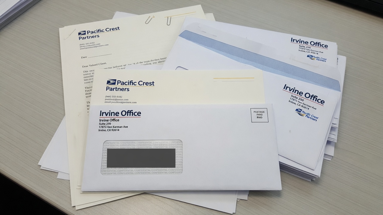
Envelope printing in California starts with three SKUs: a #10 for a folded 8.5×11 letter, a #10 window that shows the insert address, and a 9×12 that mails as a flat. Match letterhead mill and shade. Ink and toner are different machines. USPS still measures the window, the height, and the thickness.
I estimate these jobs at Avanti Printing, 15321 Barranca Pkwy, Irvine, CA 92618. We print stationery that leaves this plant and lands on desks in Spectrum towers, the Irvine Business Complex, University Research Park, Newport and Tustin medical corridors, and the rest of California when one origin is the point. Call (949) 387-0787 if you already have a mill name and a window die. Quotes still confirm size, material, quantity, finish, and date. Postage is a separate USPS charge. A pretty #10 on a website is not a mailpiece until a clerk can measure it and an insert can sit still in the window.
People order “envelopes” the way they order pens. They mean a closed-face #10, a window #10, a 9×12 catalog, a #9 reply, and a letterhead sheet that has to look like it was born in the same mill. Those are five objects. They do not share a die, a postage bucket, or a laser-safe story. This page is the estimator’s version of that split. It is not a postcard size chart. It is not a saturation-route lecture. It is not a catalog press argument. If the piece is named mail, the envelope is a container the Postal Service will grade. If the piece is a counsel letter that never sees a sorter, the envelope is still a container your client will hold next to the letterhead. Either way you start with the insert, not with a catalog photo of a square flap.
Who this is for in Irvine professional offices and statewide California
This guide is for the person who signs a stationery estimate: an office manager in a Spectrum high-rise, a law-firm administrator at Park Place, a CPA group along Jamboree, a wealth desk in Newport, a medical-practice manager in Tustin, an architecture studio in the Irvine Business Complex, a commercial broker covering from Santa Ana to Costa Mesa, or a statewide professional brand that wants one origin on Barranca Parkway. You mail letters, invoices, engagement letters, reports, and contracts. You also hand a matching sheet across a conference table. You want those two objects to look like one firm.
It is not a walk-in box of leftover white wove. It is not a souvenir announcement envelope. It is not a Laguna Woods ZIP product page. The plant is in Irvine, 92618. The mail is California mail that happens to start here. If the only instruction you have is “standard envelopes, match the letterhead,” you do not have a spec. You have a hope.
You should read this if any of the following is true. The window shows half a ZIP after the letter shifts. The #10 is a cooler white than the letterhead. Someone flooded a dark panel on a converted envelope and the return address disappeared into the ink. You ran window envelopes through a laser and the film wrinkled. You stuffed a 9×12 like a briefcase and then argued with a flat rate. You ordered 2,500 closed-face #10s and 250 letterhead sheets, then wondered why the sheets died first. You need a #9 that actually fits inside the #10. You print letters in-house on preprinted letterhead and the envelope has to survive that same device.
If the story is a mailed card with no wrapper, you do not need this suite. Start with postcard printing and mail prep from Irvine and keep the postage in the card bucket. If the contents are a multi-panel leave-behind that sometimes rides in a 9×12 and sometimes sits on a table, we print brochures that insert as documents, not as a second identity system. If the pile is a counter handout that never sees a flap, versioned flyers for locations that never see a tray are a different object. Do not mix a handout flood and a laser-safe envelope on one purchase order and then blame the dock when the wrong pile is in the window.
B2B readers in Spectrum towers should stay here too. A named letter with a suite and a permit imprint is still an envelope job. A box of #10s for the receptionist to stamp is still an envelope job. The difference is which office takes the mail and whether the address lives on the envelope or on the insert. The plant conversation in front of that choice is the same: size, stock, window, match to letterhead, ink or toner, date.
Pick the envelope from the insert, not from a stock photo
Start every envelope conversation with what goes inside, how it is addressed, and how it is sealed. The SKU follows. Doing it in reverse — picking a “standard #10” because every office has seen one — is how you buy a handsome face that will not take the letter, will not show the ZIP, or will not rate as a letter.
Use this as the planning surface before anyone opens an envelope template.
| SKU | Finished size (inches) | USPS shape if addressed as usual | What it is for | What kills it |
|---|---|---|---|---|
| #10 closed-face | 4.125 x 9.5 | Letter | Counsel letters, proposals, anything that should not show the inside | Addressing the envelope and the letter to different people; dark floods; square flaps that look social |
| #10 window | 4.125 x 9.5, plus a die-cut window | Letter, if the window and insert pass | Invoices, statements, engagement letters with the address on the letter | Insert shift; 1/8-inch clearance gone; window in the barcode clear zone; laser-unsafe film |
| #9 reply | 3.875 x 8.875 | Letter, and it must fit inside the #10 | Courtesy or business reply that rides with the letter | A #10 printed as a “reply”; missing FIM or barcode on a BRE; too thick a nest |
| 6×9 booklet | 6 x 9 | Letter if under 6.125 high, under 1/4 inch thick | A thicker folded insert that still wants letter postage | Creeping over 6.125 high; clasps; a book that makes a lump |
| 9×12 catalog | 9 x 12 | Flat. Height is past 6.125. Length is past 11.5 if you address the 12-inch edge. | Unfolded 8.5×11, contracts, thin reports, a short stack of sheets | Pretending it is a jumbo letter; clasps; overfill past 3/4 inch; uneven thickness |
| 10×13 catalog | 10 x 13 | Flat | A thicker kit, a bound report, something a 9×12 will not close | A 9×12 ordered “for savings” that will not close; parcel territory if it exceeds flat max |
Two footnotes belong under that table. First, “typical” is a pattern I see on Irvine professional desks, not a forecast for your practice area. A litigation letter is not a monthly statement. I will not invent an open rate. I will insist you name the insert. Second, letterhead quantity and envelope quantity are not the same integer. Sheets die in the printer. Envelopes die in the mail. Order them as a suite with two counts.
A #10 is a letter because it is 4.125 inches high and 9.5 inches long. A 9×12 is a flat because it is taller and longer than the letter box. Originating the cartons in Irvine does not change those national measurements. Read the Postal Service summary: USPS Quick Service Guide 201, physical standards for commercial letters. If a stationery catalog disagrees with that guide, the guide wins.
Aspect ratio still applies. Length divided by height for a #10 addressed parallel to the 9.5-inch edge is about 2.30, inside the 1.3 to 2.5 automation band. A square envelope is 1.00. Squares look “architectural” on a mood board and mail as nonmachinable letters. I would rather you print a rectangular #10 with a square mark on the letterhead.
The #10 closed-face: everyday mail for California offices
A #10 is 4-1/8 by 9-1/2 inches. It exists because American letter paper is 8.5 by 11 and folds into thirds that sit in that pocket with a little air on every side. That air is not waste. It is how the letter goes in, how inserting equipment does not crush a corner, and how the flap still seals after a 24 lb sheet and a #9 have taken their space.
Hold 8.5×11 as the insert. Fold it so the finished packet is about 8.5 by 3.67 inches. The #10 is taller and longer than that packet on purpose. If you design a “#10 insert” that is 9.5 by 4.125, it is not an insert. It is a competing envelope. If you specify a letterhead with a 1/2-inch bleed misunderstanding and the sheet trims to 8.6 by 11.2, it will dog-ear in the fold and peek in a window. Bleed belongs on the print file. The sheet trims to 8.5 by 11.
Face, flap, and seam are three print surfaces
The face is what the carrier sees. For Irvine professional offices that usually means a return address in the upper left, a small mark or wordmark, and a quiet field. Postage lives in the upper right: stamp, meter, or permit imprint. Do not put a logo where the indicia goes. Do not put a QR code in the lower-right barcode clear zone. Do not write a marketing teaser across the face of a counsel envelope and then ask why it looks like a mailer. The face can carry a thin rule. It should not carry a campaign.
The flap is a second surface. Some firms print a web address or a privacy line on the flap. That is fine if the type clears the gum and the score. Type that sits on the remoistenable strip is how you mail a sentence to the inside of the flap. Square flaps look ceremonial. Commercial (diagonal) flaps look like business. Wallet flaps give you more glue. Pointed flaps look like a wedding. Say which flap you are buying. A PDF cropped to 9.5 by 4.125 with no flap drawn is not an envelope file.
Seams are a converting choice. Diagonal seams and side seams behave differently under a window and under a laser. A side seam that creeps into the window opening is a converting error you will photograph. Grain and seam placement also change how a #10 feeds in a desktop unit. If your office will laser the envelopes, say so at quote, not after the first jam.
Stock: 24 lb wove is the workhorse, not a personality
Typical industry ranges — and they are ranges, not a promise that every mill’s 24 lb feels the same:
- 24 lb white wove: the default commercial #10. Stiff enough to run. Thin enough to stay a letter after a folded sheet. Takes litho ink and many toner engines if the gum and window are honest.
- 28 lb white wove: a more substantial hand. Common when the letterhead is 70 lb text or a 28 lb writing sheet and you do not want the envelope to feel like a cheaper cousin.
- 24 lb or 28 lb writing, including 25 percent cotton and 100 percent cotton: the law-and-accounting voice. Fibers show. Watermarks may live on the letterhead and not on the envelope unless you buy that pair on purpose.
- Laid finishes: traditional, tactile, and a laser argument. Heavy laid can be a feed and fuse problem. If the office printer is the second press, dummy the actual device.
- Colored wove: possible. Dark fields fight OCR and fight a permit imprint. A pale gray or ivory can match a cream letterhead. A navy flood is a marketing envelope pretending to be stationery.
Security tint is an inside print. Medical, legal, and financial offices in Orange County use it so the letter does not read through the wove in a Spectrum lobby. Tint is not a window. Tint is a pattern. Say whether you want it. A full-coverage inside flood is a different converting conversation and can add curl.
Weight of the filled #10 still has to live at or under 3.5 ounces if you want machinable or automation letter prices. A 24 lb envelope plus one 24 lb letter is nowhere near that. A 24 lb envelope plus a 24 lb letter plus a 28 lb #9 plus a clipped check plus a folded brochure is how you find the ceiling with a scale, not with a PDF. Weigh a dummy. A PDF cannot read a scale.
Closed-face addressing is a second pass
If the address is not in a window, it has to go on the envelope. That is inkjet, toner, a label, or a hand. Commercial drops want an Intelligent Mail barcode and a standardized delivery address. Irvine suites, Spectrum high-rises, and UCI-adjacent units still need the secondary line. A beautiful #10 with “200 Spectrum Center Dr” and no suite is a beautiful return.
Inkjet on a dark flood or a heavy varnish is the same collision you get on a coated mailer. Keep the address panel light. If the brand wants a color face, knock out a pale rectangle large enough for name, address, barcode, and quiet space. Labels exist for the job you already flooded. Labels look like labels.
Window envelopes: the eighth-inch that reprints a drop
A window is not a design flourish. It is a hole with rules. The address lives on the insert. The envelope is a frame. If the frame is wrong, or the insert moves, or the film is cloudy, the piece is not a clever #10. It is a reject, a nonmachinable letter, or a return.
What USPS actually requires in the opening
For letter-size and flat-size mail in window envelopes, every character in the delivery address — including any Intelligent Mail barcode, marking, or endorsement — must stay completely visible through the window through the full range of movement of the insert. A clear space of at least 1/8 inch is required between the address block (including any optional endorsement line and barcode) and the top, bottom, left, and right edges of the window. That clearance must still be there when the insert is shoved to each limit inside the envelope. The address, as seen through the film, has to sit on white paper or a very light color. Window cover, if used, has to be non-tinted clear or transparent material, glued on all edges. Glassine is allowed. The bottom edge of the address window must be at least 1/2 inch from the bottom of the envelope; 5/8 inch is preferred. On a letter, the window must be parallel with the longest edge.
That is the Postal Service’s own language, compressed. Read it from the source, not from a template that assumed a “standard window”: USPS Publication 25, window envelope standards. If a slide deck disagrees with that page, the page wins.
The practical meaning for an Irvine invoice run is blunt. The folded letter has play inside a #10. That play is often a quarter inch or more, depending on fold tightness and insert count. You do not design the address to “look centered in the window” on a still PDF. You design a panel large enough that after a full slide in every direction, the ZIP, the barcode, and the 1/8-inch quiet space are still in the hole. A dummy with the real fold, the real envelope, and a shove test is the proof. A JPEG of a window is not a proof.
Common commercial #10 windows, and why “standard” is still a die
A common commercial #10 window is about 4-1/2 inches wide by 1-1/8 inches high, set roughly 7/8 inch from the left and 1/2 inch from the bottom. Other dies exist: a slightly different left offset, a double window for a return address plus a delivery address, a statement window that is taller. “Standard window” on a purchase order is how you get a hole that does not match the letter template your accounting system has used for six years.
Send the window die you actually have in the field, or send the insert template with the address block drawn at final size, measured from the left and bottom of the folded panel. We will match the hole to the panel, or we will tell you the panel has to move. We will not guess from the word standard.
Double windows are a statement product. The upper window shows a return address printed on the insert. The lower window shows the delivery address. Both windows still need the 1/8-inch rule. Both still need light paper behind them. If the letterhead has a color bar that runs through the upper window, you did not design a double-window program. You designed a brand collision.
The insert is the mailpiece as much as the envelope is
Window jobs fail on the letter more often than on the converting. Typical failures I see on professional files:
- Address block too close to the fold. After the fold relaxes, a line tucks under the paper and the city disappears.
- Address block too high. The window looks at letterhead art, a logo, or a confidentiality banner.
- Gray type, 8-point script, or reverse type on a navy band. Contrast dies. The sorter is not your brand guide.
- Barcode drawn as decoration, or omitted because “the window is tight.” Tight windows do not get automation prices.
- A second language interleaved between street and city. Keep one standardized delivery address the equipment can parse. Put the other language in the letter body.
- A confidentiality footer that sits in the window when the insert drops. Move the footer. Do not shrink the address.
Fold panel matters. A letter folded so the address sits on the bottom third is the usual #10 window story. Fold it the other way and the window looks at a blank or at a signature block. Office staff who fold by hand will not match a machine fold unless you give them a sample. If 400 invoices will be folded at a Spectrum desk, give the desk a dummy and a fold mark. If we insert here, the fold is our problem and still has to match the die.
Thickness through the window still has to stay honest. A window #10 with a letter, a #9, and a folded extra can stay a letter if the stack is under 1/4 inch and even. A window #10 with a binder clip, a key, or a USB is not a letter. It is a lump. Lumps are how you buy a surcharge or a refusal.
Film, laser, and heat
Window film has to be clear enough for print contrast. It also has to survive the path you actually use. A toner desktop unit fuses with heat. Some films wrinkle, haze, or let go. Latex self-seal adhesive can fire in that heat and glue itself to the fuser. Remoistenable gum can pick up moisture in a coastal closet and then stick in a stack. Peel-and-seal tape is often the grown-up path for office lasers. “Laser-safe” is a converting spec, not a slogan on a carton. Dummy the actual printer in the actual office, or dummy the production inkjet we will use here. Do not assume the film that survived a litho jet press will survive a receptionist’s laser on the 15th floor.
Orange County heat makes a marginal film worse in a parked car and in a July mailroom. Heat is the amplifier. The root cause is still the wrong film or the wrong gum for the device.
9×12 catalog envelopes are flats, and that is not an insult
A 9×12 exists because some 8.5×11 documents should not be folded: contracts, signature packets, thin reports, a short stack of sheets that have to arrive flat. The envelope is about 9 by 12 so a letter sheet sits inside with a margin, the same logic as a 9×12 folder, except this object has a flap and a postage class.
USPS letter maximums are 11-1/2 inches long, 6-1/8 inches high, and 1/4 inch thick. A 9-inch-high envelope is already past 6-1/8. If you address parallel to the 12-inch edge, length is 12 inches, which is also past 11-1/2. You are in flats. Flats have their own physical standards: more than letter size in at least one dimension, and no more than 12 inches high, 15 inches long, and 3/4 inch thick for the common commercial flat box. A 9×12 sits inside that box if you do not overfill it and if you keep it rectangular and uniformly thick.
Postage for a flat is not letter postage. I will not invent a per-piece number here because the Postal Service moves prices. As a planning picture, retail First-Class large envelopes cost materially more than a 1-ounce letter stamp. Confirm the live figures on the Postal Service site before you lock a client deck. Originating the cartons at 15321 Barranca Pkwy does not turn a 9×12 into a #10.
Catalog opening versus booklet opening
Catalog style opens on the short side. You slide 8.5×11 in along the long dimension, like a file. Booklet style opens on the long side, like a book. Catalog is the default I see for contracts and correspondence that must stay flat. Booklet can feed some inserting equipment more happily. Say which construction you are buying. A PDF labeled “9×12” with no flap edge marked is not a converting file.
10×13 is the next catalog size when the fill is thicker or the 9×12 will not close without a fight. Do not force a bound report into a 9×12 and then photograph the bulge. Measure the dummy. If the stack is heading toward 3/4 inch, you are at the flat ceiling. Past that you are in parcels, and parcels are a different conversation.
What belongs in a 9×12, and what belongs in a #10
Fold the letter if the letter can fold without losing the job of the piece. An engagement letter, an invoice, a one-page opinion — those are #10 work. A recorded document, a signature packet with tabs, a set of 8.5×11 sheets that will be punched, a thin report you do not want creased — those are 9×12 work. A packed presentation folder is often a 10×13 or a hand-delivery. Mailing a stuffed, irregular kit as if it were a letter is how the budget finds out at the dock.
If the 9×12 is carrying a brochure plus a letter plus a sheet, name each insert. We print those brochures as document inserts that have to meet the same in-home as the envelope, and we still need the envelope on the same ticket because inserting waits for the slower object. If one of the sheets is really a flyer that will also sit on a counter, split the finish: the mailed pile has to stay insert-safe; the counter pile can flood. See flyers when the sheet never goes in a flap.
Clasps, string-and-button, and metal fasteners are how a 9×12 leaves automation. They are old catalog habits. Peel-and-seal or gum is the adult closure for a flat you still want processed as a flat. Uniform thickness matters. A USB in the corner is a bump. Bumps are how flats lose the prices you claimed.
Matching letterhead: mill, shade, and the sheet the laser will see
Matching is the whole point of a stationery suite and the place most reprints hide. The envelope and the letterhead are rarely the same converting path. Letterhead is a flat 8.5×11 sheet. Envelopes are folded, glued, windowed, gummed objects. They can share a mill family, a shade, a fiber, and an ink formula. They will not share a press sheet unless you are doing something unusual. Plan the match. Do not hope the word “white” will do it.
Build the suite as a kit with two clocks
Letterhead dies in the office printer. Envelopes die in the mail and in the drawer. A typical industry pattern — a pattern, not your quote — is more envelopes than letterhead if you mail more than you print, or more letterhead than envelopes if the office lasers ten drafts for every letter that actually leaves. Count use. Do not print 1,000 of everything so the spreadsheet looks neat.
A grown-up Irvine professional suite is usually some mix of:
- Letterhead, 8.5×11, often 24 lb writing or 70 lb text, sometimes cotton.
- Second sheets: same stock, no logo, or a quiet footer only. People forget second sheets and then laser a blank from the copy room that is a different white.
- #10 closed-face, matching shade and ink.
- #10 window, same converting family, window die matched to the letter template.
- #9 reply if you ask for money or a signature back. It has to fit. Measure.
- 9×12 catalog if you send unfolded documents.
- A business card is a different product on a different board. Do not specify the envelope from the card coating.
Put the slow facts on the envelope and the letterhead: firm name, address, phone, a stable URL, the mark. Put the fast facts on the letter body you laser: matter number, invoice line, offer, person. When a partner leaves, you change the card and the signature block, not 2,000 envelopes. When you move suites inside a Spectrum tower, you reprint the return address. That is a stationery event. Budget it as one.
Shade, fiber, and watermark
Bright white, natural white, and cream are three colors even when everyone says “white.” A 96-bright wove envelope next to a warmer cotton letterhead is a visible seam on a conference table. Pick a mill family or accept the seam. Send a sample of the current letterhead if this is a match, not a hex from the website.
Cotton is a fiber content, not a vibe. 25 percent cotton is the common professional sheet. 100 percent cotton is a heavier statement and a heavier price. Cotton letterhead next to a wood-pulp #10 looks like two vendors met in the lobby. If the letterhead is cotton, the envelope should be the matching envelope from that mill, or you should decide in writing that the envelope is wove and the sheet is cotton. Silent mismatch is how managing partners notice.
Watermarks live in the sheet. They often do not live in the envelope. If the watermark is part of the identity, say so. We will tell you whether the matching envelope carries it. A fake watermark printed in varnish is not a watermark. It is a decoration, and it can fight a laser.
Laid versus wove is a tactile choice with a device consequence. Laid shows a linear texture. Some office lasers mark it; some jam; some look fine. Wove is the safer production path for a firm that lasers every letter. If you want laid, dummy the actual printer with the actual envelope, including the window version.
Preprinted letterhead versus imaging the whole letter
Two honest paths:
- Preprint the identity on letterhead and envelopes. The office (or our lettershop) lasers or inkjets the body and the delivery address. This is still the default for Irvine professional offices that want a tactile sheet and a stable mark.
- Image the whole letter — mark, body, address — in one digital pass, then insert into a stock or printed envelope. Useful when versions churn, when names are variable, when you do not want leftover letterhead with last year’s suite number.
Those paths have different match problems. Path one needs the preprint ink to sit in the same color family as any digital body, and it needs the envelope to match the preprint. Path two needs the envelope to match a digital sheet that may be a different mill than last year’s carton. Neither path is “more professional.” The professional move is to pick one and proof them together on a table, in daylight, next to the card if the card will sit in the same folder.
Laser on preprinted letterhead still has rules. Keep the top of the sheet honest if the device needs a grip. Keep heavy coverage away from the fuser’s worst habits. Do not preprint a full-bleed dark edge and then ask a desktop unit to feed 500 sheets without marking. If the office printer is a cheap inkjet, uncoated writing stock is your friend and a heavy cotton may be a fight. Ask what device will actually print the body. “We have a printer” is not a spec.
Grain on letterhead should feed the device and fold across the letter without a white crack through a navy rule. Against-grain folds on a heavy cotton with a hard ink line hairline. That hairline will sit in a #10 looking like a defect. Score is rarely used on 24 lb. Grain and ink coverage are the levers.
Ink versus toner on converted envelopes
This is not a catalog-press lecture. It is the envelope version of a simple question: what machine puts color on a folded, glued, sometimes windowed object, and what machine puts color on the letterhead that has to sit next to it?
Use this as the decision frame before anyone talks about a unit price.
| Path | What it actually is | When it is honest | Match to letterhead | How it dies |
|---|---|---|---|---|
| Litho ink on converted envelopes | Offset on an already-made envelope, often a jet-style envelope press | Hundreds to many thousands of a static face, 1 to 4 colors, type and a mark | Can match a litho letterhead in the same ink; still proof the pair | Heavy floods, tight bleeds, small type on a seam, wet ink on gum |
| Litho on flats, then convert | Print the envelope as a flat sheet, then die-cut, fold, glue, window | Heavy coverage, edge-to-edge color, a face that a converted press cannot hold | Best chance at a full-bleed match to a flood letterhead | Lead time; a converting error after you already like the print |
| Toner digital on envelopes | A toner or liquid-toner engine printing the made envelope or a flat blank | Short runs, versions, variable return addresses, tests, a match to digital letterhead | Strong when letterhead is the same engine and the same mill family | Fuser heat versus gum and window film; latex firing; coverage limits on some engines |
| Flexo | A simple in-line converting print, often 1 or 2 spot colors | High volume, simple faces, little art | Spot color can be close; process photos are the wrong ask | Tiny type, photographs, a “just like the letterhead photo” request |
| Thermography | Raised ink, the old professional look | A tactile mark on a closed-face #10 or letterhead | Matches only if both objects are thermographed, which most offices no longer want on the sheet they laser | Raised surfaces in a laser; a shiny bump that looks dated next to a digital letter |
Two footnotes. First, those quantity notes are typical industry planning ranges, not a break-even coupon. A 250-run of a window #10 with a PMS match can still be litho if the letterhead is litho and the match is the point. A 5,000-run can still be toner if you have six suite versions. Second, “digital” on an envelope is not the same machine as “digital” on a 14 pt card. Do not import a card coating conversation onto a 24 lb wove flap.
What ink wants
Litho ink on a converted #10 is still how a lot of static professional stationery is built. It likes type, a spot color, a small mark, and a return address. It does not like a full-bleed photograph wrapped around a seam. Coverage near the gum and the window patch is a dirty-hands problem. Ink needs dry time before you box 2,000 in an Irvine July. Stacking wet envelopes is how you offset a logo onto the back of the next face.
Spot color is the match tool. If the identity is PMS and the letterhead is litho PMS, print the envelopes in the same ink in the same window of days when you can. CMYK builds of a spot color on a digital letterhead next to a true PMS envelope will show. Sometimes that is acceptable. Sometimes a managing partner will hold them in daylight on Barranca Parkway and send them back. Proof the pair. Do not argue from a coated-book formula on an uncoated wove.
Process color on envelopes is real. It is also how you discover converting limits. A photo that looks fine on a flat proof can sit on a window patch or a seam. Draw the die. Keep live matter off the window, off the gum, off the side seams, and off the score of the flap.
What toner wants
Toner is honest when the run is short, the versions are many, or the letterhead is already a toner sheet. A firm that just moved from suite 200 to suite 340 in a Spectrum tower does not always need 5,000 litho #10s. A digital 500 with a correct return address is the adult reprint. A medical group with three letterheads for three tax IDs is a version problem, not a romance-with-offset problem.
Toner still has to live with converting chemistry. Heat plus remoistenable gum plus window film plus latex is a test, not a default. Ask for laser-compatible construction if the office will run the envelopes, or if our production toner will. If the dummy wrinkles the window, we change film or we change path. We do not ship 1,000 and hope the 15th-floor device is gentler than ours.
Variable data on envelopes is a toner (or inkjet) job: names on closed-face #10s, office versions, a permit imprint that changes, a return address that maps to a location. Lock the file. A spreadsheet you “just cleaned” after we printed 800 faces is a reprint. If the address belongs on the letter, use a window and spare the envelope the variable pass.
I will not pretend ink is always cheaper at quantity or that toner is always faster. House 24 lb, a one-color mark, and a clean file can be fast on either path. A cotton mill sheet we do not stock is slow on both. The quote still has to confirm size, material, quantity, finish, and date. Path is one of those facts, not a brand loyalty.
Request a letterhead and envelope suite quote
Files, bleeds, gum, and a dummy with the real insert
Send a print-ready PDF built on the actual envelope dieline, not on a 9.5 by 4.125 rectangle that ignores the flap. Fonts outlined or embedded. Images at production resolution. Live matter off trim, off the window, off the gum, off side seams, and off the flap score. Return address in the upper left. Postage area clear in the upper right. If there is a window, draw it as a named die line, and place a dummy address at final size on a separate insert PDF.
Color: CMYK or a named spot. Do not build the mark in RGB. Do not put a 5 percent yellow cast in the address panel of a window insert to “match the brand warmth.” That cast is how contrast dies through film. If the envelope must match existing letterhead, send a printed sample, not a screenshot.
Bleed on converted envelopes is limited. A converted #10 is not a full-bleed poster. If you need color to the edge, you are often on a print-then-convert path, and you still need to talk about the flap, the seams, and the interior. A nervous “add a little extra” that grows a #10 to 4.25 by 9.6 is how a letter starts looking like a custom that no inserting machine loves. We would rather you have a hard die and an honest live area.
Letterhead files are 8.5×11 trim, 0.125 inch bleed if you actually have bleed, live matter off trim, and a clear zone where the office device will print the body. Mark the fold panel if the sheet will show through a window. Put the address block on that panel at final size, with 1/8-inch pad beyond the worst-case shift. If variable fields exist, mark them. If they do not exist yet, still show the empty panel.
Proofs for a stationery suite are a set:
- Contract-quality proof of the letterhead and of each envelope SKU, including flap and back if they print.
- A physical dummy of each envelope on the actual stock, with the actual window film and gum.
- The real insert, folded the real way, shoved to each limit in the window.
- A side-by-side of letterhead, #10, window #10, and 9×12 in daylight, not under a Spectrum LED that hides a shade miss.
- A pass through the actual laser or inkjet that will print the body or the closed-face address, when the office or the lettershop will do that pass.
Each revision that moves a window, a return address, or a stock is a day. “One more small change” after you already approved the dummy is how you buy a second dummy. I would rather you take Tuesday to confirm the suite number than take Thursday to reprint 2,000 faces with last year’s floor.
If the same program also needs a leave-behind that is not mailed, say so. Handouts can flood. Window inserts cannot always. Mixing those two specs on one purchase order is how the wrong pile gets folded into the hole.
Orange County offices, heat, suites, and the laser on the 15th floor
Local color is only useful when it changes a spec. These do. Mail we produce for this site originates at Avanti Printing, 15321 Barranca Pkwy, Irvine, CA 92618. Phone (949) 387-0787.
- Suites and receiving rooms. Spectrum, the Irvine Business Complex, University Research Park, South Coast Metro, Park Place. Secondary lines on the insert are the job. A window that shows a beautiful unique URL and hides “Ste 400” is a beautiful return. Named pieces without suites are not late. They are lost in a mailroom.
- Cluster boxes and Informed Delivery. Design the #10 face for a hallway and a phone JPEG. That does not change litho. It does change how busy you can make the face before it looks like junk in a thumbnail.
- Office lasers. Most Irvine professional letters are still finished on a device in the suite. Laser-safe gum, film, and stock are field specs. A beautiful latex flap that fires in a fuser is a service call you did not want.
- Heat. Summer envelopes in a car on Barranca Parkway, or in a mailroom that faces west, will curl, block, and pre-seal latex. Store cartons sealed, off concrete, away from a sun-facing window. Peel-and-seal often survives that better than latex. Dummy it.
- Coastal versus inland humidity. Newport and a Tustin industrial park do not store wove the same way. Gum picks up moisture. Cotton moves. Rotate stock. Do not be surprised when one office’s drawer looks tired first.
- Bilingual California. Useful on many files. Still keep one standardized delivery address in the window. Do not interleave lines the OCR will read as a broken city-state-ZIP.
- Medical and legal corridors. Tustin, Irvine, Newport. Security tint, window statements, HIPAA-ish habits on the face. Put claims and account detail on the insert, not on the envelope teaser. A #10 that advertises a balance due in 14-point type is a privacy conversation, not a branding win.
- UCI-adjacent and student-heavy ZIPs. Occupants move. If the envelope is a window statement, the list still needs a current Move Update story. Print cannot invent a deliverable suite.
- Anaheim Convention Center weeks. If the 9×12 is a handout kit for a show, that is freight, not a letter mailing. Do not mix show freight into the permit trays.
- HOA and municipal rules. Those affect signs and door hangers. They do not veto a USPS box. Do not confuse those projects on the same stationery PO.
Permit geography matters when the #10 is a commercial mailing. The imprint has to match a permit that can live at the entry office. Using our permit, your permit, or a broker permit are three paperwork paths. Pick one when you quote, not at the dock. A pretty envelope with the wrong indicia is how Friday dies. If you are only stocking the drawer and stamping at a retail counter, say that. Retail stamps do not need a permit imprint. They still need a legal size.
The same plant handles commercial printing work across California that never sees a #10. Tell us which pile is which. A board-level capabilities piece and a window invoice envelope can share a mark and still have two stocks, two postage buckets, and two freeze dates.
Mistakes that reprint stationery or re-rate the mail
These are repeats. They come from good agencies as often as from a file built in a word processor.
- Ordering “#10 envelopes” with no window yes/no, no flap style, and no mill match to the letterhead.
- Building the letterhead address block from a screen template that does not match the actual window die.
- Skipping the shove test. The PDF looked centered. The ZIP left the hole in the tray.
- Putting the delivery address on a navy band, in gray, or in script, then asking for automation prices.
- A window that sits too low, into the barcode clear zone, or too close to the bottom edge.
- Latex self-seal on an envelope the office will laser. The fuser found the adhesive first.
- Flood coverage on a converted envelope, type on the gum, a logo on a side seam.
- Bright-white wove envelopes next to cream cotton letterhead, both called “white” on the PO.
- 2,500 envelopes and 250 letterhead sheets, no plan to reprint the sheet. The identity died in the printer.
- A 9×12 specified as a “large letter.” It is a flat. The deck used the wrong postage.
- Clasps on a 9×12, a USB in the corner, a stack past 3/4 inch. Automation left the building.
- A #10 reply envelope that does not fit inside the outer #10 because someone art-directed it to 4.125 x 9.5.
- Square envelopes for a “modern” architecture firm. Aspect ratio 1.00. Nonmachinable.
- Drawing a barcode in Illustrator on the insert. It is not an IMb. It is clip art.
- Changing the suite number after 2,000 faces were litho’d, then asking toner to “just hit the return address” on a dark flood.
- Mixing a counter flyer flood with a window insert on one file so the insert could not be read through film.
- Assuming last year’s list is legal for this year’s window statements. Move Update is still a mail spec.
- Full-bleed letterhead that the office inkjet cannot feed, so staff switch to copy paper and the match dies in public.
- Ordering the 9×12 last, after the contracts were already printed on a stock that peeks or binds in the flap.
- Locking a drop date before anyone dummy’d the window. Paper, gum, film, and inserting each take calendar time.
Reprints are worse than a dummy on the first pass. Once 2,000 window faces exist with a hole that does not match the invoice template, you do not have inventory. You have a shredding appointment. Send the die. Send the insert. Send the mill. That is slower than clicking a quantity in a portal. It is faster than printing the wrong object twice.
What to send for a quote
Write one email or use the form with the facts a plant estimates from. “Match our letterhead” is not a spec unless a sample is in the envelope. Adjectives do not change window dies.
- Each SKU: #10 closed-face, #10 window (die measurements), #9, 9×12, 10×13, letterhead, second sheet. Quantities per SKU, not a blended total.
- Finished sizes. Height and length labeled. Flap style. Catalog versus booklet opening on the 9×12.
- Window: width, height, left offset, bottom offset, single or double, film yes or no. Insert PDF with the address block at final size.
- Stock: 24 lb wove, 28 lb, cotton percent, laid or wove, security tint, or “match this sample.”
- Ink: PMS, CMYK, 1-color, 4-color, where it prints (face, flap, back, tint).
- Path if you care: litho on converted, print-then-convert, toner, or “recommend from quantity and match.”
- Who prints the letter body and who addresses closed-face pieces: your office laser, our lettershop, or imaging with the job.
- Laser-safe requirement yes or no, and the device if you know it.
- Whether we insert, and what goes in each envelope, in what order, including a #9.
- Mail class if we enter the mail: retail stamp, meter, commercial First-Class, USPS Marketing Mail. Permit ours or yours.
- In-hands or drop date, and whether that date is a wish or a contract.
- Files: dielines and letterhead PDF, or a note that design is open. A physical sample of current stationery if this is a match.
We confirm size, material, quantity, finish, and date on every quote. If postage is included, it is shown as postage, not hidden in a blended “per envelope” that pretends USPS does not change prices. If postage is yours, the window and the size still have to be legal for the class you claim. Avanti Printing, 15321 Barranca Pkwy, Irvine, CA 92618. (949) 387-0787. The quote link on this page is the same form we use for the rest of the commercial work that starts on Barranca Parkway.
FAQ: envelope printing California stationery and mail
Is a #10 always cheaper to mail than a 9×12?
Usually, yes, because a #10 is a letter and a 9×12 is a flat, and letter prices sit below large-envelope prices on the public charts. That is a USPS shape fact, not a print-shop coupon. A stuffed #10 that goes over 1/4 inch or 3.5 ounces can leave the cheap letter box. A thin 9×12 is still a flat because of height. Weigh and measure a dummy. Confirm live postage on the Postal Service site. Originating the job in Irvine does not change the national shape classes.
Can I use one window die for invoices and for counsel letters?
Only if both inserts put the delivery address in the same panel with the same 1/8-inch shove-test clearance. Counsel letters often want a closed face. Invoices often want a window. Those are two SKUs. Forcing a counsel letter through a statement window is how a confidentiality banner becomes the address. If you truly share a template, send both inserts against one dummy. If they do not share a template, buy two envelopes. The second SKU is cheaper than a reprint.
Will toner envelopes match litho letterhead?
Sometimes well enough, sometimes not, and the only honest answer is a side-by-side dummy on the real stocks. Spot litho on both objects is the easy match. Toner next to PMS is a delta you have to see. Uncoated wove shows that delta more than a coated brochure would. If match is the reason you are reprinting a suite, print both objects in the same ink family in the same week, or accept a documented difference. I will not promise a mill-perfect match from a blog post.
Are window envelopes safe to run through our office laser?
Only if the converting is laser-compatible: film that takes fuser heat, gum that does not offset, no latex that fires. Many window envelopes are not that product. Dummy ten pieces on the actual device before you buy 1,000. If we are imaging here, we dummy our engine. Your 15th-floor unit is still a different heat. Peel-and-seal plus a known film is the usual path when the office must print the face or when leftover envelopes will be fed in a suite.
What paper should match 24 lb letterhead?
A 24 lb writing or wove envelope from the same mill family is the boring, correct pair. If the letterhead is 70 lb text, a 28 lb envelope is often the closer hand. Cotton letterhead wants the matching cotton envelope, or a written decision that the envelope is wove. Shade matters as much as basis weight. Send a sample. “24 lb white” from two mills is two whites.
Does a security tint replace a window film?
No. Tint hides contents through the paper. Film covers the hole. You can have both. Tint without a window is a closed-face privacy choice. A window without a light address panel is a read-through of a different kind: the sorter has to see the address, and a person in a lobby should not see the rest. Design those two jobs separately.
Can I mail a presentation folder in a 9×12 as a letter?
No. A 9×12 is already a flat by height. A stuffed folder is often an uneven flat, and sometimes a parcel. Uniform paper contents, a catalog envelope that actually closes, and a dummy under 3/4 inch are the grown-up path if it must mail. Hand delivery is still how a lot of Irvine kits should travel. Do not put a clasp on it and call it vintage.
How do I get a quote from Avanti for envelopes and letterhead?
Send SKUs, sizes, window measurements, stocks, inks, quantities per SKU, who prints the body, laser-safe yes or no, insert recipe if we insert, mail class if we enter, and date. Use the quote form or call (949) 387-0787. We will confirm size, material, quantity, finish, and date in writing. A 250-piece digital window #10 with a cotton letterhead match is not the same estimate as 10,000 litho closed-face #10s on house 24 lb wove.
Print the envelope that still matches the sheet next quarter
Envelope printing in California professional offices is a suite problem. A #10 is a letter. A window #10 is a letter only if the insert still shows a legal address after it moves. A 9×12 is a flat. Letterhead has to match in mill, shade, and ink family, not in the word white. Ink and toner are different machines with different habits around gum and film. USPS still measures height, length, thickness, and the eighth-inch in the window. A dummy with the real insert is cheaper than a reprint.
Khalid, Avanti Printing, Irvine. Bring a current letterhead sheet. Bring a window die if you have one. Bring the device that will print the body. We will tell you whether the job is a house 24 lb #10, a cotton match, a window program, or a 9×12 that you should stop calling a large letter. Then we will print the version that actually leaves Barranca Parkway looking like one firm.